


SOMA: Identity for the Higher Modern School of Marketing
Type of Design: Brand Identity and Website
Specifics and Business Area: Education
"Education allows a child to realize potential," - said Erich Fromm. And Nelson Mandela considered education to be the path to freedom. Therefore, an educational project with a critical social mission is a dream for a design agency!
Everyone knows that getting into a university in America is difficult and expensive. People from poorer families or difficult life circumstances have no choice but to study at vocational schools. And the list of professions there is hardly prestigious.
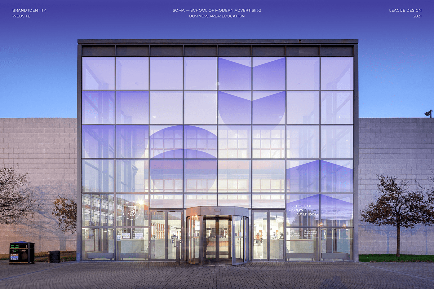
Now imagine that such children can get a full-fledged education in digital marketing! SOMA (SCHOOL OF MODERN ADVERTISING) is not a short-term course, but a prestigious modern offline education institution that helps children get a profession, find a job, and open up opportunities for a better life.
At first, our client created an MVP school where a group of students were trained as part of a charity. Even Facebook, Dell Computers, and Goldman Sachs recognized their professionalism. And then he decided to create a full-fledged educational institution.
Among the advantages of SOMA:
- Practitioner teachers and 100% up-to-date knowledge
- High reputation. The founder himself has 16 years of experience in digital marketing and entrepreneurship
- Offline education, but cheaper than university.
- Availability of mentors-teachers assigned to students.

Design goals
Our design task was to create a presentable professional identity for the institution that would help attract the best
teachers and students.
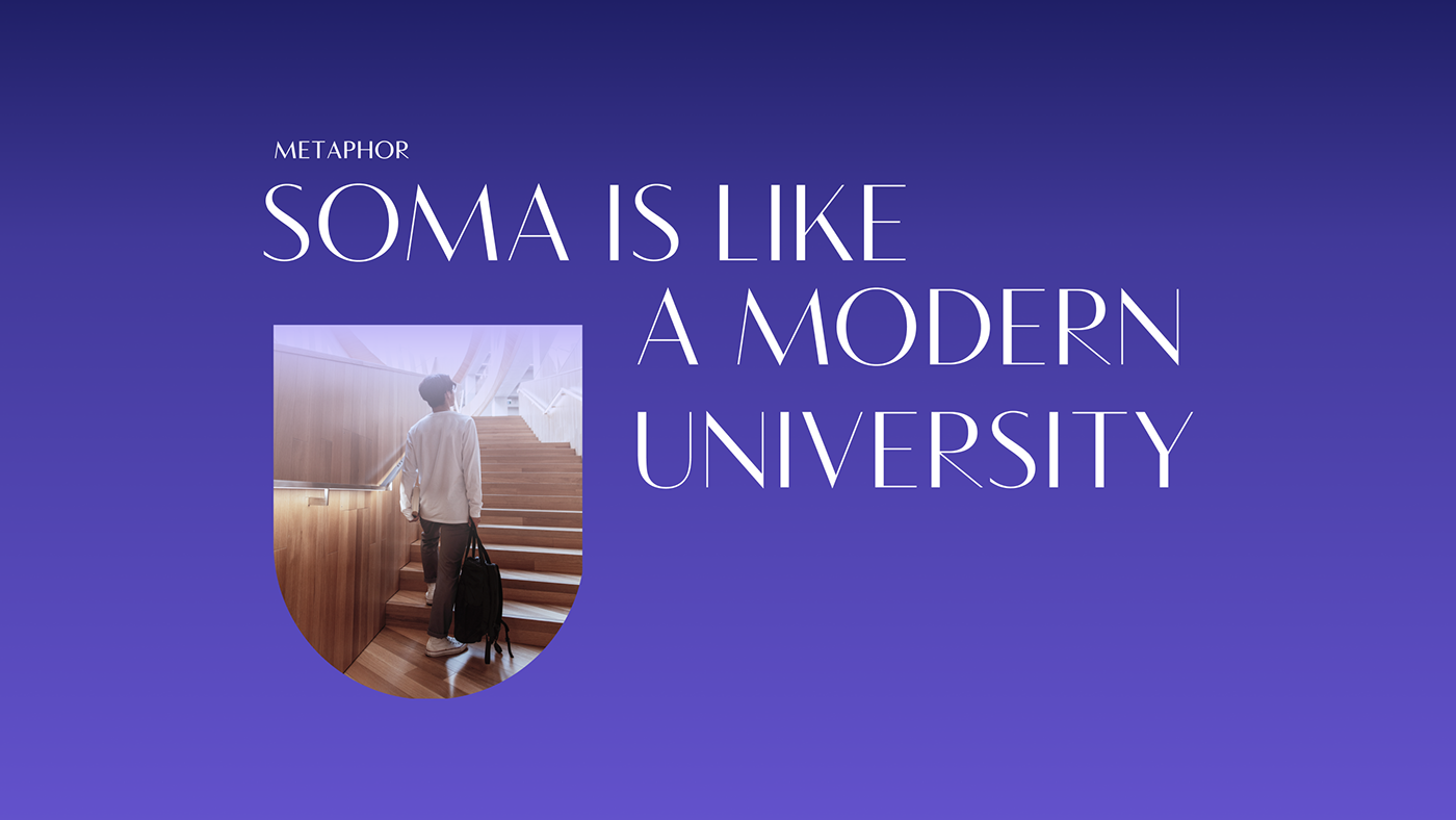
SOMA provides a functional education, combining modern content with traditional full-time learning. Thus, we provide students with real knowledge + the atmosphere of "real education". Our metaphor is a modern university.
Concept
To look like a university, we first conducted a visual survey among top US universities and identified the main
features of their identity:
- Heraldry
- Realism and detailing
- Specific color palette
- Combination of many fonts and/or compositions
Graphic technique
To recreate the first feature of the university — custom heraldic graphics with a modern character — we used the abbreviation of the name and four emotional benefits of the brand.
The logo is a monogram of the name in a heraldic form. To add versatility, we developed three versions of the composition:
an expanded version (circle), a classic version with the name on the side, and a sign. This is how we revealed the idea
of realism and detail.

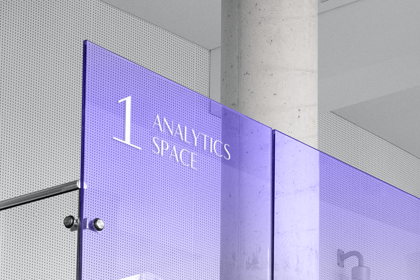
Coloristics
The visual research provided us with color options that would help us adhere to the specific color palette inherent in
educational institutions. Two colors turned out to be too popular in the category (it was hard to stand out), and red did not match the brand's character. So purple became the main color. In the identity, we divided it into a dark and light gradient to make the use of color more flexible and diverse.
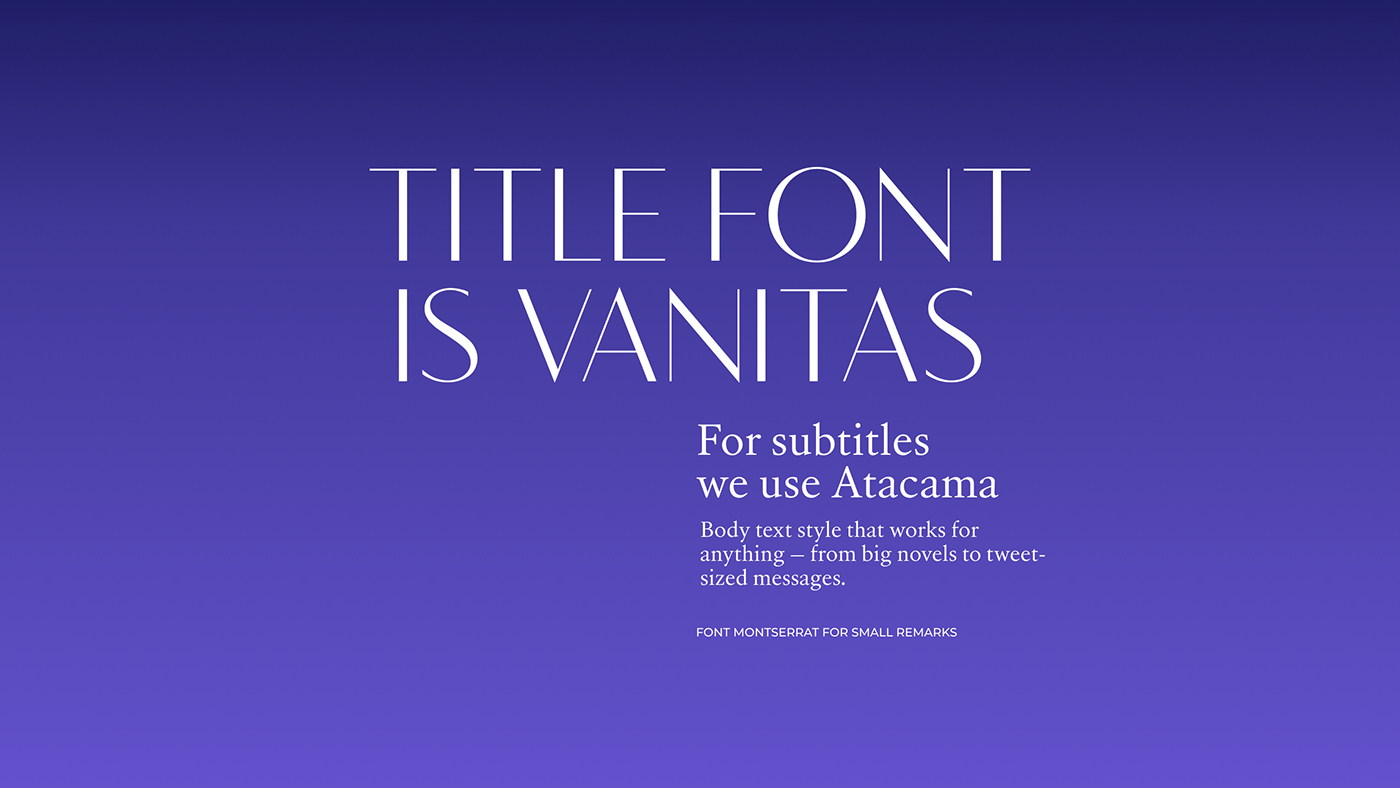
Typography
To convey the idea of variation in fonts, but to keep the style consistent, we chose the versatile Vanitas font. It combines a classic look (contrasting elegant letters), but it has no serifs, which makes it modern at the same time.


Website creation
After creating the brand identity, we proceeded to develop the university's website. The design task was to combine the traditional university-style with modern interactive elements as harmoniously as possible.
Based on the identity and reference concept, it was decided to add interactivity and interaction to each screen, because SOMA is about the future, development, hopes, and the impetus to gain new experience, and therefore the site should be as lively and dynamic as possible.
The heraldic elements that we used in all the sections were not perceived as separate: one element was undergoing metamorphosis and turning into another.
Together with gradients and smooth color changes, these transformations seem to hint that the educational path is not necessarily something very difficult and thorny. With the help of teachers as mentors, learning will be comfortable and environmentally friendly, and the lower price will allow everyone to realize their dreams and get a demanded and promising profession.
Would you like to study at such a "vocational" institution?
We love that affordable education can be so stylish!


Powered by League Design Technology
Design Director: Mike Samovarov
Team Leaders: Julia Zamiatina, Vadym Haidai
Graphic Designer: Kateryna Ishchenko
Team Leaders: Julia Zamiatina, Vadym Haidai
Graphic Designer: Kateryna Ishchenko
Web Designer: Anna Zlonska
Creative Project Manager: Yulia Lysenko, Sergey Podobnyi
Case Design: Anna Fedorovych, Anton Bukoros, Alina Kovalenko
Case Design: Anna Fedorovych, Anton Bukoros, Alina Kovalenko
Important!
If you want to support Ukrainian designers and the entire Ukrainian people in the war for world independence from russian terrorism, please, follow the links below:
savelife.in.ua(charity fund)
u24.gov.ua (an initiative of the President of Ukraine)


