ZEVIA
A NEW LEAF
ON LIFE
As the war on sugar continues to challenge the food and beverage industry, so do consumer expectations. Enter Zevia – the better-for-you, zero-sugar beverages with naturally sweetened flavors and planet-friendly packaging.
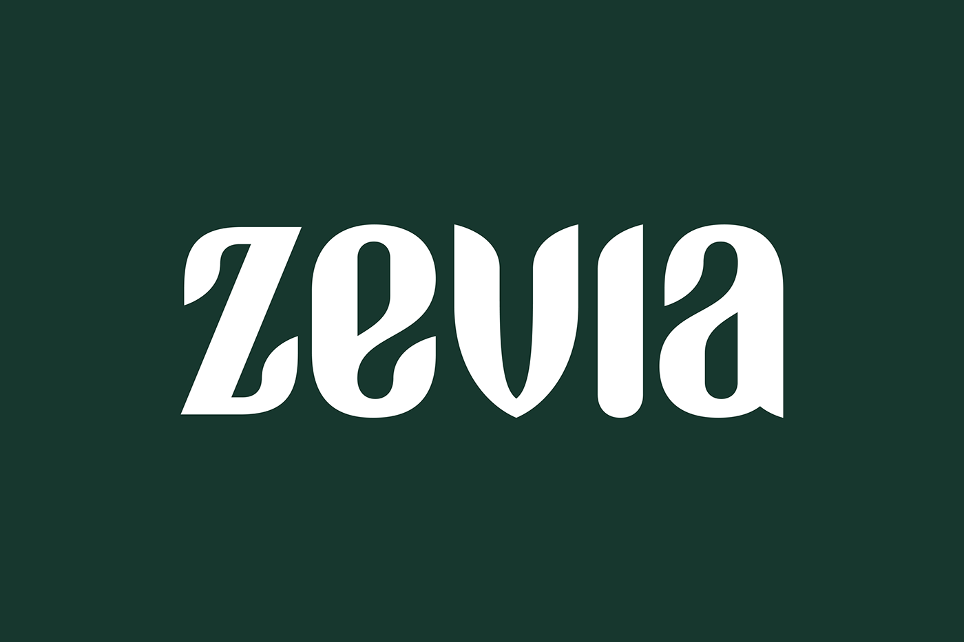
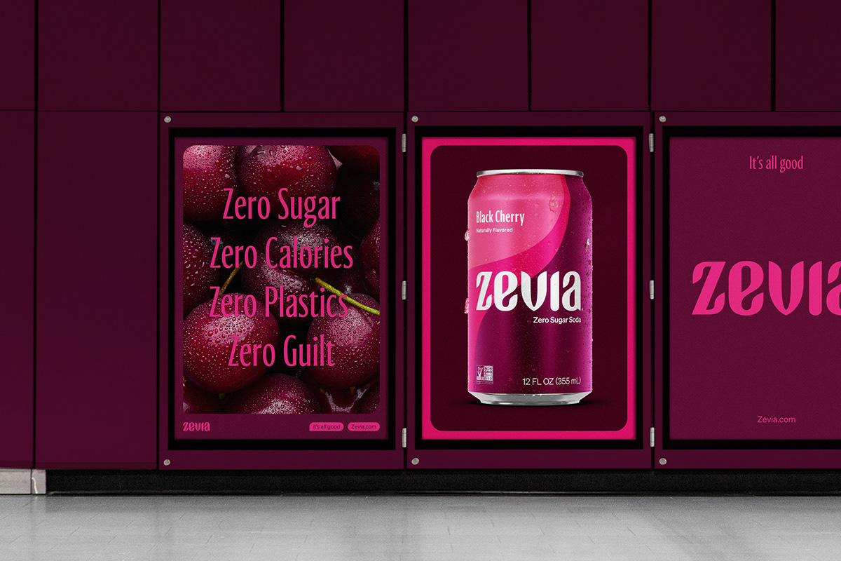
Inspired by the scalloped edge of a stevia leaf, our evolution of the mark defined a new and bolder visual language for the entire brand. One that blended fluid leaf-like forms with a sense of movement and considered geometry to shape an expression that felt nostalgic yet fresh. This approach provided a subtle nod to the soda world while creating a dramatic shift for the brand, rather than a simple evolution.
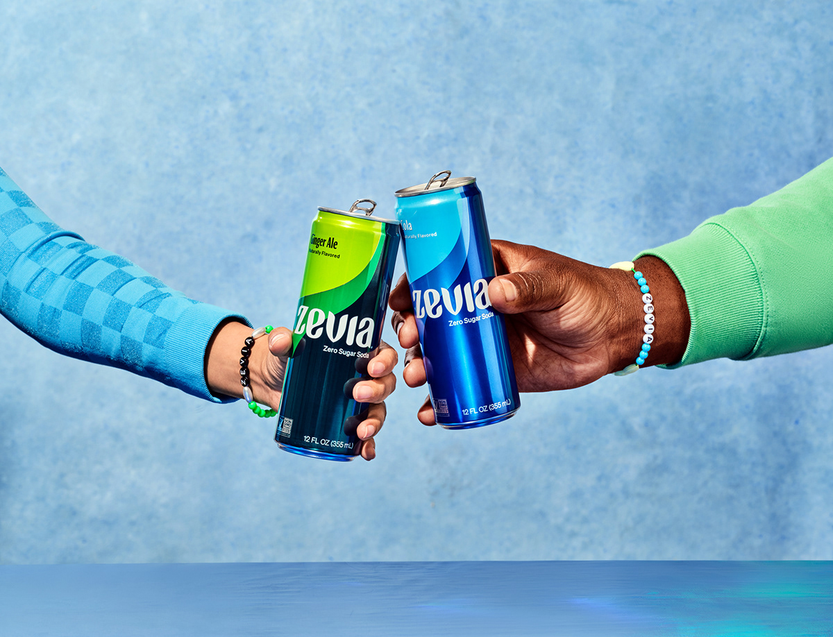
Embracing the joy of drinking better, we crafted a fluid and swooping visual language to sit across each can within the Zevia range. This ever-flowing concept was developed to capture the zero-sugar benefits of the brand but also reflect its richness in flavor. Using this language and our newly defined leafy DNA, we extended this approach across the Zevia universe to create five cohesive yet unique expressions.
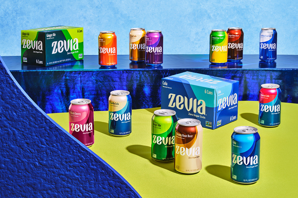
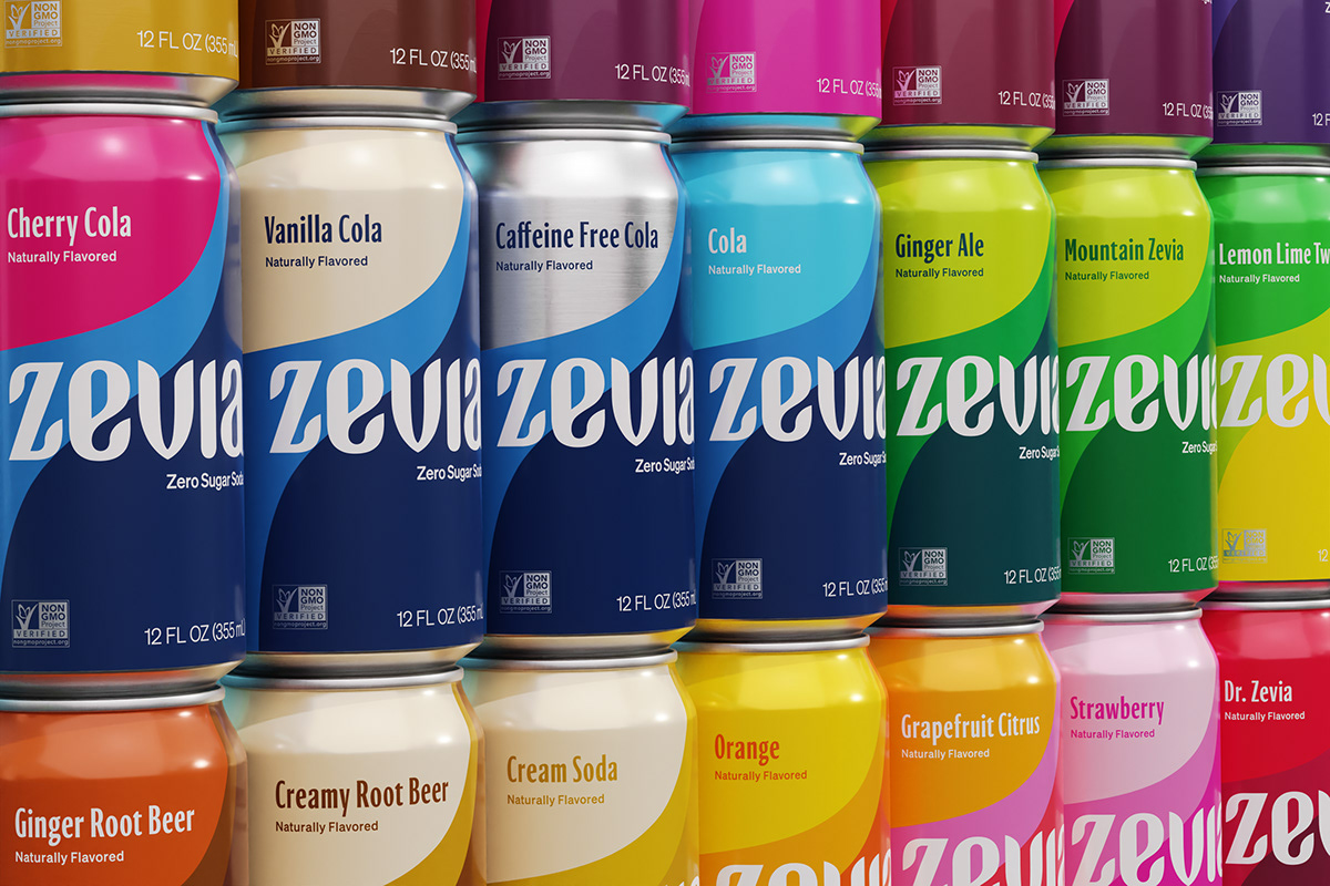
Channelling the nostalgia of soda, our approach to the color theory paid homage to an era where soda was still fun, and each sip felt carefree. Engaging and impactful in its own right, this bold new pattern and contemporary style captured the liveliness and fluidity of the brand, as well as the freedom of being able to drink as much Zevia as you wanted, whenever you wanted.
A continuation of the soda story, Kids evolved the visual language by infusing it with a sense of playfulness. We introduced super crops of fruit, and clashing yet complimentary colors that satisfied the senses of young ones and parents alike. Yes, even the grown-up kids.


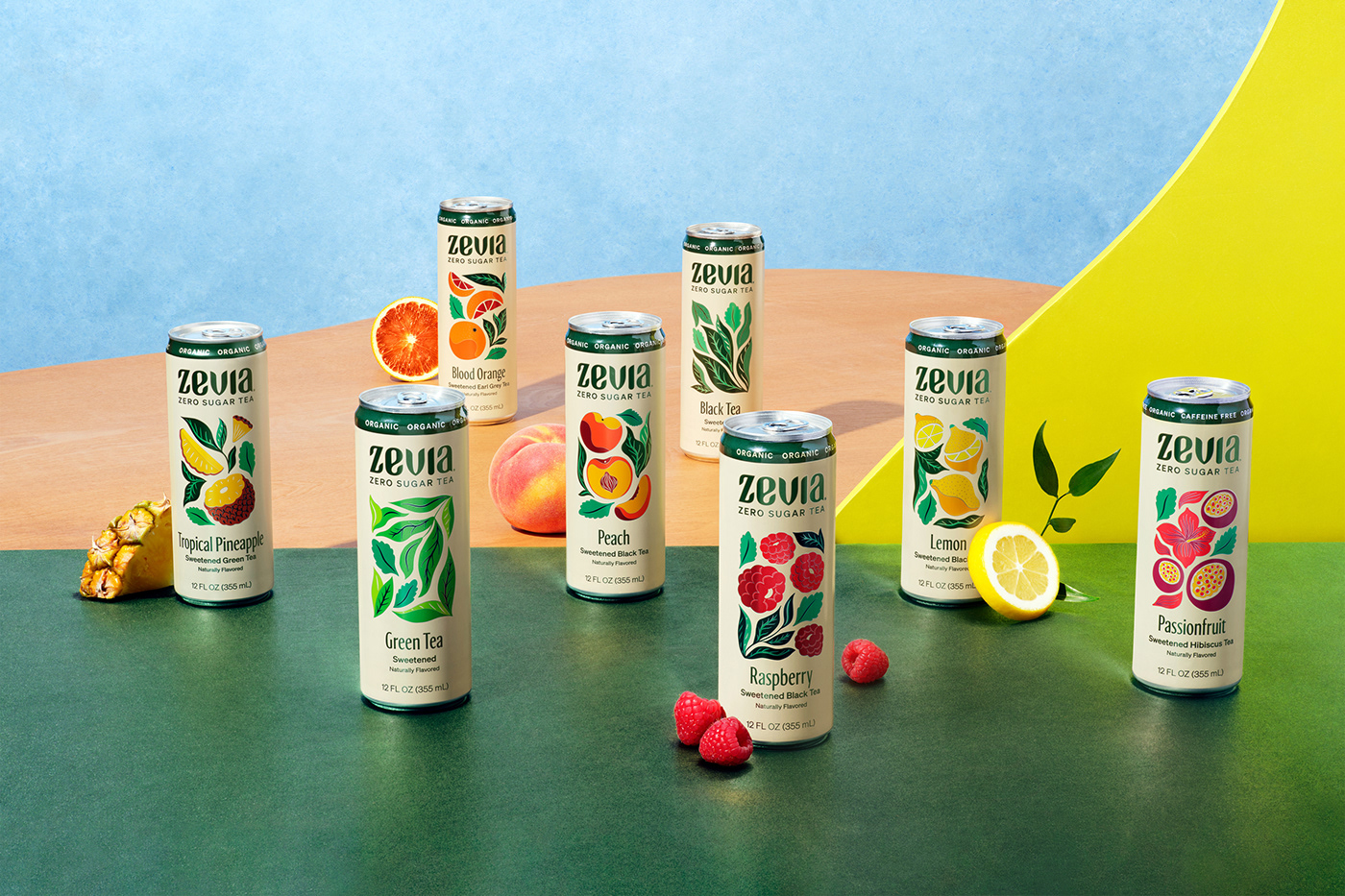
Steeped in calmness and clarity, our fluid DNA took on new life through Agathe Singer’s captivating illustrations. These became the centrepiece of the tea range. From the fluid edge of the tea leaf to the shadows and details within the fruit, we played off existing language to create a visual approach that was imbued with a sense of serenity while seamlessly celebrating Zevia’s signature blends.
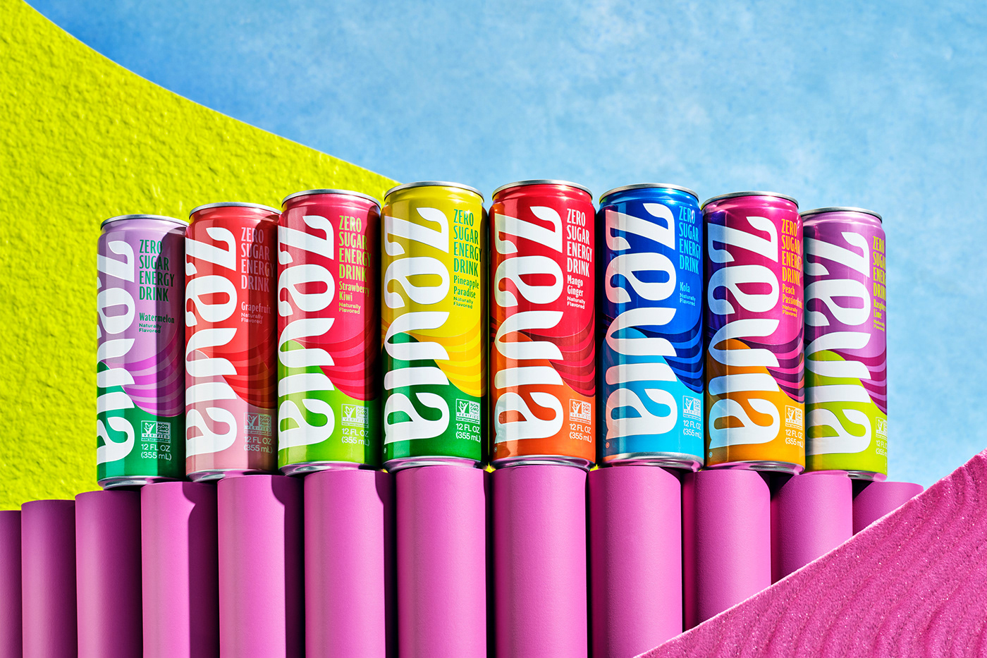
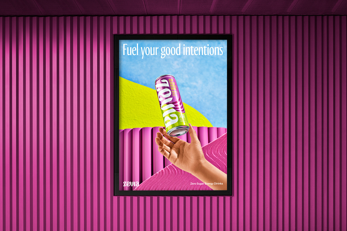
Finding Zevia’s place for energy on the other hand meant capturing the lively force that comes with any good boost. The kind that helps you achieve what you need to in life through positivity and vitality. In applying a natural yet vibrant color palette and dynamic pattern to each can, we dialed up the new brand language to capture the energy of life’s all-important boosted moments.
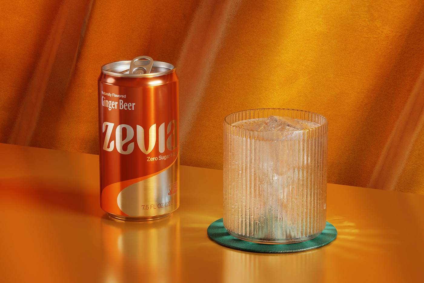
From polished finishes to exposed substrates and a sophisticated earthy palette – we crafted a visual expression for Zevia’s mixers range that felt just as at home on the shelf as it did in the fridge. The ultimate accessory to any beverage.
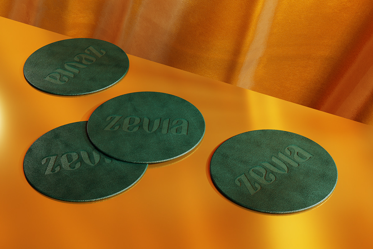
With its newly defined leafy DNA and ‘anytime, anywhere’ philosophy, Zevia has continued to re-write the soda story and change the beverage game for good.
A special thanks to our collaborators
Still Life Photography: Kelsey McClellan, Photographer. Michelle Maguire, Stylist. Zevia, Art Driection. Renders & CGI: Spruce.tv Website Design: BBDO Colenso. Tea Illustrations: Agathe Singer. Epic Collaboration: Zevia Creative Team.


