About:
Spirit is an online store specialized in selling sports wears and equipment produced by itself to both genders, what distinguishes them is to provide comfort and confidence to the athletes in their sports.
Challenge:
The challenge is to build a strong identity that can stand out in the market. The logo carries many meanings suitable for the enterprise and is available to both genders.
Our Solution:
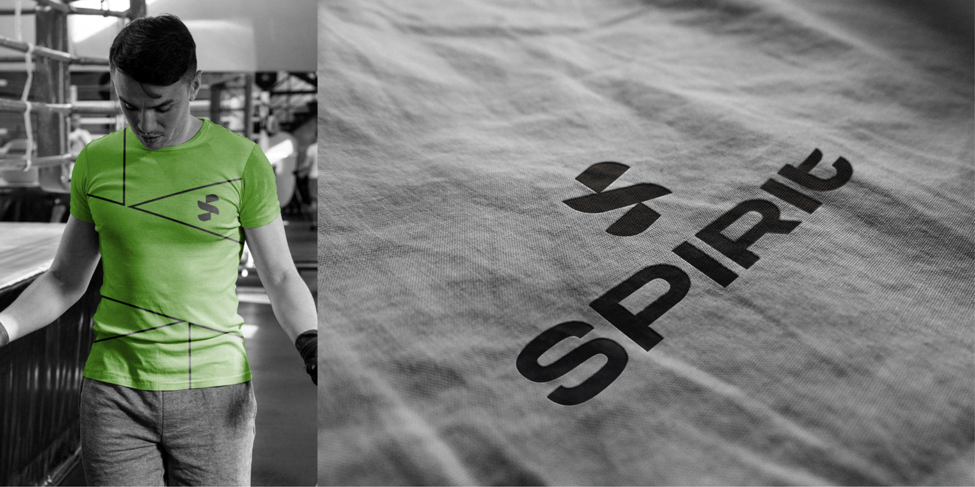
The solution is to use colors that suggest energy, spirit, and activism through green. Using bold shapes as “S” letter to add a feeling of strength and power.
The logomark is designed as an ascending shape to add a feeling of leveling up, boosting and dynamic. We used the bold line to imply strength to represent males and shapes to represent women.
The wordmark is made as a sans serif font and designed as moderate letters to add a feeling of balance and clear mind. And by using curves to add a feeling of flexibility. The boldness in the wordmark is the same as the logomark to add the consistency between them. Line to imply strength to represent males and shapes to represent women.


