Proper British Beer
- A Packaging Design Brief from M&S -
The Details
Design packaging for a set of four commodity beers using only two colours and
the medium of photography.


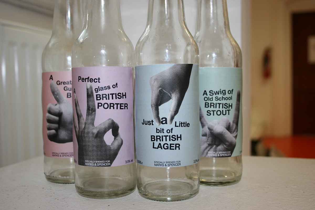
The Concept
I wanted the design to embrace the commodity label rather than shying away
from it. Choosing hands and gestures of everyday life and colloquial language to
appeal to uninitiated beer buyers. This is echoed in the Swiss-punk typography
layout and playful interaction with the photography.
--------------------------------------------------------------------------------------------------------------------------------------
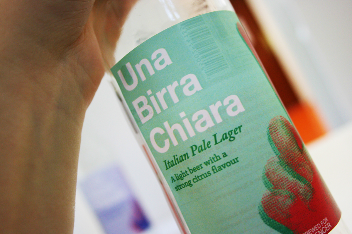
Alternate Concept
During photography I began to look at hand gestures used in a pub or bar. Incorporating
the element of nationality that I found in M&S beers and the hand signal for ‘one’
I developed the concept of ‘one beer’ in a variety of European Languages.


The Result
My Brief was selected alongside two others from my class by the packaging department at M&S to interview for a position in their in-house design team. In the end I got through to the final
round of interviews, an achievement I'm very proud of !


