Chito Tonic Kofola
Logo & Package Design
_
Art Direction, Design & ideamaker: Robin Remsa
Copywriter & ideamaker: Jaroslav Jahelka
Brand name: Client
Client: Kofola Česká republika
Mission: Logo, Package Design
Year: 2012
_
Specifically prepared for human consumption.
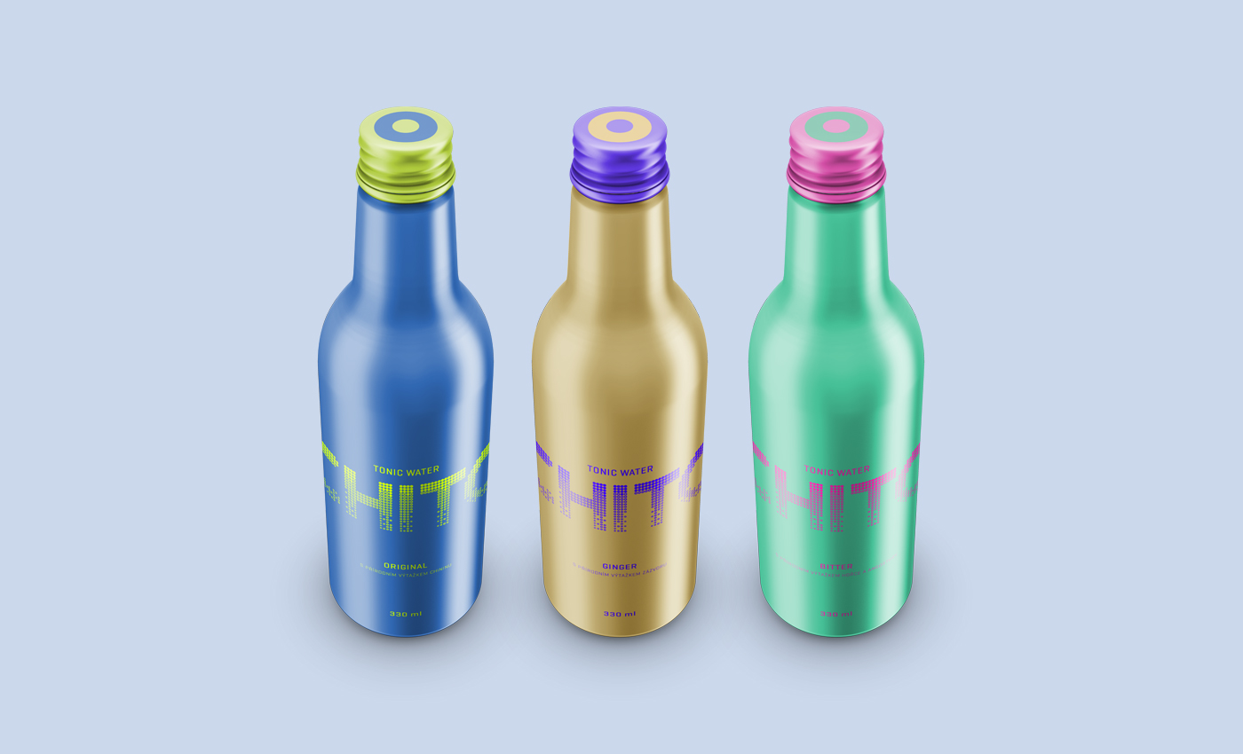
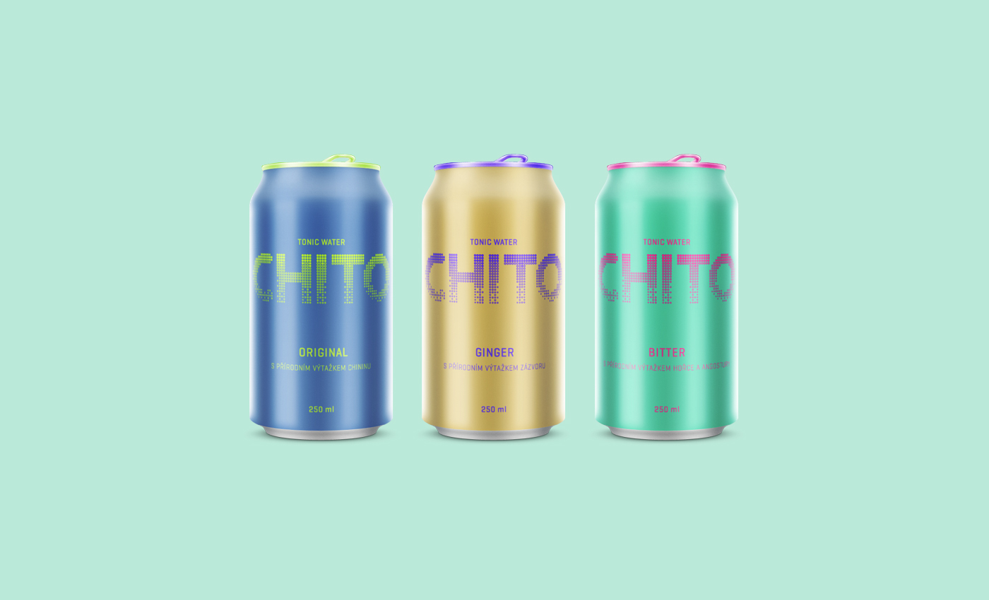
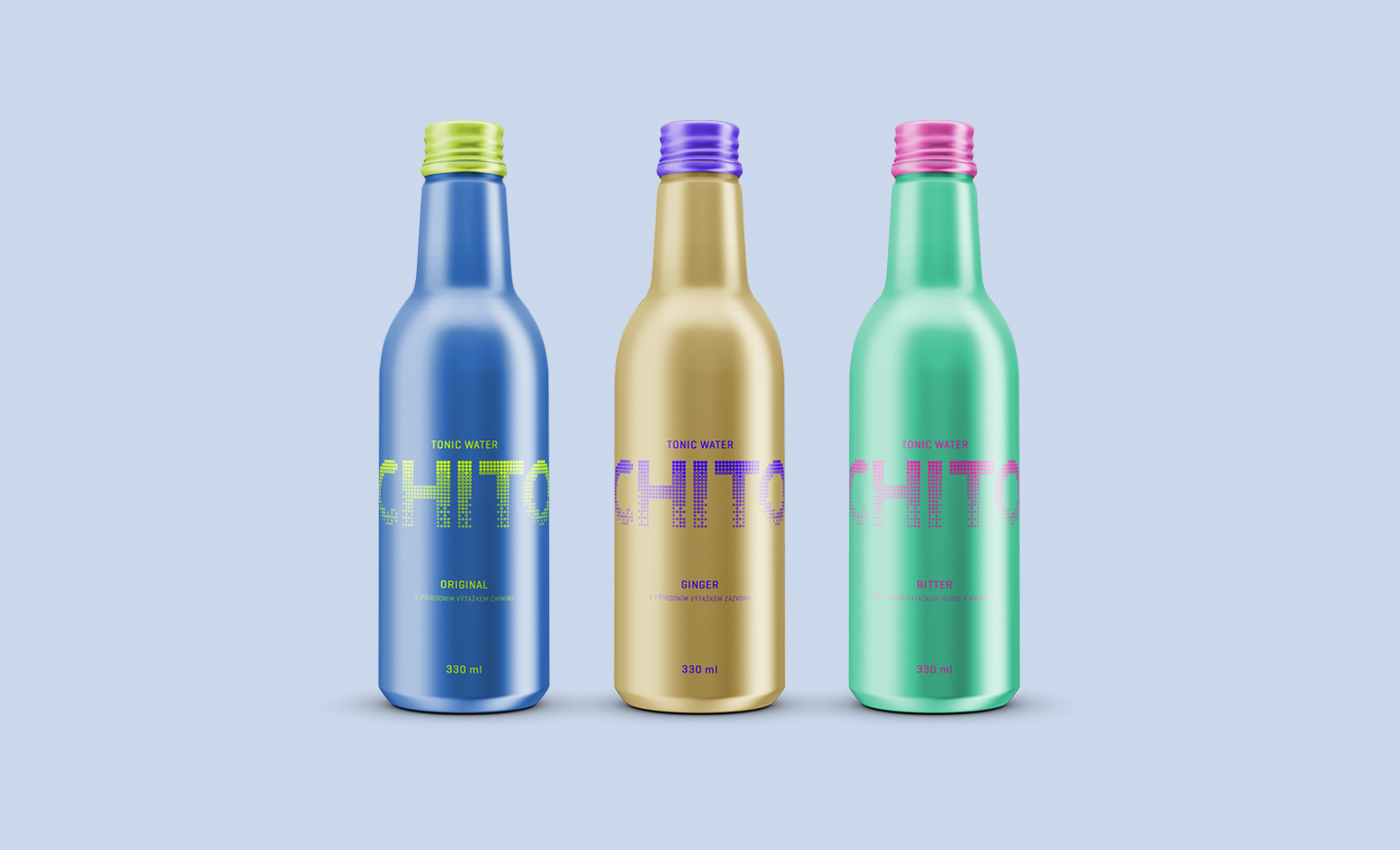
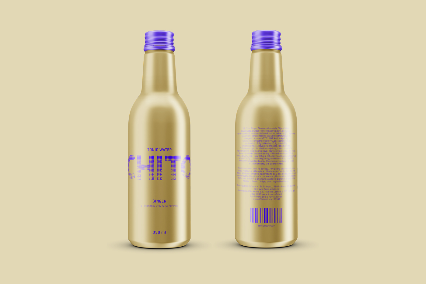
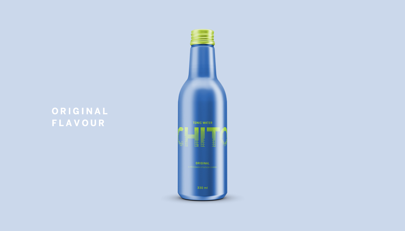
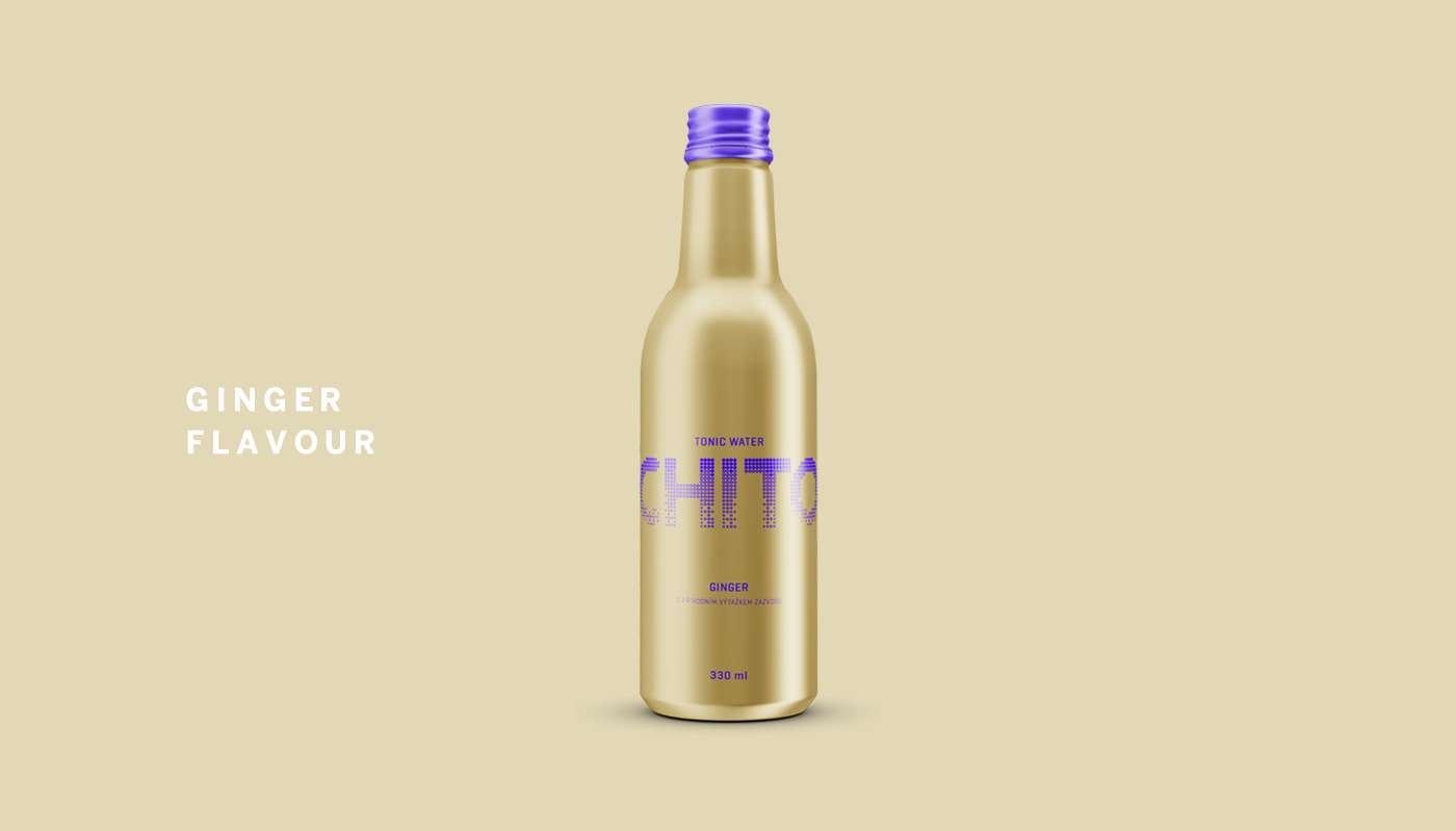
Concept of packaging design for Kofola. First, we created a completely new logo based on life cycle of bubbles. Main elements of logo are small rings that form name Chito. It's infographics to the actual name, which in Spanish means rings. Large number of rings form strong associations with bubbles and tonic is a carbonated beverage.

Originally used as a prophylactic.
We could hold traditional glass bottle with yellow label and black letters, but it would be invisible between competing products. We choose a different path. Special matte aluminum packaging and colors, which are main and only elements of entire design. Ring on the cap completes the visual identity.

To tell you the truth, it's quite simple.
Packaging is something we're bombarded with on a daily basis. So creating an eye-catching packaging design that can be reproduced for years is a real challenge, especially with trends in industrial design now demanding biodegradable or renewable packaging. This is solution for many reasons. With minimalist design, you're not limited by unnecessary graphics and other elements. Everything is easy to apply and still united.