


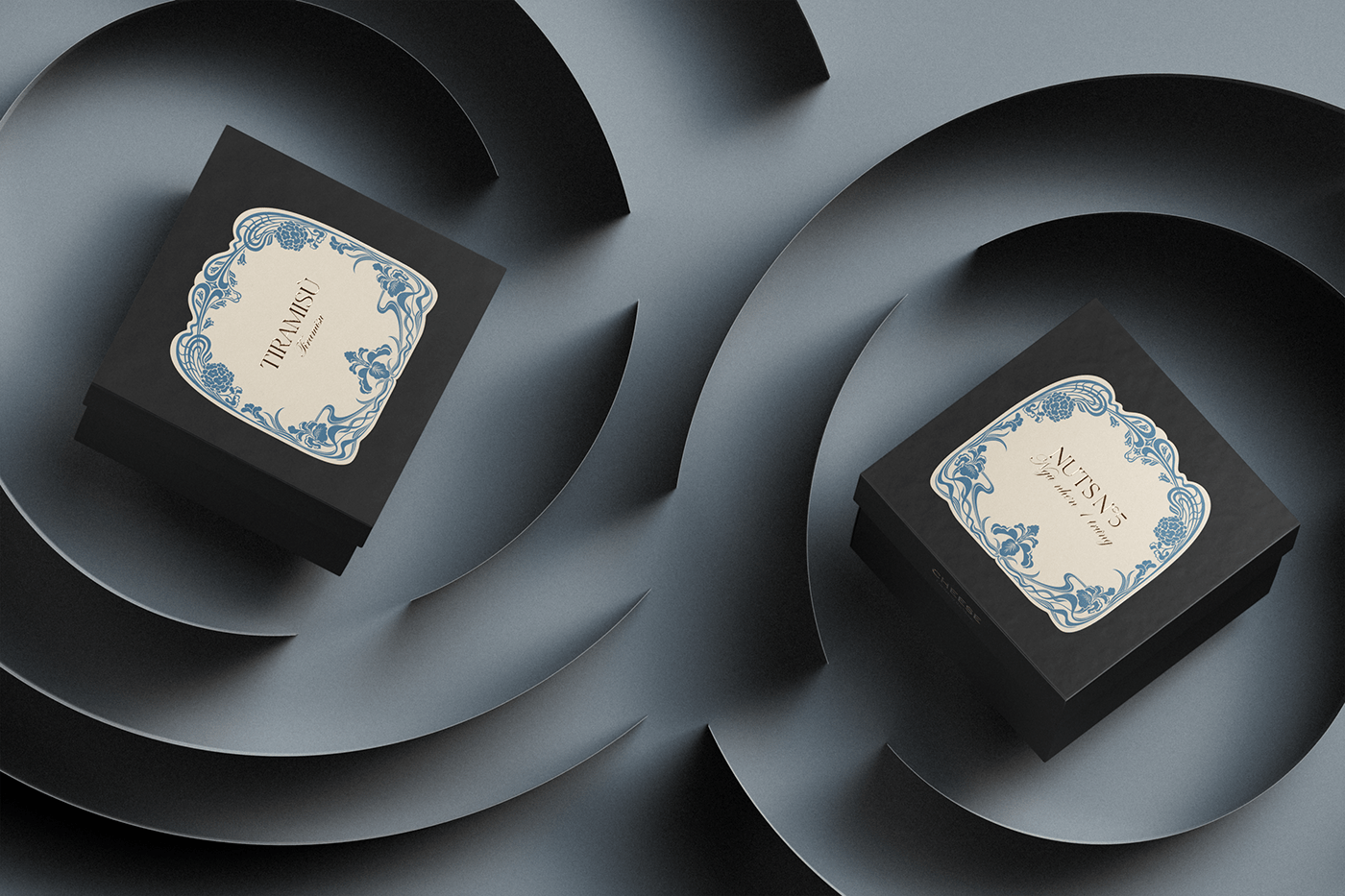
The mooncake market in Southeast Asia in general, and in Vietnam in particular, is always lively during the mid-autumn holiday. Customers are quickly confronted with a plethora of packaging designs based on Oriental themes. Cheese Coffee - a brand creates their identity system based on European spirit - first appears on the mooncake market in 2022. They want to introduce European cultural and artistic values to Vietnamese young, such as painting, architecture, and interior design. Cheese Coffee hope that their Mooncake Packaging will set them apart from the rest of the market.
VERBAL CONCEPT
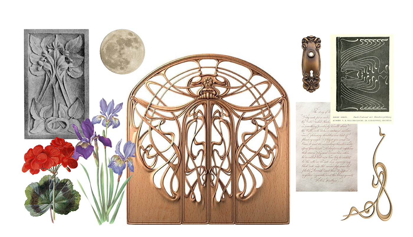
We are deeply touching with the significant creative iron bending movement of the 16th - 17th centuries as we study European cultural values and aesthetic styles. The blacksmith's skilled hands brought life to what appeared to be hard, cold iron components. When represented in the Art Nouveau art movement of the 19th - 20th centuries, the lines of iron are more smooth and twisting. The iron gates and fences, which were originally a cold, impregnable boundary, suddenly became attractive and inviting. Between the gaps created on the background of Art Nouveau motifs, we suddenly see behind the gate is a romantic garden. That poetic space is evocative, it reminds us of a time of conversation: when the garden is dyed with moonlight and the story between soulmates begins - 'Garden by the moon'.
TYPOGRAPHY
The Canela group of letters has an ambivalent shape between Serif and Sans Serif, both soft and harsh, modern but still of classical provenance. To communicate the opposing sense between the material and the lines of the iron gates, we picked Canela as the main typeface in the design. It also displays the hazy nature of each image created in moonlight. Furthermore, the ITC Edwardian Script typeface family exudes heart and lyricism. ITC Edwardian Script, with its handwriting description, is an excellent choice for communicating narrative and emotional messages to viewers.
ILLUSTRATION
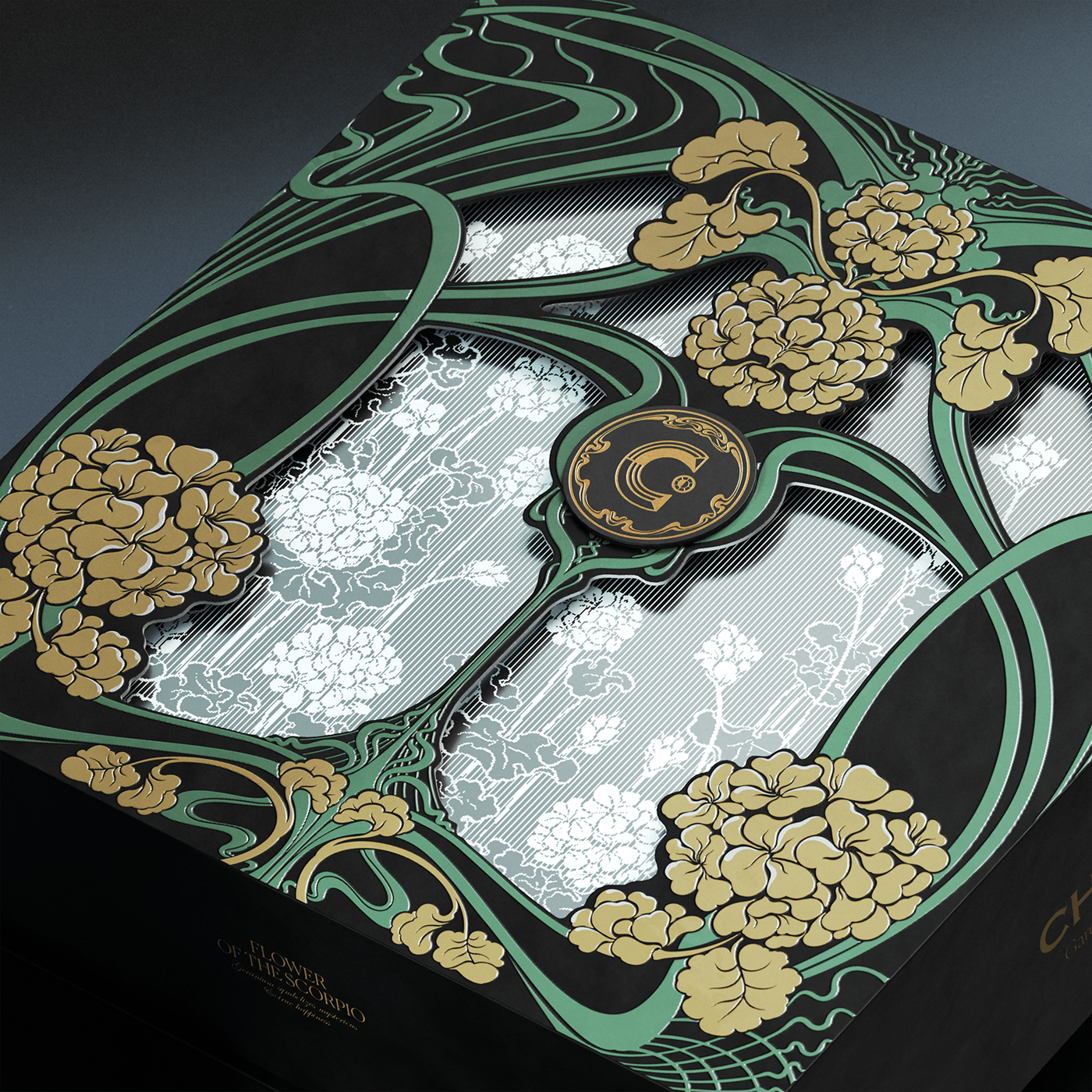
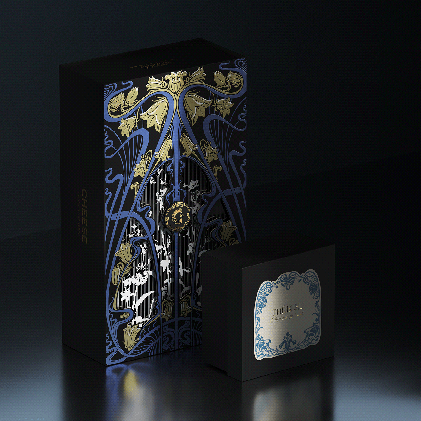
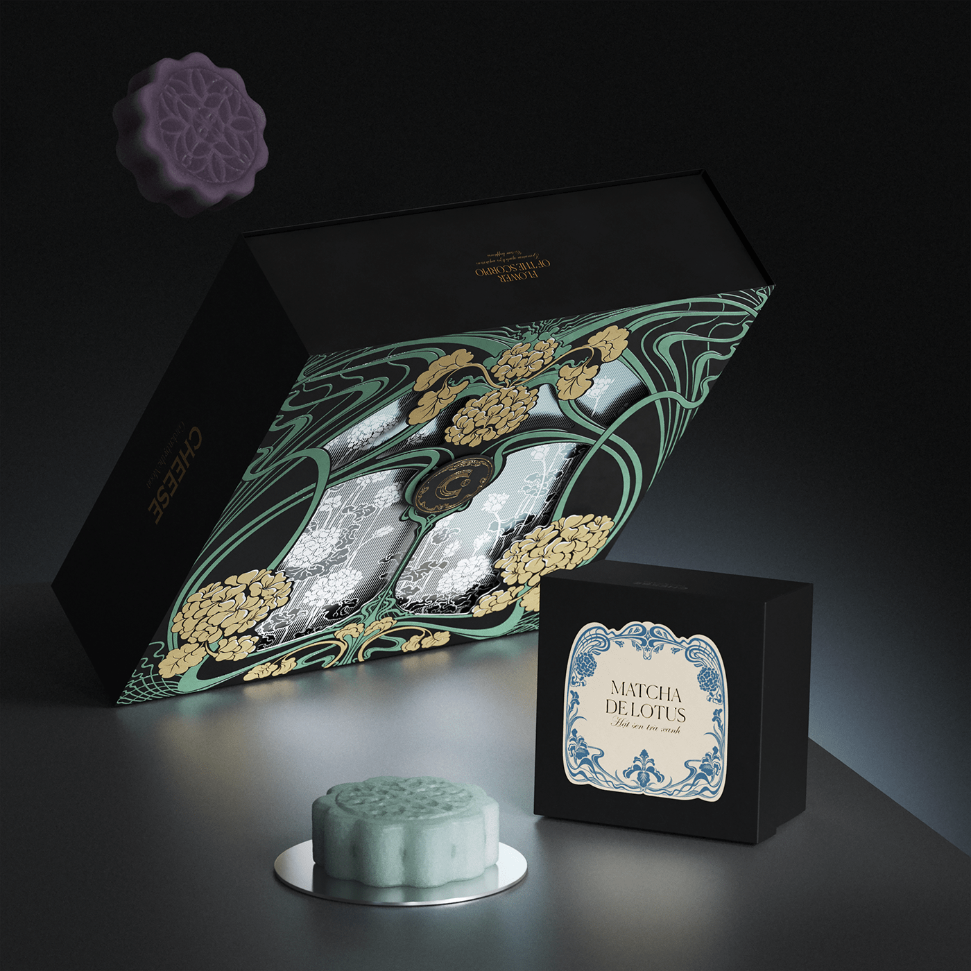
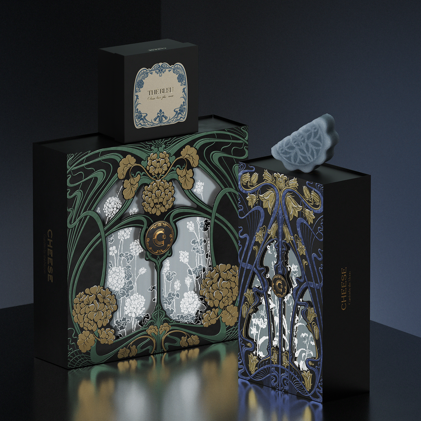
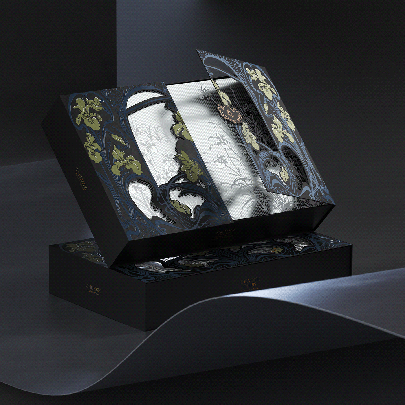
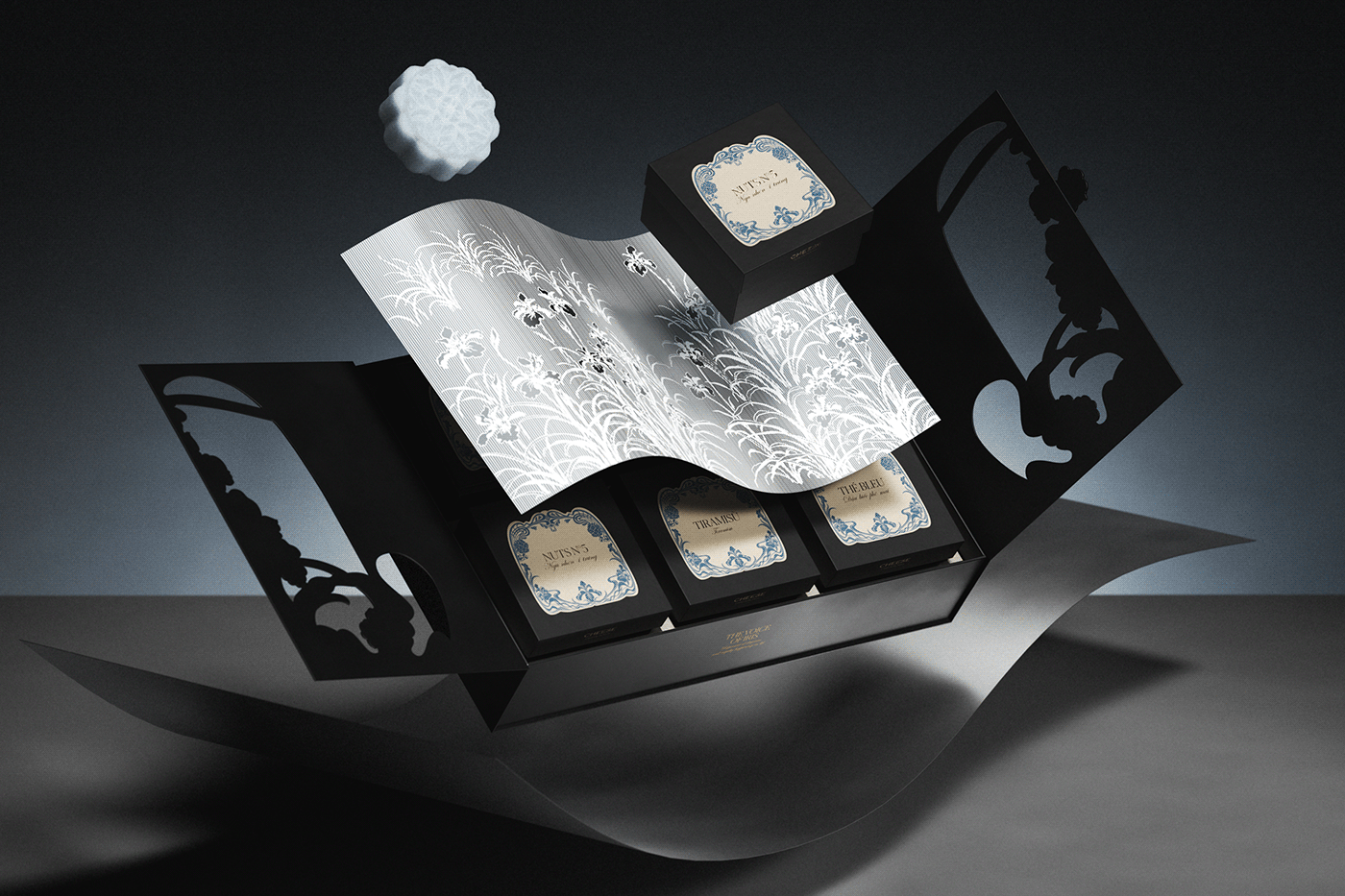
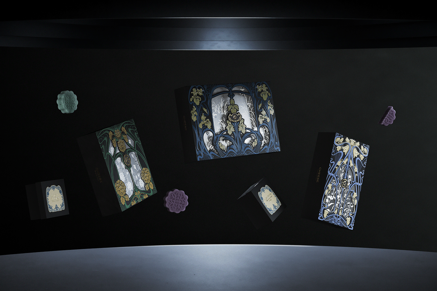
The illustration method used on the outside of the box and on the label system closely resembles the Art Nouveau style in shape and color. The whole texture is set against a black background, giving the impression of a night garden waiting for the moon to rise. Three common European flowers represent friendship, caring, and gratitude: Campanula, Geranium, and Iris are the subjects chosen to illustrate a spiritual garden.
STRUCTURE & MATERIALS
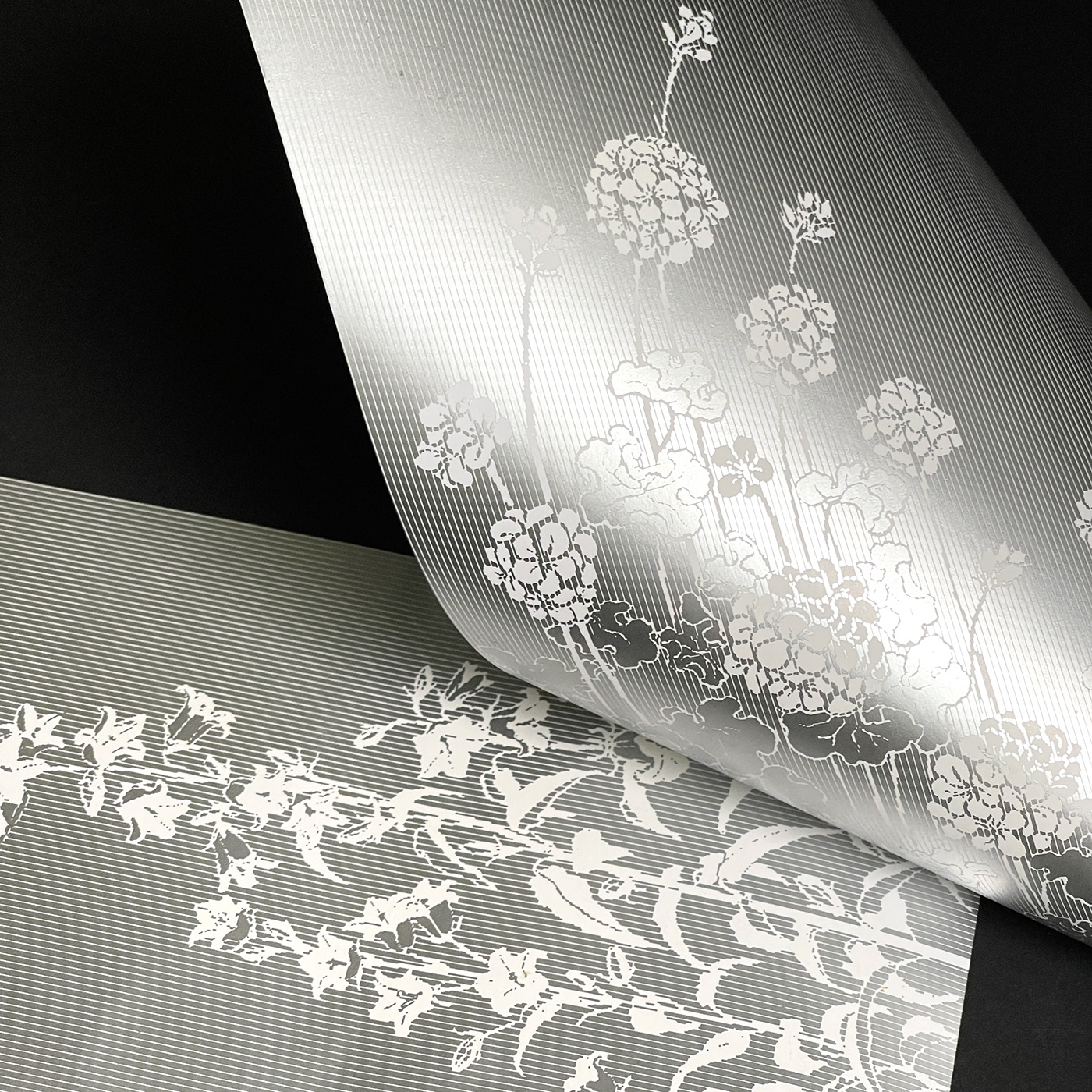
Contrast the delicate textures generated by the Art Nouveau design on the gate. The spectator can see a combination of thin lines and pixels chosen to replicate the image of the inner garden via the die cut gaps in the outer layer. Through the silk-screen printed silver emulsion ink, a gloomy garden surrounded by moonlight shines.
Ecoheim Beige, with beige tones and tiny scattered textures on each grain of paper, was chosen for the label and thank you letter designs, conveying a sense of elegance and nostalgia.
Ecoheim Beige, with beige tones and tiny scattered textures on each grain of paper, was chosen for the label and thank you letter designs, conveying a sense of elegance and nostalgia.
CREDITS
Concept: Navigator studio
Design Director: Công Trọng
Project manager: Trinh Huỳnh
Illustration: Huỳnh Phú
Graphic: Phương Anh, Công Trọng
Calligraphy: Hiếu Trương
Showcase/ 3D: Phong LNT


