

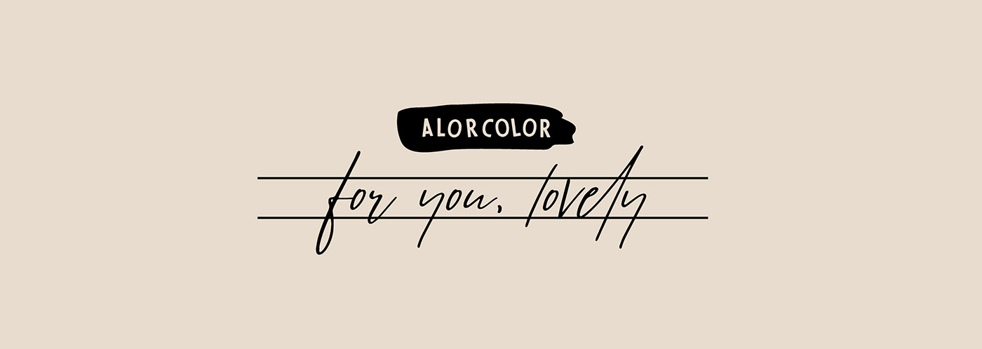
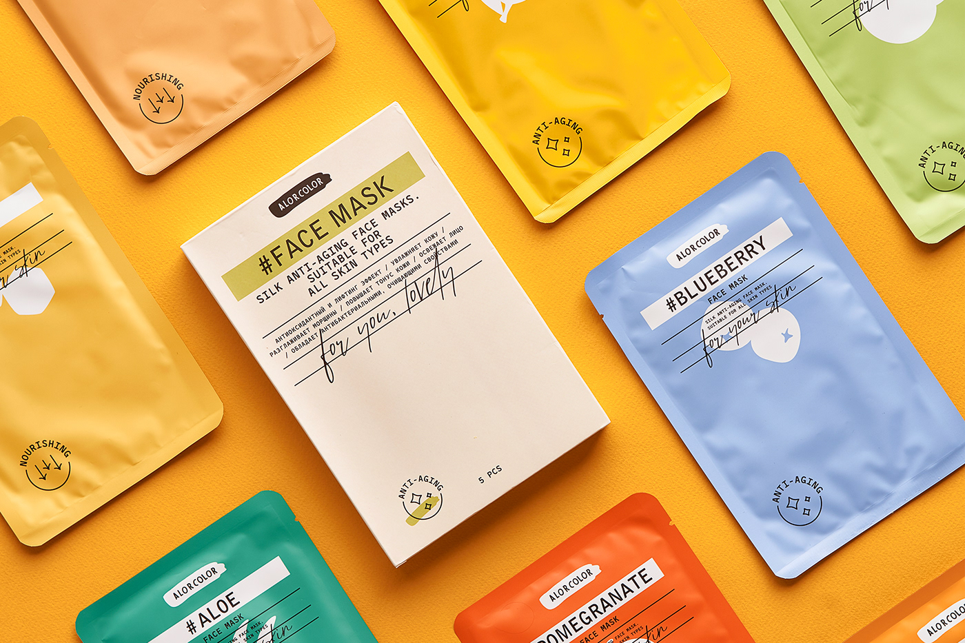
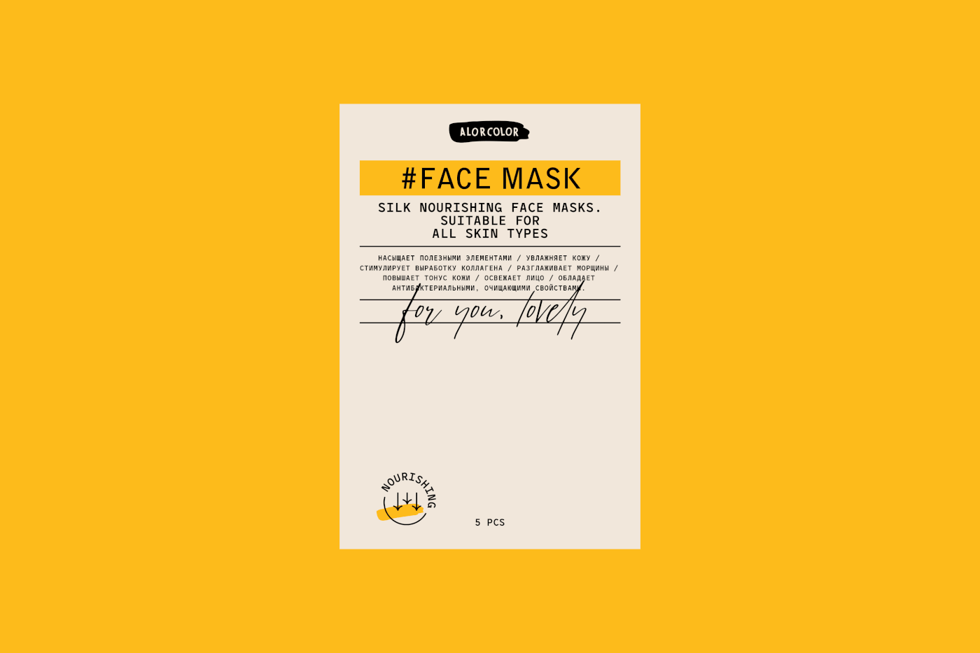
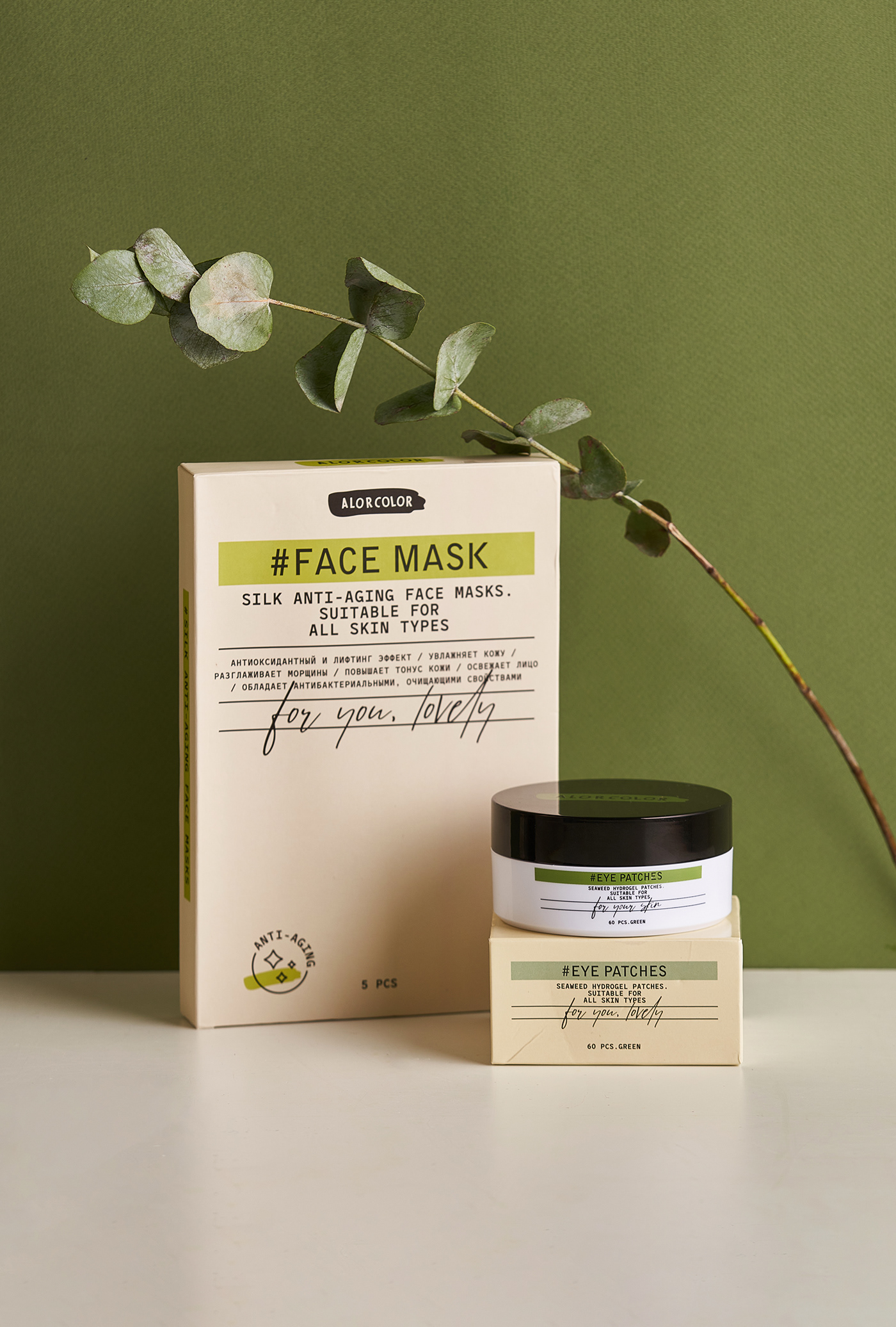
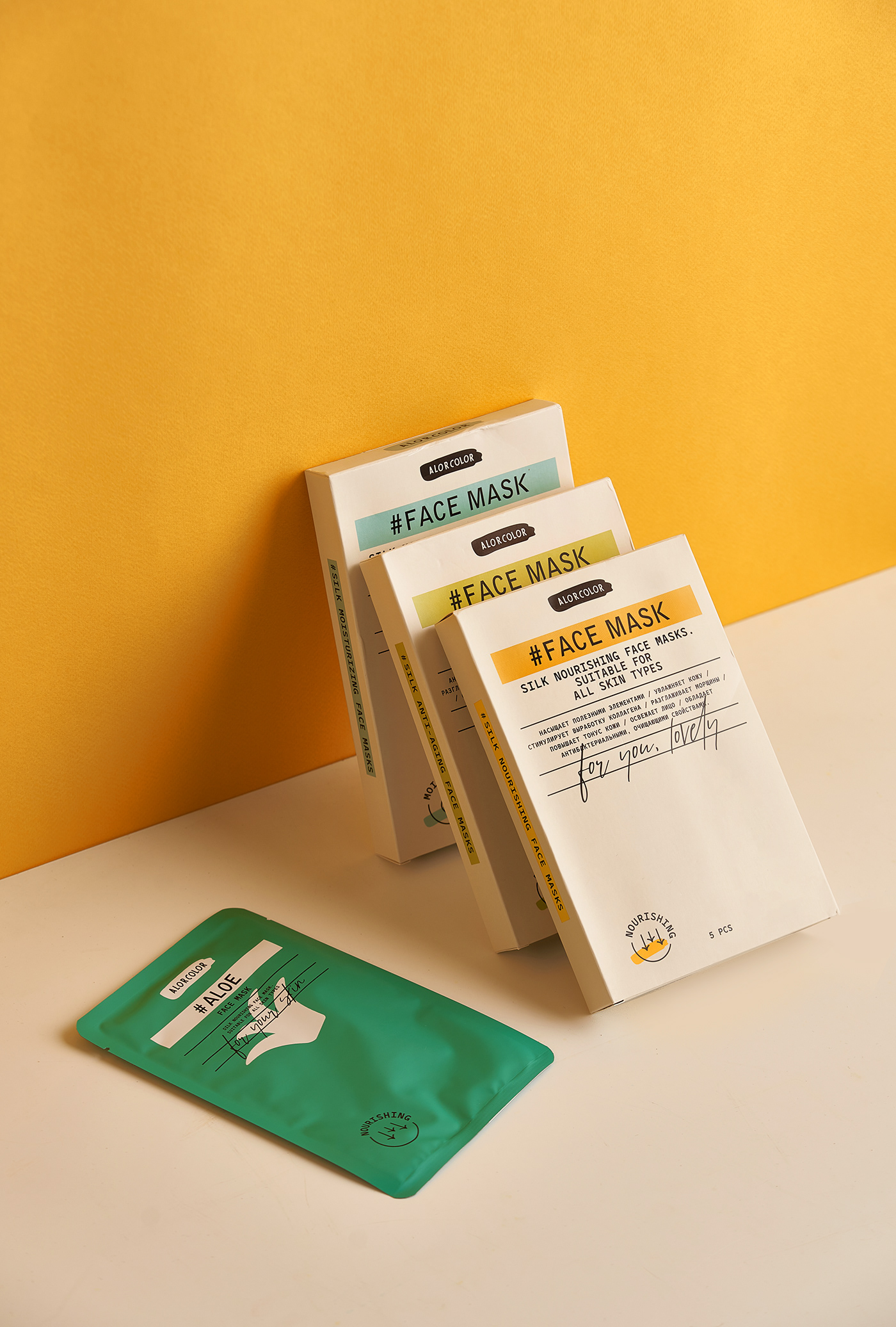
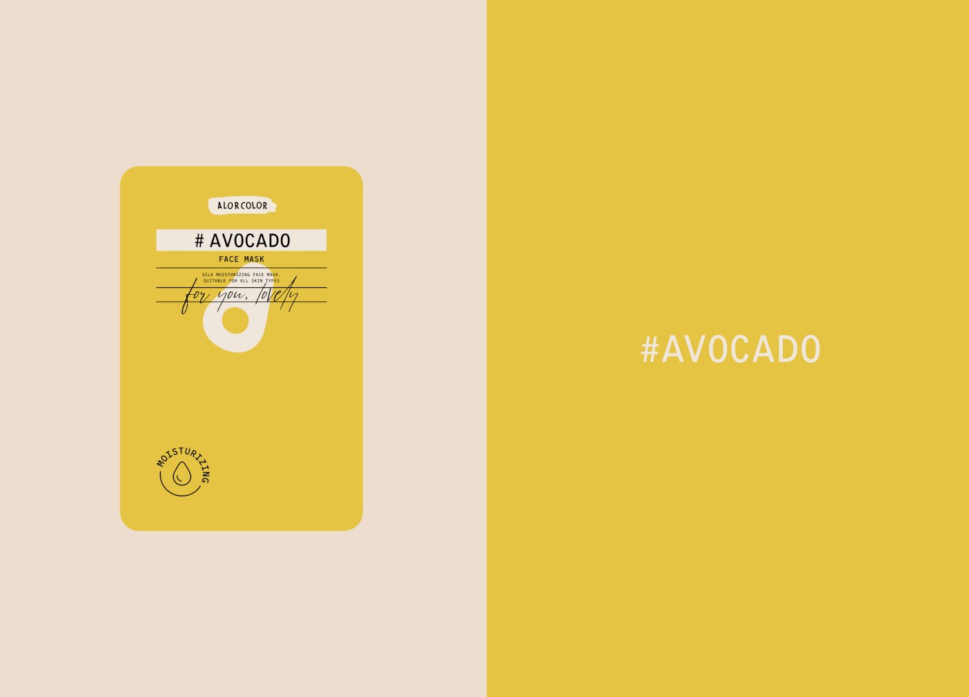
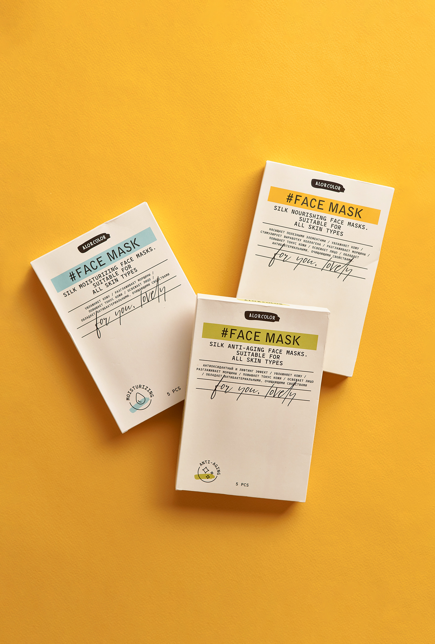
AlorColor is a fledgling skincare brand. The agency's task within this project was to craft a memorable brand identity. We employed the metaphor that each woman is herself a work of art, and within this context, skincare products should resemble the tools of artists.
The brush strokes in the logo and the corporate style reflect our perception of makeup as an art form while remaining an enjoyable pastime that enhances beauty. The graceful and effortless strokes, along with the clear and straightforward outlines of the ingredients, communicate our dedication to simplicity and naturalness.
AlorColor is also a dependable cosmetics brand that, in addition to prioritizing the naturalness of its ingredients, aims to showcase its professionalism.
This is why, alongside artistic elements, we have integrated elements characteristic of pharmaceutical design into the logo, thereby creating a unique and recognizable style.


#Client — Alor Color
#Designer — Maria Volkova
#Art-director — Timur Saberov
#Photo — Vladimir Zotov / 100% Art
#Assistant — Anna Garanicheva
#Project Manager — Anton Bulekov
🎨
#2023


