I had the amazing opportunity to rebrand the best rated acupuncture clinic in Charleston, SC! From the beginning, Dr. Allison wanted to incorporate spirals and the golden ratio to convey a sense of balance and harmony into the identity. The logo forms also were inspired by the palm trees and waves from the Charleston coast. We took the concept of the logo being a central target/goal/point that Dr. Allison and her patients would be aiming for throughout the treatment process. We also incorporated AIM, Acupuncture and Integrative Medicine, into the system as a supporting element.


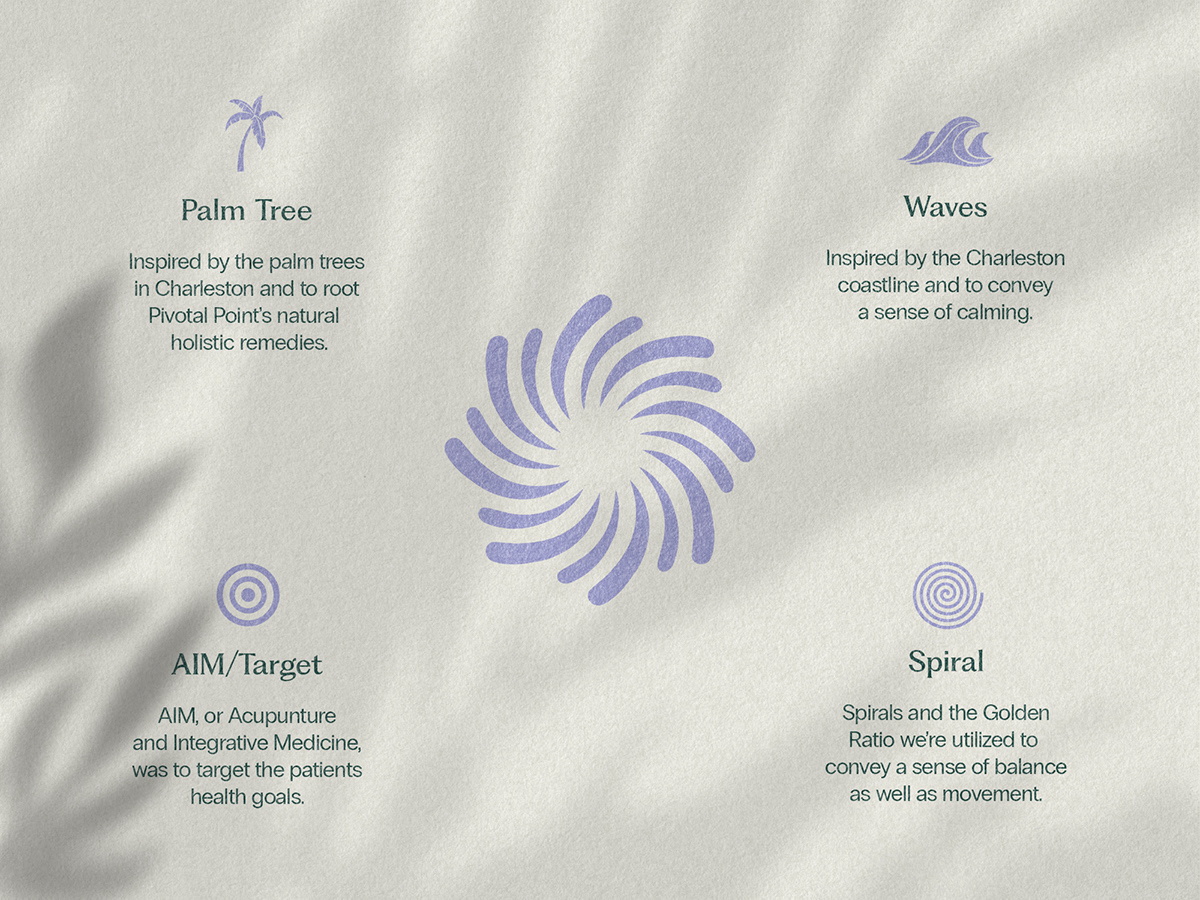
Dr. Julie Allison wanted to root the Pivotal Point identity/brand in Charleston themes. This included the Charleston coastline as well as palm trees that can be found all over town. We also integrated her motto into the main mark of AIM, or Acupuncture and Integrative Medicine, which also served a double meaning of targeting the patient's health goals. I utilized the golden ratio when constructing the spiral logo, as well the primary lockup.


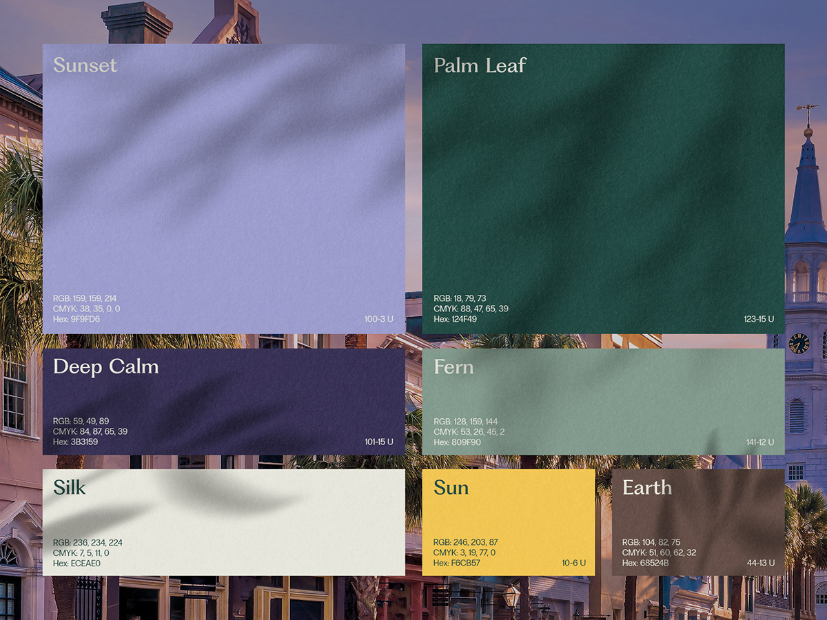
The Pivotal Point color palette was inspired by a sunset on the Charleston coastline. The natural colors give off a calming sense while still keeping it grounded.
Right from the beginning, we both loved the character forms of Fragment Glare by PangramPangram for the main typeface. I incorporated the spiral shapes from the logo into the shoulders of the P’s and the crossbar of the A to really tie the system together. And just because I love PangramPangram’s typefaces so much, I really vouched for us to keep it with the same foundry and utilize Radio Grotesk for the secondary type.


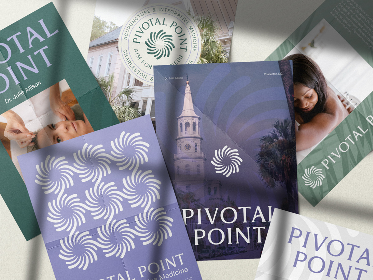
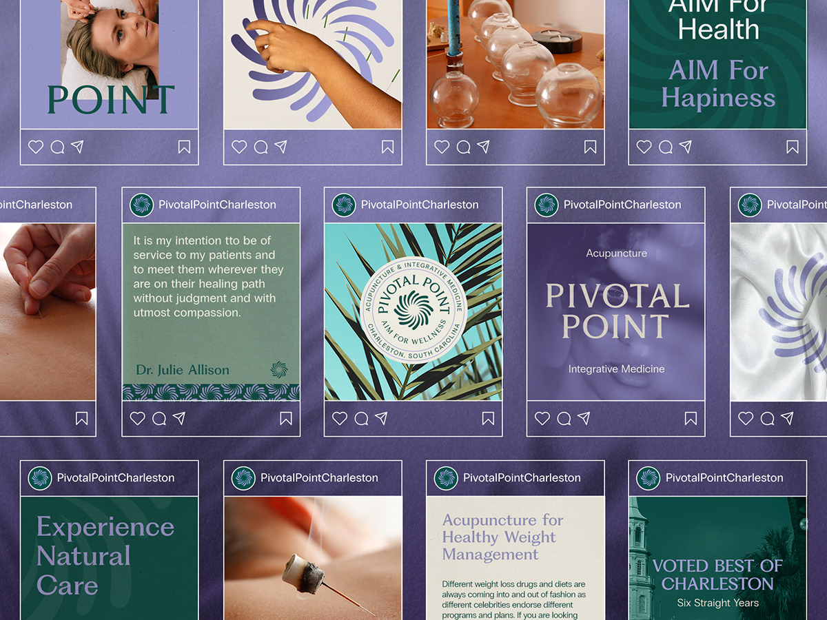
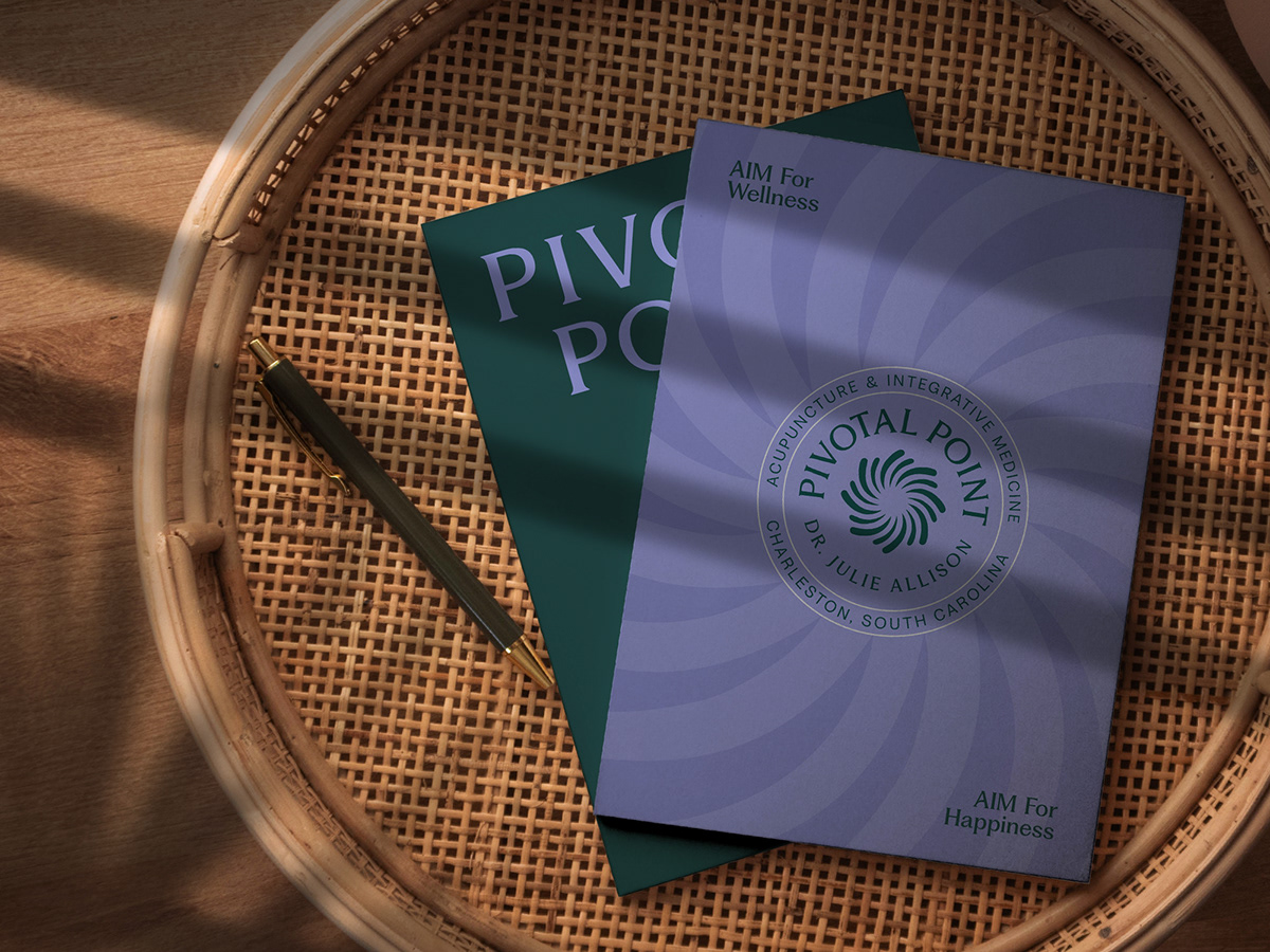
Building out the Pivotal Point brand identity was super fun in part because Dr. Allison needed a ton of tangible pieces of collateral including: business cards, envelopes, leaflets, stickers, flyers, bags, gift cards, invitations and digital assets!