


Brand Identity Development for Bioma
Introducing one of our most holistic branding project that we've ever had. This is our brand identity development of Bioma, a renting platform that aims to democratize access towards a better standard of living by providing a Paas platform business model for people in Indonesia.
Introducing one of our most holistic branding project that we've ever had. This is our brand identity development of Bioma, a renting platform that aims to democratize access towards a better standard of living by providing a Paas platform business model for people in Indonesia.


Inspired by the brand name, we derive it into five different color system. Each one of these color systems mirrors five most common biomes that we can found in real life; Aquatic, Grassland, Forest, Savannah, and Tundra. We designed the color system to be both rich in variety, yet flexible in it's nature to accommodate the various needs of Bioma's brand communication needs.


In order to create a fun yet on - brand imagery, we were driven and inspired by the common symbol of circular economy. We direct our focus, to create a fun iteration of the symbol, and to give it a twist so that it could create an imminent impact and a remarkable impression in the audience's eye.


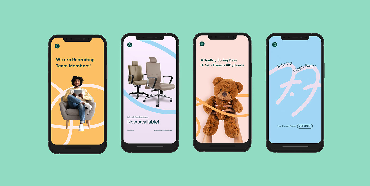
All the design element, from the color system, the inclusive twists, and modern dynamic photography direction are intertwined harmoniously, resulting a visual identity of a brand that is cordially trying to democratize access towards a better standard of living, this is the identity of Bioma.


Team
Art Director // Silvia Isabella
Graphic Designer // Silvia Isabella, Ahmad Ghazali, Damai Arungsamudra, Radinda Syahira
Illustrator // Caroline Amelia
Animator // Maria Nonita
Brand Strategist // Adrianus Killian
Supporting Designers // Karyn Theo
Art Director // Silvia Isabella
Graphic Designer // Silvia Isabella, Ahmad Ghazali, Damai Arungsamudra, Radinda Syahira
Illustrator // Caroline Amelia
Animator // Maria Nonita
Brand Strategist // Adrianus Killian
Supporting Designers // Karyn Theo


