


Doca Tapbar: A Place for Craft Beer Lovers
Doca Tapbar's Visual Identity
CLIENT: DOCA TAPBAR
YEAR: 2020
SERVICES: BRAND STRATEGY | BRAND IDENTITY DESIGN | PACKAGING DESIGN
Doca Tapbar's brand identity is a vibrant celebration of craft beer and the spirit of Pelotas, Brazil. Inspired by shipping containers and the nautical world, it tells a story of transformation and authenticity. Accordingly, in this exploration of its visual identity, we delve into the choices and elements that have ingeniously shaped Doca's unmistakable brand.
PT
Identidade Visual do Doca Tapbar
A identidade visual do Doca Tapbar é uma celebração vibrante da cerveja artesanal e do espírito de Pelotas, Brasil. Inspirada em contêineres de transporte e no mundo náutico, conta uma história de transformação e autenticidade. Desta forma, nesta exploração de sua identidade visual, mergulhamos nas escolhas e elementos que engenhosamente moldaram a marca inconfundível do Doca.


Celebrating Beer through Visual Identity
Doca's visual identity is versatile, drawing on the timeless allure of black and white. Moreover, additional hues seamlessly intertwine over time, maintaining the brand's unity.
PT
Celebrando a Cerveja por Meio da Identidade Visual
A identidade visual do Doca é versátil, baseando-se no fascínio atemporal do preto e branco. Além disso, tons adicionais se entrelaçam perfeitamente ao longo do tempo, mantendo a unidade da marca.

Embodying the Essence of the Bar
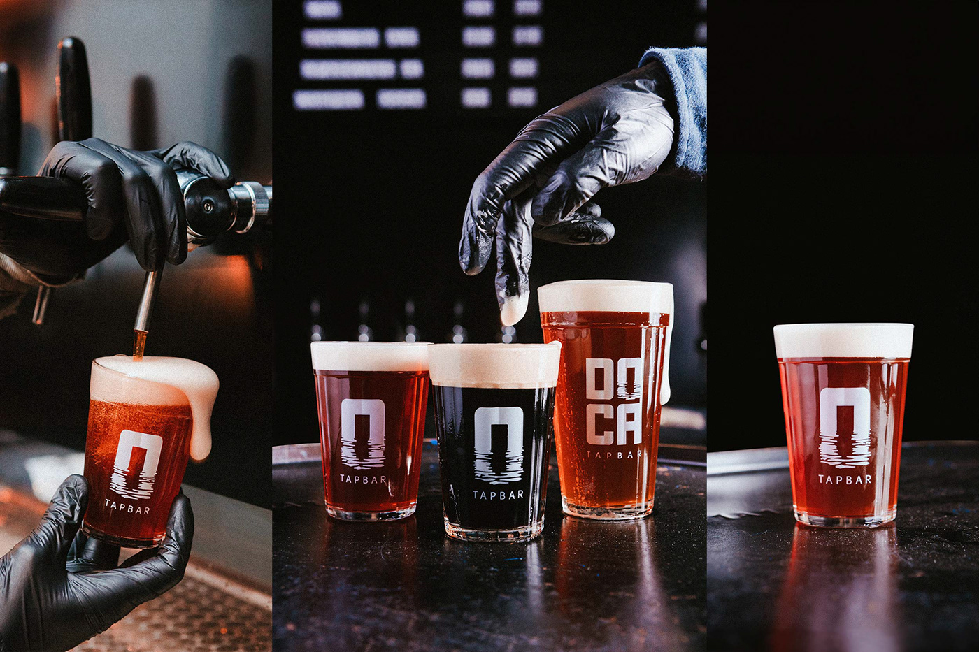
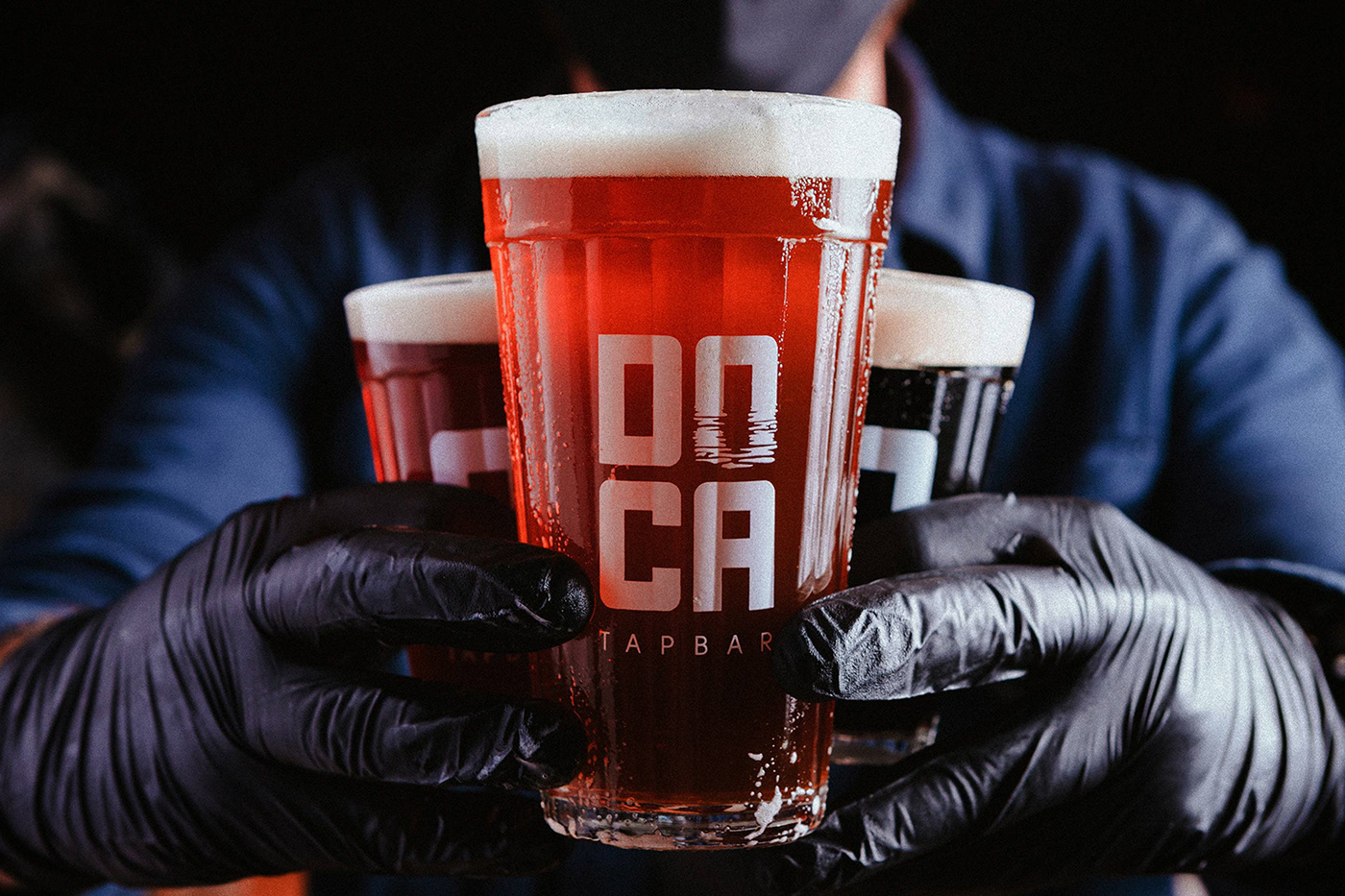
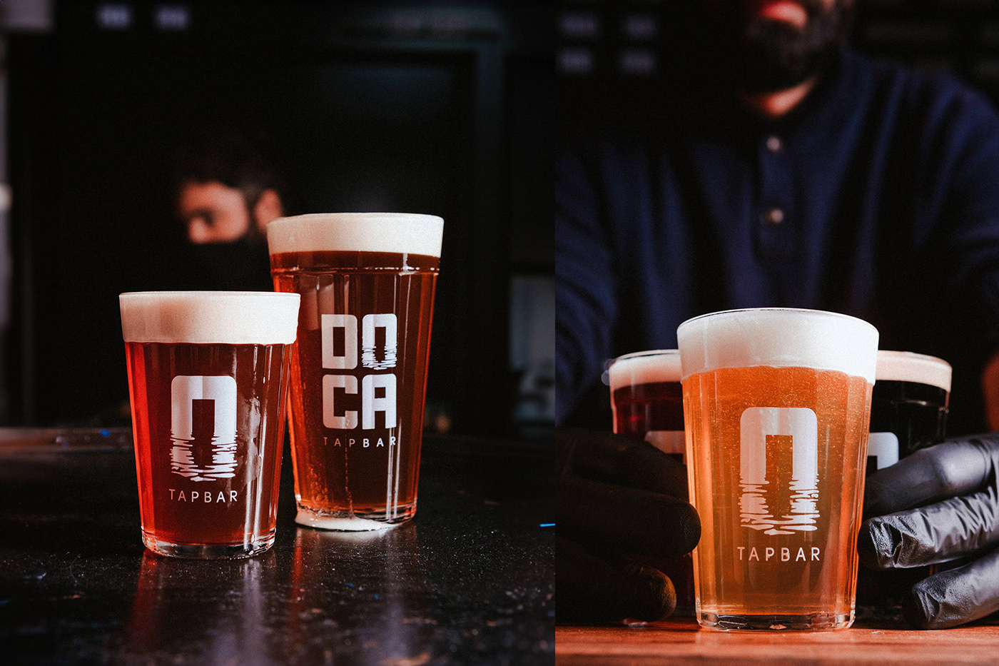
Doca's visual identity embodies the essence of the bar, an authentic "harbor of the beer scene." Indeed, inspired by shipping containers, the typography mirrors their architecture and arrangement, invoking the iconic stacks found at docks and ships. The letter "O" in "Doca" stands prominently as an emblematic symbol. At its core, the brand encapsulates the concept of a water's mirror, forging an indelible visual link between the fluidity of beer and the enigmatic sea in the logo design.
PT
Incorporando a Essência do Bar
A identidade visual do Doca encarna a essência do bar, um autêntico "porto da cena cervejeira". De fato, inspirada em contêineres de transporte, a tipografia espelha sua arquitetura e disposição, invocando as pilhas icônicas encontradas em docas e navios. A letra "O" em "Doca" se destaca como um símbolo emblemático. Em sua essência, a marca encapsula o conceito de um espelho d'água, forjando um elo visual indelével entre a fluidez da cerveja e o mar enigmático no design do logotipo.

Influencing the Beer Culture
Doca Tapbar has made an undeniable impact on the local beer culture. Hence, by championing local craft brews and providing a platform for guest breweries, Doca has emerged as an embodiment of authenticity and excellence. This sentiment resonates seamlessly with its welcoming atmosphere, which elegantly melds with the visual identity to captivate beer enthusiasts.
PT
Influenciando a Cultura Cervejeira
O Doca Tapbar teve um impacto inegável na cultura cervejeira local. Portanto, ao defender as cervejas artesanais locais e fornecer uma plataforma para cervejarias convidadas, o Doca emergiu como uma personificação de autenticidade e excelência. Esse sentimento ressoa perfeitamente com seu ambiente acolhedor, que se mescla elegantemente com a identidade visual para cativar os entusiastas da cerveja.
Transformative Journey
Doca is far more than a gathering spot. It has unfurled a transformative narrative, evolving from a container bar into an inspired space that embodies positive change. With the addition of an in-house brewery, Doca has solidified its influence as a potent force. Furthermore, the brand has gracefully woven itself into the community's fabric, celebrating special events like St. Patrick's Day and thematic anniversaries.
PT
Jornada Transformadora
O Doca é muito mais do que um ponto de encontro. Ele desdobrou uma narrativa transformadora, evoluindo de um bar de contêineres para um espaço inspirado que incorpora mudanças positivas. Com a adição de uma cervejaria própria, o Doca solidificou sua influência como uma força potente. Além disso, a marca se entrelaçou graciosamente no tecido da comunidade, celebrando eventos especiais como o Dia de São Patrício e aniversários temáticos.


Evolving Aesthetics
Doca's aesthetics, like its journey, have transformed over time. Starting with a sleek, industrial outlook, Doca embraced a laid-back and eclectic approach, aligned with global trends. Consequently, this metamorphosis adds to its charm and positions Doca as a contemporary space, open to experimentation and warmly receptive.
PT
Evolução Estética
A estética do Doca, assim como sua jornada, transformou-se ao longo do tempo. Começando com uma aparência industrial elegante, o Doca adotou uma abordagem descontraída e eclética, alinhada com as tendências globais. Consequentemente, essa metamorfose acrescenta ao seu charme e posiciona o Doca como um espaço contemporâneo, aberto à experimentação e calorosamente receptivo.


A Captivating Visual Narrative
Doca Tapbar's visual identity transcends superficial appearances. In fact, it weaves a vivid visual narrative, tracing the bar's evolution from a container-based concept to a definitive icon of Pelotas' beer culture. Each facet of the visual identity coalesces to narrate this enchanting story, inviting all to partake in an authentic, immersive, and memorable beer experience.
Brand strategy
Doca Tapbar's visual identity is strategically crafted to reflect its brand values and mission. The simple, yet effective logo design conveys a sense of modernity and sophistication, while the typography evokes the ruggedness and authenticity of the beer scene. The chosen color palette is versatile and adaptable, allowing the brand to evolve over time without losing its core identity.
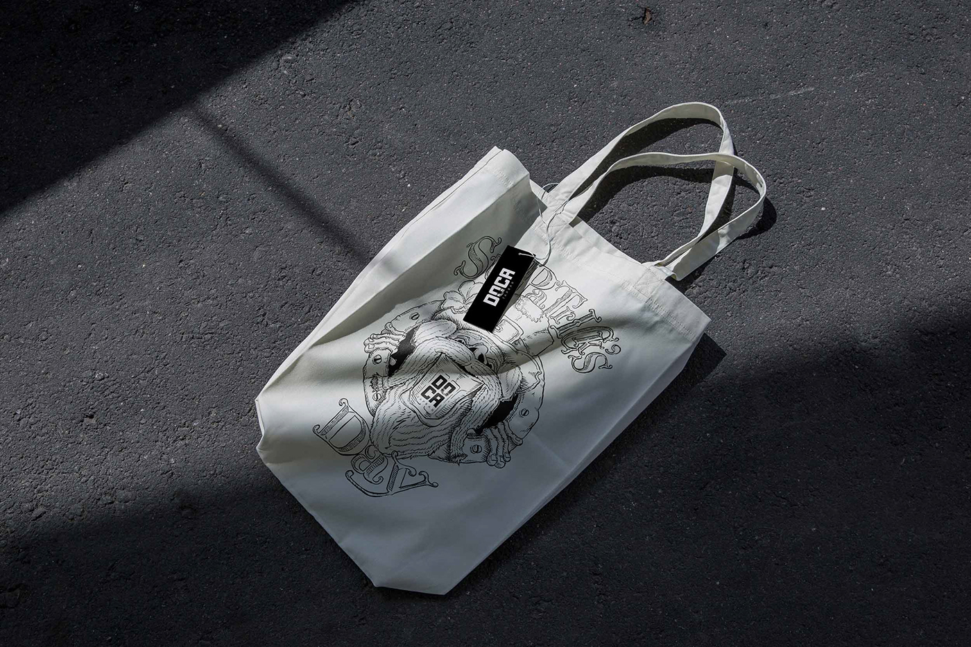
Brand identity design
The Doca Tapbar brand identity design is cohesive and consistent across all touchpoints, from the logo to the website to the packaging. Therefore, the typography, color palette, and imagery all work together to create a unified and recognizable brand experience.
Label design
The Doca Tapbar label design is informative and engaging. It includes all of the essential information, such as the beer style, ABV, and ingredients, as well as a brief description of the beer. Typography and imagery are also well-designed and contribute to the label's overall aesthetic. The overall design is both creative and informative, and it perfectly reflects the brand's identity and the unique craft beer experience that Doca Tapbar offers.
PT
Uma Narrativa Visual Cativante
A identidade visual do Doca Tapbar transcende as aparências superficiais. Na verdade, ele tece uma narrativa visual vívida, traçando a evolução do bar de um conceito baseado em contêineres a um ícone definitivo da cultura cervejeira de Pelotas. Cada faceta da identidade visual se une para narrar esta história encantadora, convidando todos a participarem de uma experiência cervejeira autêntica, envolvente e memorável.
Estratégia de marca
A identidade visual do Doca Tapbar é estrategicamente elaborada para refletir seus valores e missão de marca. O design do logotipo, simples, mas eficaz, transmite uma sensação de modernidade e sofisticação, enquanto a tipografia evoca a robustez e a autenticidade da cena cervejeira. A paleta de cores escolhida é versátil e adaptável, permitindo que a marca evolua ao longo do tempo sem perder sua identidade central.
Design de identidade de marca
O design da identidade de marca do Doca Tapbar é coeso e consistente em todos os pontos de contato, do logotipo ao site e às embalagens. Portanto, a tipografia, a paleta de cores e as imagens trabalham juntas para criar uma experiência de marca unificada e reconhecível.
Design de rótulo
O design do rótulo do Doca Tapbar é informativo e envolvente. Inclui todas as informações essenciais, como o estilo da cerveja, ABV e ingredientes, bem como uma breve descrição da cerveja. A tipografia e as imagens também são bem desenhadas e contribuem para a estética geral do rótulo. O design geral é criativo e informativo, e reflete perfeitamente a identidade da marca e a experiência única de cerveja artesanal que o Doca Tapbar oferece.


Would you like to elevate your brand to the next level?
Take the first step, contact us.
Let's work together.
hello@holman.design
For more case studies at www.holman.design
For more case studies at www.holman.design


