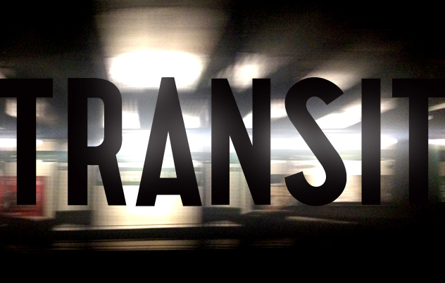
The Bleecker Street subway station in the New York subway is home to a bizzare design error. The "B" in "BL'KER" features a weird construction, with a middle bar that seems to be built from from stacking the two loops on top of each other, rather than merging them. This odd look, combined with the cryptic abreviation caught my interest and I decided to explore this weird font a little further.

The Bleecker Street station features some odd letter construction.
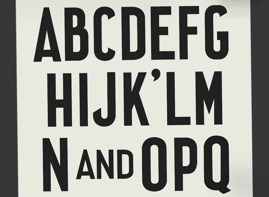
I started to collect more images and tracings of station signs of the 1940's, trying to document the broad range of letter shapes. The New York Transit Museum features an amazing collection of signs. The further I dug into the specimens, the broader the range of weights and shapes became.
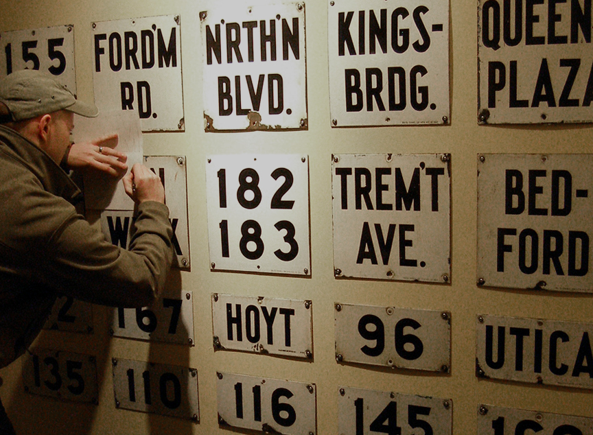
Tracing station signs at the Transit Museum. (Photo by Mark Hewko)
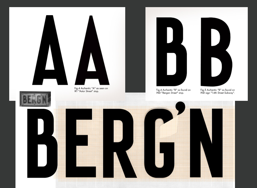
Different craftsmen left their personal mark in this typefont, creating a beautiful range of odd letters fitted to the individual sign. These signs were most likely drawn in the Bergen Street sign shop of the Transit Authority. They were then fabricated as enamel signs and tiles by different makers.
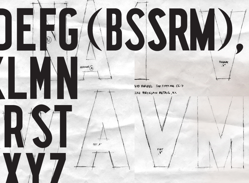
Sketch details

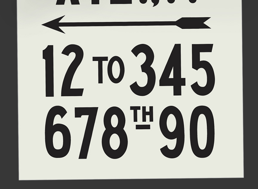
This heavy version of numerals can still be found in many subway stations.
The pencil tracings were then carefully drawn in Adobe Illustrator. The odd appearance and imbalance of weight and color is clearly visible, yet absolutely intentional.

I highly recommend "Helvetica and the New York City Subway System" by Paul Shaw for further reading. While his book only touches on certain aspects of the pre-Vignelli era, it should be considered the most important publication on the subject matter.
Another great book is "The Illustrated Encyclopedia of the New York City Subway Rollsigns and Ancillary Items Vol I - BMT and IND Lines" by Gregory Gil and Louis Guadagni which features an unbelievable range of reference files from every BMT and IND line.

