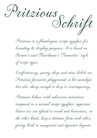
Pritzious is a flamboyant script typeface for branding and display purposes. It is based on Rosart’s and Fleischman’s ‘Financière’ style of script types. With its cultured shapes, its European roots and its contemporary demeanour, Pritzious stands out among all the scripts of its kind. The typeface is suitable for branding, publishing and packaging, it might also be a fine choice for titles and headings etc. and for setting certain historical texts.
Pritzious was conceived and developed during the Type Design Expert Class 2021–2022 chaired by Frank E. Blokland, with the help of Jan Van der Linden, at the Plantin Instituut voor Typografie in Antwerp. The typeface was published by C-A-S-T Type Foundry in December 2022 among the Studies section and in April 2023 the typeface is available as a free resource among the Adobe Fonts selection.
This is a labour of love and it would not have been possible without the feedback and encouragement from Troy Leinster, Kyle Letendre and Marco Goran Romano. Marco also helped me with illustrations and graphic design.
––––––
Inspiration for this unusual face came from the 18th-century ‘Caractère de Finance’, a style of type following the ‘Financière’ handwriting style introduced by some 17th-century calligraphers and engravers, and above all the French ‘maître écrivain’ Louis Barbedor (1589–1670). Over a span of twenty years (1750s–1770s) the Caractère de Finance was cut several times by different punchcutters, such as Jacques-François Rosart (1714–1777), Joan Michaël Fleischman (1707–1768), and others including Rosart’s son Mathias (1743‒1815).
Pritzious main feature is that lowercase letters are not connected. This feature repeats what we find in Rosart’s and Fleischman’s types, where there are inconsistencies with the joining of letters due to technological limitations. I decided to transform these constraints into a design feature to maintain a strong connection with the sources. These inconsistencies show the technical limitations of 18th-century metal type and give the opportunity today for some fun and unexpected behavior for a script typeface. Some of the connections were intentionally let looser to avoid stiffness as can be noticed in letters such as i, p, t and u.
Confectionery, pastry shops and wine labels are Pritzious favorite playground: a bit nostalgic but also sharp enough to keep it contemporary. He behave with subversive intentions compared to a normal script typeface: uppercase letters are not afraid to touch and lowercases, on the other hand, keep a distance from each other, giving birth to unexpected and dynamic layouts.
—


Thanks for watching!
Feel free to follow my work on Instagram: