


/ PT - BR
A Patricia Lupi - Terapias Integrativas é uma marca pessoal criada para gerar conexão e guiar as pessoas para o autoconhecimento. Uma marca multifacetada em técnicas para a saúde física, mental e espiritual.
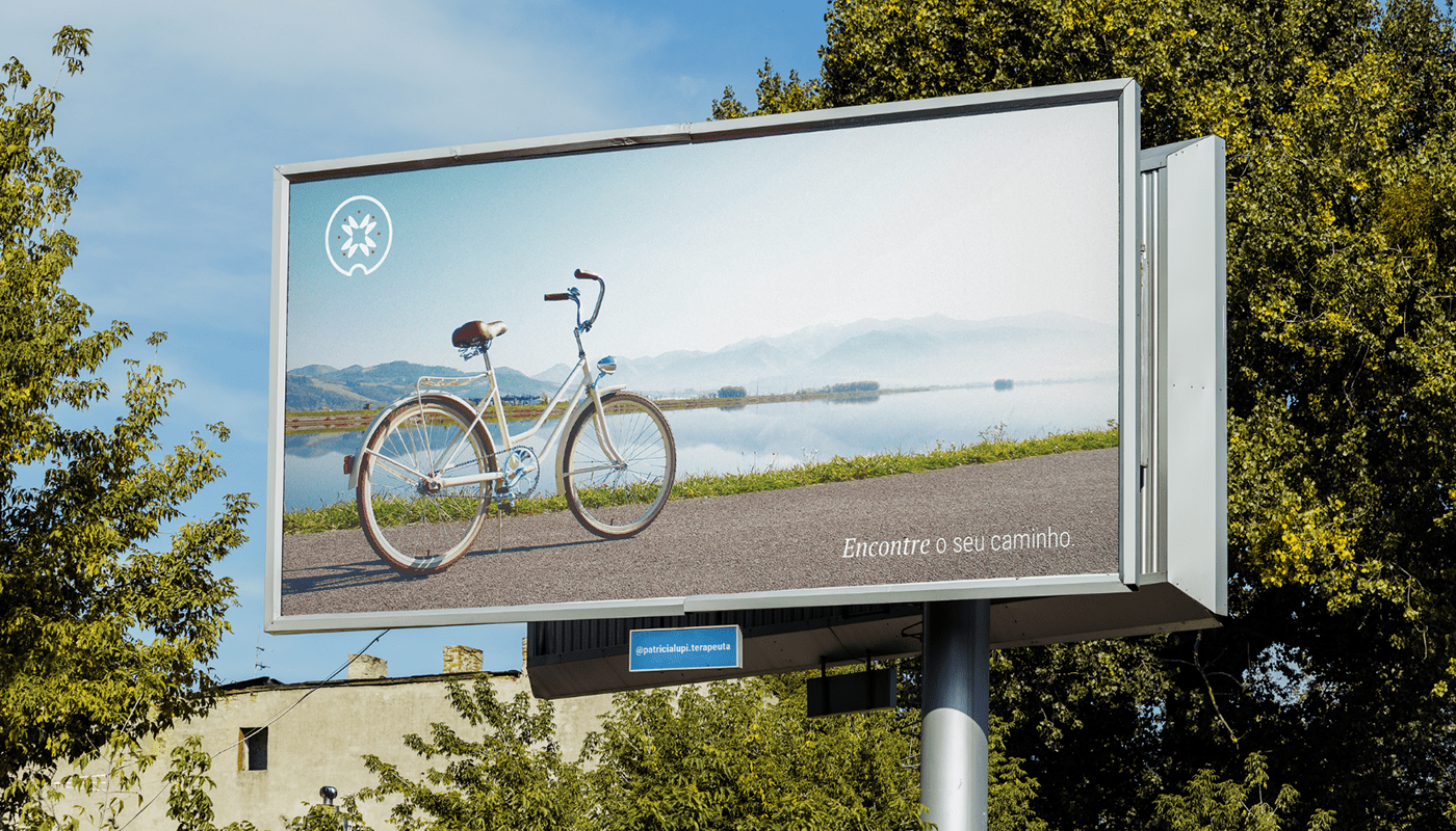
O objetivo deste projeto foi criar uma identidade visual que correspondesse a imagem pessoal da Patricia e demonstrasse o seu profissionalismo.
Dentre os principais pontos, essa IDV busca transmitir o profissionalismo de forma alegre, acolhedora e respeitosa. A marca visa ser reconhecida pela valorização e cuidado com as pessoas, oferecendo caminhos acessíveis para cada indivíduo e fazendo com que resgatem o controle sobre suas próprias vidas e se sintam seguras e compreendidas.
/ EN
Patricia Lupi - Integrative Therapies is a personal brand created to foster connections and guide people towards self-awareness. It is a multifaceted brand encompassing techniques for physical, mental, and spiritual health.
The objective of this project was to create a visual identity that aligns with Patricia's personal image and showcases her professionalism.
Among the main aspects, this Visual Identity Design (VID) aims to convey professionalism in a joyful, welcoming, and respectful manner. The brand aims to be recognized for valuing and caring for individuals, offering accessible paths for each person to regain control over their own lives and feel secure and understood.

/ PT - BR
Como inspiração para criar o símbolo da marca, foquei em conceitos físicos e matemáticos.
Átomo:
O átomo é sistema energético estável, eletricamente neutro, que consiste em um núcleo denso, positivamente carregado, envolvido por elétrons.
Para os pensadores do atomismo, cada uma das partículas minúsculas, eternas e indivisíveis, que se combinam e desagregam movidas por forças mecânicas da natureza, determinando desta maneira as características de cada objeto.*
*Definições de Oxford Languages
Mandala:
A simbologia da Mandala também foi utilizada, por utilizar formas geométricas e representar o universo e a alma.
Teorema da Borboleta:
O teorema da borboleta é um resultado clássico na geometria euclidiana. Essa geometria considera o espaço e o tempo como realidades independentes e absolutas. O espaço é contínuo, tridimensional, homogêneo e infinito. O tempo se escoa linearmente, ou seja, é o mesmo em toda a extensão do espaço.
/ EN
As inspiration to create the brand symbol, I focused on physical and mathematical concepts.
Atom:
The atom is a stable energetic system, electrically neutral, consisting of a dense, positively charged nucleus surrounded by electrons.
For atomism thinkers, each of the tiny, eternal, and indivisible particles combine and break apart, driven by mechanical forces of nature, thereby determining the characteristics of each object.*
*Definitions from Oxford Languages
Mandala:
The symbolism of the Mandala was also used, as it utilizes geometric shapes and represents the universe and the soul.
Butterfly Theorem:
The Butterfly Theorem is a classical result in Euclidean geometry. This geometry considers space and time as independent and absolute realities. Space is continuous, three-dimensional, homogeneous, and infinite. Time flows linearly, meaning it is the same throughout the entire extent of space.

/ PT - BR
Como na antiga versão do logo da Patricia haviam cores representando os chakras, quis incluí-los de alguma forma. Portanto, neste projeto os chakras estão sendo representados pelos 7 círculos ao redor do símbolo interno.
A Patricia me contou como a borboleta tem uma simbologia de transformação importante para ela, então encontrei uma maneira de acrescentá-la no projeto sem ser literal, utilizando o teorema da borboleta, que apesar de ser uma conceito da geometria, está relacionado às diferentes realidades e a infinitude do espaço, que vive em constante transformação.
A sequência de Fibonacci e o Triângulo de Ouro foram utilizados como base para formas e tamanhos, promovendo harmonia no símbolo. Há um pequeno recorte na parte inferior do logo relacionado a intersecção. A interseção de conjuntos representa o que há em comum entre as formas (um dos símbolos complementares criados representa exatamente este fator), remetendo ao que há em comum entre as pessoas (profissional e o paciente).
/ EN
The former version of Patricia's logo featured colors representing the chakras, so I wanted to include them in some way in this project. Therefore, in this design, the chakras are represented by the 7 circles around the inner symbol.
Patricia shared with me how the butterfly holds significant symbolism of transformation for her. So, I found a way to incorporate it into the project without being literal by using the Butterfly Theorem. Despite being a concept from geometry, it relates to different realities and the infinitude of space, which are constantly undergoing transformation.
The Fibonacci sequence and the Golden Triangle served as the foundation for shapes and sizes, promoting harmony in the symbol. There is a small cutout at the bottom of the logo representing an intersection. The intersection of sets represents what is common between the shapes (one of the complementary symbols created precisely represents this factor), relating to what is common between people (the professional and the patient).

/ PT - BR
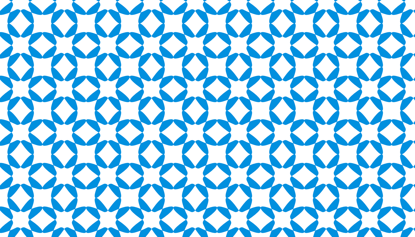
O logotipo possui a combinação branca/azul com vermelho/branco com vermelho.
As combinações mais harmônicas se dão nas versões 1 e 2. Sobre fundos complexos ou coloridos a preferência é de sempre utilizar a versão completamente branca. Sobre fundos claros, pode-se utilizar a versão em azul.
/ EN
The logo has two main combinations: white/blue with red/white with red.
The most harmonious versions are version 1 and version 2. On complex or colorful backgrounds, the preference is to use the completely white version. On light backgrounds, the blue version can be used. These choices of combinations ensure a balanced and suitable appearance in different visual contexts.

Tipografia em sua forma natural / Typography in its natural form.

Tipografia modificada e aprimorada / Modified and enhanced typography.

/ PT - BR
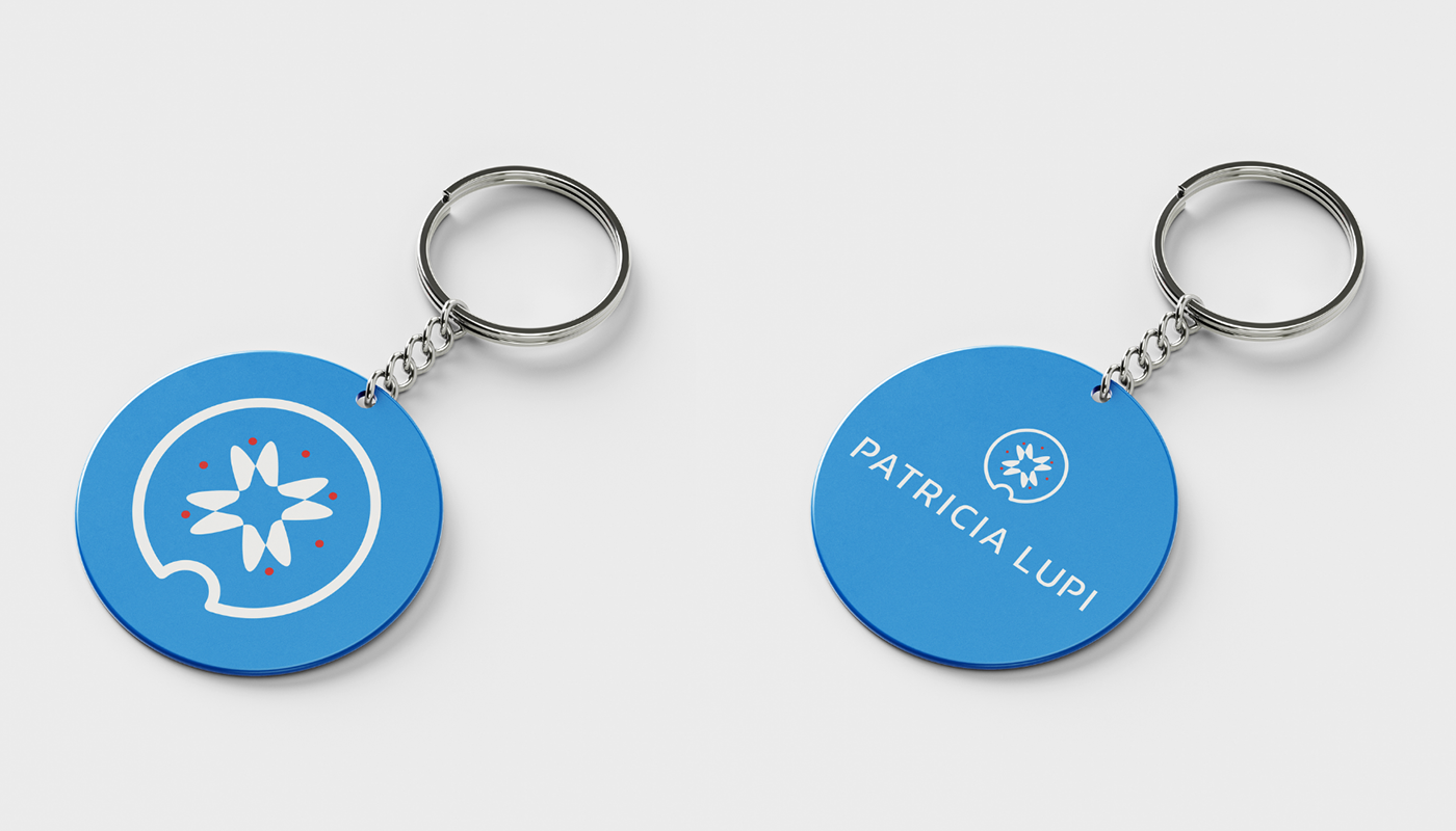
Logo:
O logo principal é um conjunto de símbolo e palavra, escolhido com base em princípios matemáticos e físicos. A tipografia sem serifa traz modernidade e atemporalidade ao logo, seus detalhes foram pensados para gerar movimento e amigabilidade.
Símbolo:
O símbolo foi criado a partir do Golden Ratio para criar equilíbrio, mas também teve inspiração na geometria euclidiana com a utilização do Teorema da Borboleta, juntamente com a forma dos átomos e da mandala.
Esses elementos foram levados em consideração devido a essência e o ramo de atividade da marca, pelo significado relacionado ao universo e à mente, os ciclos e movimento da vida humana.
/ EN
Logo:
The main logo is a combination of symbol and word, chosen based on mathematical and physical principles. The sans-serif typography brings modernity and timelessness to the logo, and its details were designed to generate movement and friendliness.
Symbol:
The symbol was created using the Golden Ratio to achieve balance, but it was also inspired by Euclidean geometry, incorporating the Butterfly Theorem along with the shape of atoms and mandalas.
These elements were taken into consideration due to the essence and business field of the brand, representing the connection to the universe and the mind, the cycles, and the movement of human life.

/ PT - BR
Símbolos Complementares:
O conjunto de símbolos criados como apoio a identidade visual foi baseado nos mesmos princípios do Logo e do Símbolo. As formas redondas remetem ao planeta e a junção de formas geométricas trazem modernidade.
Cada símbolo pode ser utilizado separadamente para representar alguma das áreas de atuação da Patricia Lupi - Terapias Integrativas, mas todos carregam o significado de mudança e movimento.
/ EN
Complementary Symbols:
The set of symbols created to support the visual identity was based on the same principles as the Logo and Symbol. The rounded shapes evoke the image of a planet, and the combination of geometric forms brings modernity.
Each symbol can be used separately to represent one of Patricia Lupi - Integrative Therapies' areas of expertise, but they all carry the meaning of change and movement.


/ PT - BR
Kanit Regular
A tipografia escolhida para o logotipo é a Kanit no peso Regular, é uma fonte contemporânea e futurista sem serifa.
É uma combinação de conceitos que utiliza como base a fonte Humanista e formas geométricas.
Kanit significa matemática em Tailandês o que faz abraçar o conceito principal deste projeto.
PT Serif Bold
A PT Serif Bold foi escolhida para os títulos para trazer destaque e por ter terminações humanistas que têm como principal característica o desenho feito a partir do movimento da mão. Sua serifa ajuda também facilita a leitura.
Roboto Condensed
Já a Roboto Condensed é uma fonte amigável e moderna, porém apesar de não possuir serifas, ela possui uma compactação e abertura aberta nos tipos que ajudam a facilitar o ritmo de leitura.
/ EN
Tipography:
Kanit Regular
The chosen typography for the logo is Kanit in Regular weight, which is a contemporary and futuristic sans-serif font. It's a combination of concepts that draws from Humanist typefaces and geometric shapes.
"Kanit" means mathematics in Thai, which embraces the main concept of this project.
PT Serif Bold
PT Serif Bold was selected for the headings to provide emphasis and because of its humanist endings, which are characterized by designs based on hand movements. Its serifs also aid in readability.
Roboto Condensed
Roboto Condensed is a friendly and modern font, even though it lacks serifs. Its compactness and open letterforms contribute to an easy reading rhythm.

/ PT - BR
Cores:
Céu Ensolarado
O azul é uma cor fria, mas nesse tom remete ao céu iluminado num dia ensolarado. Significa compreensão, tranquilidade, espiritualidade e ajuda a transmitir criatividade.
Foi uma das cores sugeridas por você no briefing e foi considerada por estar presente em marcas voltadas a saúde e pessoas.
Vermelho Amor
O vermelho também foi uma das cores sugeridas, essa é uma cor quente que ajuda a equilibrar com a frieza do azul e que gera estímulos de amor, entusiasmo e poder.
Essa cor será secundária, mas poderá tornar a marca diferenciável das demais no mesmo segmento, além de permitir gerar vontade e disposição.
Pureza
O branco no ocidente está relacionado à paz, calma, pureza e saúde. É uma cor neutra e fria assim como o azul, mas ajuda a equilibrar a utilização de diferentes cores.
Voltada a parte espiritual, ela ajuda a repelir energias negativas e eleva as vibrações espirituais, promovendo equilíbrio.
/ EN
Colors:
Sunny Sky
The blue color, in this shade, evokes a sunny sky. It represents understanding, tranquility, spirituality, and helps convey creativity. It was one of the colors suggested in the briefing and was considered because it is commonly used in health and wellness-related brands.
Love Red
Red was also one of the suggested colors. This warm color helps balance the coolness of the blue and generates feelings of love, enthusiasm, and power. This color will be secondary but can make the brand stand out from others in the same segment and evoke desire and energy.
Purity
White in the Western culture is associated with peace, calmness, purity, and health. It is a neutral and cool color, similar to blue, but it helps balance the use of different colors. Associated with spirituality, it helps repel negative energies and elevates spiritual vibrations, promoting balance.


A marca valoriza e respeita as experiências de cada um, por isso, trabalha com ecumenismo sem interferir ou buscar mudar a crença de ninguém. O trabalho tem foco na transformação e no equilíbrio, mostrando como o autoconhecimento pode influenciar nas escolhas e ações.
//
The brand values and respects the experiences of each individual, which is why it embraces ecumenism without seeking to interfere or change anyone's beliefs. The focus of the work is on transformation and balance, showing how self-awareness can influence choices and actions.


