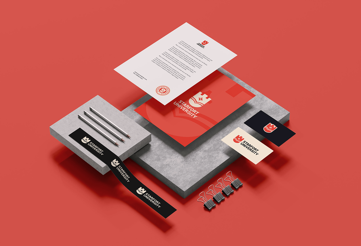
Project Overview
Starfort University is a modern and prestigious educational institution known for its innovative approach to learning and its commitment to academic excellence. The university offers a wide range of programs across various disciplines and has a reputation for nurturing creativity, critical thinking, and global awareness among its students. Starfort University aims to attract students from diverse backgrounds who are passionate about acquiring knowledge and making a positive impact on society.
Objective
The primary objective of this logo design project was to create a visually compelling and meaningful emblem that represents the essence of Starfort University. The logo needed to embody the university's core values of strength, ambition, and intellectual growth while maintaining a modern and approachable appeal. The design also had to resonate with the target audience, including prospective students, faculty members, and potential stakeholders.


Logo Concept
The design concept was centered around combining the essential elements of the university's values and personality. The castle symbolizes strength, security, and the foundation of knowledge. The star represents aspiration, ambition, and the pursuit of excellence. The book signifies education, learning, and the acquisition of knowledge. Placing these elements within a shield shape embodies the idea of protection, community, and the university's commitment to nurturing its students.
Design Elements
Castle: The central element of the logo is a castle, which signifies the university's foundation and longevity. The castle represents the university as a fortress of knowledge, providing a solid base for students to build their future.
Star: Placed inside the castle, the star signifies guidance, aspiration, and enlightenment. It reflects the university's mission to illuminate the path of its students towards a brighter and successful future.
Book: Below the castle, we incorporated an open book, symbolizing knowledge, wisdom, and academic pursuits. It represents the university's dedication to education and its role as a center for intellectual growth.
Shield Shape: The overall shield shape not only gives a sense of tradition but also conveys a feeling of protection and security, reinforcing the university's commitment to safeguarding its students' dreams and ambitions.

Color Palette
The chosen color palette reflects the contemporary and vibrant personality of the institution. The combination of #F0483B, a bold and energetic red, with #0E131F, a deep and sophisticated navy blue, portrays the perfect balance between passion and knowledge. The addition of #FFF8E5, a warm and welcoming off-white color, adds a touch of elegance and approachability.

Typography
I carefully selected the Roboto Bk font to complement the logo design. The choice of Roboto Bk, with its clean and modern appearance, perfectly aligns with the university's contemporary approach to education.
The typography not only enhances the visual appeal of the logo but also adds a touch of professionalism and clarity. The sleek lines and balanced proportions of Roboto Bk contribute to the overall harmonious composition, ensuring that the logo stands out with a timeless and sophisticated impression.
By using Roboto Bk as the font of choice, I aimed to create a seamless connection between the emblem and the typography, presenting a unified and coherent visual identity for Starfort University. This carefully considered selection ensures that the logo remains impactful across various applications, from university materials to digital platforms, and truly embodies the institution's essence as a modern and forward-thinking educational establishment.


