


Sinthome. Lacanian School of Psychoanalysis.
brand identity
In 2022, we received a request to design a new visual language for Sinthome, the 'Association of analysands and analysts working at the school growing out of Jacques Lacan's desire'. The background to the organization's rebranding was structural changes and a formal name change. The project included the creation of:
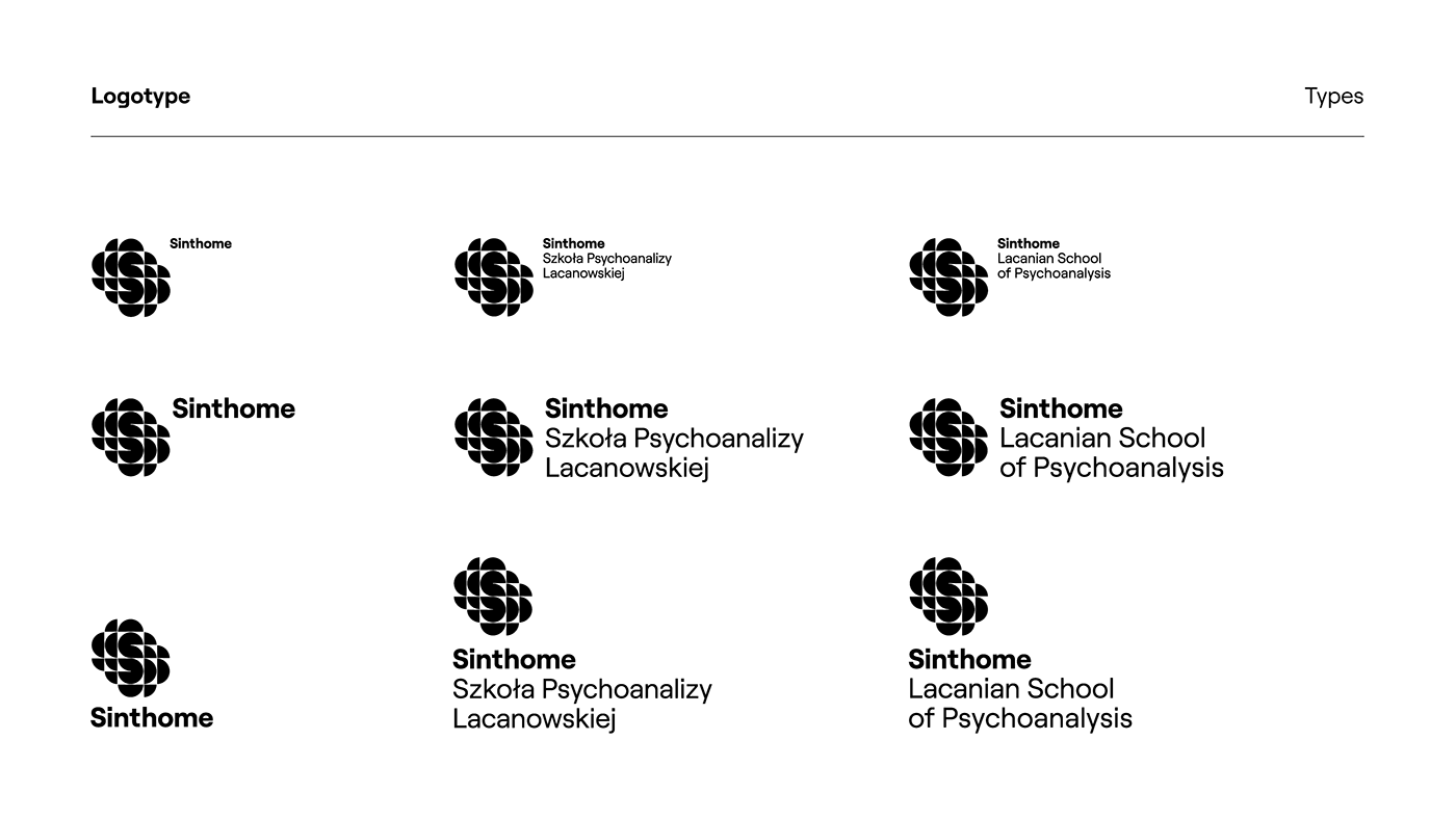
● a new logotype;
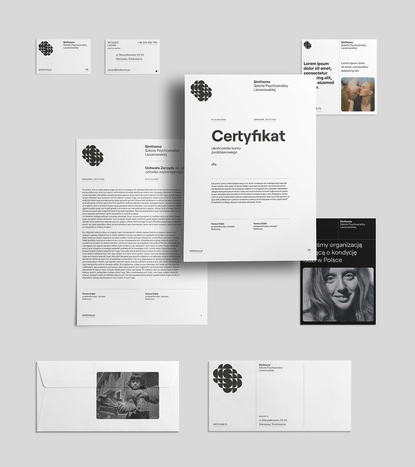
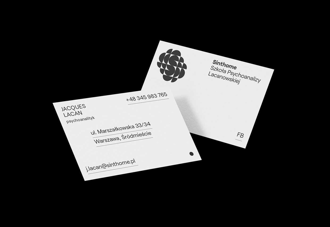
● print materials: business cards, document templates, envelopes, etc.
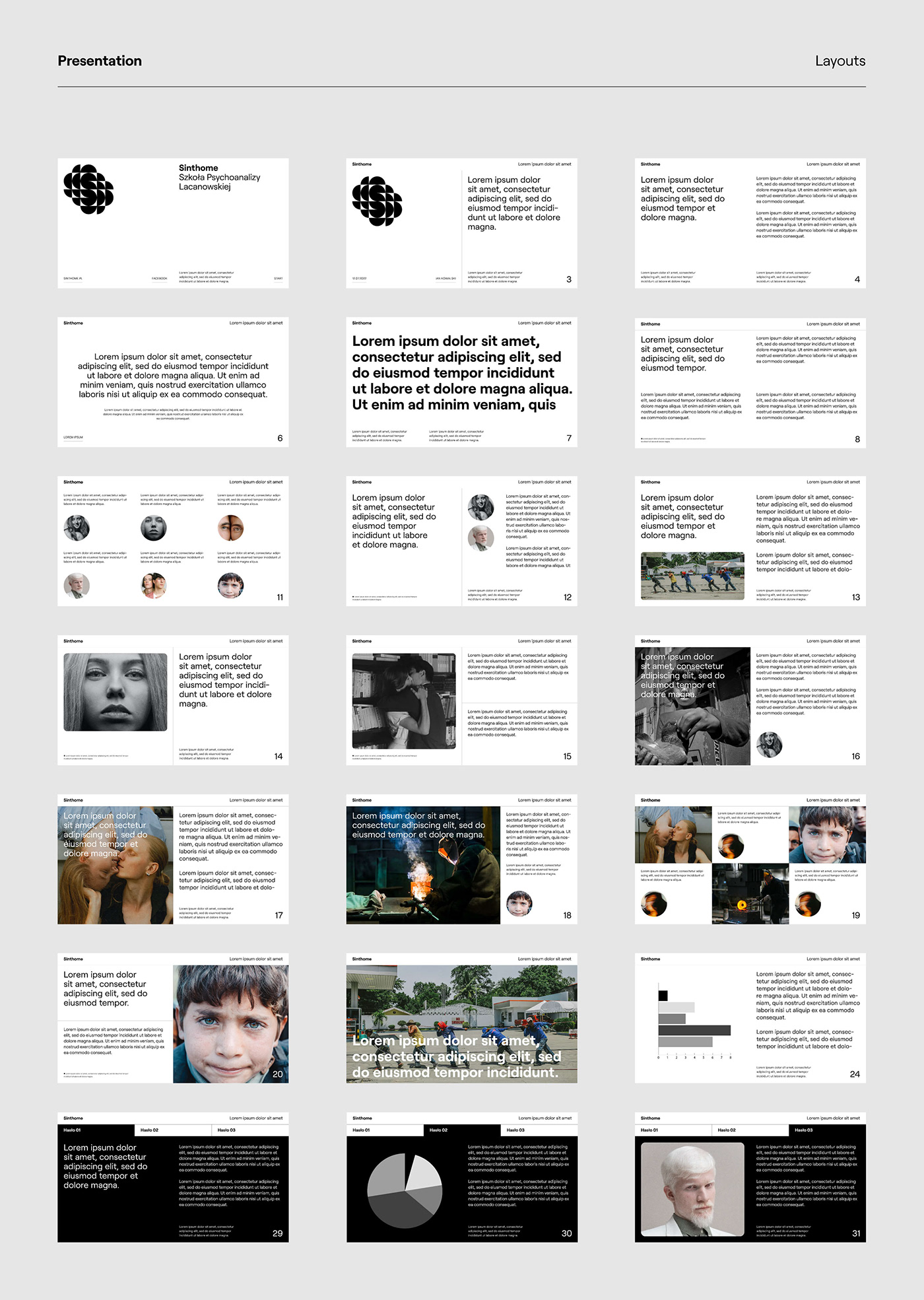
● presentation materials;
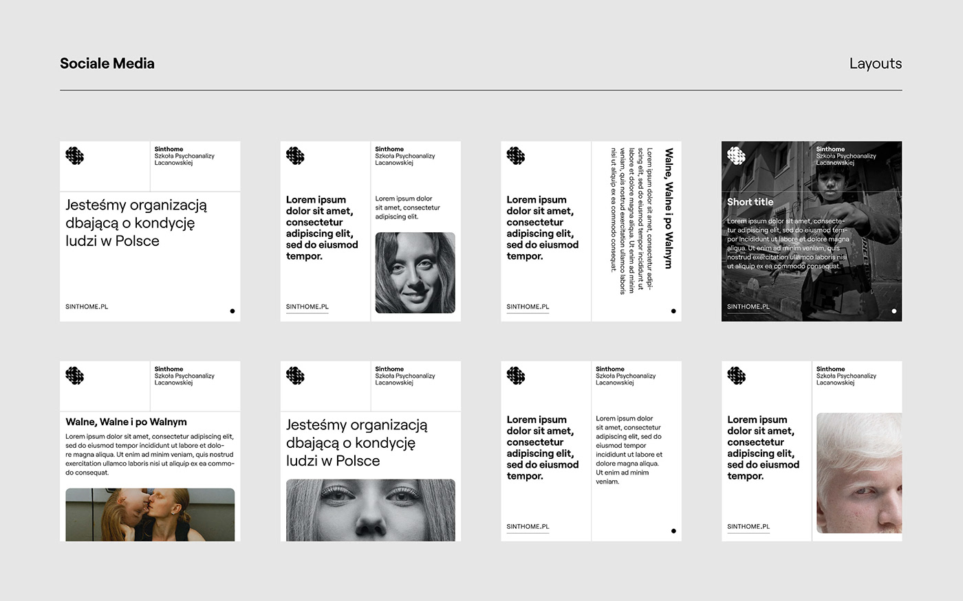
● social media communication materials;
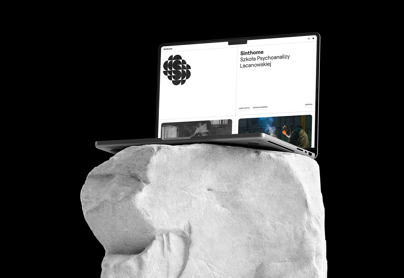
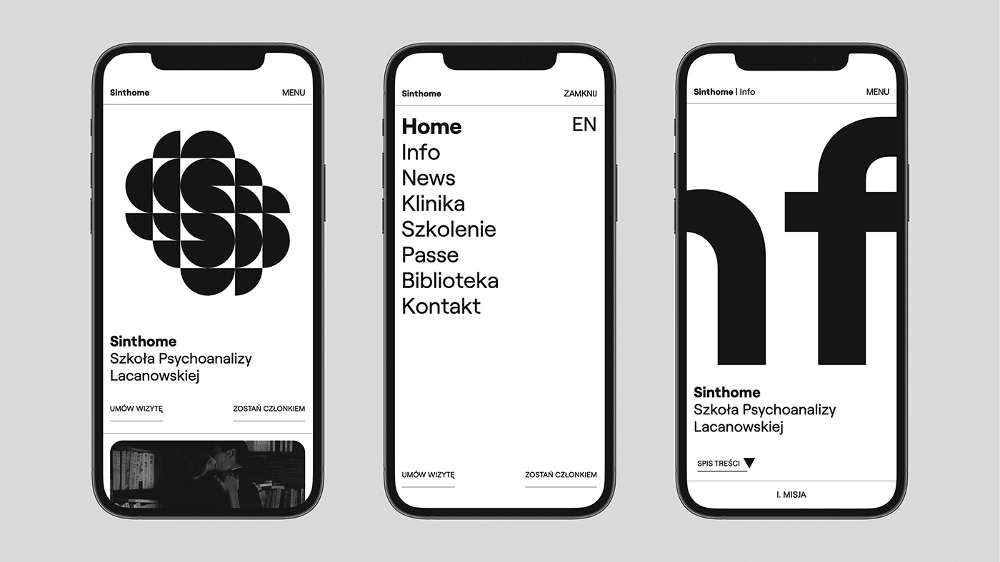
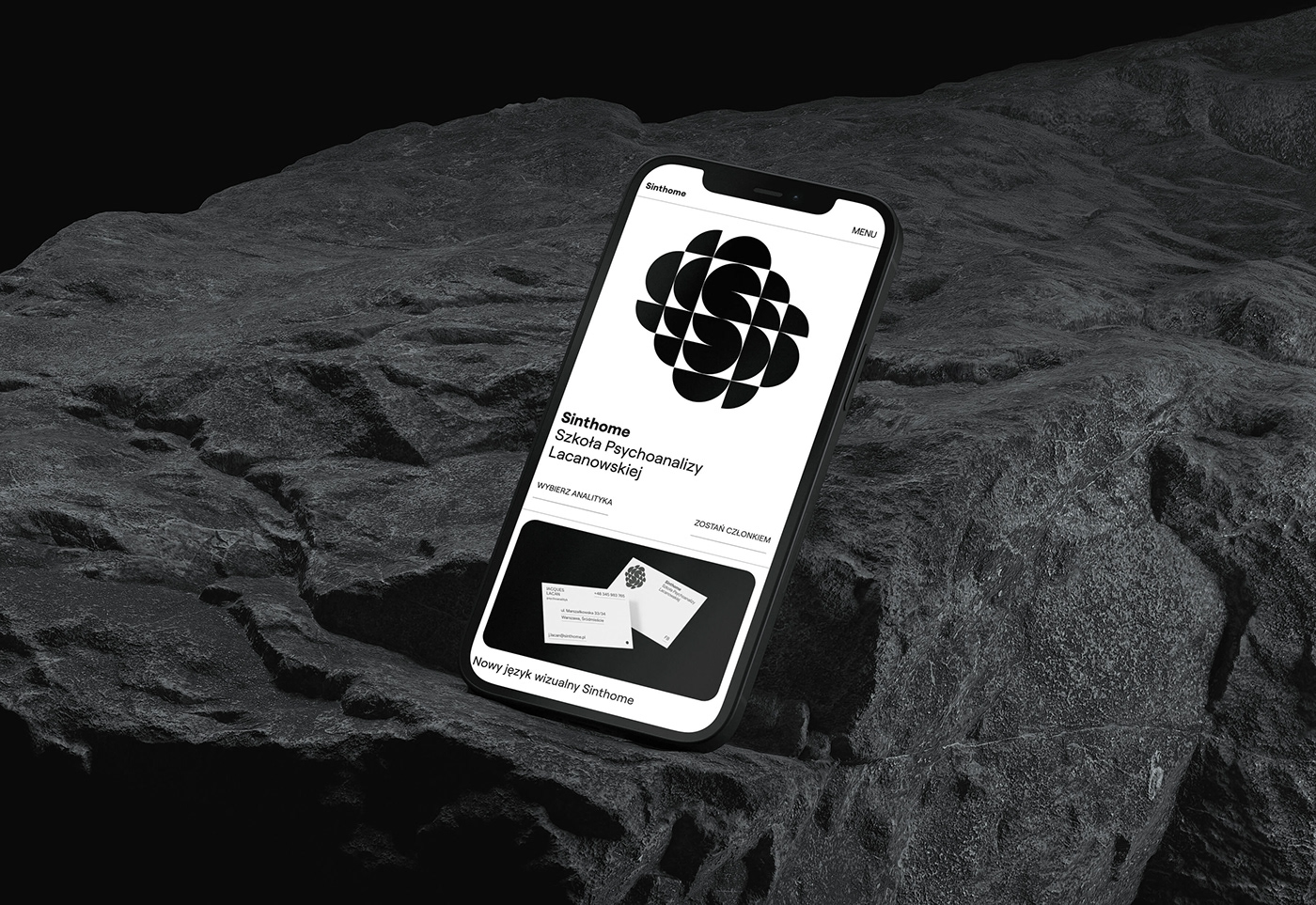
● the website.
The design process itself was unique in this case. We were expected to immerse ourselves deeply in the world-view concepts and philosophical ideas that form the organization so that the result of the work on the identity on a formal and symbolic level would reflect its character as much as possible, highlighting the specific way in which an environment centered around Lacanian psychoanalysis functions.
We wanted the choice of formal means in the identification to be based on the principle of contrast - from substantive content laid out functionally and hierarchically in a sterile, white/gallery space to elements that shatter this rational structure, break out of the rhythm or disrupt the direction of the reading. Lacanian psychoanalysis is based on the play with words, allows discussion based on paradoxes, and is characterized by surprises. The visual language should reflect this character in the project assumptions.
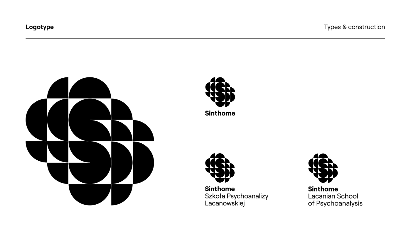
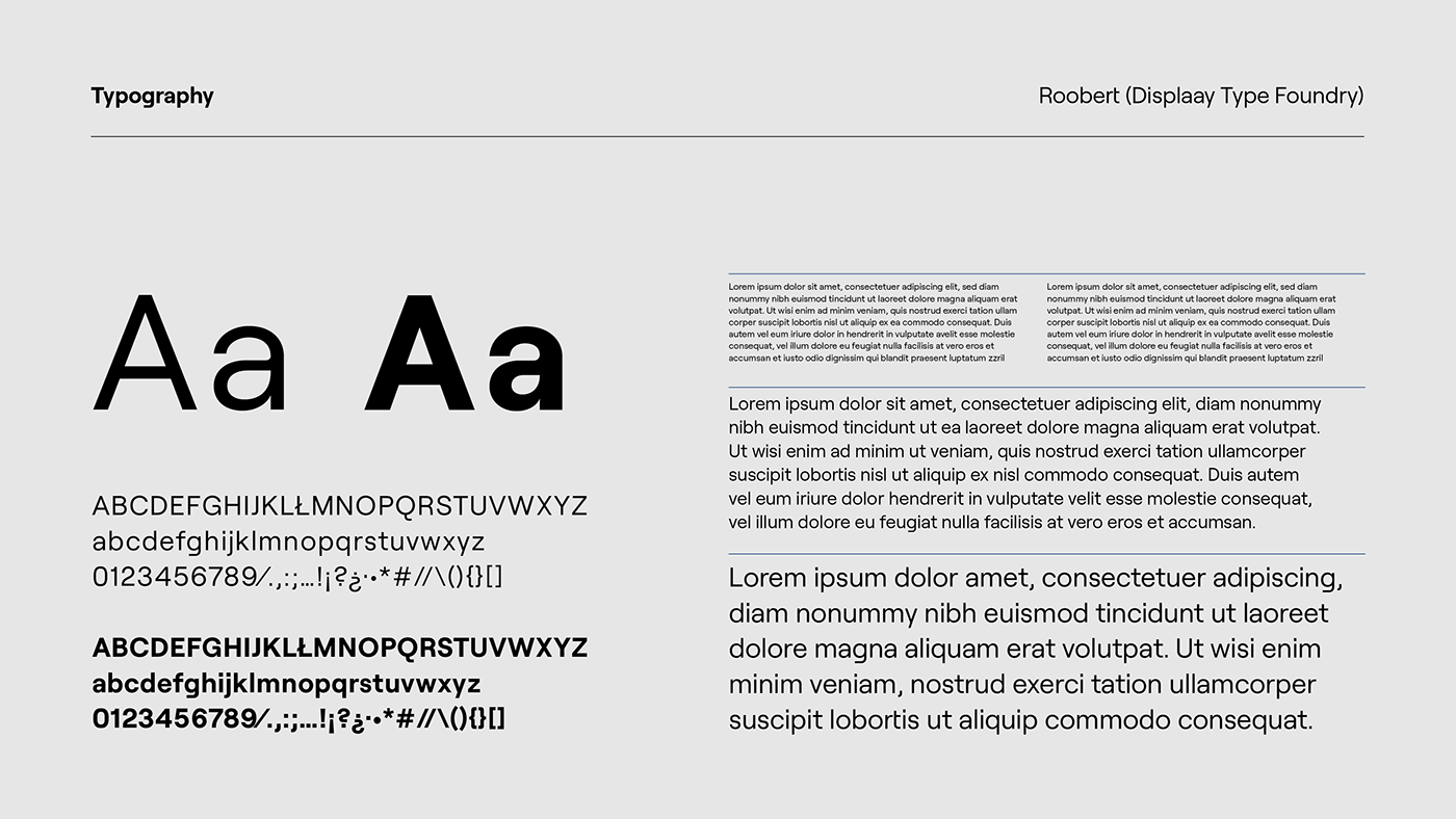
The dominant element of the identity is a logotype symbolizing the letter S (school) broken into modules resulting from cutting a circle in half or quarters. This symbol refers to historical signs such as the Canadian Broadcasting Company sign designed in 1972 by Burton Kramer. We wanted the sign itself to confuse tropes, and to be strictly modern at the same time (appearing mainly in a dynamic, animated version, with small spaces between elements) while at the same time alluding to design traditions dating back to modernism. The mark is accompanied by the font Roobert (Display Type Foundry) mono-linear geometric sans serif, which combines similar opposites - some letters' unique drawings disrupt the script's harmonious duct. In addition, the most commonly used character, the minuscule letter a, has an anti-aesthetic elongation at the top.
A vital element of the identity is the website. We created an extensive website that fulfills all the brief's assumptions to the maximum extent, both from the point of functional communication of the content and from the point of view of building the organization's image. The website uses many new technologies and techniques for distributing visual material, animated vector files, three-dimensional elements, and scroll-activated effects. To guarantee the comfort and enjoyment of the site, we have also introduced many animated interactions.
The visual identity was enthusiastically received at the organization's general membership meeting.
2023
+ Client
Sinthome. Lacanian School of Psychoanalysis
Sinthome. Lacanian School of Psychoanalysis
+ Scope
Logo / Branding / KV / Corporate / Website
Logo / Branding / KV / Corporate / Website
Filip Tofil (Art Direction)
Urszula Tofil (support)
Paulina Brzezińska (motion graphics)
Bartek Urbańczyk (Ortografika; web development)
Tomasz Dubis (support)
2023
+ Documentation
photographs & visualisations thanks to:
photographs & visualisations thanks to:
Sinthome. Lacanian School of Psychoanalysis
PEXELS


