Este projeto tem como objetivo criar uma marca que se reposiciona no setor imobiliário, com foco na geração de renda passiva através do aluguel de imóveis. A missão da Basesul é proporcionar aos clientes a oportunidade de investir em imóveis compactos, gerando renda passiva e patrimônio de forma escalável e segura.
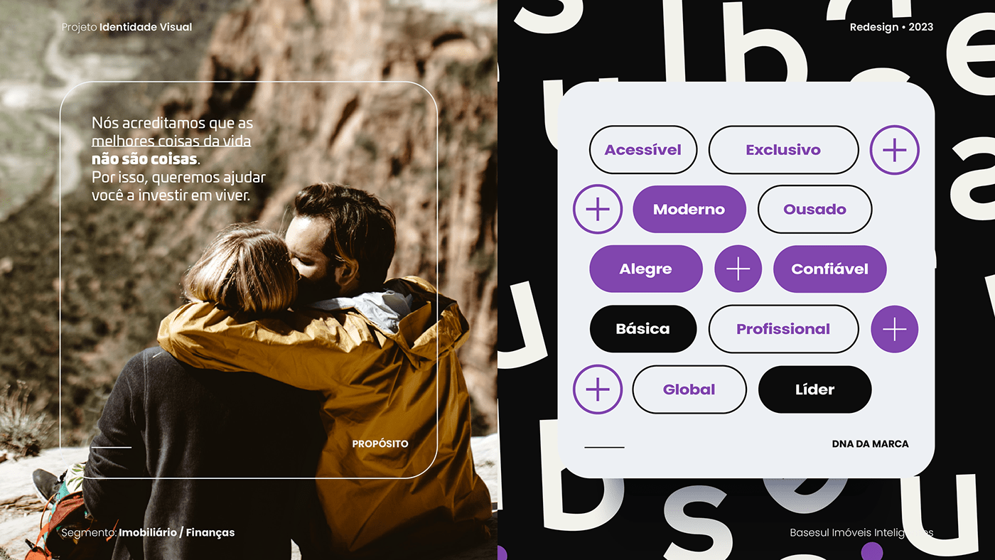
O projeto visa transmitir uma identidade visual moderna e eficiente, com elementos orgânicos e tecnológicos, destacando a proposta única da empresa. A marca se posiciona como uma opção diferenciada no mercado, oferecendo uma forma inteligente e rentável de construir um patrimônio.
EN
The project aims to create a brand that repositions itself in the real estate sector, focusing on generating passive income through property rentals. Basesul's mission is to provide customers with the opportunity to invest in compact properties, generating passive income and scalable and secure assets.
The project aims to convey a modern and efficient visual identity, with organic and technological elements, highlighting the company's unique proposition. The brand positions itself as a differentiated option in the market, offering an intelligent and profitable way to build wealth.


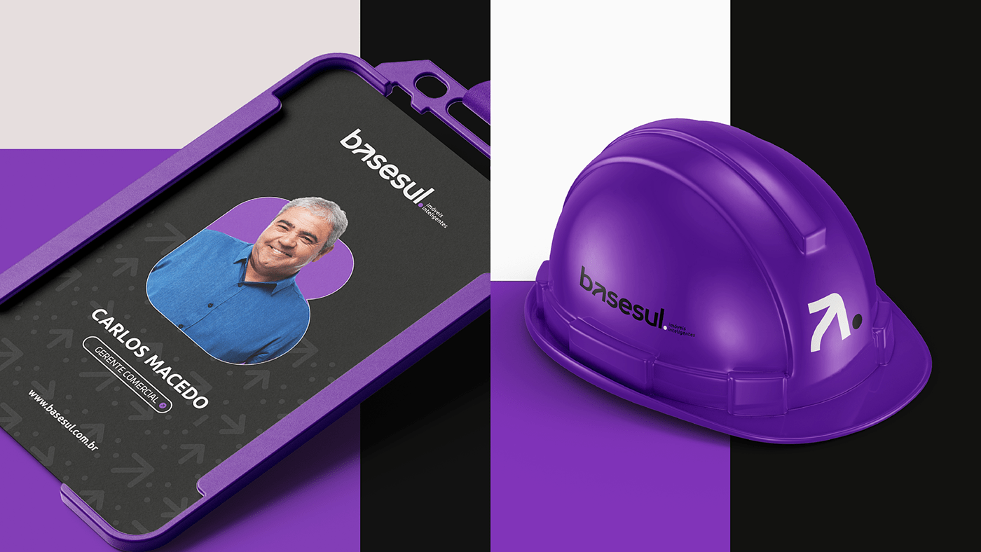
A escolha de uma tipografia minúscula, com letras de tamanho reduzido, reforça a abordagem de imóveis compactos. Ao utilizar uma fonte com essa característica, a marca estabelece uma relação direta com seu público-alvo, ressaltando o foco em apartamentos e espaços reduzidos. Essa escolha também transmite uma sensação de proximidade e intimidade, sugerindo que a marca está disposta a oferecer soluções personalizadas e cuidadosamente planejadas para atender às necessidades dos clientes em ambientes compactos.
Além disso, a seta na letra A pode representar a orientação e o direcionamento. No setor da construção, é fundamental para os clientes e investidores terem uma visão clara e direcionada, especialmente ao considerar a proposta inovadora e o modelo de negócio da Basesul. A presença da seta no logotipo transmite a mensagem de que a empresa está pronta para guiar e direcionar seus clientes em suas jornadas imobiliárias, oferecendo orientação confiável e estratégica.
EN
The choice of lowercase typography with reduced letter size reinforces the approach of compact properties. By using a font with this characteristic, the brand establishes a direct connection with its target audience, emphasizing the focus on apartments and small spaces. This choice also conveys a sense of closeness and intimacy, suggesting that the brand is willing to provide personalized and carefully planned solutions to meet the needs of clients in compact environments.
Furthermore, the arrow in the letter "A" can represent guidance and direction. In the construction sector, it is essential for clients and investors to have a clear and directed vision, especially when considering Basesul's innovative proposition and business model. The presence of the arrow in the logo conveys the message that the company is ready to guide and direct its clients in their real estate journeys, offering reliable and strategic guidance.