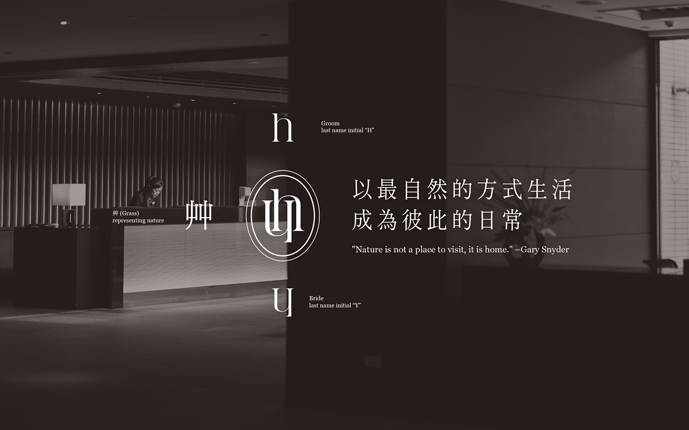

This logo is designed for a couple who loves nature. In the conceptualization of the wedding logo design, the initials "H" and "Y" from the surnames Hsu and Yang are intricately combined with the “grass” radical, symbolizing flowers and plants. This fusion creates a unique graphical representation. By interweaving the letter shapes together, the aim is to highlight the connection and fusion between the two individuals. In terms of appearance, an elliptical shape symbolizing life, love, and harmony is used to represent a stable force. However, the presence of two layers of ellipses signifies inclusivity and the ability to embrace diversity. In terms of font, a serif typeface is used to ensure clear, readable, and intricate information. Regarding the color scheme, the Melange color palette is extensively utilized, as the combination of coffee and pink hues is intended to evoke a comfortable and warm feeling.
這個標誌是為了一對喜歡大自然的夫妻所設計。在婚禮 Logo 設計理念的造型發想,將新人的姓氏 Hsu 與 Yang 的字首 H & Y 與象徵自然的「艸」部,巧妙地結合在一起,形成一個獨特的圖形。透過將字母形狀互相交織的方式組合而成,來突顯兩人的聯繫和融合。在外觀上,使用象徵生命、愛與和諧的橢圓形,象徵穩定的力量。然而,兩層的橢圓形,表示包容和容納多樣性;字體方面,使用有襯線的字體來確保資訊清晰、可讀,且細緻;色彩計畫,我們大量使用了美拉德色系。正因為咖啡色與粉紅色能帶給人舒適溫暖的感受。


© 2023 design workplace
Client: Jeffrey Hsu & Vera Yang


