On your attention is part of my diploma work for bachelor degree from July, 2013.Those are five typographic posters.
Each one of them present valuable information about the
world of typography. The works which are front of you is introduction to my "Small typography handbook" - http://bit.ly/1cK7ZG4
Each one of them present valuable information about the
world of typography. The works which are front of you is introduction to my "Small typography handbook" - http://bit.ly/1cK7ZG4

The ligatures show high cultural, sophistication, attitude towards font. Only really good typographer can dance on this dancing floor.
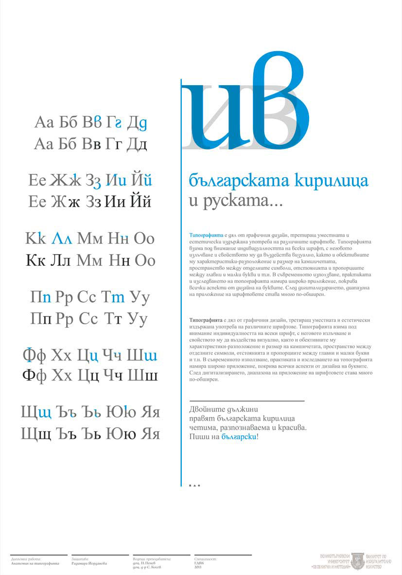
There is difference between the Bulgarian cyrillic and the Russian one.
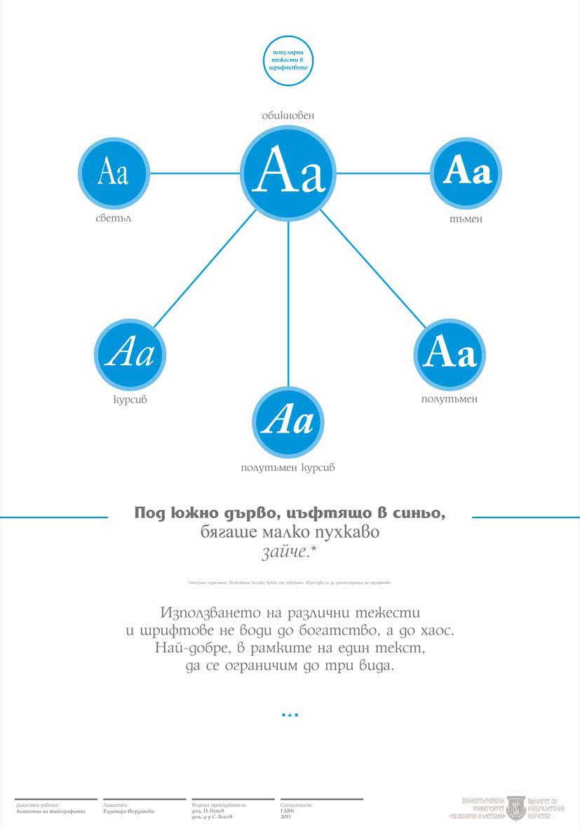
When you use too much fonts and weights at one page, it will only bring to chaos. Three fonts are a good limit :)
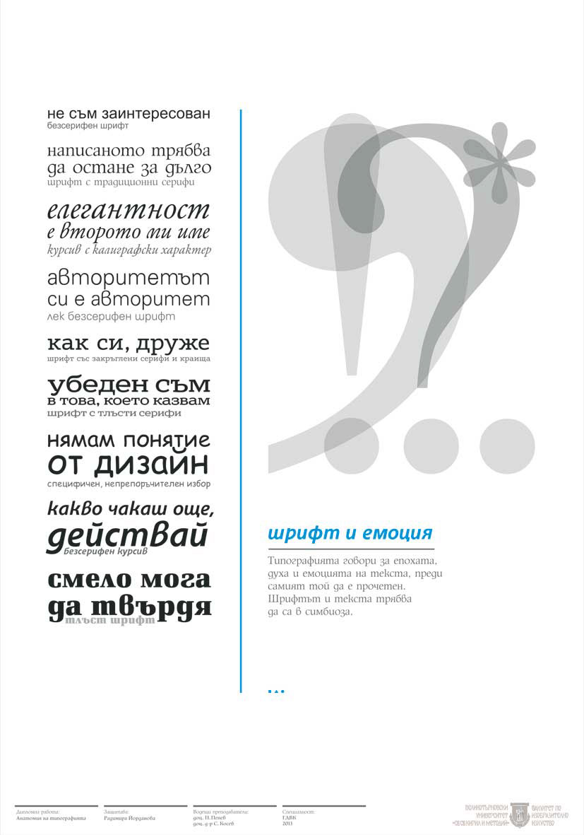
Every font has some kind of emotion. Choose wisely.

Anatomy of typography


