


The CHIMO branding project aimed to showcase and celebrate Chinese culture, with a specific focus on the city of Xi'an, to the people of Brussels. At the heart of this endeavor was the restaurant's name itself, "CHIMO," which cleverly played on the popular dish 'mo' in Xi'an, underscoring the establishment's dedication to offering authentic Chinese cuisine.
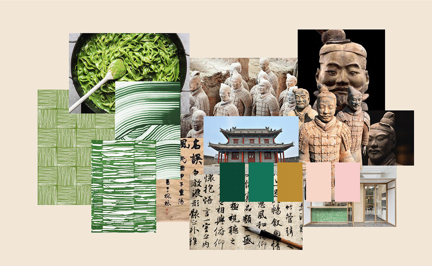
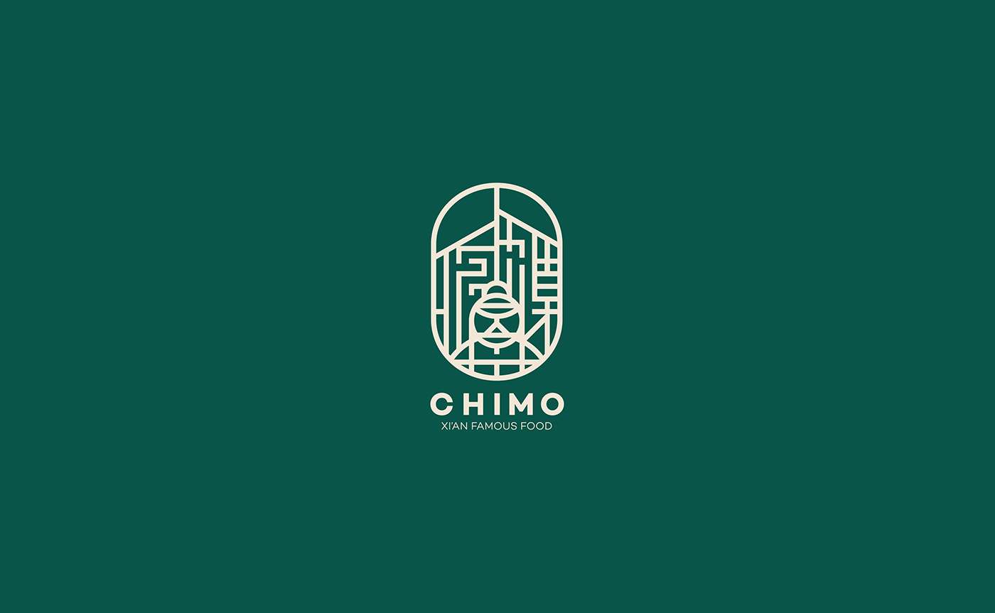
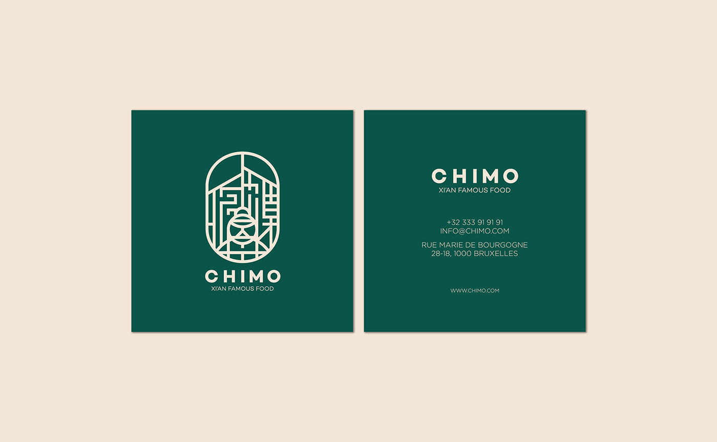
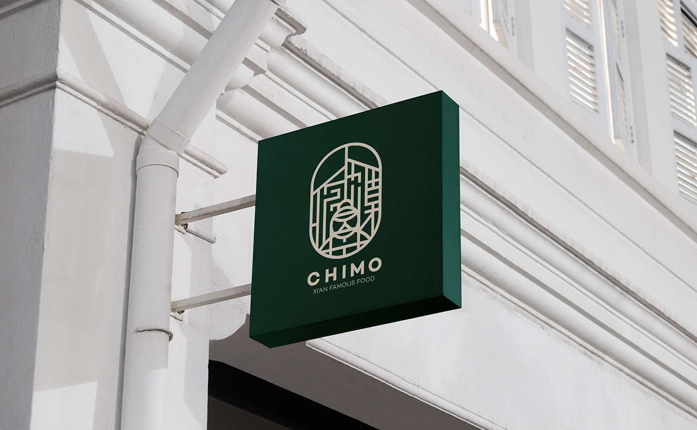
The challenge in this branding project was to create a logo that would effectively represent both the city of Xi'an and the restaurant's name. The final logo was designed by incorporating the shape of houses in Xi'an, which is a distinct architectural feature of the city. The use of Chinese typography and the CHIMO letters to fill the space around the Terracotta Warrior in the middle adds a contemporary touch to the traditional design.

The final logo eloquently conveys the restaurant's mission of introducing Chinese culture to Belgium with historical and authentic elements. Overall, the CHIMO branding successfully created a strong and memorable logo, representing genuine Chinese cuisine and the essence of Xi'an.


THANK YOU!


