


Solid /ˈsɑː.lɪd/, adjective:
hard or firm, keeping a clear shape. In physics, one of the four fundamental states of matter.
hard or firm, keeping a clear shape. In physics, one of the four fundamental states of matter.
"The word Solid and its meanings represent the perfect union for the purpose of this project: the creation of a community of climbers who feel part of an exclusive "club". This is achieved also through the design and build of whole-new structure which recalls a monolith, a cathedral; therefore communicating a strong visual impact thanks to the use of raw-looking materials, wide, minimal and well-enlightened spaces. All this is represented in a graphic sign, the logo of Solid Climbing Club."
Davide Curzi, SCC Creative Director


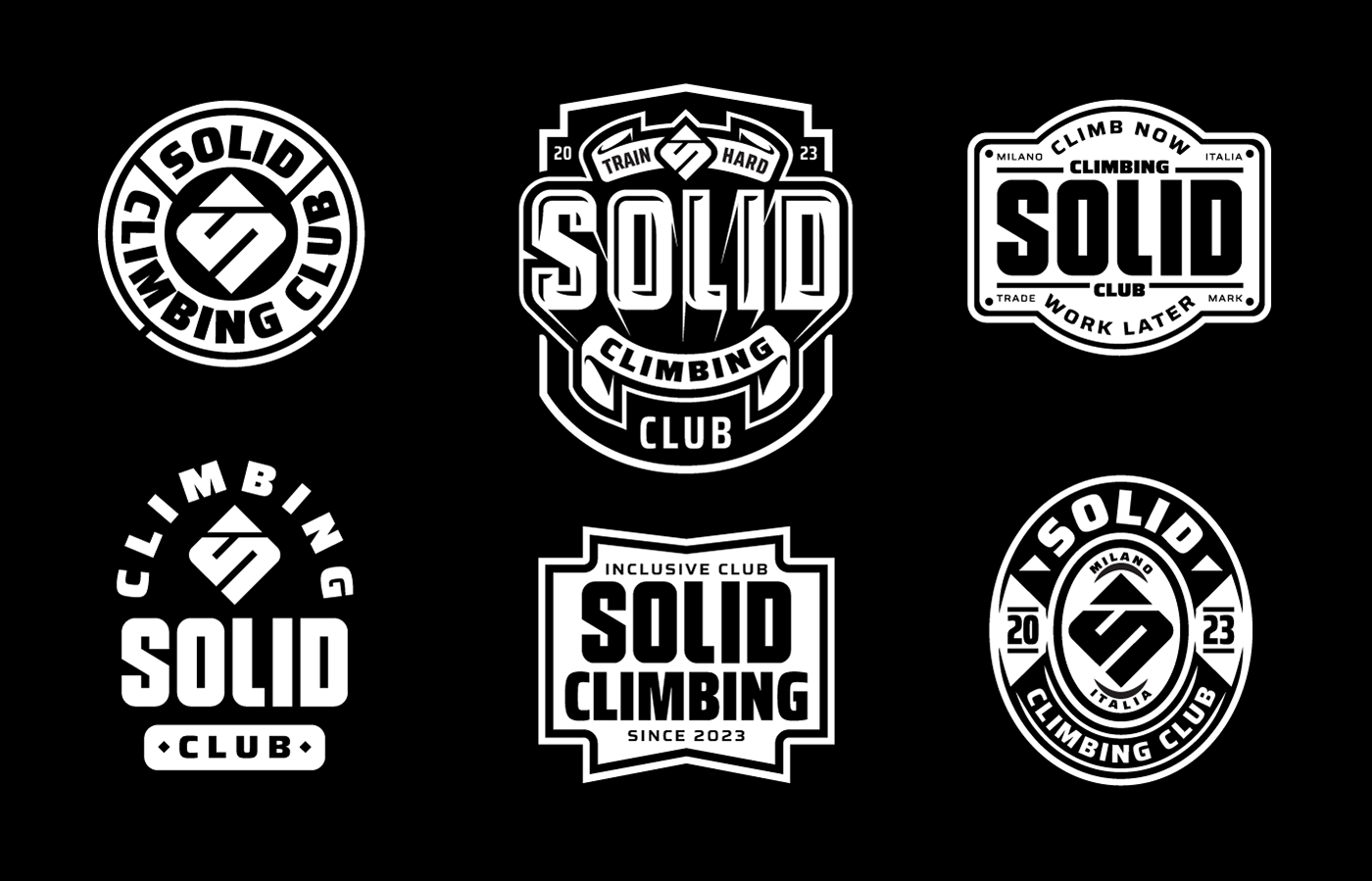
The logotype of Solid has been created from scratch: the letters have been designed expressly on purpose, and therefore they are unique and original. From these letters, a whole new font was designed, with only uppercase letters, to be used for particular usages, such as signs on the spot for: locker rooms, boulder or lead areas, restaurant, toilettes... etc.


To strengthen and convey the new brand Solid, we created a series of graphics which recall the world of badges and emblems: carrying around the symbol of Solid Climbing Club on a t-shirt, on a bottle, or on the chalk bag, have to become a distinctive sign, immediately recognizable. Having a gadget with one of the Solid graphics means to belong to a club, which shares some values; in our case these values are expressed with a captivating and modern graphic means.


THANKS!
Special thanks to Davide Curzi, who directed the project and provided all the gym photographs.
Merchandising photos: Davide Farabegoli.


