PT
A MARCA
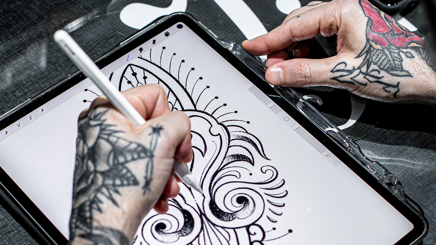
A Milk Ink é uma tattoo shop em Florianópolis especializada em diversos estilos de tatuagens. O estúdio é altamente elogiado em todas as esferas, sendo amplamente reconhecido na cena local e nacional. A exigência dos artistas proporciona um trabalho rigorosamente profissional, um atendimento acolhedor e uma experiência que marca profundamente qualquer pessoa que queira fazer uma tatuagem.
EN
THE BRAND
Milk Ink is a tattoo shop in Florianópolis specializing in various tattoo styles. The studio is highly praised in all its aspects, being widely recognized in the local and national scene. The artists' commitment ensures highly professional work, welcoming customer service, and a moment that deeply marks anyone seeking to get tattooed.
PT
DESAFIO
Com anos de atuação no mercado, já consolidada como referência em tatuagem, os sócios se depararam com perguntas desafiadoras: quem é a Milk Ink? Qual é o seu propósito? Como ela é percebida pelo mundo? Diante desse cenário, o objetivo principal era reposicionar a marca, fortalecendo seus atributos e alinhando seu posicionamento e cultura. Dando assim, insumos para a construção de uma comunicação consistente, que refletisse a essência da marca com propriedade.
EN
CHALLENGE
With years of experience in the market, already established as a reference in tattooing, the partners were faced with challenging questions: who is Milk Ink? What is its purpose? How is it perceived by the world? In this scenario, the main objective was to reposition the brand, strengthening its attributes and aligning its positioning and culture. This aimed to provide inputs for the development of a consistent communication that truly reflected the brand's essence.

PT
ESTRATÉGIA
Entendemos que o propósito da Milk Ink está centrado em dois pontos: impulsionar transformações e tornar os dias mais especiais. A proposta do estúdio é traduzir sentimentos, dar novos significados às histórias e causar impacto por meio de boas mudanças. Além disso, a Milk Ink quer surpreender as pessoas. As experiências são pensadas para gerar encantamento e romper com a rotina comum.
Com base nesse propósito, identificamos a oportunidade de reformular o discurso da marca, inspirando-nos nos arquétipos do mago e do governante. Para fortalecer a conexão com as pessoas, reconhecemos a necessidade de adotar um tom de voz acolhedor, desenvolvendo uma comunicação mais plural e acessível, que preservasse a elegância e o mistério característicos da marca. Além disso, estabelecemos diretrizes para alinhar a cultura interna e alcançar um posicionamento consistente.
EN
STRATEGY
We understand that the purpose of Milk Ink is centered around two points: driving transformations and making days more special. The studio's proposal is to translate emotions, give new meanings to stories, and create an impact through positive changes. Additionally, Milk Ink aims to surprise people. The experiences are designed to generate enchantment and break away from the common routine.
Based on this purpose, we identified the opportunity to reshape the brand's narrative, drawing inspiration from the archetypes of the magician and the ruler. To strengthen the connection with people, we recognized the need to adopt a welcoming tone of voice, while developing a more diverse and accessible communication style that would maintain the brand's elegance and mystery. Additionally, we established guidelines to align the internal culture and achieve a consistent positioning.


PT
TAGLINE
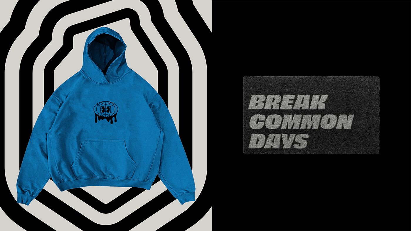
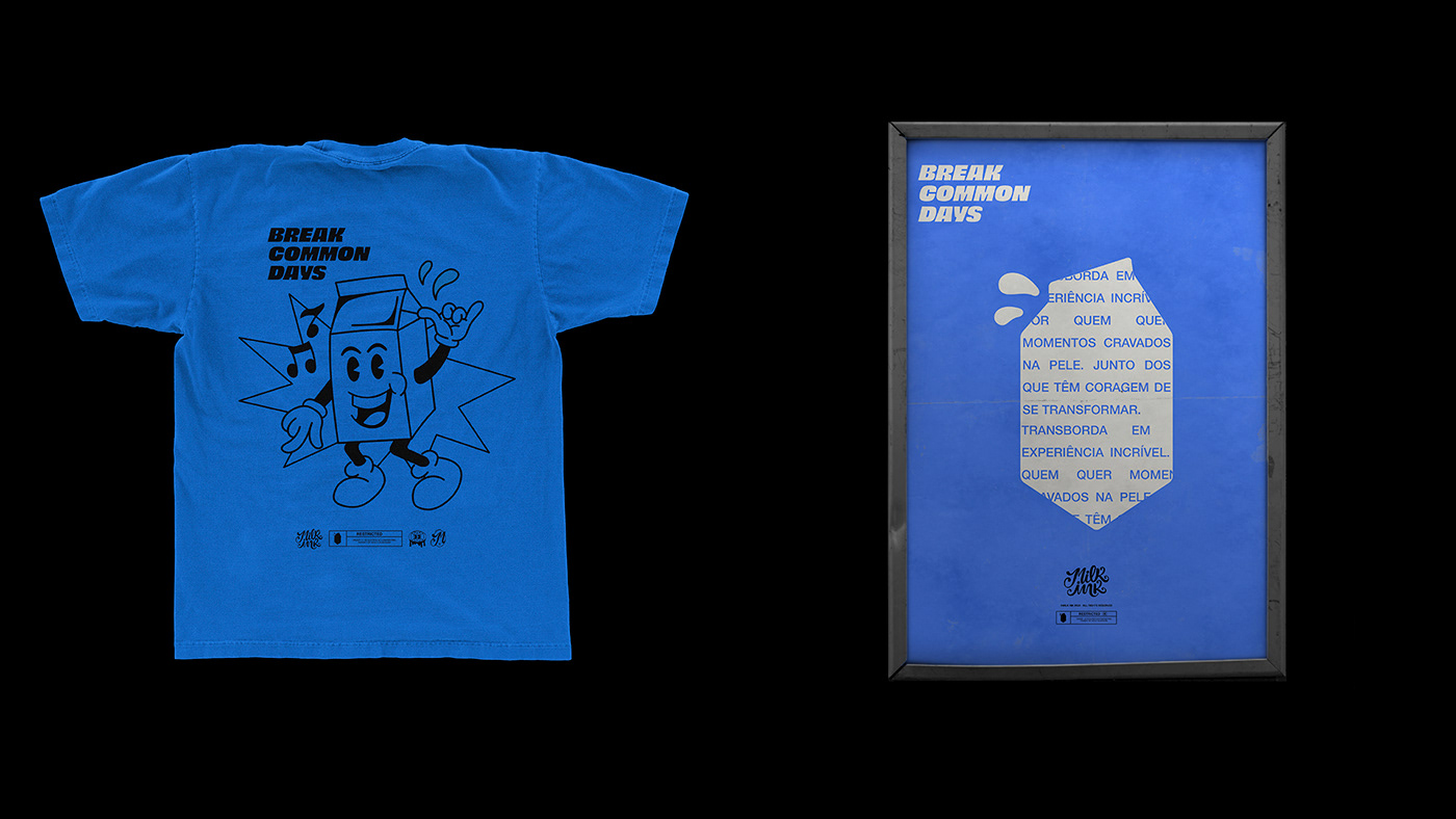
"Break common days", além de inspirar atitude e encorajar as pessoas, expressa que tatuar significa sair da inércia e se transformar. Isso implica que na Milk Ink, os dias comuns podem se tornar mais especiais. Tanto o tom de voz quanto o conceito inserido na frase resgatam os arquétipos pensados para a marca.
EN
TAGLINE
"Breaking common days", besides inspiring attitude and encouraging people, expresses that getting a tattoo means breaking inertia and transforming oneself. It implies that at Milk Ink, ordinary days can become more special. Both the tone of voice and the concept embedded in the phrase evoke the archetypes envisioned for the brand.

PT
LOGOTIPO
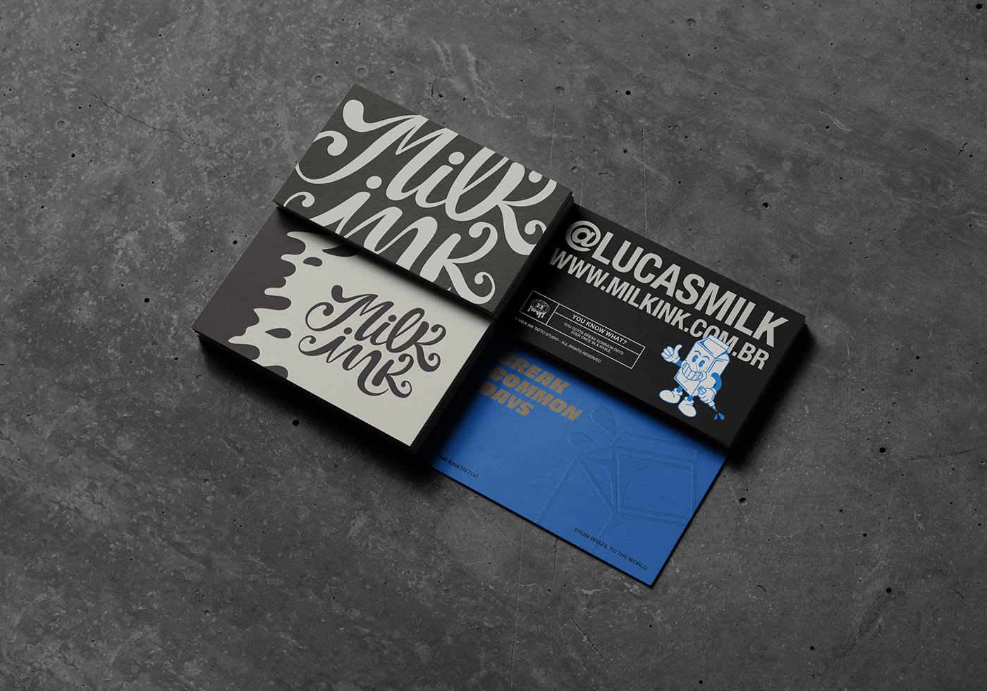
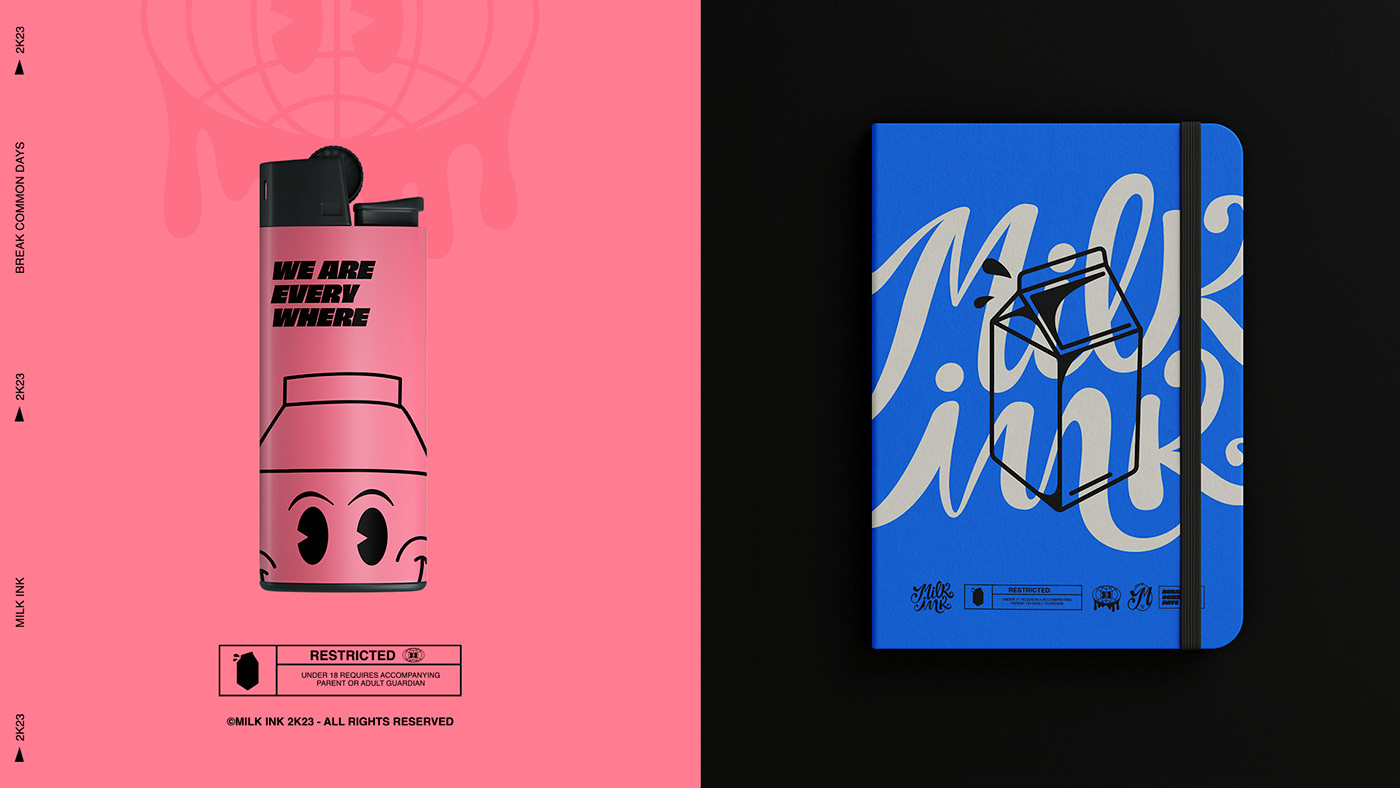
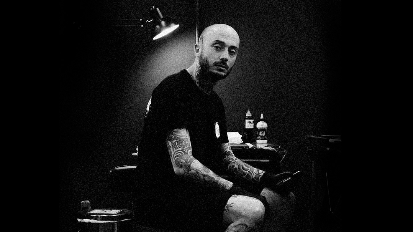
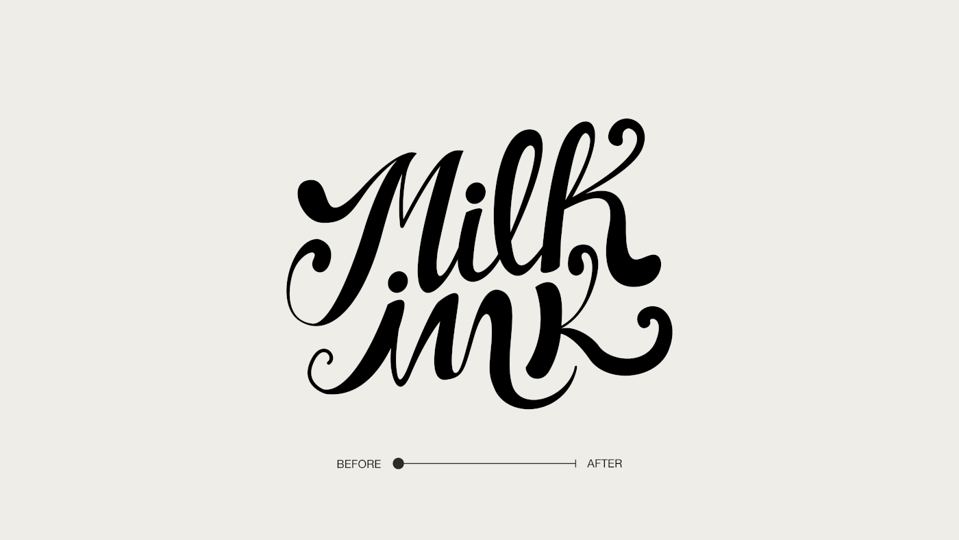
Lettering criado manualmente pelo artista e idealizador do estúdio Lucas Milk, transmite a fluidez do leite e da tinta. Tem uma atmosfera mágica e carrega o reconhecimento do público. Preservando sua originalidade, ela foi refinada para reforçar seus pontos marcantes e garantir mais coesão.
EN
LOGOTYPE
The typographic brand is a handcrafted lettering created by artist and studio founder Lucas Milk, conveying the fluidity of milk and ink. It has a magical atmosphere and carries public recognition. While preserving its originality, it has been refined to reinforce its distinctive features and ensure greater cohesion.

PT
SÍMBOLO
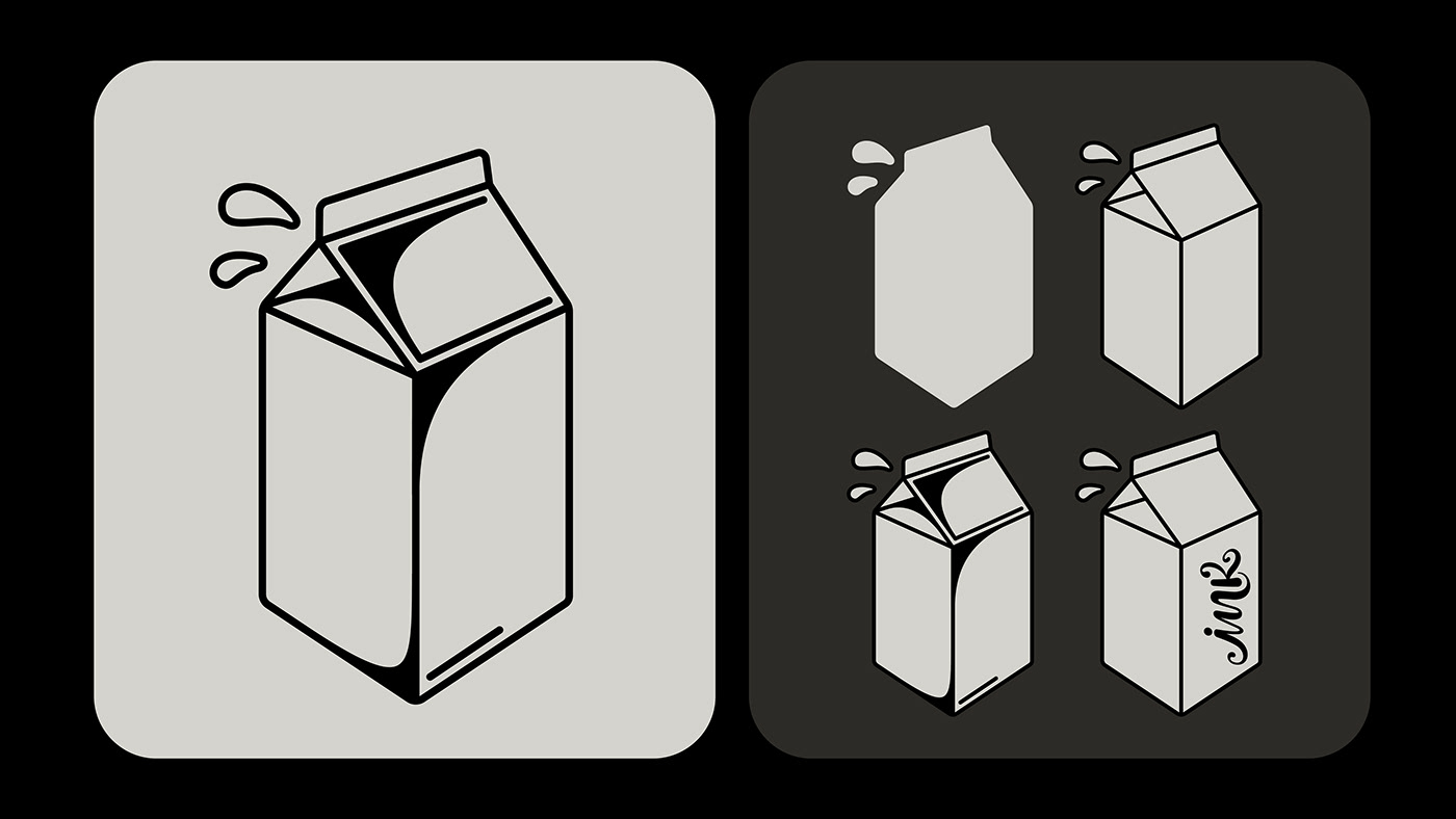
A caixa de leite, que já se tornou um ícone associado à marca, é elevada a símbolo e ganha maior destaque. Desenhada pelo próprio Lucas Milk, ela é um elemento lúdico, simpático e versátil, que permite bastante diversidade e liberdade em suas aplicações.
EN
SYMBOL
The milk carton, which has already become an iconic symbol associated with the brand, is elevated and given greater prominence. Designed by Lucas Milk himself, it is a playful, friendly, and versatile element that provides diversity and great freedom in applications.

PT
ILUSTRAÇÕES
O "Milkito" é a personificação mais encantadora e bem-humorada do símbolo da Milk Ink. Ilustrado pelo idealizador do estúdio, ele reforça o arquétipo do mago, equilibrando a personalidade da marca. O personagem retrata o contexto da tatuagem com interações criativas envolvendo café, a cidade e elementos do universo das tattoos.
EN
ILLUSTRATIONS
"Milkito" is the most enchanting and humorous personification of the Milk Ink symbol. Illustrated by the studio's founder, it reinforces the magician archetype while balancing the brand's personality. The character portrays the tattoo context through creative interactions involving coffee, the city, and elements from the tattoo universe.

PT
ASSETS
O universo visual conta com diversos recursos novos que garantem mais versatilidade e enriquecem a comunicação. A tagline ganha destaque com uma tipografia própria e se transforma em um elemento gráfico impactante. As faixas servem como complemento e aparecendo em diversas peças gráficas.Além disso, temos o divertido e poderoso elemento do splash de leite, inspirado no personagem Milkito.
EN
ASSETS
The universe includes various new resources that ensure greater versatility and enhance communication. The tagline gains prominence with its own typography and becomes an impactful graphic element. Stripes serve as complementary elements appearing in various graphic pieces. Additionally, we have the fun and powerful milk splash element inspired by the character Milkito.

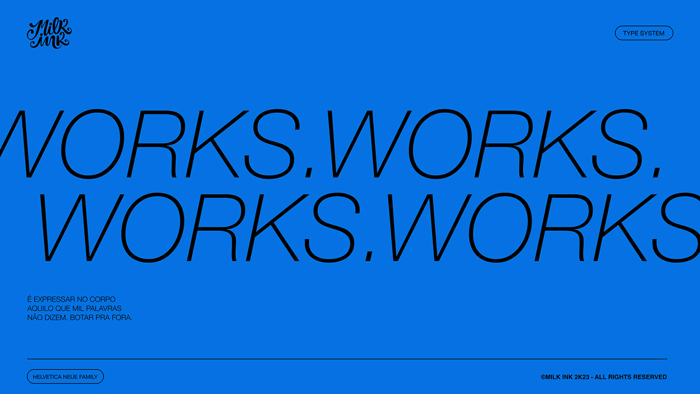
PT
TIPOGRAFIA
A marca utiliza a Helvetica Neue como sua principal fonte, aproveitando suas variações de peso em todos os elementos textuais. Foi escolhida devido à sua alta legibilidade, clareza e contemporaneidade, seguindo a linguagem identitária da marca. Além disso, para gerar contraste, sugerimos a combinação com uma fonte serifada, itálica e elegante em algumas composições adicionais.
EN
TYPOGRAPHY
The brand uses Helvetica Neue as its main font, taking advantage of its weight variations in all textual elements. It was chosen for its high legibility, clarity, and contemporary appeal, in line with the brand's identity. Additionally, to create contrast, we suggest combining it with a serif, italic, and elegant font in some additional compositions.


PT
PALETA CROMÁTICA
O azul e o rosa viram os protagonistas, marcando uma Milk Ink surpreendente e acolhedora. Esses tons mais lúdicos, divertidos e encantadores ativam bem o arquétipo do mago. Por outro lado, o preto, cinza e off-white resgatam o lado governante e se conectam com a cena da tattoo. Para trazer elegância, um toque de dourado é sutilmente incorporado. Além disso, o verde, vermelho, laranja e amarelo são utilizados como cores secundárias, sendo aplicados pontualmente em peças especiais.
EN
COLOR PALETTE
Blue and pink take the lead, creating a surprising and welcoming Milk Ink brand. These more playful, fun, and enchanting tones effectively activate the magician archetype. On the other hand, black, gray, and off-white retrieve the ruling aspect and connect with the tattoo scene. To add elegance, a touch of gold has been subtly incorporated. Additionally, green, red, orange, and yellow are used as secondary colors, applied selectively in special pieces.