


The task is to create a logo for a new digital agency, in this case, a corporate lettering is created, filled with an original idea consonant with the company name, and there is also a task – to select one letter from the spelling into a sign and use it separately, if necessary.
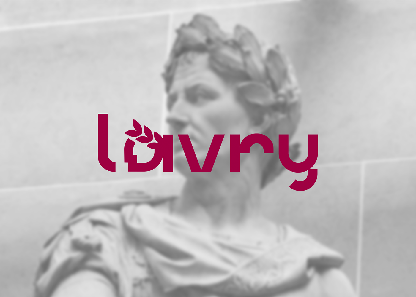
The name of the agency is LAVRY.
Associative series - digital technologies, contextual interactivity, innovation, unification, from simple to complex, triumph, laurel wreath, Roman triumphant.
The viva magenta color was chosen, as it corresponds to the stated life position of the company's professionals.
The lettering logo is drawn based on simple geometric elements, in the style of modern minimalism, the stated idea is added - from simple to complex, so we see the combination of elements in the letters A- 0 as a laurel berry and 1 as a branch (a computer idea of binary code), as well as the face of the triumphant creator, all this is combined into a single the semantic series, which carries an individual name- LAVRY. Mosaic narrative accompanies this business, so it looks organic and whole. And also in the carriers of the style, the word lav is highlighted associatively - love.


