/ THE PROJECT
Green Ratio is a hypothetical smoothies brand that allows you to customize your drink by selecting
the ingredients and their proportions. The store chain is placed in Australia and shaped to its lifestyle, focused on healthy and natural, high quality products. The project has been developed during my Major Project class at Raffles College of Design and Commerce in Sydney.
the ingredients and their proportions. The store chain is placed in Australia and shaped to its lifestyle, focused on healthy and natural, high quality products. The project has been developed during my Major Project class at Raffles College of Design and Commerce in Sydney.
/ NAMING & LOGO
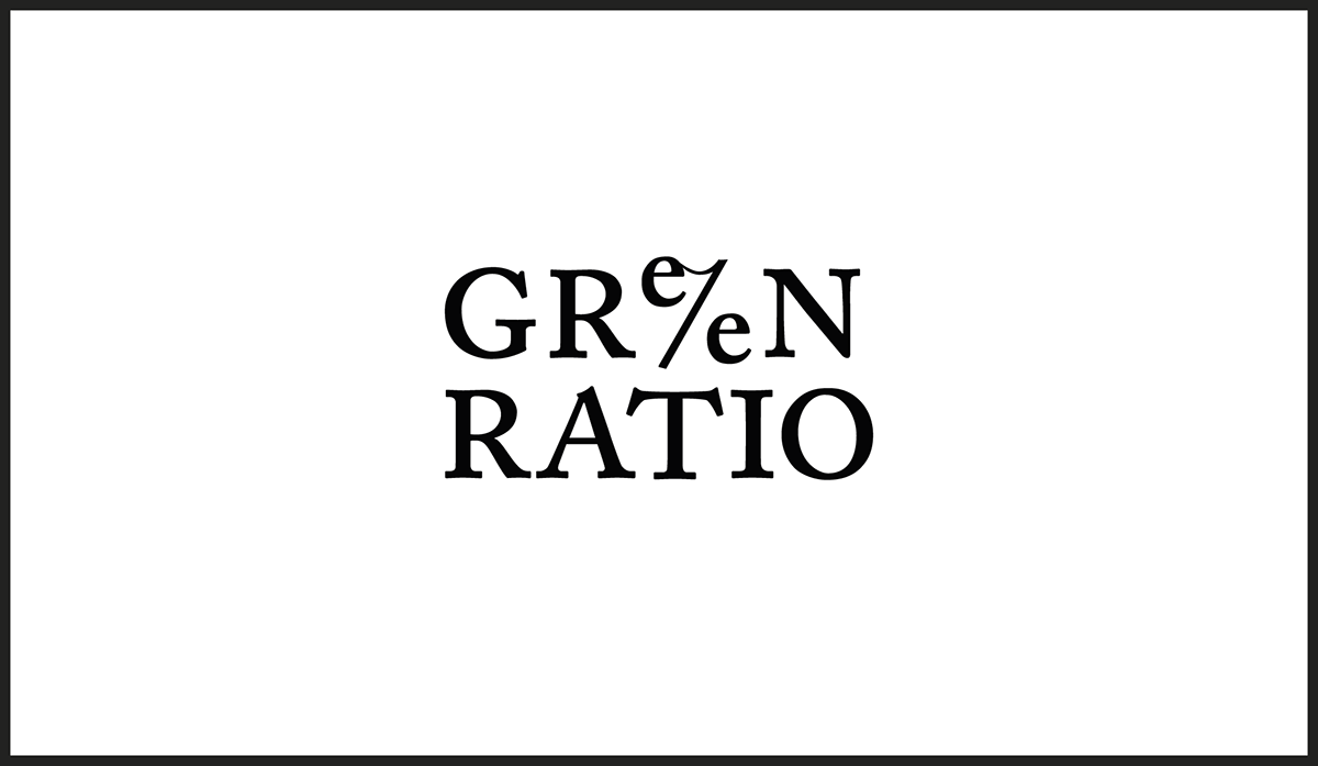
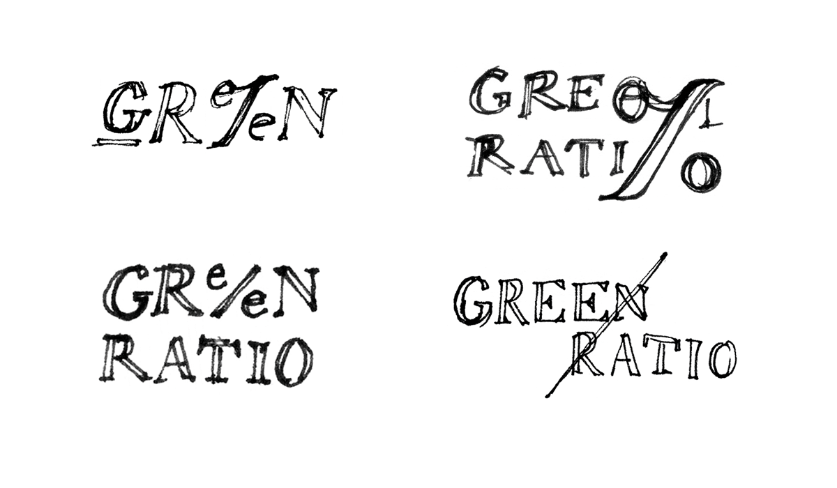
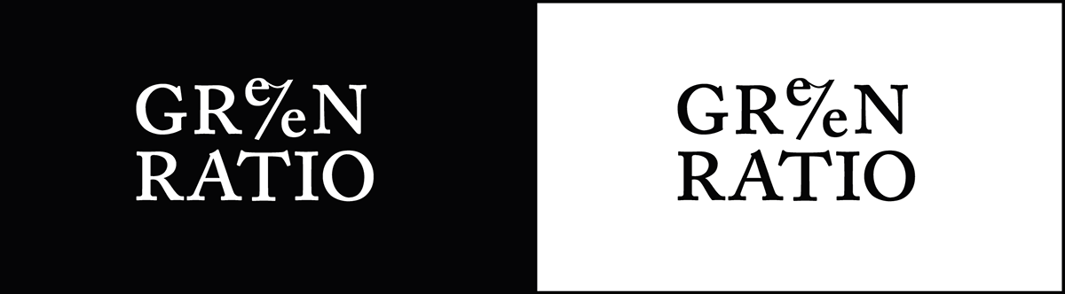
The name “Green Ratio” derives from the golden ratio, which is universally known as the proportion of beauty and harmony. Therefore “Green Ratio” can be read in different levels: it represents the perfection of the product related to the green/natural side, but also suggests the idea of proportion, that is linked to the custom made value of the brand.
The logo idea comes from the percentage symbol, designed to adapt to the name. The wordmark wants to be consistent with the Green Ratio concept in order to reinforce the storytelling of the brand values.
%

/ PACKAGING
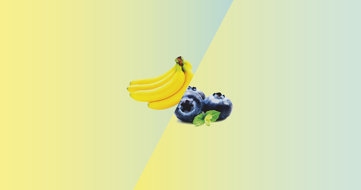
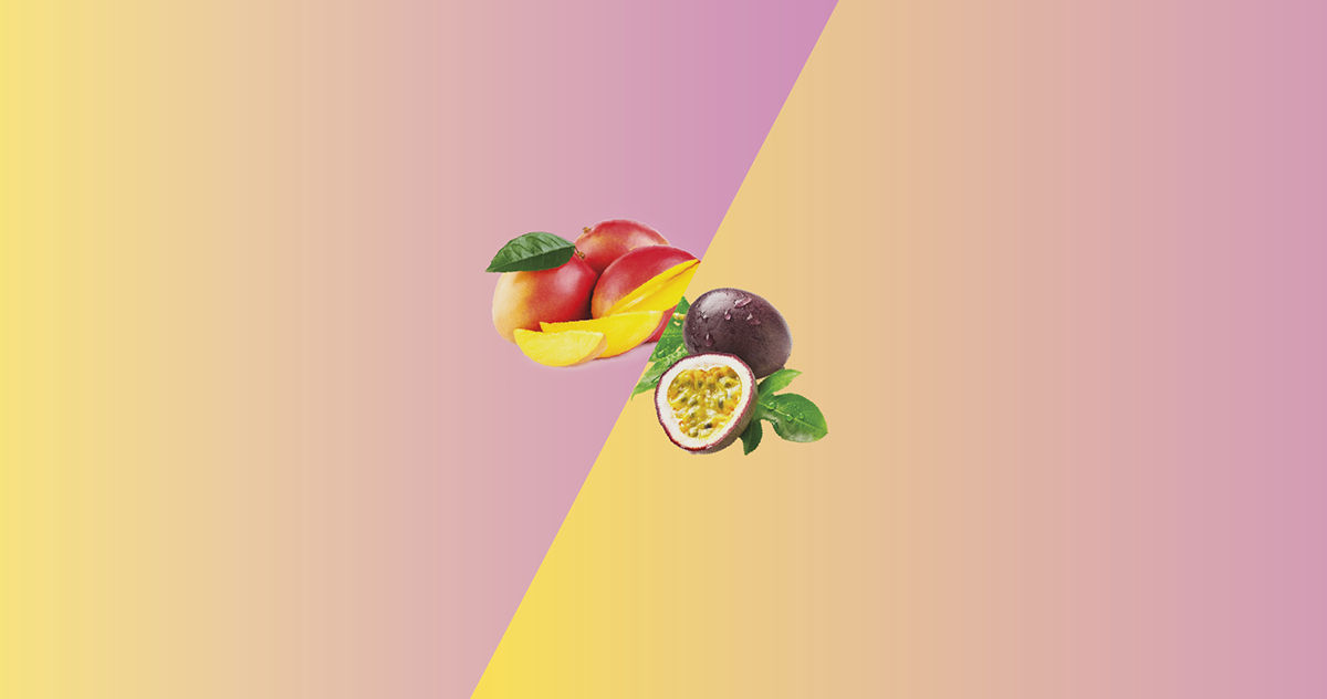
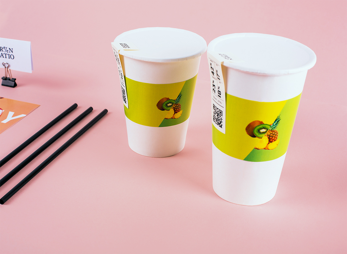
The cup shows the proportion and relation between the ingredients. The percentage symbol is used this time graphically: the label represents the two main ingredients in the smoothie, divided by a gradient that is wrapped around the cup and separates the fruits.


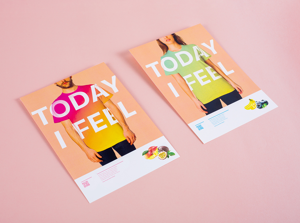
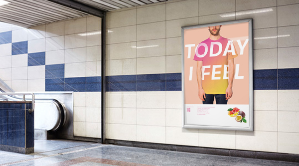
/ ADVERTISING
/SMARTPHONE APP


/ DELIVERABLES


THANK YOU!


