


Supernova a new creative co-operative focused on working on mission-based work based in Halifax, Nova Scotia, Canada.
The collective will eventually have many partners working together across a wide range of disciplines relating primarily to marketing / design / video / events / brand / strategy / communications. Ultimately it’s all about helping people achieve GROWTH.
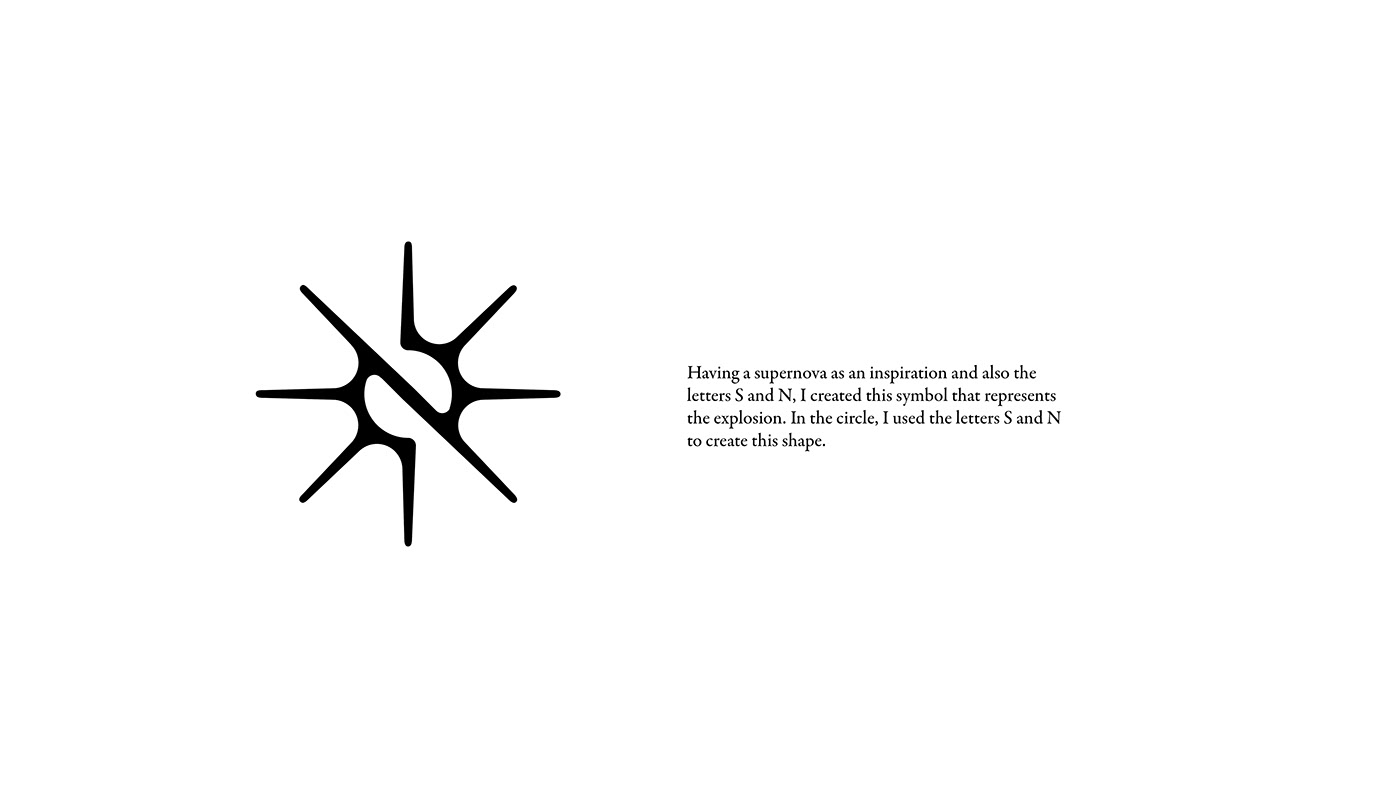
The real meaning of SuperNova is:
A supernova creates an explosion billions of times brighter than our sun, with enough energy to outshine its own galaxy for weeks.
Whose luminosity after eruption suddenly increases many millions of times its normal level. Extremely rare - once a century occurrence.
Whose luminosity after eruption suddenly increases many millions of times its normal level. Extremely rare - once a century occurrence.
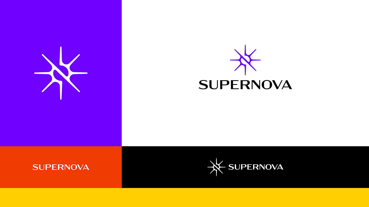
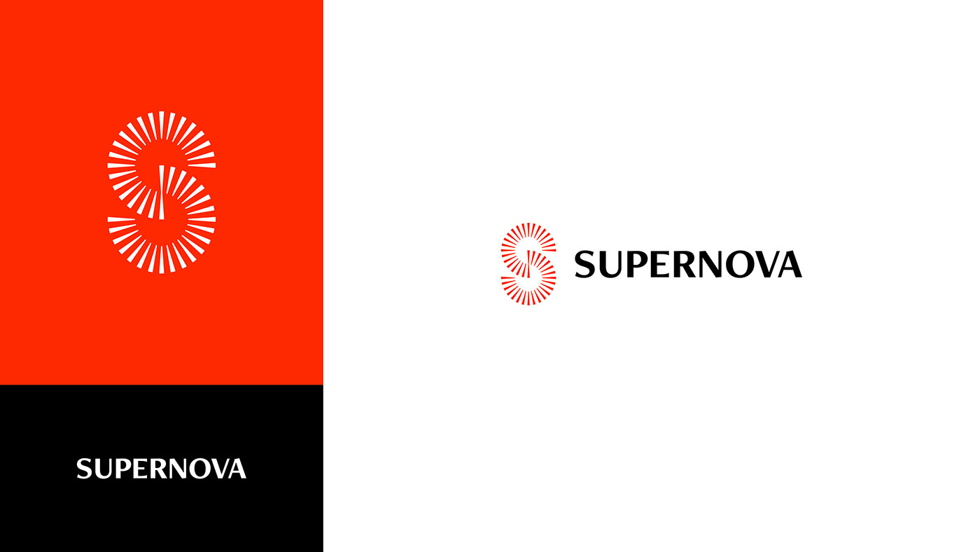
Here are 3 concepts for this brand.
For the typeface, I chose one that will emphasize the concept of expansion and that is bold, modern and with balanced proportions of line thickness.
The visual weight of this typeface is very similar to the symbol.
The visual weight of this typeface is very similar to the symbol.

For the colour scheme, I envisioned a bold selection with high contrast, warm tones and cool tones. Unusual colours.
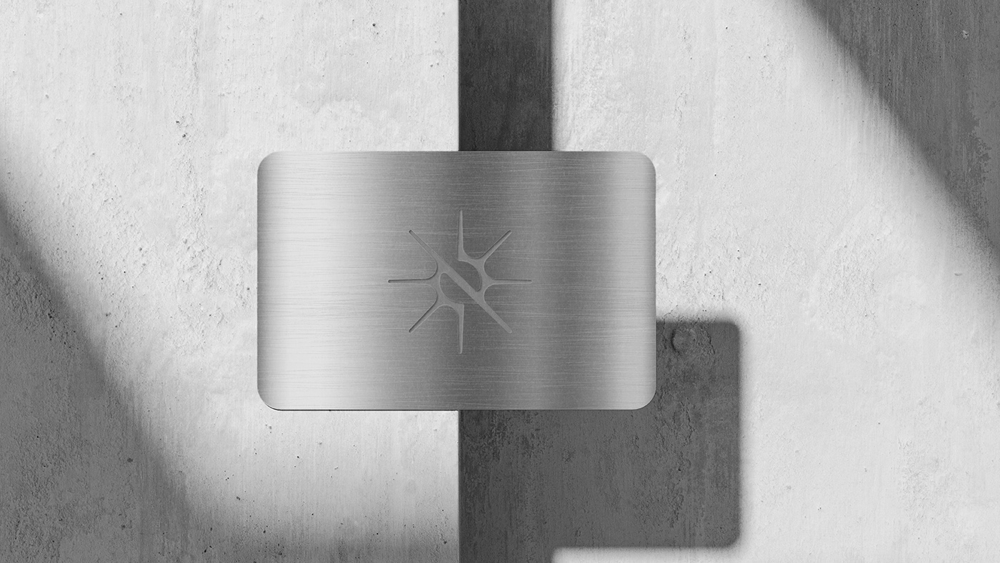
The business card could be made of steel with the logo and all the information carved into it.

I chose a bold typeface with some line contrast to resemble the symbol and give the logo more personality.

For the colour scheme, I chose the a bold bright orange to be the main colour.


For this colour scheme, a vibrant green looks very interesting as a pop of colour, but this identity could also use the logo in the black version to allow more colours to come in.

I thought it would be a good idea to create a transparent business card, it looks new, futuristic and it’s a great match with this brand identity.


