


Marigold is a small-batch ice cream business focusing on quality, locally-sourced ingredients. All the flavors are very unusual and depending on the seasons. The idea for this business came to life due to the abrupt closure of our clients bakery during the quarantine in March 2020. In order to use up left over ingredients from the bakery business, our client decided to turn them into ice cream and was soon surprised how much attention and demand she got from her clients. Especially the unique flavors, like „Marigold“ ended up being the most popular ones. A brand was born.
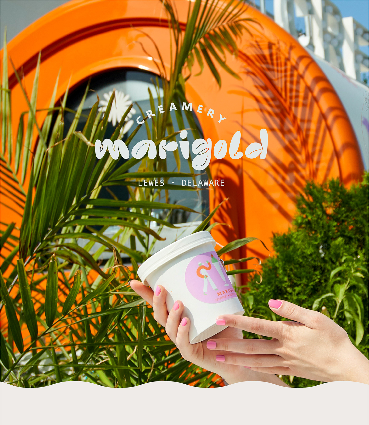
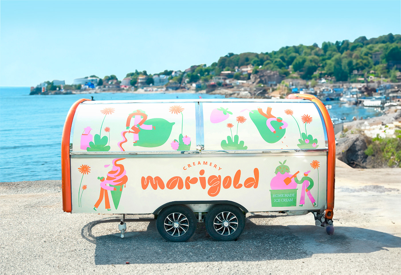
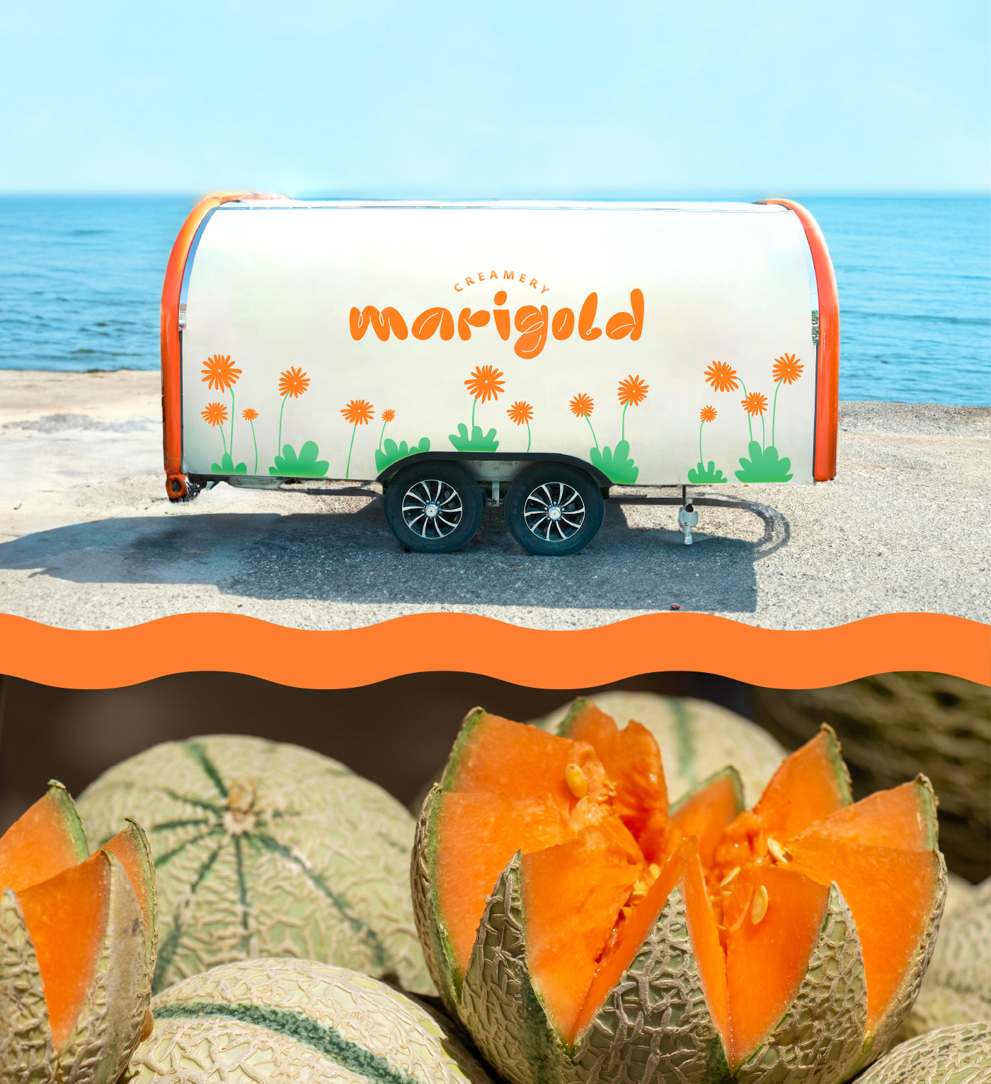
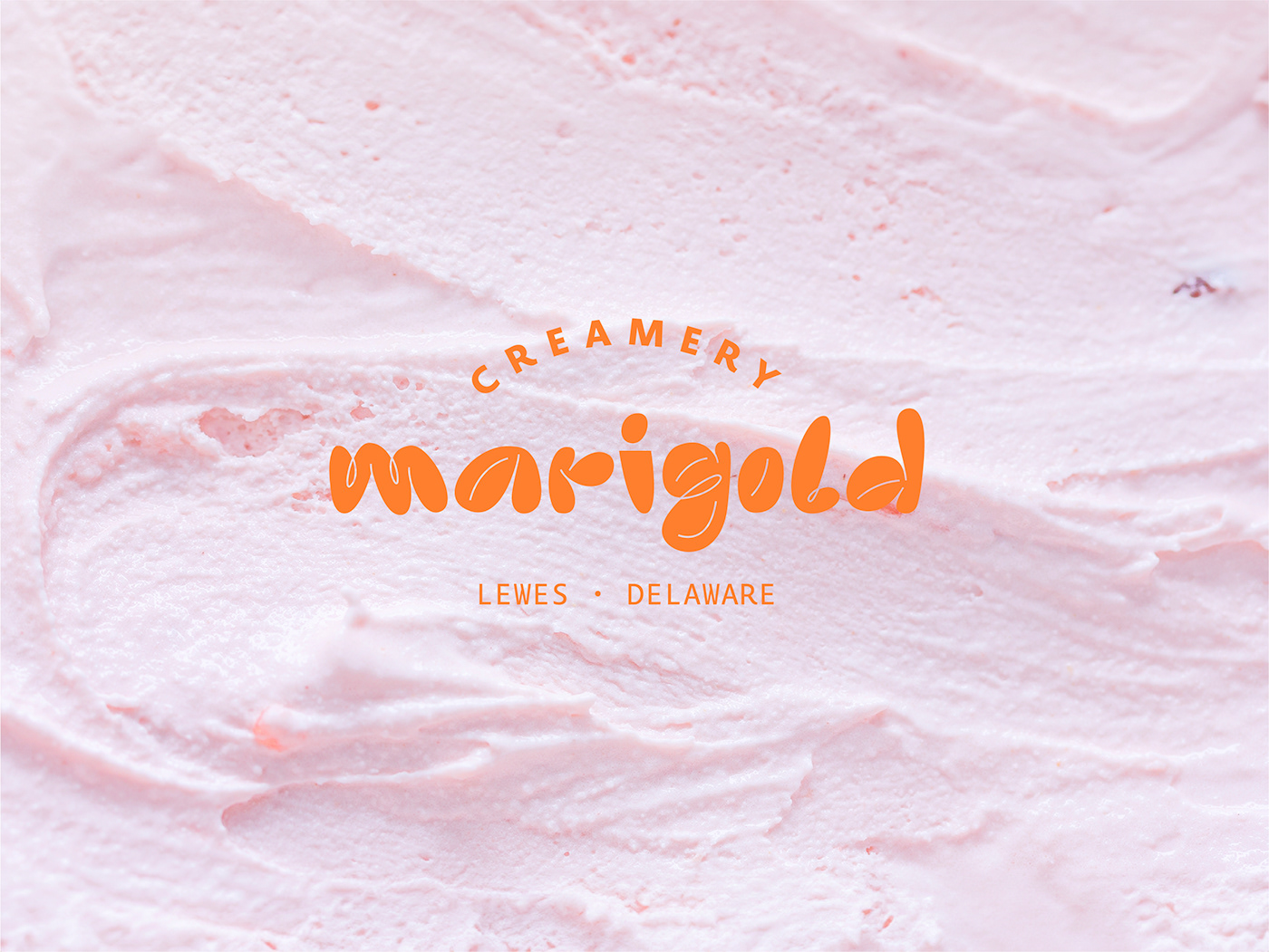
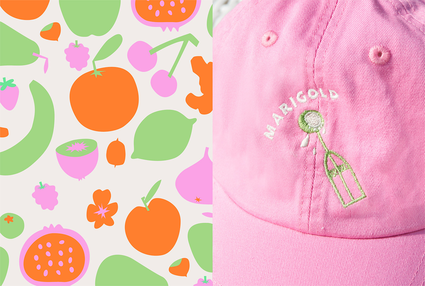
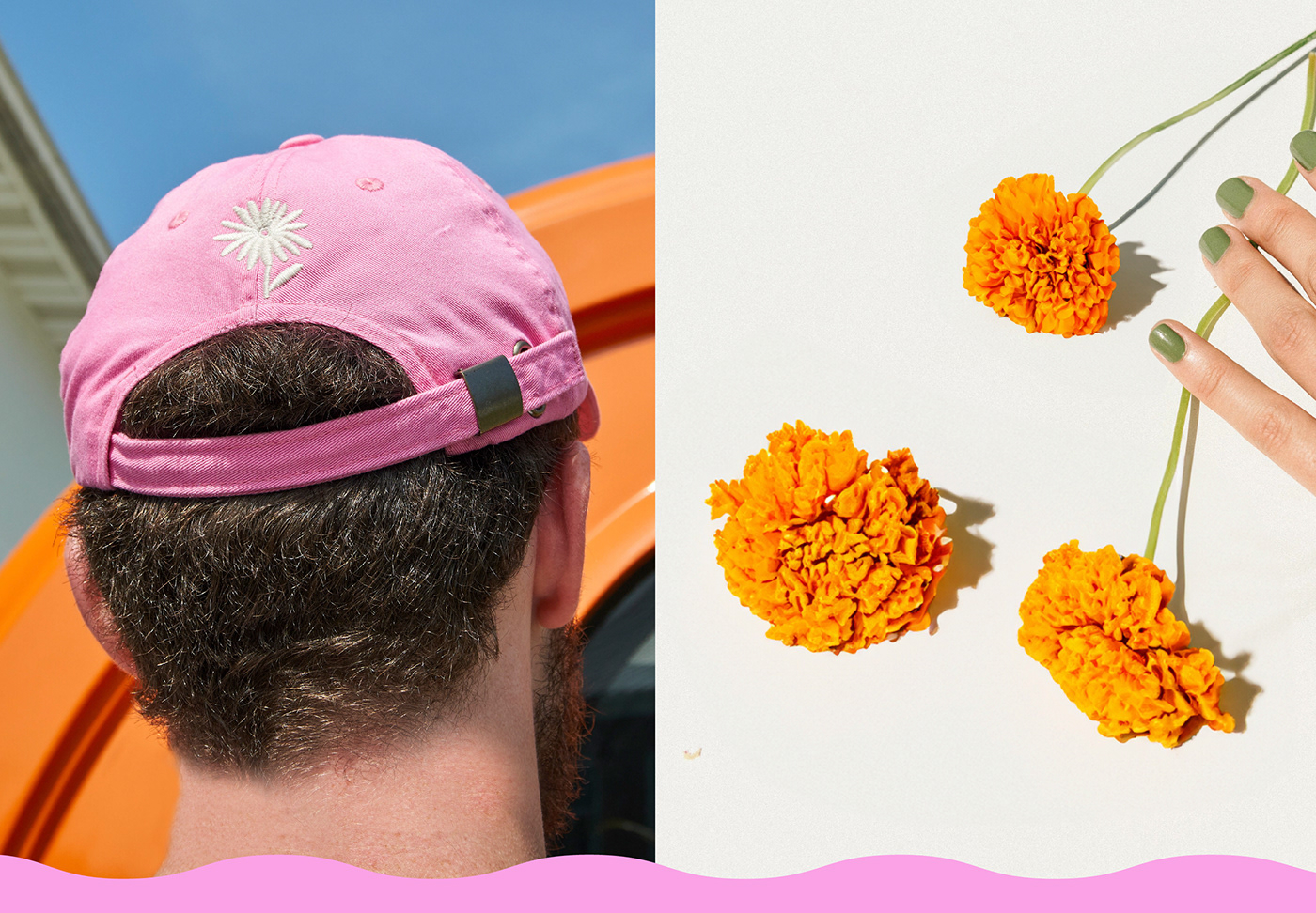
The goal was to create a branding that would uplift people’s mood, be fun, child-friendly but not childish. We came up with a custom logotype that is inspired by the creaminess of the ice cream and bright colors that remind of sorbet flavors. The illustrations show insights in the handmade production process and communicate the joy of eating ice cream. One important point was the use of sustainable packaging materials and versatile application elements, which is why we decided to work with stickers for take home ice cream. The eye catcher of this design is definitely the ice cream truck, which has been built according to our customers needs and which showcases the branding in all its forms.
Client: Marigold Creamery
Branding & Design: Design Studio B.O.B.
Design Team
Art Direction & Design Lead: Alessia Sistori, Lilly Friedeberg
Design Assistance: Léane Beauquis, Ezgi Duman, Irina Madan, Eli Alaimo Di Loro, Emma Kollmorgen
Photos by Thomas Ignatius


