Warren
EN
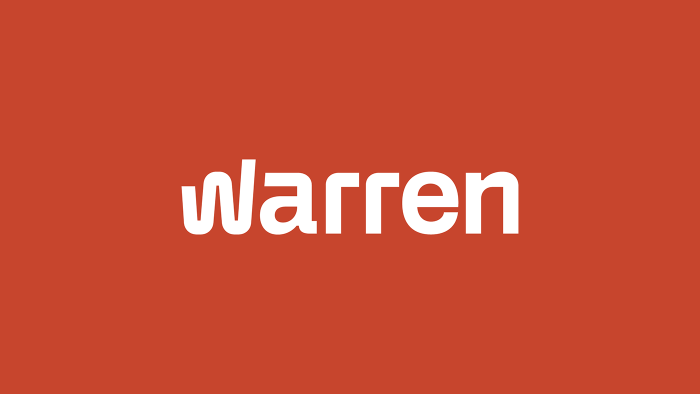
Warren is an investment brokerage and wealth management company that provides access to investments with transparency. Launched in 2017, the company underwent a brand repositioning, embodying the idea that investing should be something natural into its communication. This was the starting point for the construction of a new visual universe for Warren, which embodies the new phase of the business.
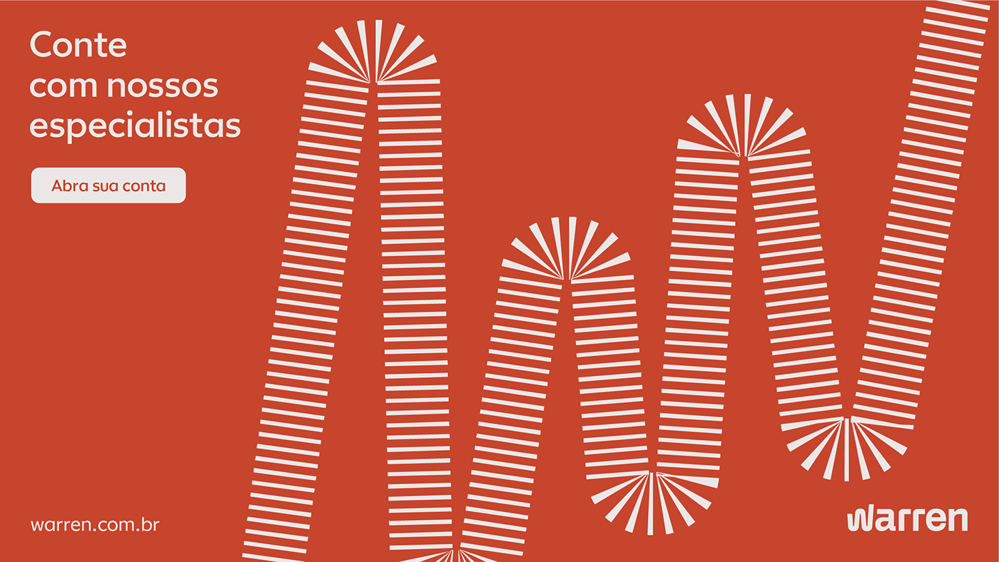
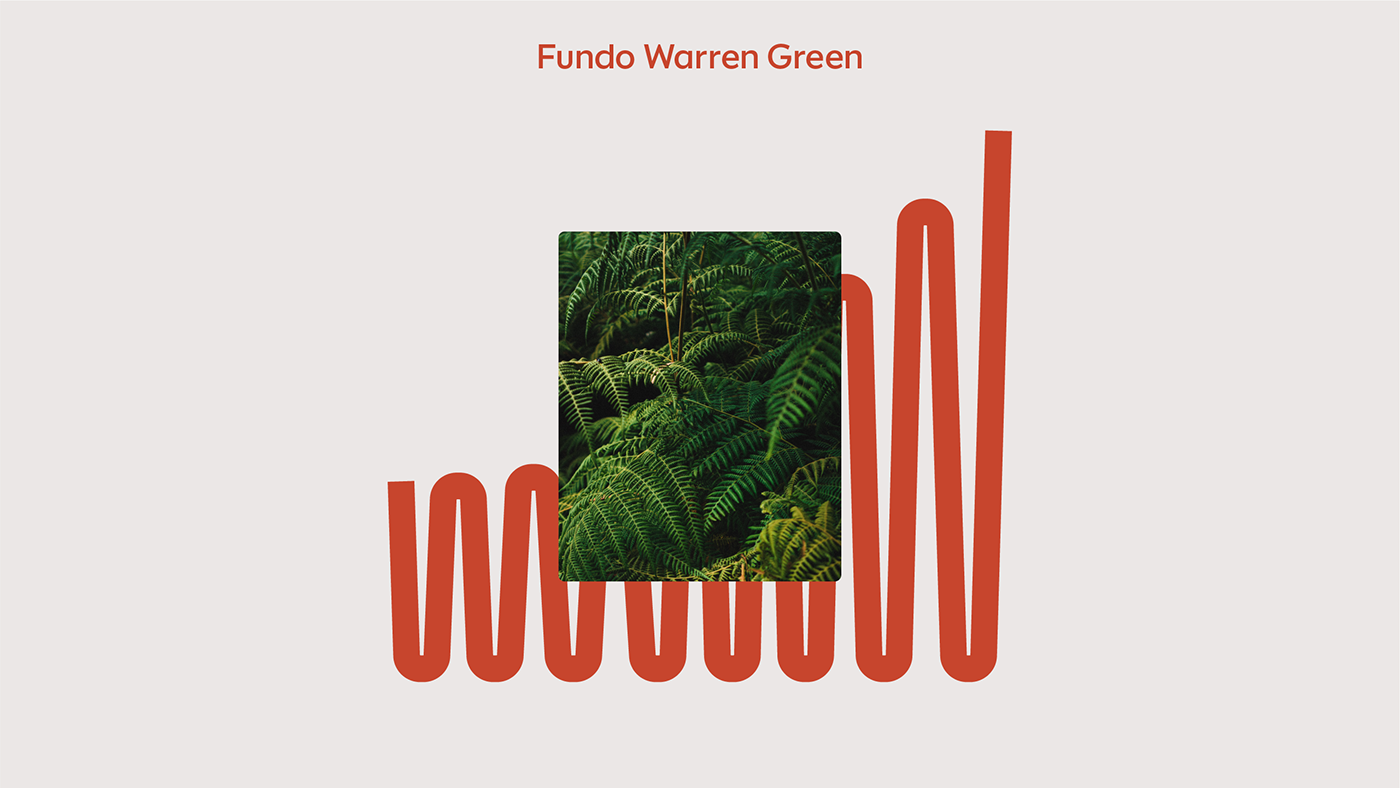
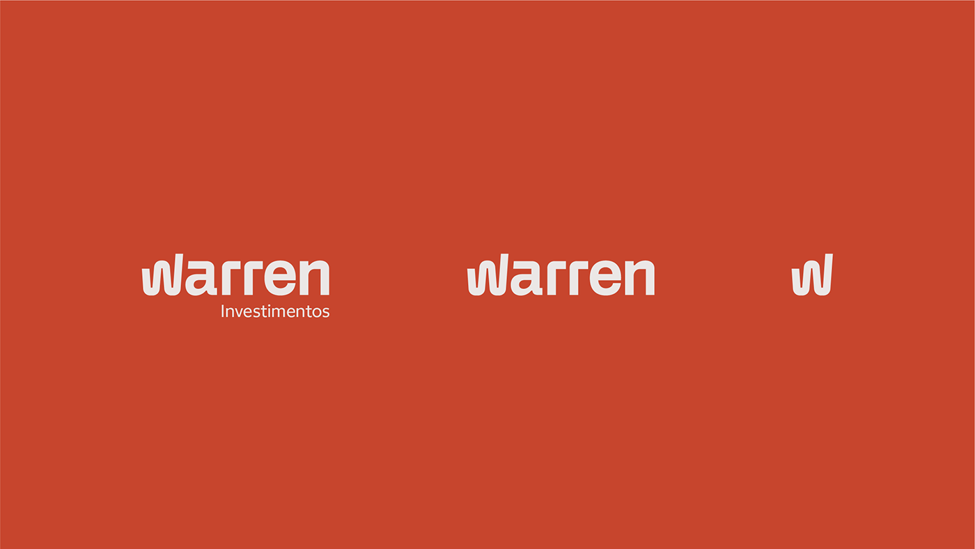
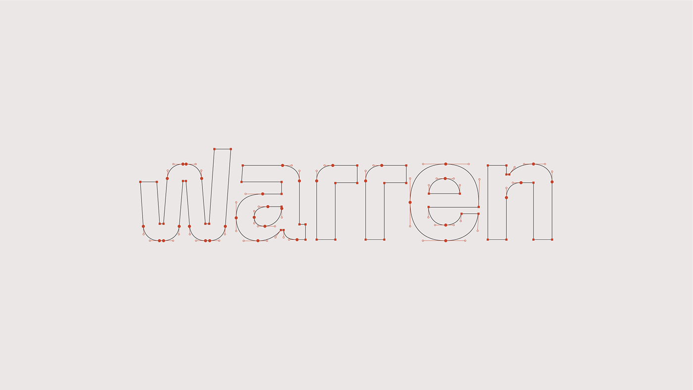
A new logo was designed, aiming to convey characteristics such as solidity and seriousness more clearly. Typographic choices, such as the double-storey "a" and the rounded 90-degree corner finishes, also contribute to the logo's maturity. The symbol, in turn, refers to the idea that investments are a journey, and at Warren, this journey is facilitated and focused on performance. The symbol also gave rise to a system of graphics that derives from the structure of the letter "W" to support information and bring more personality to the company's communications. Highly flexible, these graphics coexist with the brand's photographic language, being able to interact with depicted objects or serve as frames for images.
POLAR TEAM
Creative Direction: Bruno Ribeiro, Ronaldo Arthur Vidal
Design: Ralph Mayer, Ronaldo Arthur Vidal, Satsuki Arakaki
Motion design: Ronaldo Arthur Vidal, Rônatan Bica
Logo Design: Ronaldo Arthur Vidal, Satsuki Arakaki
Design: Ralph Mayer, Ronaldo Arthur Vidal, Satsuki Arakaki
Motion design: Ronaldo Arthur Vidal, Rônatan Bica
Logo Design: Ronaldo Arthur Vidal, Satsuki Arakaki
WARREN TEAM
Alexandre Fontes, Fabio Safini, Lilian Faria, Rodrigo Grundig, Tito Gusmão
TYPEFACE
Warren Display & Text (Plau)
PT
A Warren é uma corretora de investimentos e gestora de patrimônio que proporciona acesso a investimentos de forma transparente. Lançada em 2017, a empresa passou por um reposicionamento de marca, incorporando em sua comunicação a ideia de que investir deve ser algo natural. Este foi o ponto de partida para a construção de um novo universo visual para a Warren, que materializa a nova fase do negócio.
Um novo logotipo foi desenhado, buscando transmitir com mais clareza características como solidez e seriedade. As escolhas tipográficas como a letra “a” de dois andares e os acabamentos de canto 90º arredondado também constroem o amadurecimento do logo. O símbolo, por sua vez, remete à ideia de que os investimentos são uma jornada, e que na Warren essa jornada é facilitada e voltada para performance. O símbolo também deu origem a um sistema de grafismos que parte da estrutura da letra “W” para dar suporte às informações e trazer mais personalidade nas comunicações da empresa. Extremamente flexíveis, os grafismos dialogam com a linguagem fotográfica da marca, podendo interagir com os objetos retratados ou funcionar como moldura para as imagens.