In today's world of product design and development, consistency and efficiency are indispensable. To achieve this, many organizations have aimed to create a "Design System" – a systematically organized collection of design principles, standards and elements, to provide a common language. Unified design language for both development and design teams. Design System not only helps ensure consistency in products but also increases work efficiency through reuse of pre-defined components. This allows teams to focus on solving larger design challenges, rather than having to build from scratch. With the goal of helping you better understand the benefits and process of developing a Design System, this article will provide an overview and insight into the steps to design and implement this system.
Color Tokens Documentation
When developing a Design System, choosing a color system is one of the first and most important steps. Color not only affects the aesthetics of the product but also plays an important role in conveying the brand message. Color systems typically include:
Color System
Primary and Secondary colors: These colors are often used to define branding and are the main colors in design. The Primary color is the main color that represents the brand, while the Secondary color supports and creates the necessary contrast.
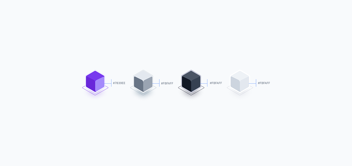
Accents Color: These colors are used to highlight important parts of the interface, for example error, information, success or warning colors. Commonly used colors include red, blue, green, and yellow.
Color Tokens
• Primitives: These are the basic colors from which all other colors are created. Includes constant colors such as black, white, and various shades of gray.
• Semantic Tokens: These colors are determined based on function rather than appearance. These may include colors for success (usually green), warnings (yellow or orange), and errors (red). Semantic tokens help express the meaning and intended use of components.
• UI Elements: Apply tokens to interface elements such as buttons, search bars, and menus. Each element will have different states such as normal, hover, pressed, and disabled, each using different color variations.
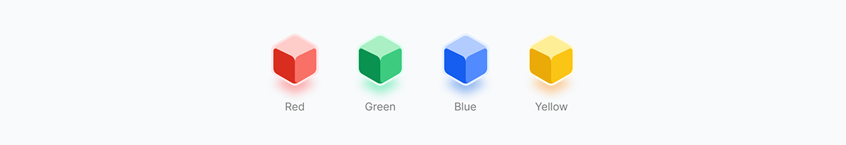
How the color system works
Color tokens are assigned to semantic tokens, that are then assigned to UI elements. With your semantic tokens now assigned to all of our UI elements, you can update them and see the changes you make propegate throughout the entire system.
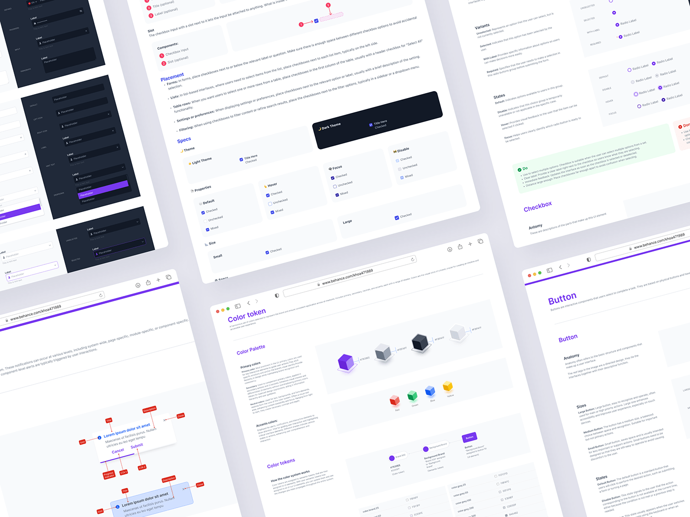
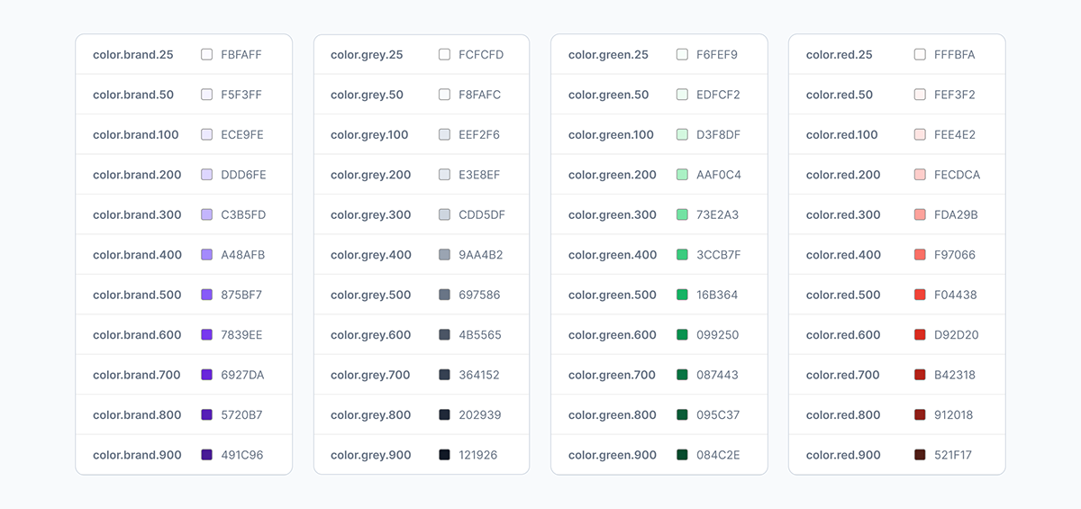
Primitives
The color palette for primitives includes the most basic colors used to build other colors. For example:
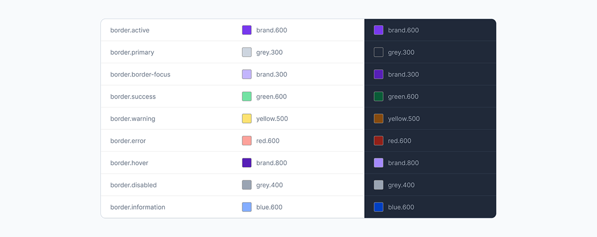
Semantic
Semantic tokens will reflect their function and meaning. This color palette also includes the number of colors for light mode and dark mode.
Here is an example:

Typography
Next I created a Typography system:
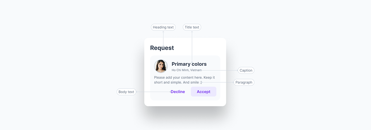
• Heading: The main title is usually the largest, used to attract attention and identify the topic of the content or section.
• Title: The name of a specific section or content, helping users identify and distinguish different sections.
• Body: Main text, containing detailed information, used in paragraphs and main content.
• Paragraph: A paragraph of text, the basic element of content, containing one or more sentences related to a main idea.
• Caption: A caption for an image or graphic, providing descriptive or explanatory information.
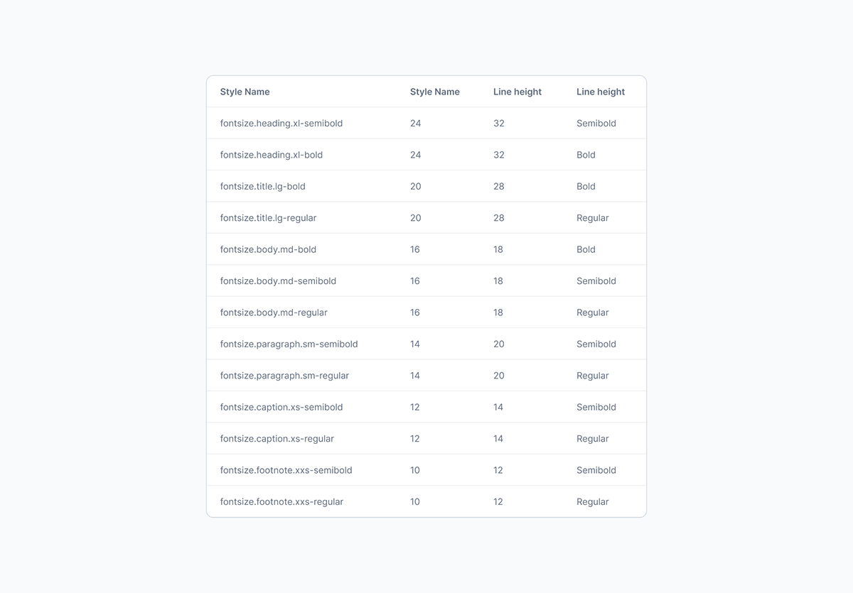
Then I set up a typography token system
Size, Spacing, Borders Shadow
Applying the same method, I will also create a token table for Size, Spacing, Border & shadow


Basic Components
I take for example a specific component called Button.
Anatomy
When designing a button in a Design System, the first thing is to analyze its anatomy. Anatomy of button includes:
• Label: Text displayed on the button, indicating the function of that button.
• Container: The outer frame of the button, usually shaped by border and background.
• Padding: The distance between text and the edges of the button, important to ensure readability and aesthetics.
• Icons (if any): Icons can be added to increase visualization or emphasize the function of the button.
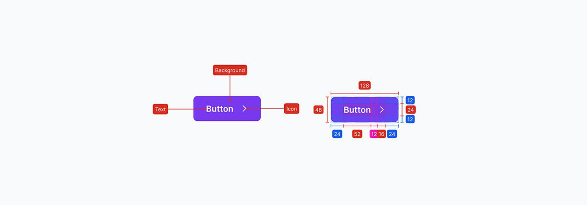
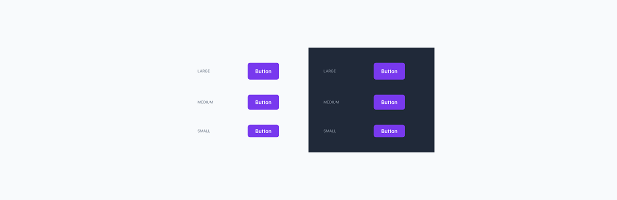
Size
The size of the button depends on its importance and desired level of interaction. Standard sizes often include:
• Small: For less important actions or when space is limited.
• Medium: Default size, suitable for most situations.
• Large: Used for buttons that need to attract more attention, like main calls-to-action.
• Medium: Default size, suitable for most situations.
• Large: Used for buttons that need to attract more attention, like main calls-to-action.
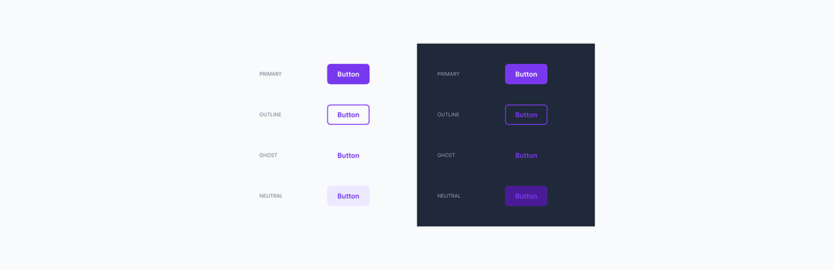
Variants
Button variants allow adaptation to different usage contexts in the interface:
• Primary: Used for main actions or high priorities, often with prominent colors.
• Outline: Button has a transparent border and background, used when you want the button to be less prominent than the primary.
• Ghost: No clear background or border, usually just text or icons, used in interfaces that need minimalism.
• Neutral: Neutral colors, often used for secondary or not so important actions.
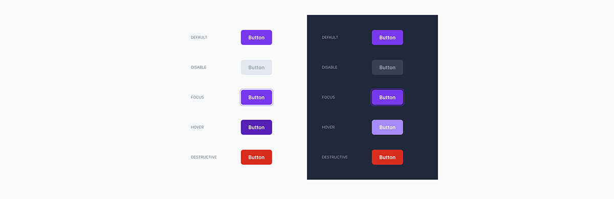
States
Buttons in the user interface must handle different states in response to user interaction:
• Normal: Default state when there is no interaction.
• Hover: When the mouse pointer moves over the button.
• Disabled: When the button is not available for interaction.
• Focus: When the button is in focus, usually indicated using the keyboard.
• Normal: Default state when there is no interaction.
• Hover: When the mouse pointer moves over the button.
• Disabled: When the button is not available for interaction.
• Focus: When the button is in focus, usually indicated using the keyboard.
• Destructive: When the button is a warning to users, asking them to think carefully before taking that action.
Types
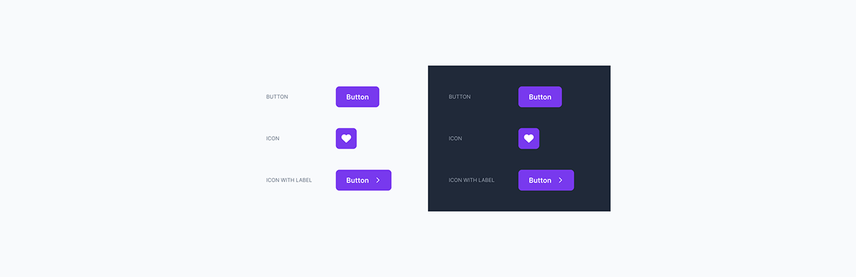
Classify buttons based on the content displayed on the button, helping to increase design flexibility:
• Text only: Only displays text, used for buttons with clear and simple functions.
• Icon only: Only has an icon, often used when space is limited or the function is familiar to the user.
• Label Icon: Combines both text and icon, increasing visualization and explaining the function of the button more clearly.
• Icon only: Only has an icon, often used when space is limited or the function is familiar to the user.
• Label Icon: Combines both text and icon, increasing visualization and explaining the function of the button more clearly.
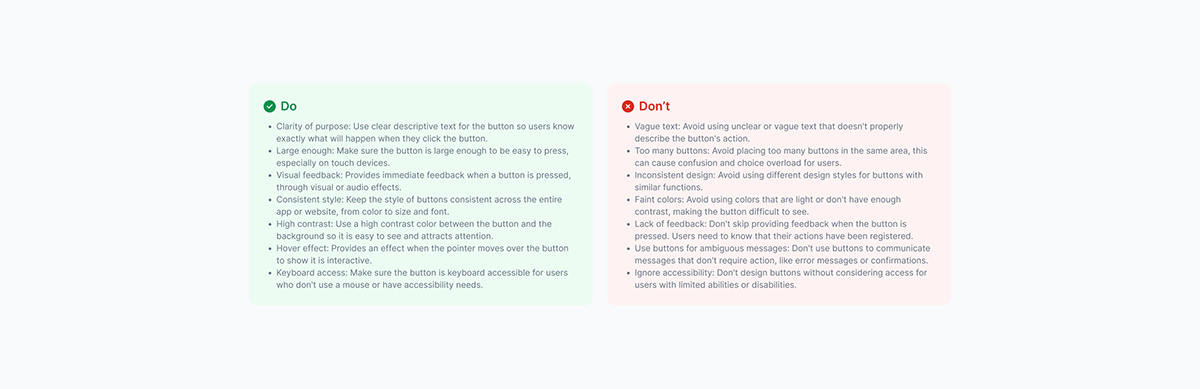
Do & Don't
Finally, I add cases where it should and should not be used
Samples
Below are some of the sample layouts:


Conclusion
In this article, I have briefly presented how I design a Design System, based on the experiences and methods I have accumulated during my work. This is not a rigid or standard process but a flexible approach that I came up with, suitable to the specific context and requirements of each project. While this approach can be effective for small to mid-sized projects that require agility and dynamism, for larger, more complex projects it may need to be adjusted and fine-tuned. more thoroughly.
My goal was to create a design system that not only ensured consistency and ease of use, but could also be easily expanded and adapted to product changes. Through this article, I have tried to give some specific examples from the products I have designed, to help people better visualize the process and specific steps in developing a Design. System. Hopefully, these shares will be useful to anyone I'm learning and want to apply this design method to my work.

