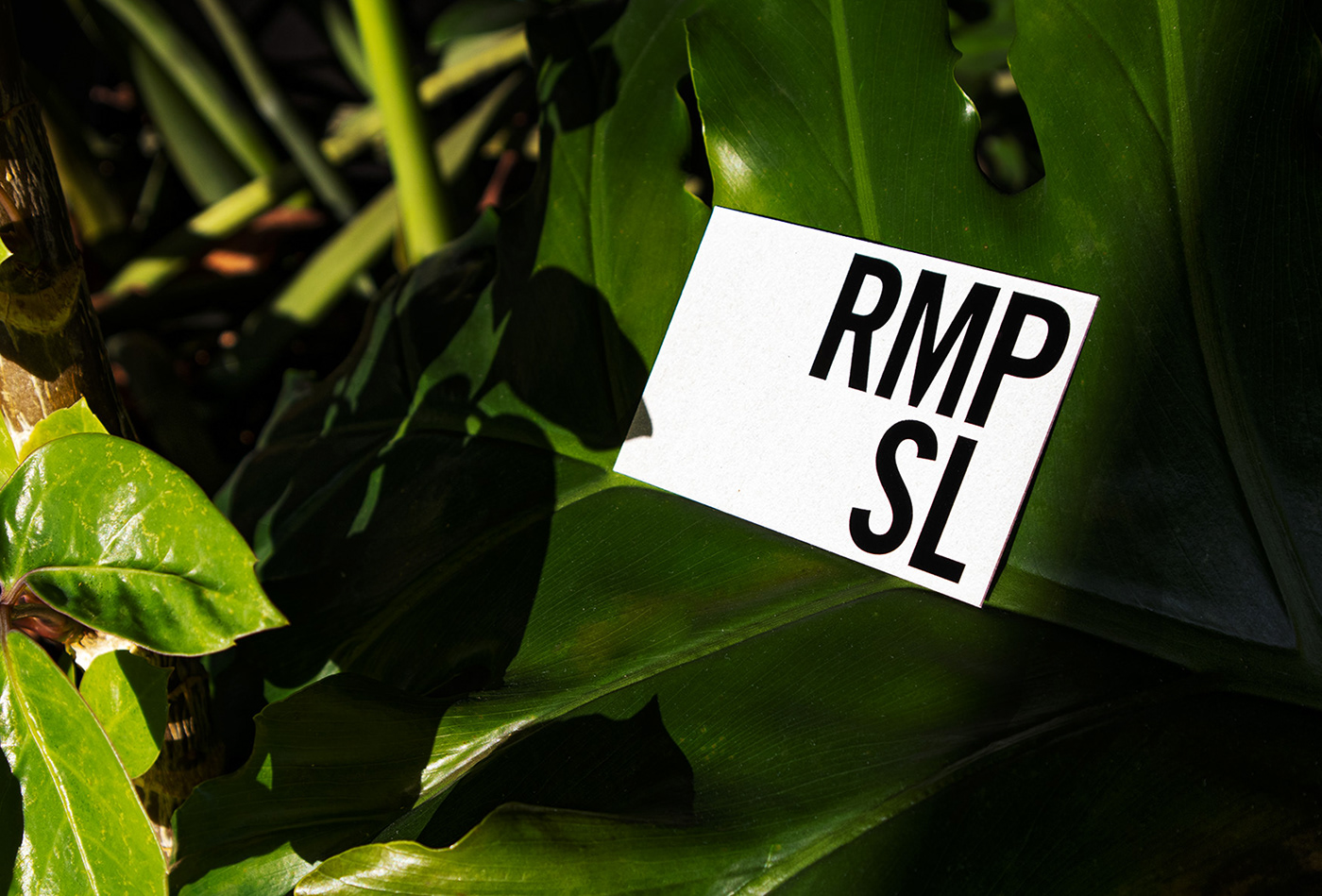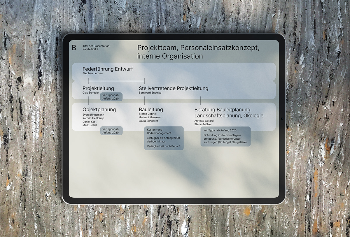

The new corporate design for landscape architects RMPSL presents itself as a straightforward wordmark applied to a new colour system with a focus on coherent typographic design. The design conveys order and simplicity while embodying a modern and dynamic aesthetic. The graphic system is complemented by a subtle colour palette inspired by nature and the environment. The clear and accessible design creates a calm but clear presentation stage for the diverse services and content that RMPSL communicates.
The new corporate design preserves the firm’s design tradition, but at the same time represents a change for the future. A word mark / branding is charged with the most diverse associations. The newly created animated wordmark plays with this fact and takes it further: the logo (or RMPSL) is more than just the abbreviation of the founders’ names, but reflects a variety of values, principles, messages, etc. and thus answers the question: “What does RMPSL actually stand for?”.


