REBRANDING GANG
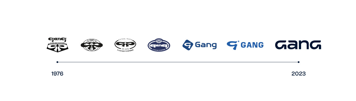
A Gang é uma das lojas mais queridas pelo público jovem do Rio Grande do Sul, que desde 1976 fez parte do imaginário de várias gerações. Para esse projeto de rebranding, a Gang estava decidida a fazer uma grande mudança de imagem e percepção da marca, ampliando o público-alvo para atingir além de adolescentes, jovens de todas as idades, com foco no público de 18 a 30 anos. Para isso a empresa sentiu necessidade de se desvencilhar do arquétipo do rebelde, e investir no seu DNA de marca de jeans e básicos pra pessoas criativas se expressarem.
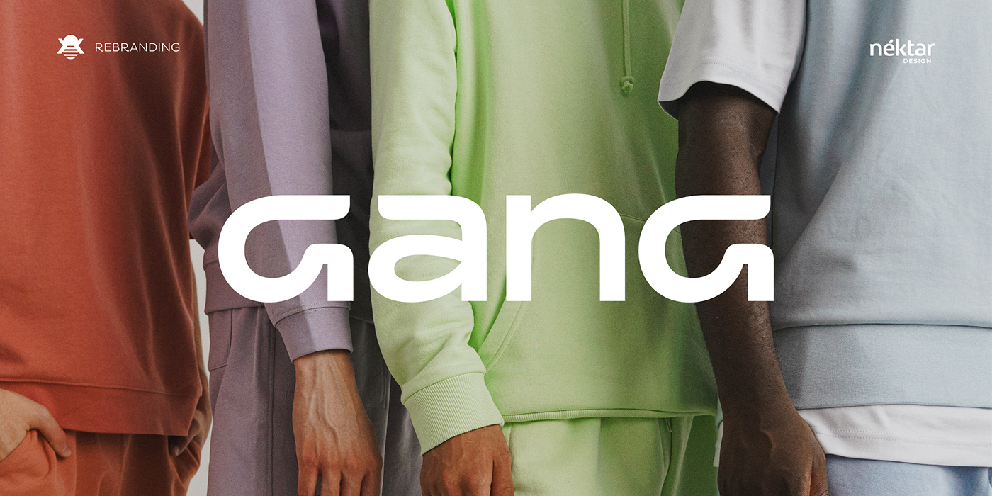
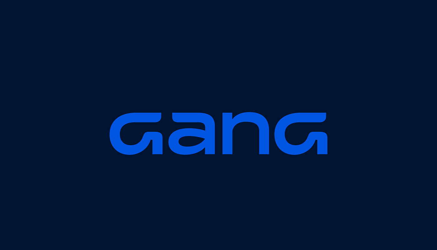
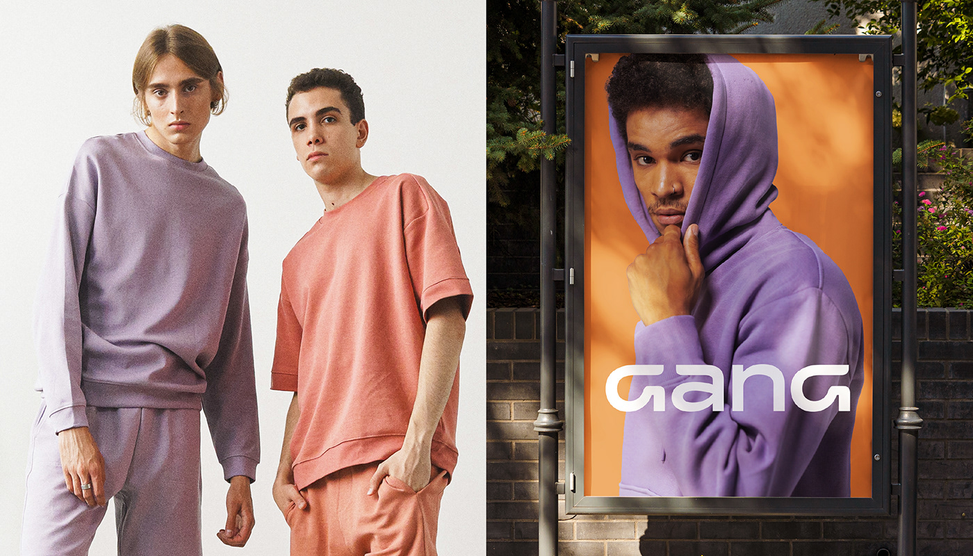
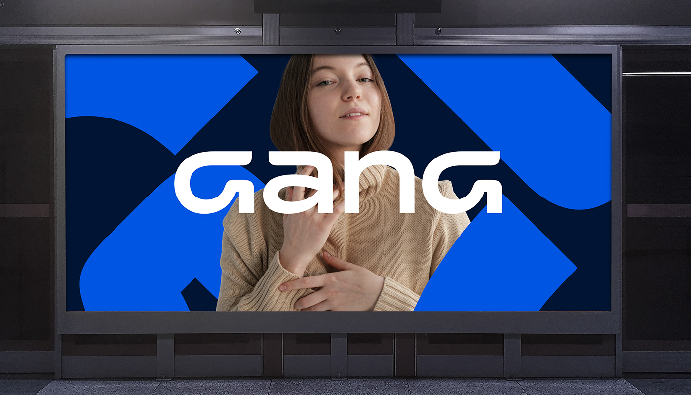
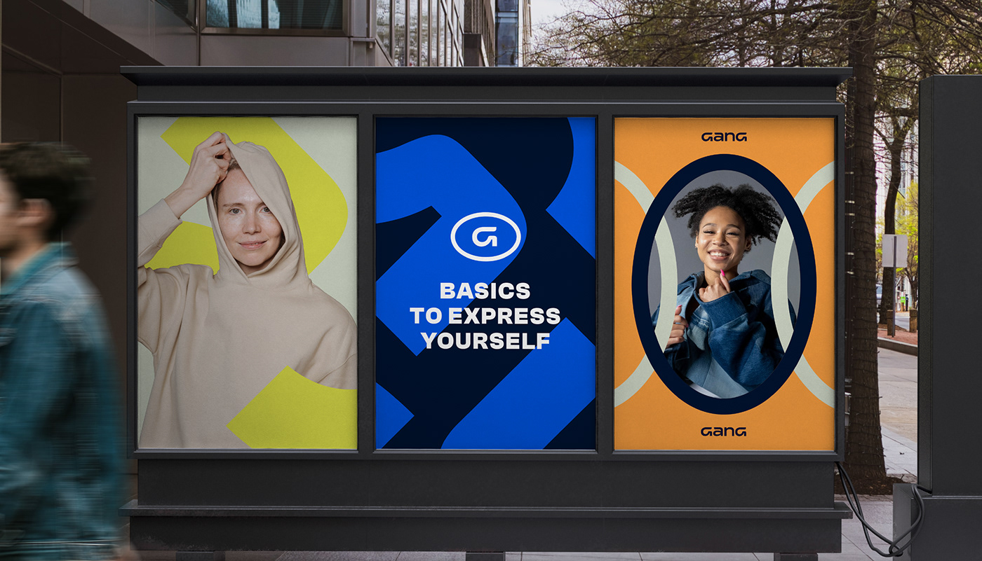
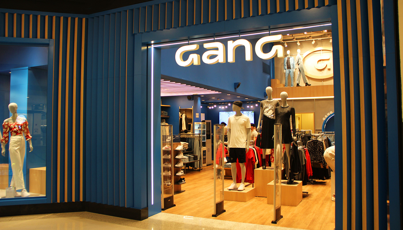
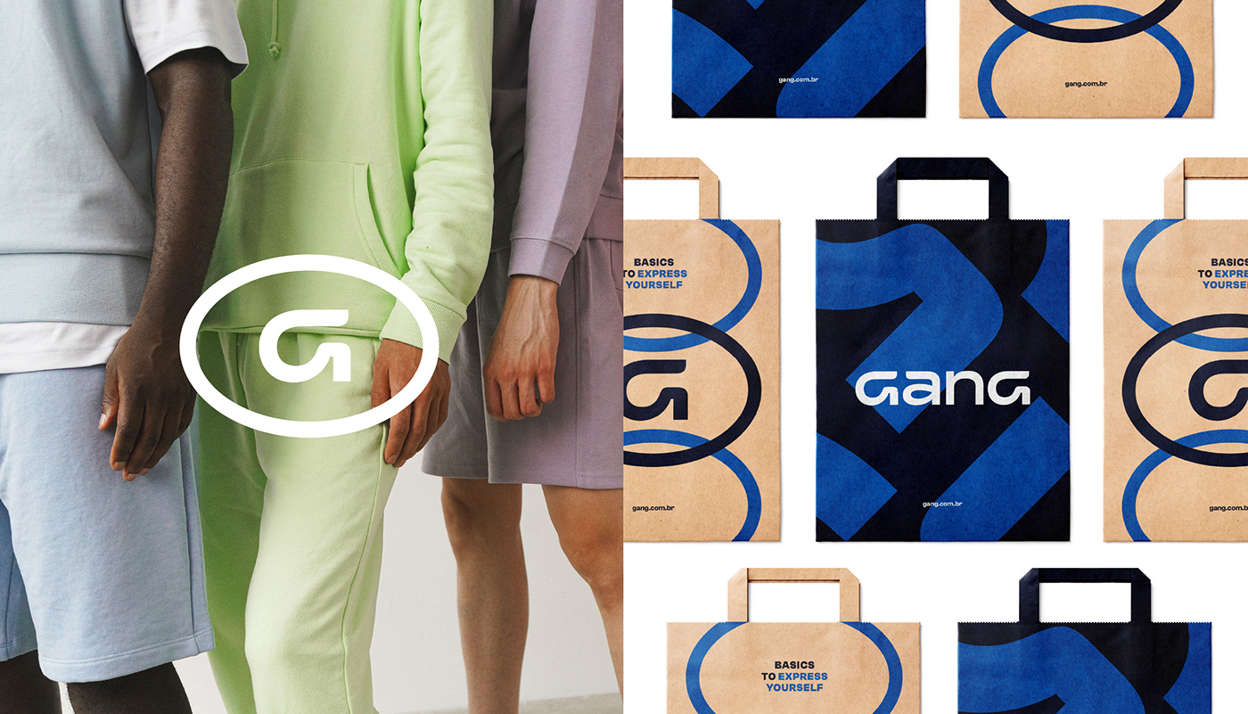
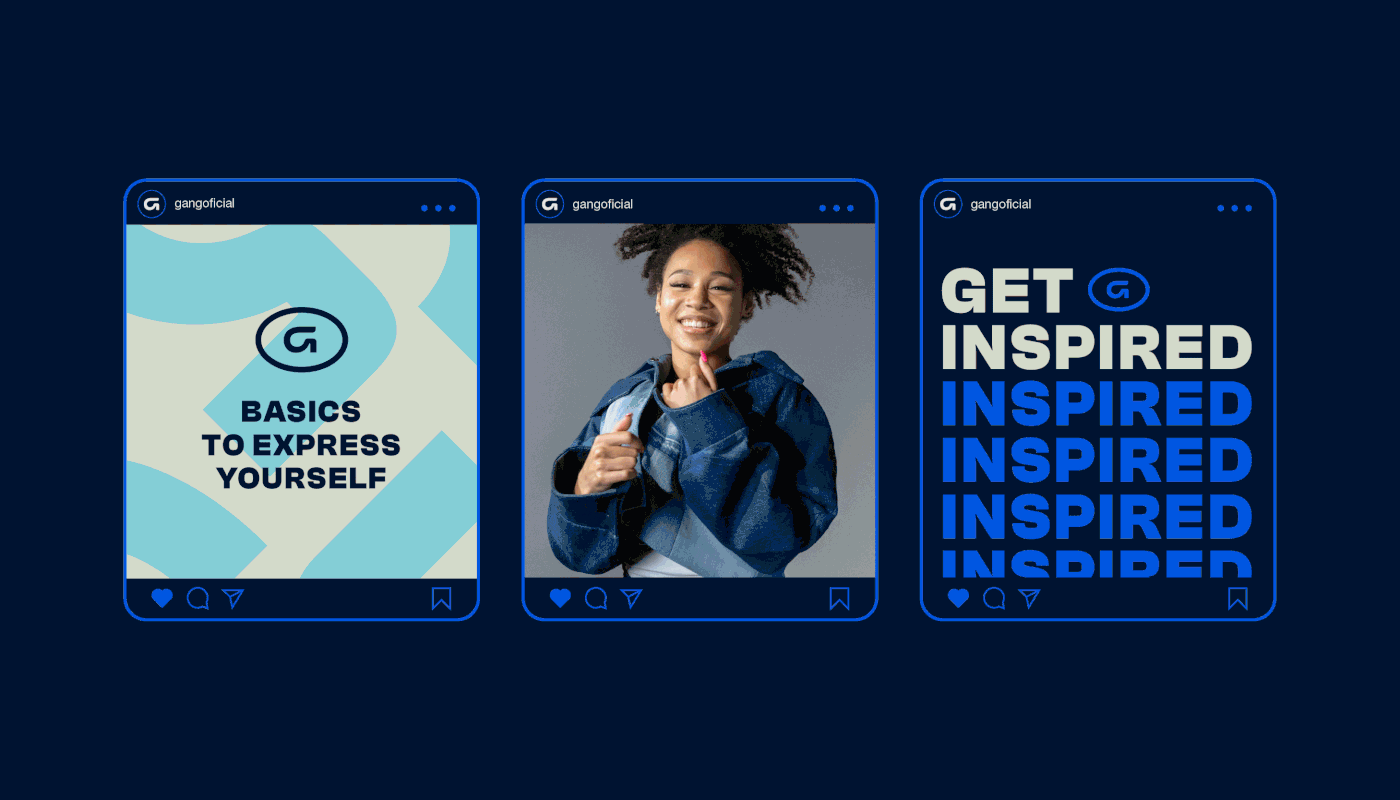
Pra representar essa nova fase da Gang, mergulhamos na história visual da marca, reconhecendo desenhos, estilos e posicionamento de comunicação, explorando possibilidades de como o desenho da identidade poderia evoluir reforçando o DNA básico da Gang. Definimos que o G, elemento sempre tão marcante na identidade, passaria a fazer parte do lettering, tornando a marca uma coisa só, símbolo e lettering na mesma composição mantendo a personalidade arrojada mas trazendo um refresh clean pra marca, tornando-a mais conectada com o universo da moda e das tendências.
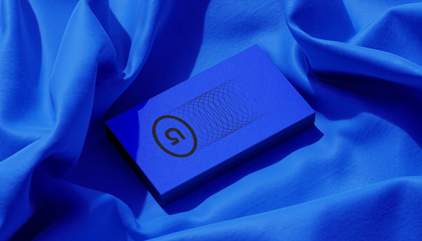
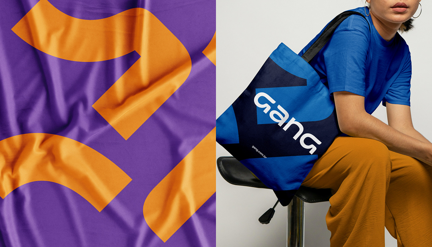
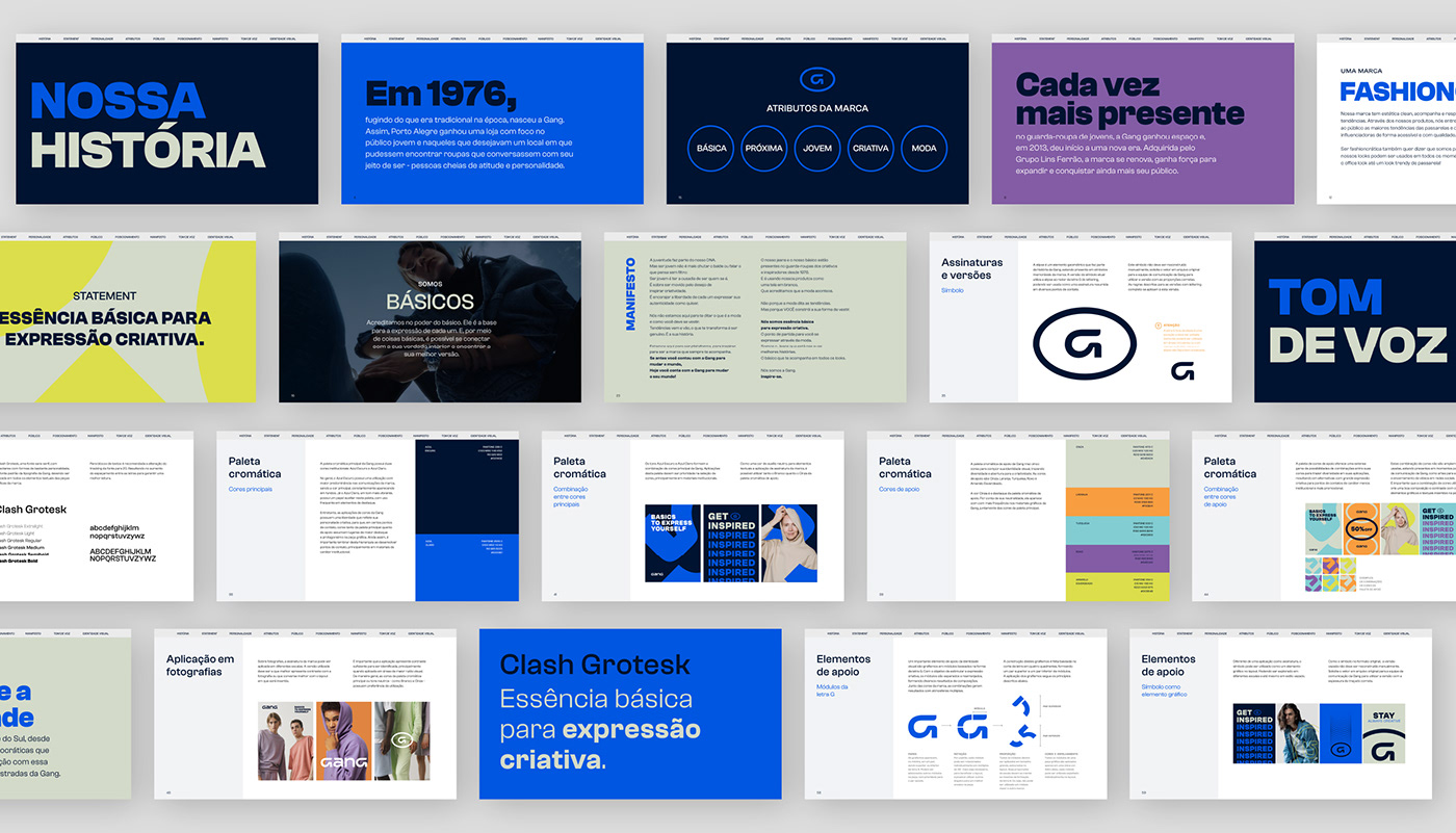
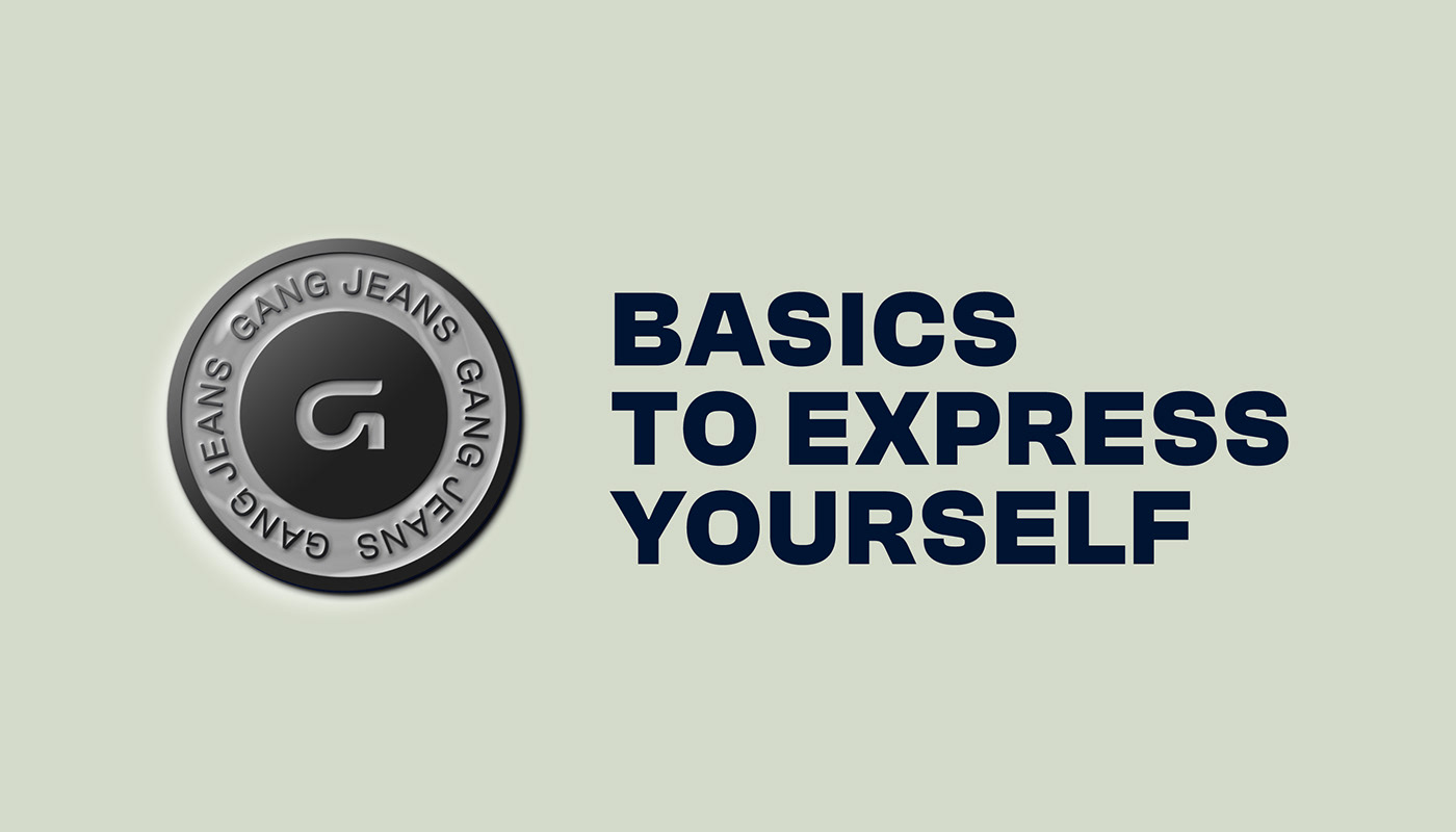
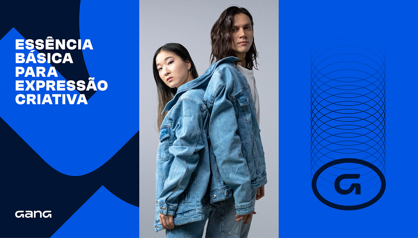
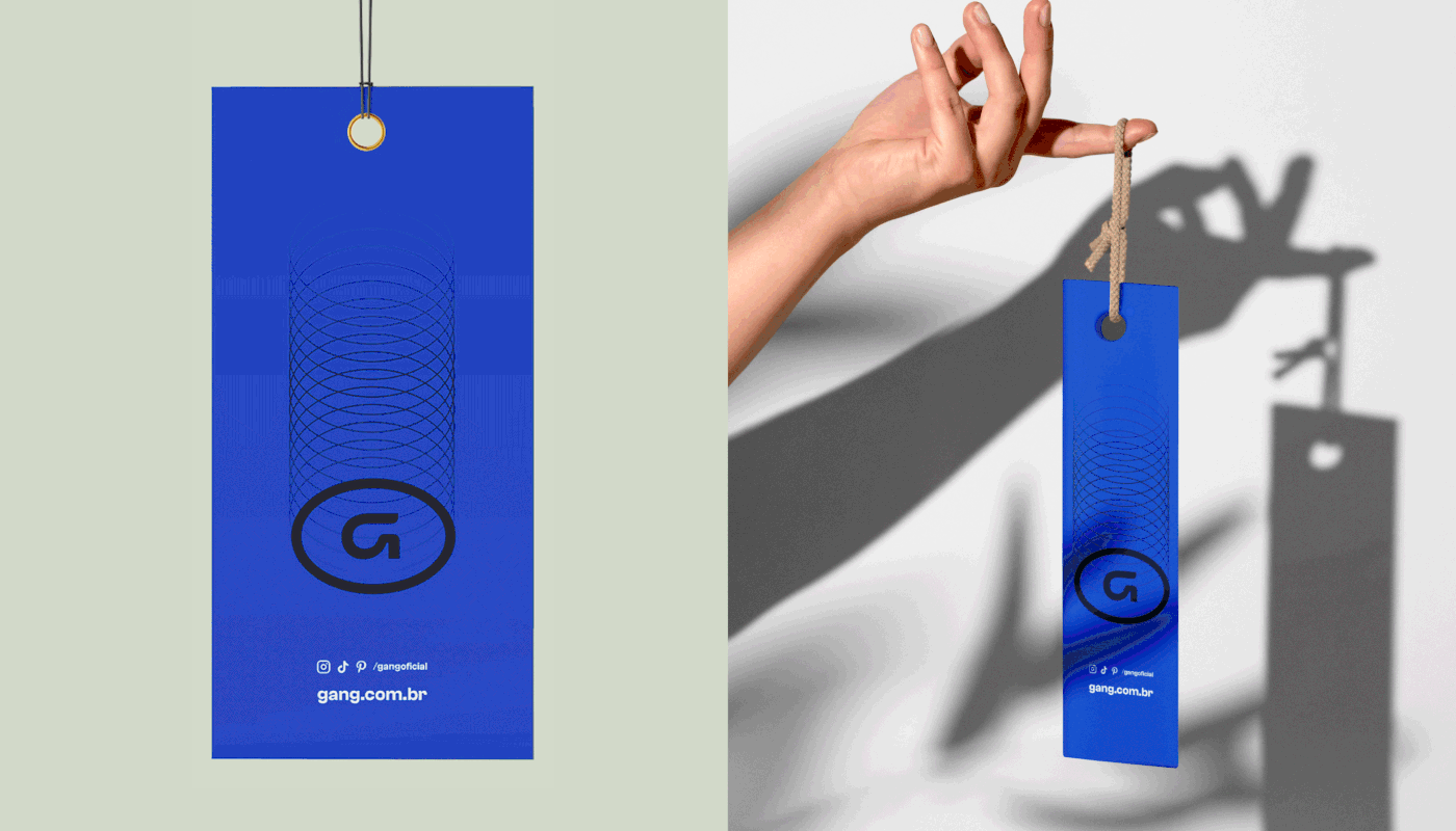
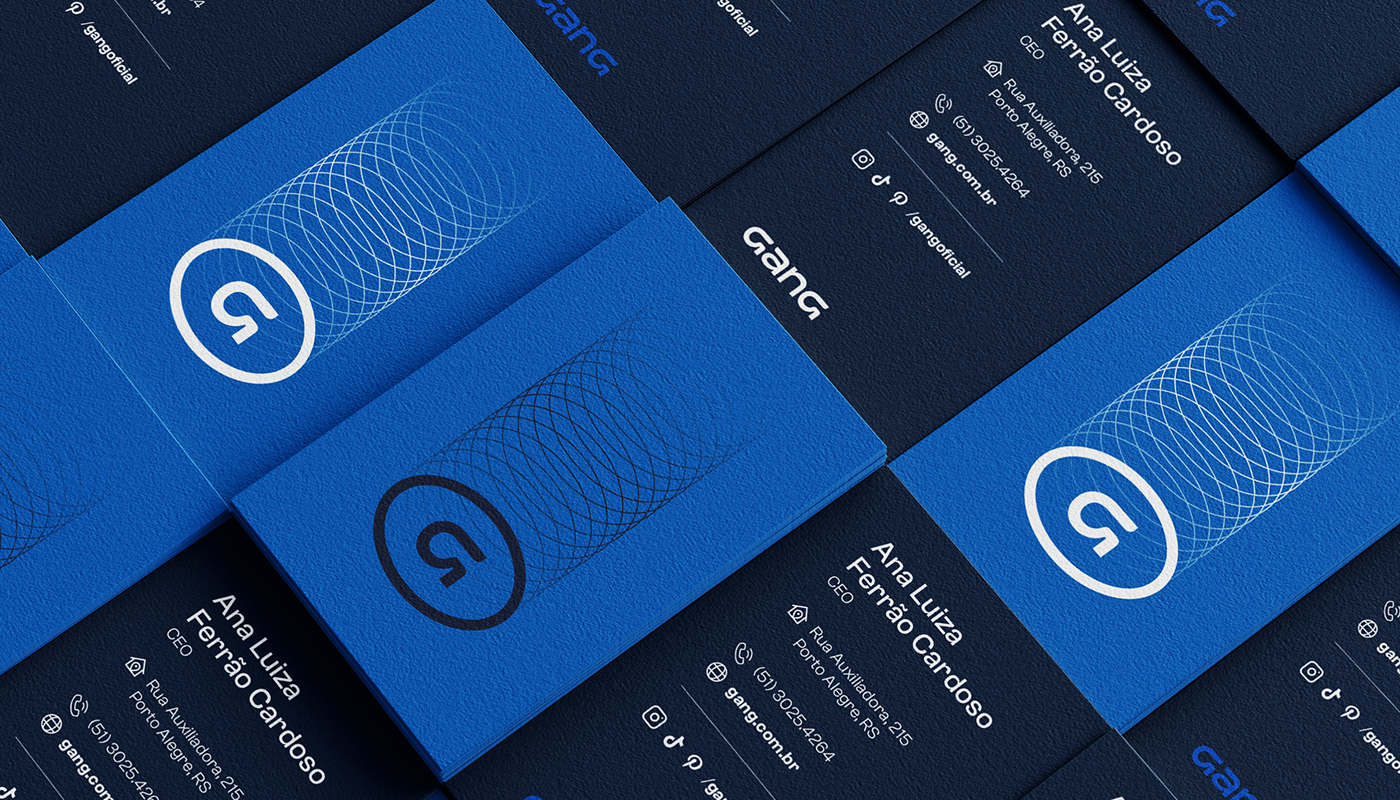
O conceito “Essência Básica para Expressão criativa” norteou o design do sistema gráfico da marca, em que a letra G, tão marcante na história da Gang, além de representar o básico, foi “desmontado” em várias partes, permitindo diferentes composições criativas.
Gang is one of the most beloved stores for the youth audience in Rio Grande do Sul, which has been part of the imagination of several generations since 1976. For this rebranding project, Gang was determined to make a significant change in its image and brand perceptionexpanding the target audience to reach not only teenagers but also young people of all ages, with a focus on the 18 to 30-year-old demographic. For this, the company felt the need to break free from the rebel archetype, and invest in its DNA as a brand of jeans and basics for creative people to express themselves.
To represent Gang's new phase, we delved into the brand's visual history, recognizing designs, styles, and communication positioning, exploring possibilities for how the identity's design could evolve by reinforcing the brand's basic DNA. We determined that the letter G, an element always so striking in the identity, would become part of the lettering, making the brand a single thing, symbol and lettering in the same composition, maintaining its bold personality but bringing a clean refresh to the brand, making it more connected with the universe of fashion and trends.
The concept "Basic Essence for Creative Expression" guided the design of the brand's graphic system, in which the letter G, so remarkable in the Gang's history, not only represents the basics but was also "disassembled" into several parts, allowing for different creative compositions.
SEDE DA EMPRESA / COMPANY HEADQUARTERS
Porto Alegre / RS - Brasil
DATA DO LANÇAMENTO / RELEASE DATE
Junho 2023 / June 2023


SERVIÇOS / SERVICES
Redesenho de marca e identidade visual / Brand identity
Conceito e voz da marca / Brand voice
Materiais de comunicação / Communication
NÉKTAR DESIGN TEAM
Account Executives: Paula Langie, Adrienni Klering
Creative Direction: Paula Langie
Strategic Direction: Roberta Hentschke
Strategic Direction: Roberta Hentschke
Design: Matheus Fritz, Patrícia Ugalde, Thomas Becke Miguel, Gabriel Hoch Jaques
Motion: Thomas Becke Miguel
Copywriting: Gabriela Leite, Letícia Monteiro
Copywriting: Gabriela Leite, Letícia Monteiro
PROJECT PARTNERS
Typographic Refinement: Fábio Haag, Rodrigo Saiani
Research: Favo
Campaing Insights: Bonaparte
Campaing Insights: Bonaparte
Say hello: nektar@nektardesign.com.br