About Infina
Infina is a fintech company in Vietnam that offers online investment and financial accumulation services. The company allows users with modest capital to invest in stocks, mutual fund certificates, and other financial products, thus simplifying the investment process for everyone. Infina has grown rapidly, attracting investment from international venture capital firms such as Y Combinator and Sequoia Capital, and currently has over 1.5 million customers.
Product and Development Strategy
Initially, Infina's main product was selling real estate in fractional units, enabling multiple investors to participate. The company then expanded into fractional shares and whole shares, but fractional shares remain the main focus of its development efforts. I am honored to be part of this project, playing a crucial role in shaping the product.
About Fractional Shares
Fractional shares, also known as "retail stock trading," allow individual investors to buy and sell stocks in small amounts through online platforms. This differs from institutional trading, where large and professional investors participate. Although retail investors may not have the scale and influence of large financial institutions, they contribute to market liquidity and activity.
Goals and Challenges
Infina aims to attract young Gen Z users who are just starting to invest and have limited financial resources. The company wants to provide a friendly investment platform that minimizes risk and helps them accumulate investment knowledge. In the context of the COVID-19 pandemic, where remote work is necessary, conducting extensive user research has become challenging.
My Role
In this project, I serve as the user interaction designer and redesign the interface to suit the young audience. Due to the project's small scale and time constraints, my work mainly focuses on streamlining the design process to fit these limitations.
Research
Despite many limitations in the research process, understanding the target users and the challenges they face remains a crucial task in the design process.
1. Develop Persona
To gain an accurate understanding of the user group I aim to target, I have created a list of Personas.


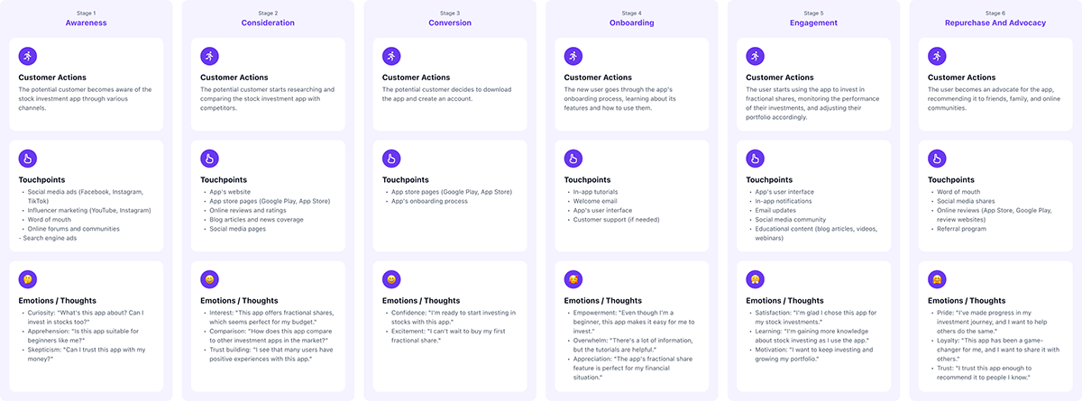
2. Develop User Journey:
After gaining a clear understanding of the target users, I have sketched out a complete map of the user journey to better comprehend how users interact with the application.
3. Survey
A basic yet very effective method in this period, by sending out surveys I have been able to collect valuable feedback from users. We sent the survey to 100 people (both new and existing app users), and approximately 40% responded. From these responses, we have gained valuable insights to begin the process of redesigning the application.
4. Results Obtained:
• Most users feel confused and unsure of what to do when they arrive at the main screen of the app.
• The CTA button on the bottom toolbar is overloaded with options (buy, sell, withdraw...), making it difficult for new users to determine their next action.
• The buying and selling process is overly complicated and confusing.
• The buy or sell screen is too complex with numerous data fields to fill in, causing users to feel overwhelmed.
• The process for depositing and withdrawing money is not user-friendly; users have to transfer money to their accounts and contact a staff member by phone to confirm, similar to the withdrawal process, which is time-consuming.
• The stock detail page does not provide sufficient useful information for new users.
Design
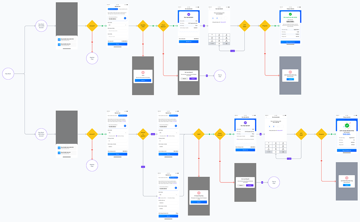
1. Redrawing the Current App Map
I reassessed the layout and sequence of the screens to identify any illogical elements and find solutions. Specifically, I focused on two main flows that cause user difficulties: searching and trading.


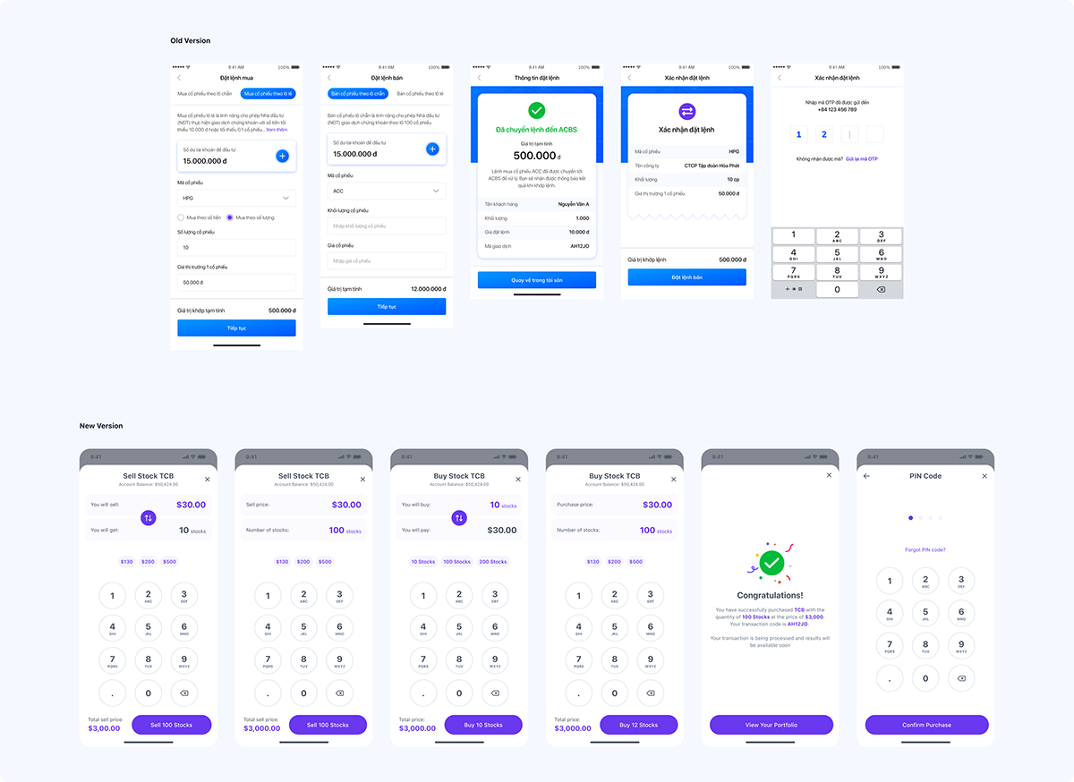
2. Redesigning the Trading Flow to Address Complexity Issues:
• Analyzing the Current Process:
After reevaluating the diagram of the current trading process, I realized it was quite convoluted, especially when users wanted to buy both whole and fractional shares. In the old system, users had to select the type of shares before searching and buying, which was challenging if they did not know whether the stock codes were for whole or fractional shares.
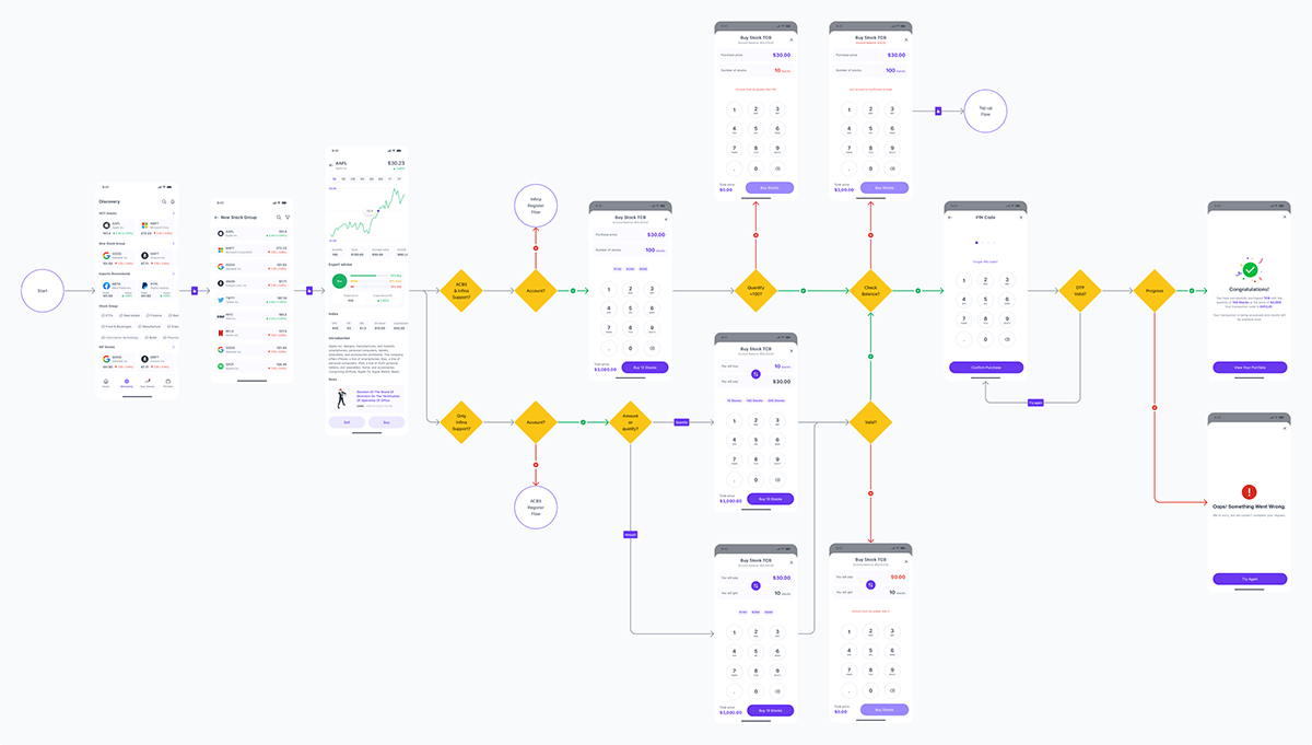
• New Design Solution:
To address this issue, I simplified the process by allowing users to directly access the home or discovery page to search and select any stock code, then directing them to that stock's detail page to execute a buy or sell order. This change makes it easier for users to access and familiarize themselves with the application's trading process.
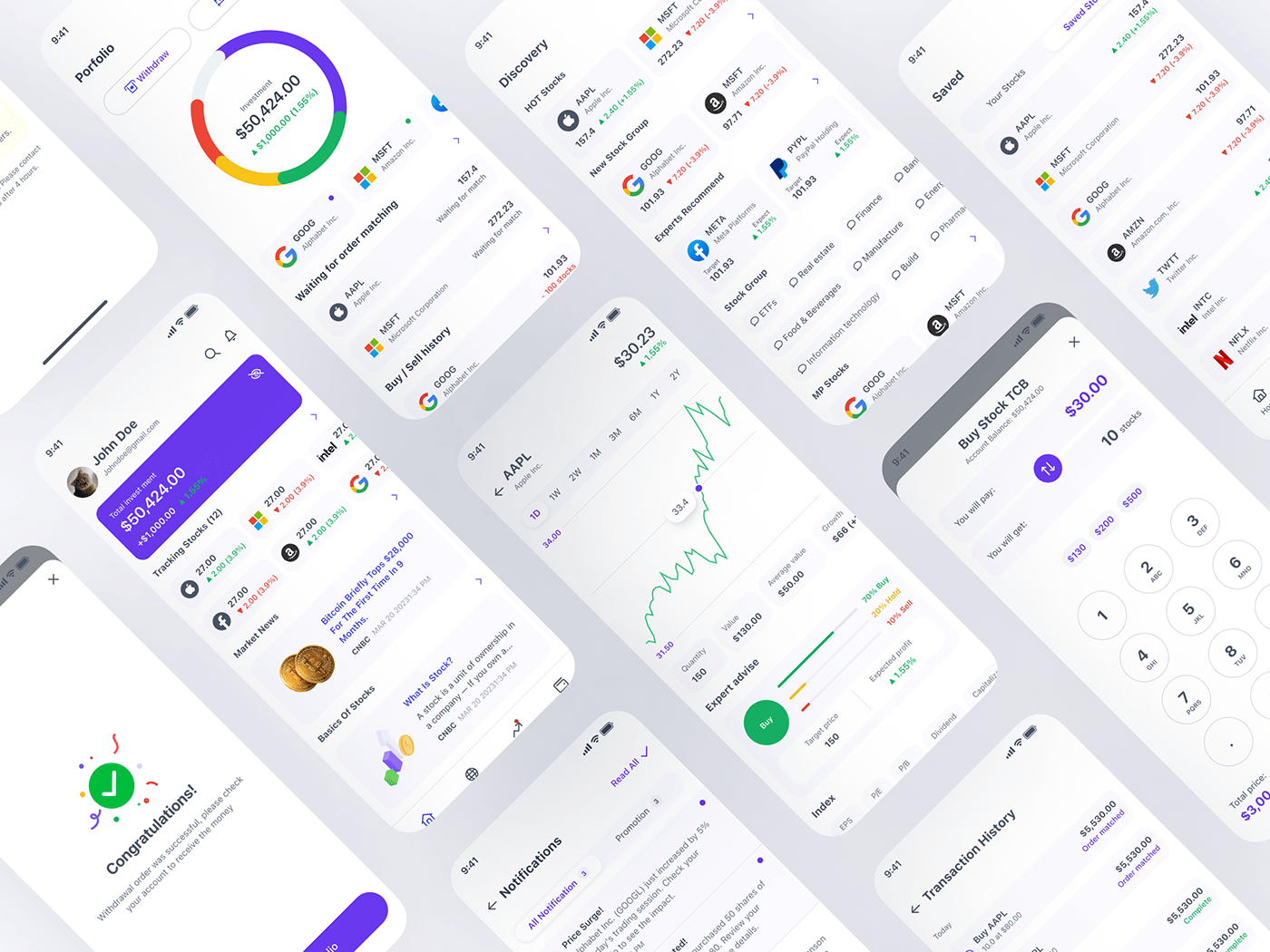
• Redesigned Trading Screen:
I removed the stock code entry from the order placement screen and brought out a numeric keypad to make data entry easier for users. I also added a quick-fill option for the amount to speed up entries. The total transaction amount is placed at the bottom of the screen, next to the CTA button, to save screen space and enhance visibility.
• Toggle Button Between Quantity and Price:
To increase flexibility, I placed a toggle arrow between the two input fields for quantity and price, allowing users to easily switch between these two input modes. Thanks to these designs, the order placement screen has become incredibly simple and intuitive, making the user's ordering process faster, smoother, and easier than ever before.
3. Redesigning the Home Page and Bottom Navigation Bar
Removing the CTA Button on the Bottom Navigation Bar:
• Current Issue:
The current CTA button is very prominent and multifunctional (Buy, Sell, Withdraw, Deposit), which can be confusing for new users unsure of where to start.
• Solution:
I decided to remove this CTA button to simplify the interface, making it easier for new users to access the application. Now, users can start searching or selecting stocks directly from the home or discovery page without navigating through a complex CTA button.
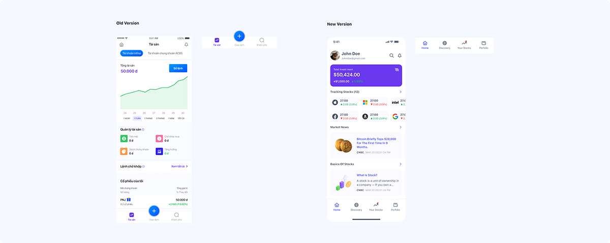
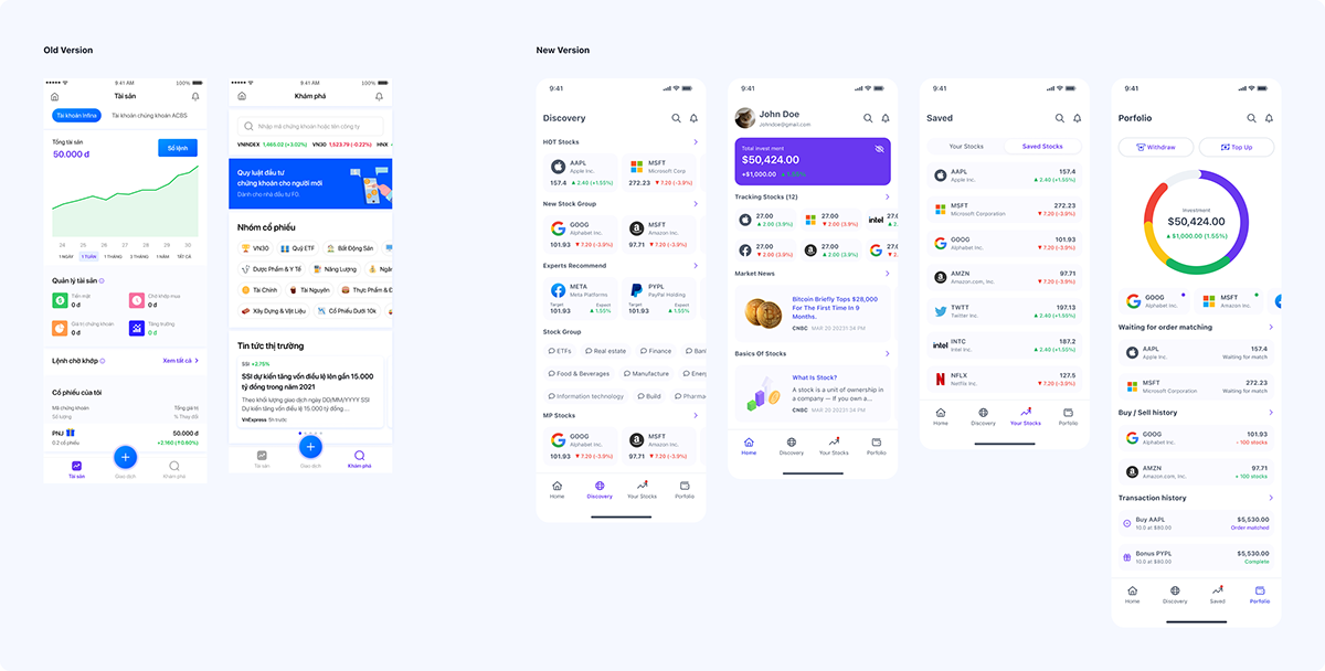
4. Revamping the Home Page and Adding a New Tab:
• New Home Page:
Personalized for each user. For new users, this page will provide basic information about stocks, helping them learn and get acquainted with the market. For seasoned users, it will display market updates and their assets, aiding timely investment decisions.
• Discovery Page:
This page helps both new and existing users search and explore stocks. It will also offer suggestions on trending or volatile stocks, helping new users find suitable investment options.
• New Saved Tab:
A new feature that allows users to save stocks they are interested in. In this tab, users can monitor the price movements of saved stocks and make informed buy or sell decisions promptly.
• Porfolio:
The asset page is separated from the home page so that users can more easily track information about their order placement process.
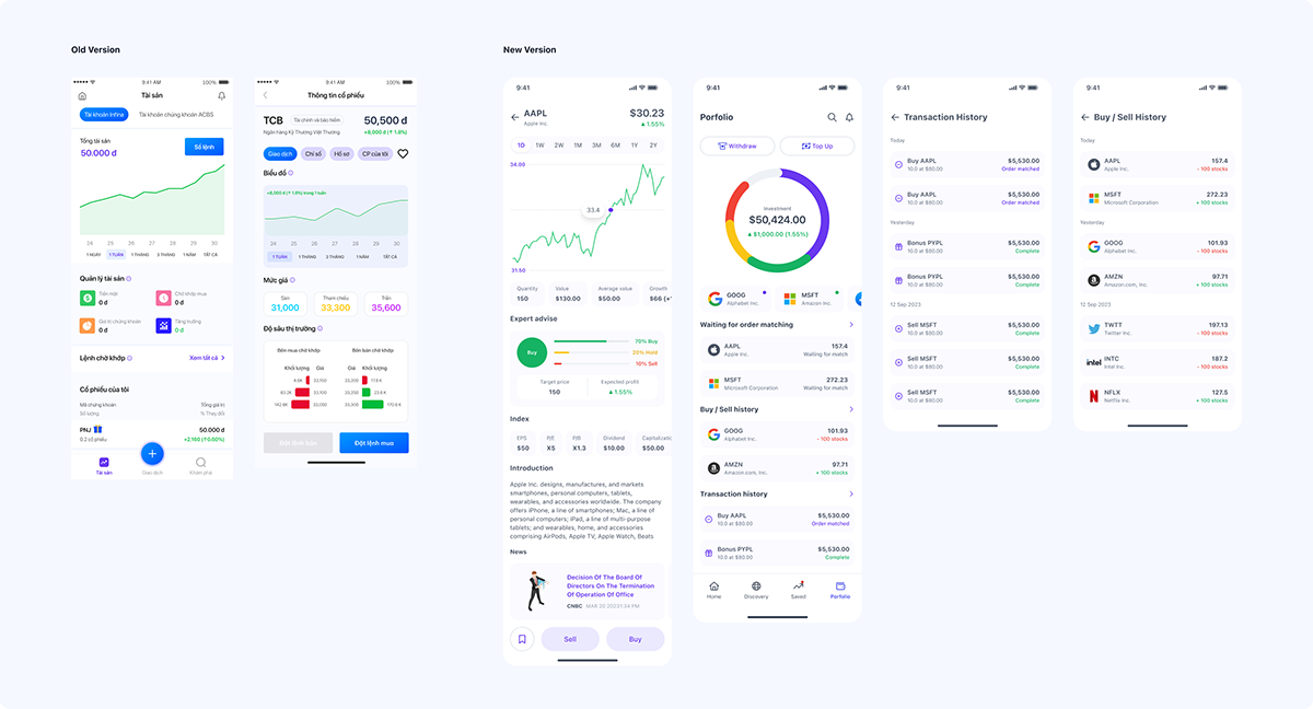
5. Redesigning the Stock Detail Page and Asset Page
Stock Detail Page:
• New Design:
I simplified the charts to update in real-time and for various time frames such as weekly, monthly, or annually. The stock price information is designed for horizontal scrolling, saving screen space.
• Additional Information:
Carefully designed sections on introductions, press information, and investment funds provide useful information without overwhelming the user. Notably, I added expert advice to the charts to help new users better understand decisions about buying, holding, or selling stocks.
• Asset Page:
→ New Charts: Instead of fluctuation charts, I switched to pie charts to display asset distribution, making it easier for users to perceive their investment portfolio structure and optimize their investment process.
→ New Functions: I added features like order matching, purchase history, and transaction history, helping users track order statuses and manage their assets more effectively.
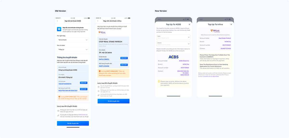
6. Optimizing the Deposit/Withdrawal Process:
Due to the complexity and the need for coordination across multiple departments, I currently added direct deposit and withdrawal buttons on the asset page. This allows users to perform financial transactions immediately as they check their balances, offering convenience and speed.
7. Search Page
I redesigned the search page to make it more user-friendly and added several new features:
→ Search History: This feature saves the user's search history, allowing them to easily revisit previous searches without re-entering them.
→ Stock Group: Stocks are categorized by industry, facilitating a systematic and straightforward search process for users.
→ Recommendations: Stocks are recommended based on the user's search activities and preferences, providing tailored suggestions.
When users type a character into the search bar, the list below automatically updates to display stocks that match the entered character, making the search process quicker and more accurate.

8. Encouraging User Interaction: The Reward System
To encourage users to interact more with the app, I designed a simple yet effective solution: rewarding users. Specifically, when users create a new account, they receive a welcome gift. Following that, we implement a task system where users can complete assigned tasks and earn corresponding rewards.
These rewards can be used to invest in stock codes, giving users the opportunity to practice and learn from real-life experiences. This not only motivates users to engage more with the app but also provides them with valuable investment knowledge and experience.

Project Handover
After completing the design, I handed over the work to the development team so they could start building the application. This handover process required considerable time and support from my end, especially in specific situations. I organized the file structure neatly and categorized it by feature, making it easier for subsequent designers and developers to access and continue the work. My involvement in this project was short-term, and I did not have the opportunity to gather performance metrics or interact directly with the end-users. Therefore, I made every effort to complete the project on time, ensuring it was aligned with the company's available resources.


