
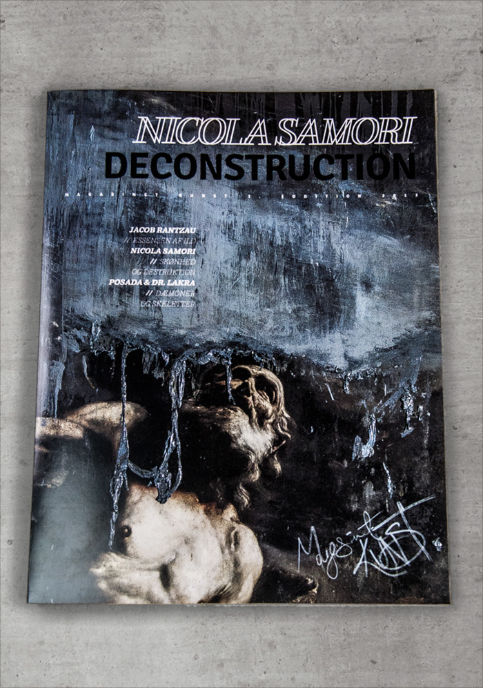
Three covers designed with black, white and the cmyk yellow.

I designed new logo with inspiration from the way a signature would look on a painting.
I chose this because the disciplin of painting is one of the most iconic and oldest traditions in art.

My choise of typography and the way they relate to each other to create the most balance despite the
relatively elaborate design.

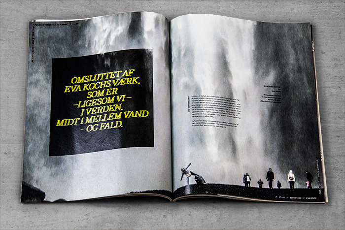
The contents of the magazine follows the flow of the water.
The logo is placed in the right corner like a signature.


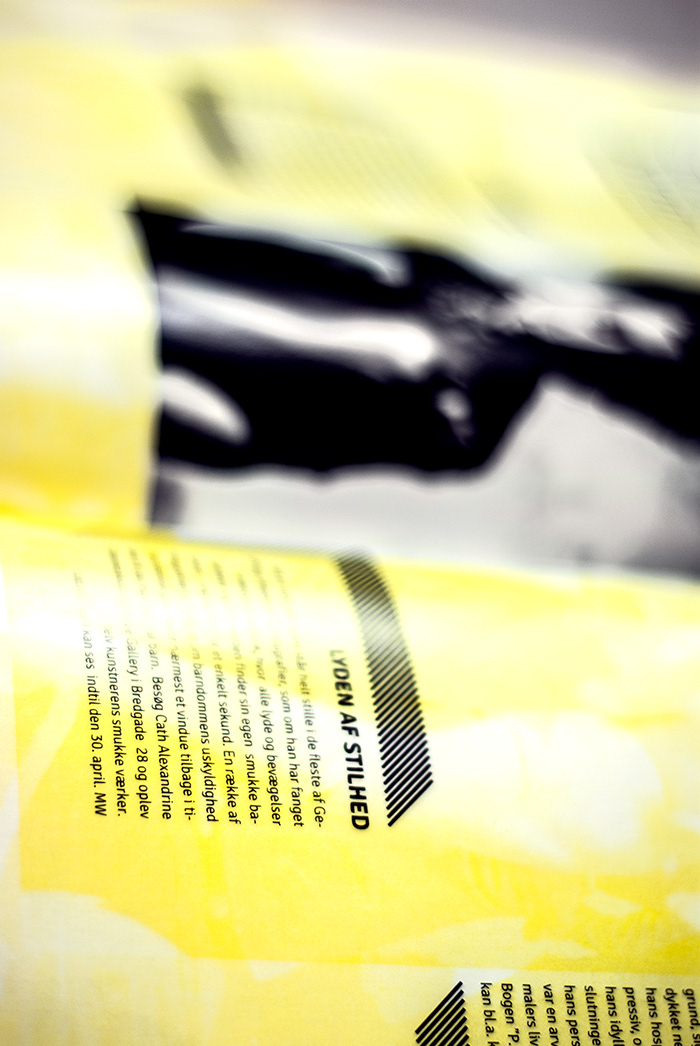
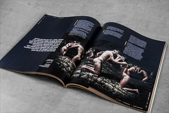
The "boxes" are inspired by the information boxes you see at a museum.

To introduce the artist, I use his personal signature.


The furniture is placed like a frame - similar to the "boxes".


Creative ways of incorporating the barcode.


Thank you for watching.
// Lea


