Brief: Create Logo for Cycle company. Croft Cycle is selling traditional and electric bicycles in London. Founder requested the design to incorporate two styles, combine the modern with the traditional cycling theme.
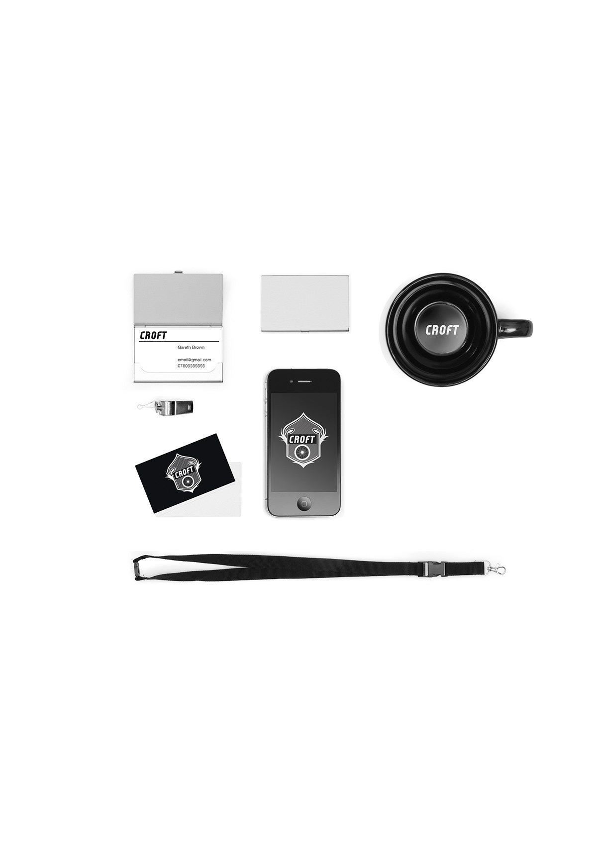
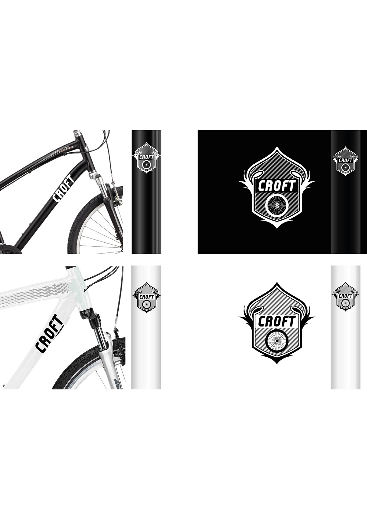
Logotype has to fit to the bike’s frame, be legible and energetic. Logotype should be expanded to more classic bicycle headstock logo, used to brand other Croft products and touch-points. Both designs had to be consistent and incorporate both styles requested by the brand’s founder.
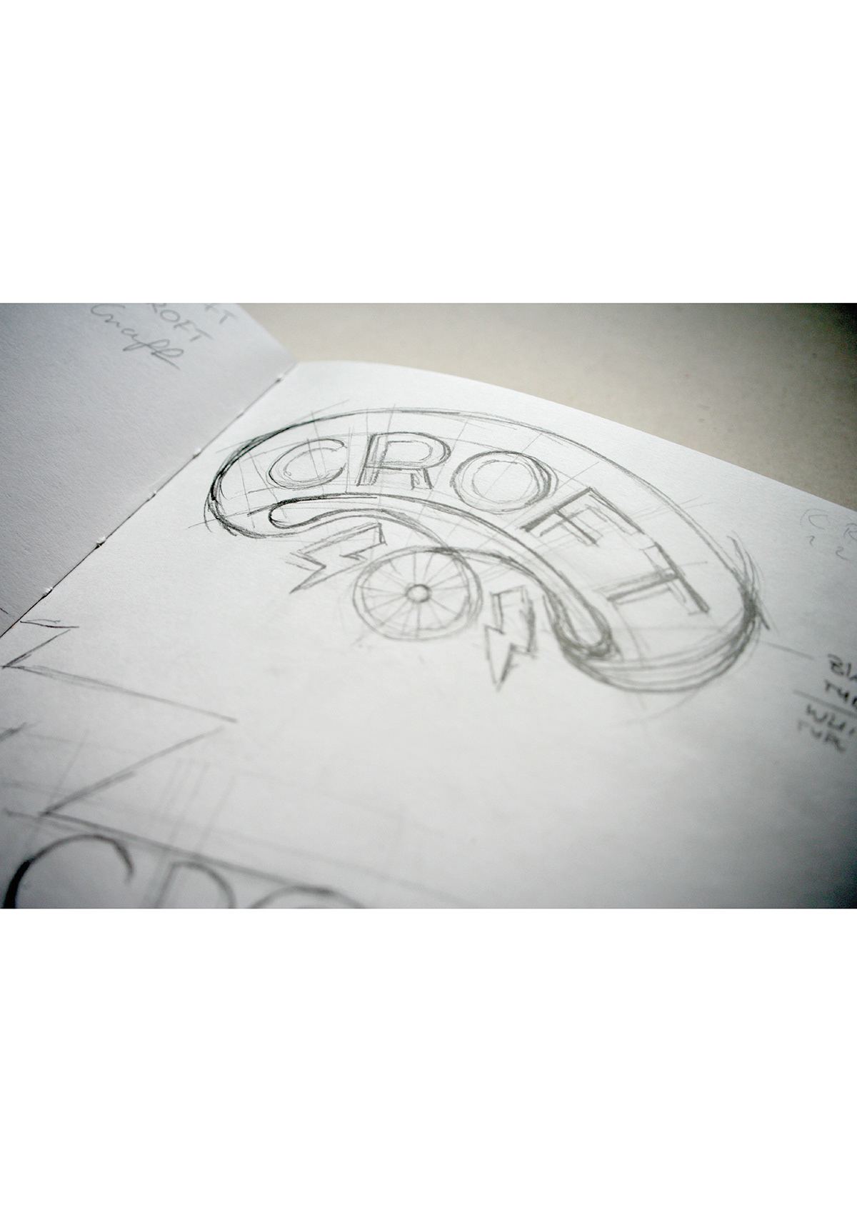
Response: I have developed various proposals and worked directly with the client to fulfil his requirements regarding the style. Every idea was followed by a prototype, helping the client to visualize his future product. Throughout development successful outcome was achieved, Croft logo incorporated traditional shapes and devices, while used type is modern and energetic. Logotype used on bicycle’s frame is strong and clean, nicely becomes part of the Logo and its consistent with brand’s values, target audience and desired style. It is also functional and looks well on various touchpoints.
Info: Logo and Logotype will be printed on bicycle’s frame and headstock, placed on multiple touchpoints. As Croft Cycle is a new company, designed outcome’s style will be followed in further brand’s development and represent the company.
Client: Gareth Brown
Launching Croft Cycle