
Background
Founded in 2016 and based in Minneapolis, MN, Inspectorio provides software solutions for supply chain management, focusing on quality, compliance, and delivery.
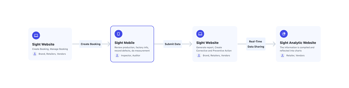
To explain the roles and features of platforms related to Inspectorio SIGHT, we have three main platforms as follows:
‣ SIGHT Web: This platform enables suppliers, retailers, and brands to create inspection orders. These orders include information about the factory, production processes, and product details such as quantity, color, and type. This is also where information is turned into reports and Corrective and Preventive Action Plans (CAPA).
‣ SIGHT Mobile: This application helps inspectors receive and manage the inspection orders assigned to them. They can view reports, capture information during inspections such as taking photos, filming, and measuring.
‣ SIGHT Analytic: The collected information is transformed into charts, reflecting production data and common defects, thereby proposing suitable production solutions for different industries.
The workflow includes:
‣ Retailers and brands create an order, including detailed information about the factory and the production process.
‣ This order is then assigned to inspectors according to their schedule. They visit the factory to conduct inspections, take measurements, and verify production information.
‣ After completion, they upload this information to the server in the form of PDF reports. These reports are then sent to suppliers, retailers, and brands. If there are any discrepancies during production, CAPA plans are implemented.
‣ From the synthesis of many reports, AI processes the information to provide an overall picture of a factory's or an entire enterprise's production capabilities, thereby offering assessments and production plans for the brands.
Research
The goal is to specifically identify the issues users are encountering in order to devise appropriate design solutions. I utilize four methods for this purpose:
1. Develop personas
To gain an accurate understanding of the target user group I am addressing, I have developed a list of personas:
‣ Program Manager
‣ Merchandiser
‣ QC/QA Manager
‣ QC Auditor/Inspector


2. User Flow
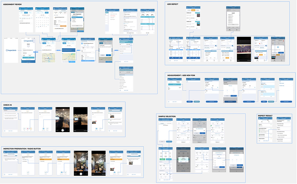
Based on personal experience and collected data, I proposed several improvements to optimize user interactions. I redesigned the user flow in diagram form to make it easier to understand and present. After finalizing the overall diagram, I divided it into specific flows, each including screens corresponding to different branching scenarios. This helped me clearly identify the screens that needed designing before starting.


3. Data Review:
Concurrently with user interviews, we also reviewed data collected from AppSee, a platform that records user interactions with the app. This platform provides metrics on users' interaction times with each step and screen, unresponsive points, and a heat map of interaction points. During this process, I discovered that the platform was not implemented correctly, causing heat map points from one screen to overlap onto another. I reported this issue to the relevant teams to find a resolution.


4. User Interview & Survey:
To verify the accuracy of my assumptions, I need feedback from those who directly use the product to obtain the most realistic responses. I employ two methods: directly with individuals present at my location, and indirectly by sending surveys to inspectors living abroad.


5. Shadowing to Observe:
After gathering user feedback through interviews and surveys, we identified many useful insights. However, some opinions might be subjective and stem from an incomplete understanding of their work processes. Therefore, we decided to go directly to their workplaces to observe how they use the app in a real work environment. This helps ensure that our feedback and assumptions about the app are accurate.


6. Review Current Process to Define Pain Points:
Based on personal experience, I organized meetings with the team to discuss illogical aspects when using the app. In these meetings, each member notes down the issues they observe and posts them on a board. We then collectively identify the main difficulties that many agree are problematic. From there, each member proposes solutions based on their experience to address these issues.


7. Organize Workshop to Clarify:
During the process, we applied solutions based on personal experience and assumptions. To validate the accuracy of these assumptions, we organized a workshop and invited all the inspectors we knew to participate. Here, we used the sticky paper method, already applied in our team, to pinpoint the difficulties they face. This allowed us to compare whether our assumptions align with their experiences. After confirming this, we presented our solutions. Some solutions were unanimously agreed upon, but others were not, due to our lack of in-depth knowledge in this field. Therefore, we asked the inspectors to propose their solutions, which were recorded on pre-prepared paper, so we could analyze and agree on the best resolution together.


8. Research Outcomes
Critical Issues:
‣ The error recording screen interface is user-unfriendly and can easily confuse users.
‣ The system logic for recording measurements does not meet the inspectors' requirements.
‣ Inspectors often measure multiple items at once before recording, contrary to the current design of measuring one item at a time then recording.
‣ Users struggle to complete the questionnaire as they need to press the back button after each question to proceed to the next one.
‣ The interface is inconsistent and outdated compared to the company's new image and clientele.
‣ The app takes up too much storage space on phones.
‣ The app's performance is slow.
Major Issues:
‣ Users often forget to add measurement points before starting the measuring process.
‣ Users cannot perform multiple inspections at once and need a method to easily switch between inspections.
‣ The "Move to Fast" screen frequently appears when users transition through steps too quickly (to prevent inspectors from skipping steps in the process).
Minor Issues:
‣ Users are unclear which questions require accompanying images, often encountering errors when pressing the ‣ submit button, causing the app to report errors.
‣ After completing a question, users have to press the back button to start the next question.
‣ Users cannot arrange the measurement points in the order they desire.
Prepare
1. App Map
Before starting the application design, I decided to review the existing app map to identify any inconsistencies in the previous design. This allowed us to gain an overview and develop an appropriate strategy for the number of screens needed, from which we established a timeline for all stakeholders.
2. Branding & UI Kit
Before proceeding with the interface design, conveying the brand spirit and ensuring consistency across platforms is crucial. I thoroughly researched branding guidelines and chose dark blue to convey a fresh, dynamic, and user-friendly feel to new customers. I also refined the graphic components to make them rounder and softer, helping to reduce user stress at work. An initial basic UI Kit was set up and will later be developed into a complete design system.


Design
To facilitate monitoring and save time, I will present designs aimed at addressing the most critical issues first. Below are four severe issues listed and their solutions:
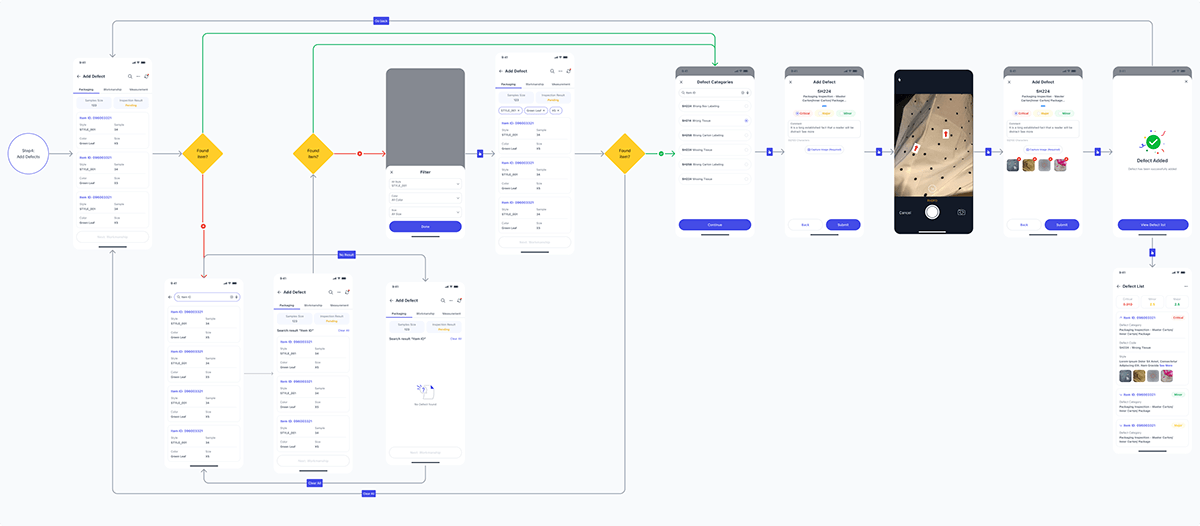
1. Error Recording Screen Interface: Unfriendly and Confusing for Users
In the current interface, users must navigate through several cumbersome steps to add error information: selecting an item, then choosing the Item ID, followed by Size & Colors, selecting a defect category, and finally the defect list from a tab next to it. After all these steps, they can take a photo and save the information. This process is inefficient and can cause confusion due to too many buttons and options on the screen.
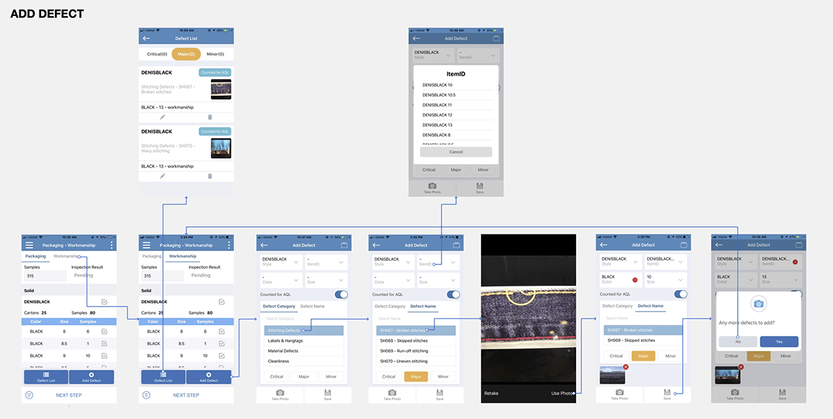
To improve, I have decided to divide this process into four separate steps, each focusing on a specific task, making the process of adding defects clearer and easier. Although this might increase processing time, I believe it is worth the effort as users can now easily identify the necessary steps. Additionally, they can filter items by Size, Style, or Color, which was difficult previously due to needing to remember the exact attributes of each item.
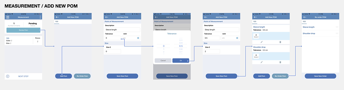
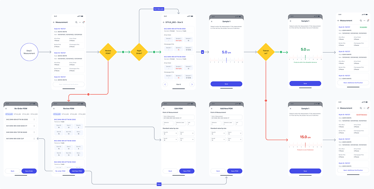
2. Measurement Method Issue:
In the current design, inspectors have to measure each item one by one and record it immediately, which does not suit their method of frequently measuring multiple items at once. To improve, I have developed a virtual ruler that allows them to slide to select measurements, with two distinct color zones: green for acceptable error margins and red for unacceptable ones. This saves them time and avoids re-entering data.
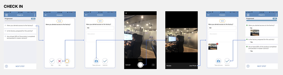
3. Improving the Questionnaire Completion Process:
Currently, users struggle because they have to press the back button after each question. To address this, we will design the interface in a card format, allowing users to swipe left or right to move to the next question. Additionally, the photo capture screen will automatically display for questions that require an image, and the system will automatically advance to the next question after the user responds, saving time and improving user experience.

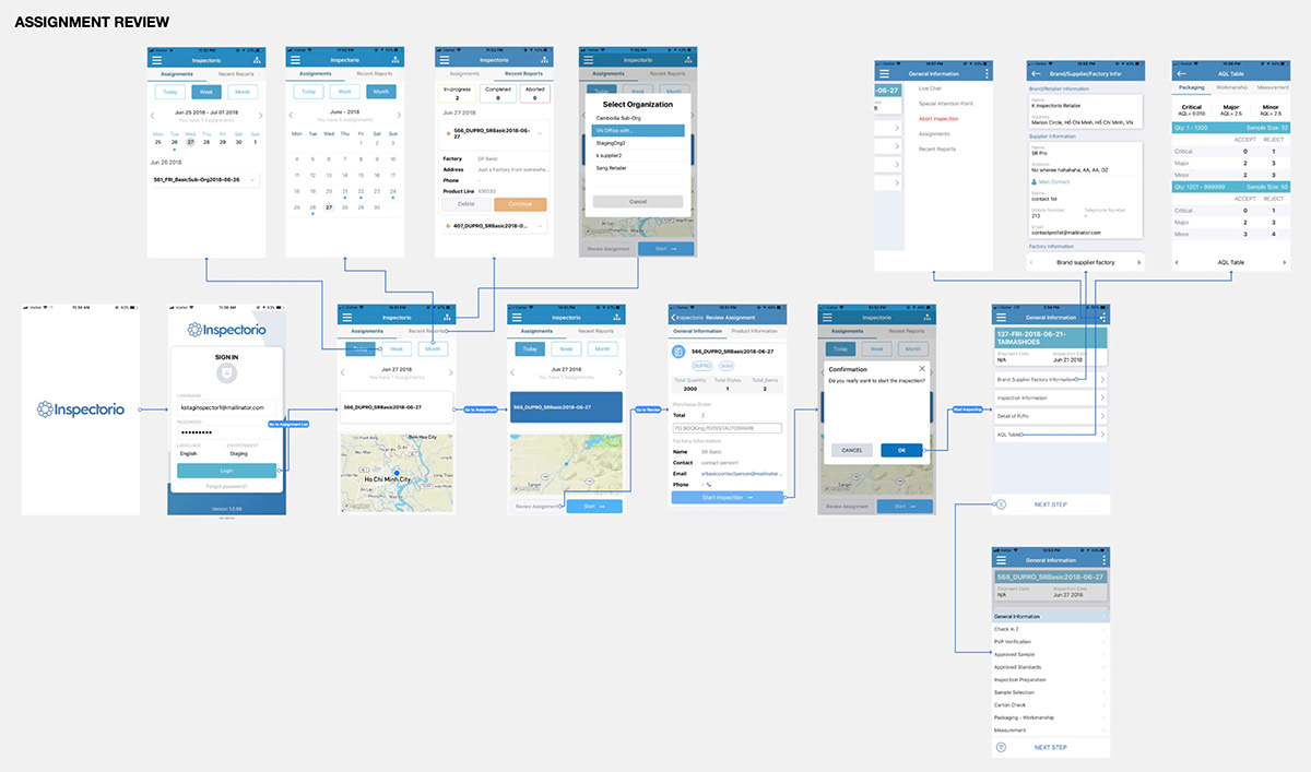
4. Assessment and Improvement of Task Assignment Processes
In an effort not only to address current issues but also to enhance the user experience across different screens, I have revisited the task assignment process to identify ways to improve:
‣ Redesigning the Calendar: I have redesigned the calendar to allow users to easily scroll up or down and view all the days of the month. This enables them to quickly identify tasks that have been assigned and plan their work efficiently. Users can switch between days quickly, enhancing time management and work efficiency.
‣ Improving the Design of Inspection Cards: The inspection cards have been redesigned to be more intuitive, with information arranged logically, completely, and neatly. A new feature allows users to collapse the cards to save screen space, helping them manage multiple tasks more easily within a single interface.
‣ Redesigning the Assignment Detail Page: This page has been improved with a clearly designed and easy-to-view map. Information related to assigned tasks has been reorganized into a new, modern, and more intuitive layout. Users can quickly view essential information before starting a task, which helps minimize errors and save preparation time.

Usability Testing
After completing the designs, I will integrate them into a prototype board that closely resembles the actual application for users to experience and provide feedback.
1. Test Plan:
‣ Prepare the Script: I will prepare a list of questions to ask users during their interaction with the prototype. This helps control the testing process and prevents random user interactions that could lead to serious errors.
Participant Selection: We will choose users based on their familiarity with the previous application to ensure more accurate feedback.
‣ Focus Group Method: Each test group will have a person to read the questions, record audio, video, and take notes on responses.
‣ For Remote Users: We will use software to record facial expressions and screen interactions, helping us better understand their emotions during the experience.


2. Test Objectives:
The purpose of Usability Testing is to verify if our solution fits the users' workflow and to gather the most valuable feedback.


3. Test Results:
Some users treated the test as a mandatory task and did not offer much feedback.
Others just wanted us to listen to their opinions, showing little interest in the content we presented.
Some were very enthusiastic about contributing feedback, providing detailed explanations of what they liked and disliked, thus helping us gain a comprehensive view and make suitable adjustments to the application.
Summary
Redesigning the app was a challenging task, mainly because we didn't have a lot of time and there weren't many references out there since not many competitors were around. Being trailblazers means taking some risks, right?
We put our all into it and learned from what we went through, using what we knew to get the best results as fast as we could. We're still pushing for recognition and always working on the design and making it better, so our app can help as many people as possible and be the best it can be.


