Case
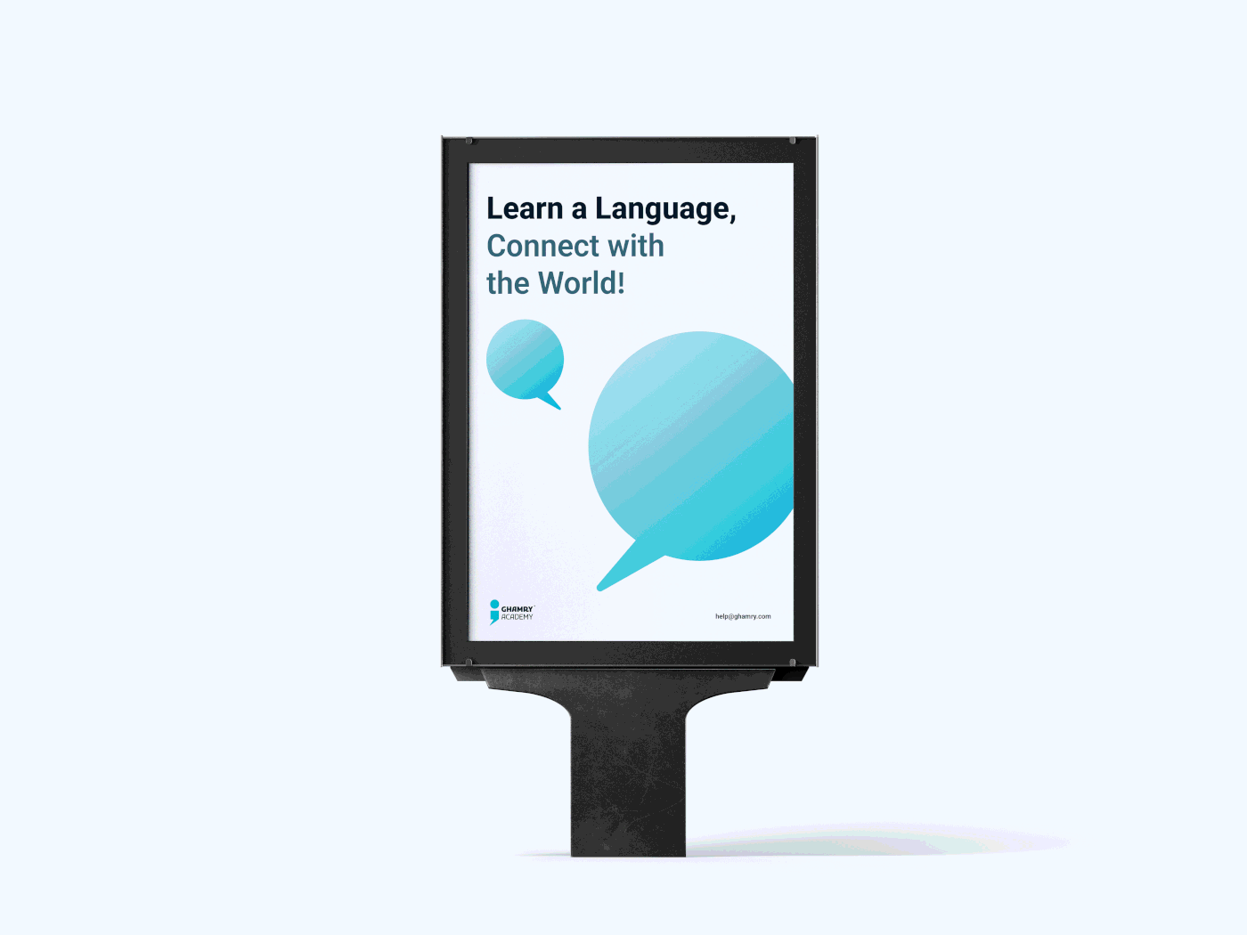
GHAMRY Academy stands out for its exceptional commitment to providing practical and engaging language courses that cater to students of all ages and proficiency levels. Their innovative approach emphasizes conversational skills and real-life language use, equipping students with the tools to communicate effectively and confidently in today's globalized world. By fostering a love for learning languages, the academy recognizes the importance of cross-cultural communication in our interconnected society. Through their efforts, they empower individuals to expand their horizons, enhance job prospects, and elevate their communication abilities, ultimately contributing to the creation of a more interconnected and globally aware community. GHAMRY Academy's dedication to language education is truly inspiring, promising a transformative impact on the lives of countless students.
Solution
I found that Naming the academy after its founder, Ghamry, adds a personal touch to the brand identity, making it more relatable and memorable to potential students. A clear and consistent visual identity that aligns with the academy's mission and values helps it to stand out among competitors and attract students looking for a high-quality language education experience. A strong brand identity also builds trust and credibility with potential students, communicating the academy's commitment to providing an excellent education.


Logo philosophy
Language is what unites the world and enables us to express ourselves, showcase our personalities, and communicate with one another. It is also one of the most important sources for gaining knowledge and learning through reading and exposure. Based on this, I designed the logo to highlight these important qualities in a unique way that is easy to remember and makes the brand stand out. At the same time, the logo is designed to be suitable for the brand's diverse audience, with varying cultures and age ranges.


The selected colors aim to convey feelings of trust, safety, high quality, and professionalism. They have been carefully chosen to clearly and distinctly differentiate the brand from its competitors.


The pattern was designed to strengthen the brand and highlight it clearly. The academy's offerings have been simplified through the pattern, as it provides courses in all the skills a learner needs to master a language, including reading, speaking, listening, translation, and more. The pattern also ensures excellence and superior performance through a brilliant approach that fosters a love for language learning and encourages learners to excel.