Recast is a global streaming platform making access to quality content fairer – both for the viewers watching and the people creating it. Where fans pay per view, rather than a subscription. And up to 85% of the income goes directly to the content creators themselves.
But as start-up going against convention in pursuit of fairness, how do you create a brand with enough impact to reach the audiences that will value you? By making every connection meaningful.
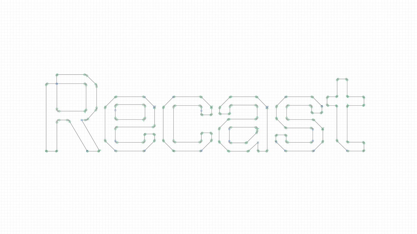
Recast needed an aligned identity that reflected its commitment to fairness and compelling content. We used the R in the name to create a beam graphic that put streaming in the spotlight. The distinctive R made for a powerful app icon, as well as a flexible device to form the rest of the system from. Paired with a diverse palette and a bespoke typeface it makes Recast’s content and comms unmistakable, ensuring a deep connection with its audiences.
_
Project - Logo design | Art Direction | Animation
Date - 2021/2022


As a streaming platform, it was vital the new brand worked seamlessly across the site and app. The design system, built from the R, allowed the site to showcase content and talk about the Recast difference in a compelling way, while the angular style elements mean content can be showcased in a uniquely Recast way.