
ANNA COFFEE ROASTERS / brand identity
objectives:
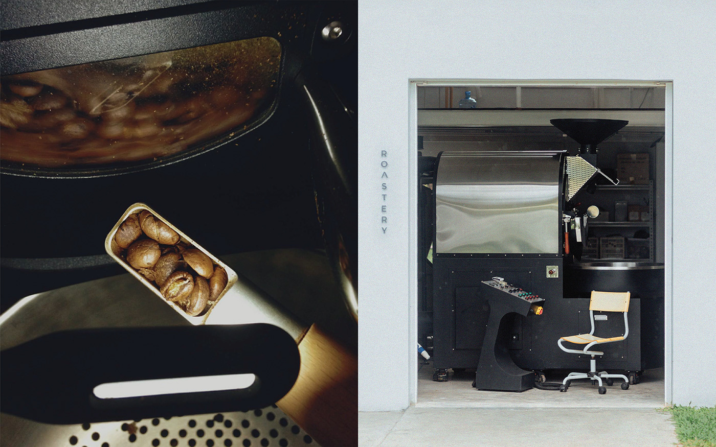
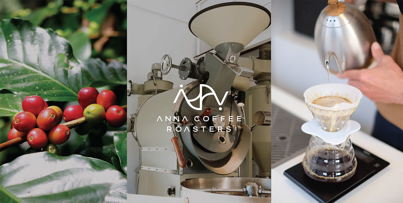
Anna Coffee Roasters is an expert in the coffee specialty, in which the brand covey its expertise through brand identity. For starters, they grow their coffee beans in Chiang Mai, north of Thailand. They roast their coffee beans to their precision for the beans to pronounce their unique taste. They are meticulous in selecting different beans in making a variation of coffee beverages.
logo:
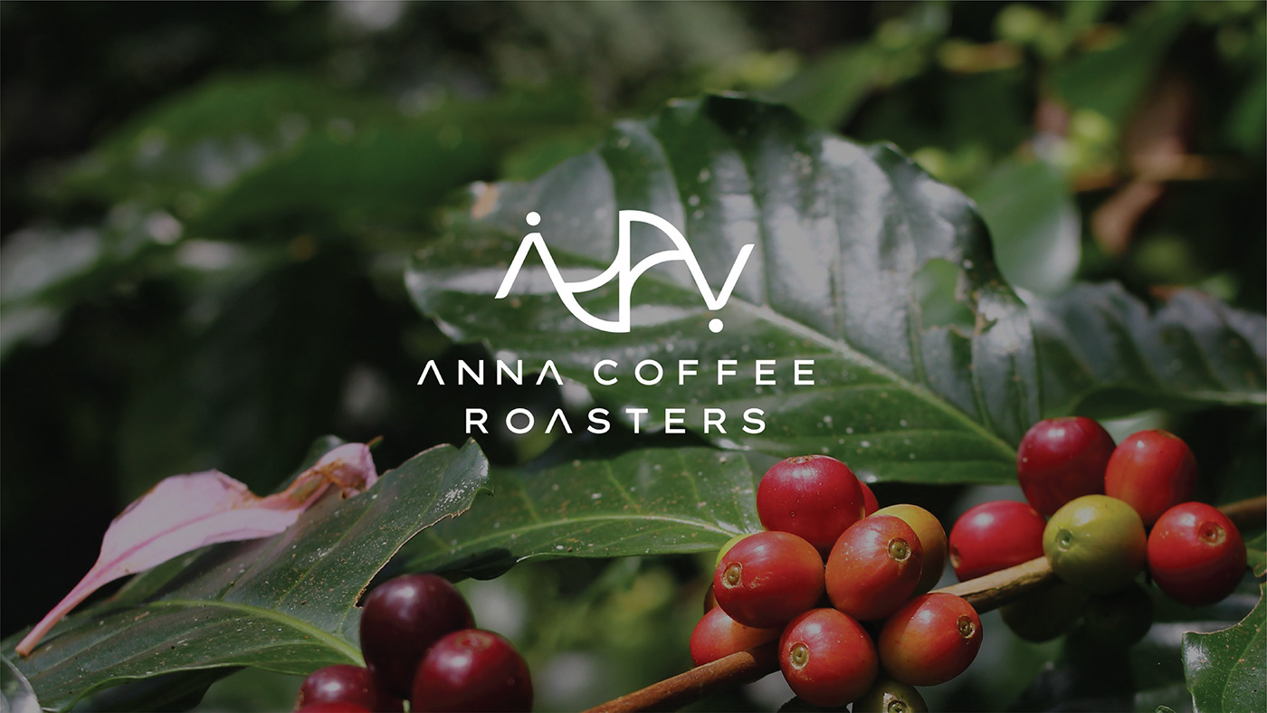
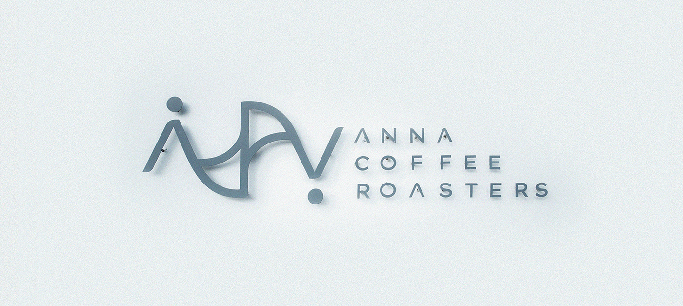
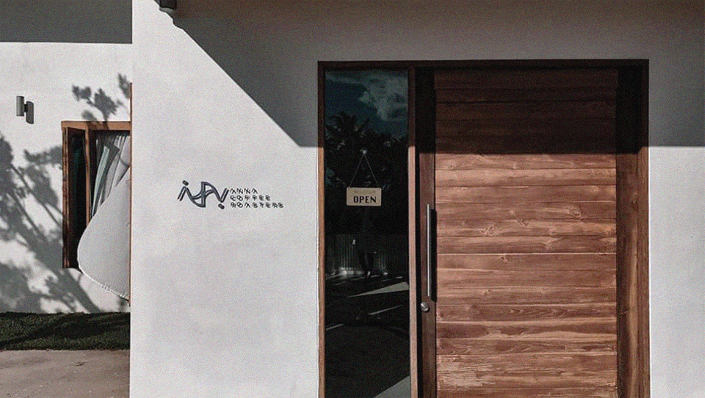
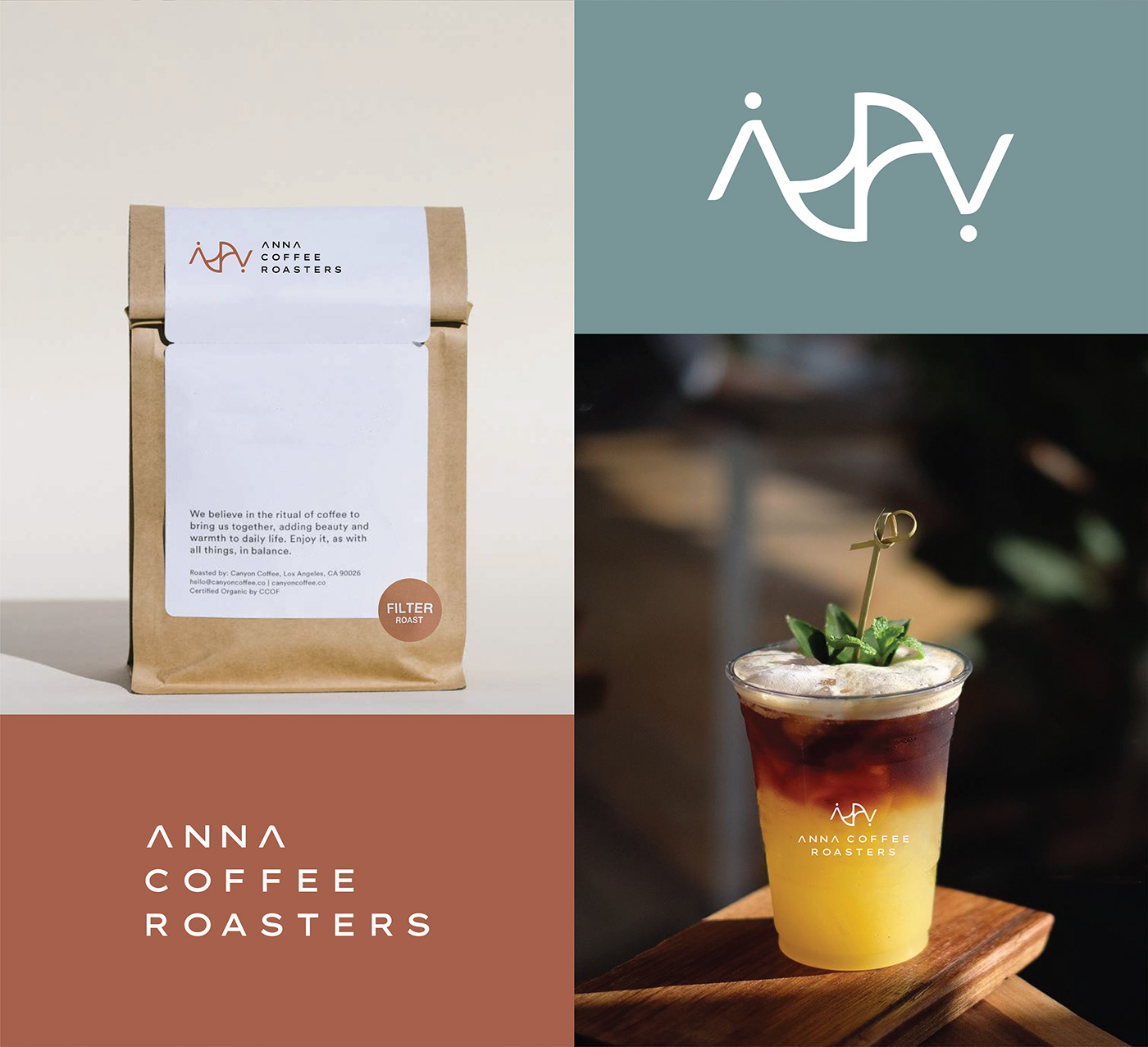
Anna Coffee Roasters' logo is an interpretation of the journey of coffee, from its origins on the plantation to the expert roasting and ultimately, the perfect pour into a cup. The story begins with the letter "A," representing the mountainous regions where coffee is grown. The double "N" captures the essence of the roasting process of crafting coffee beans. Finally, the letter "A" is rotated 180 degrees to depict the final step in the journey - the coffee being brewed in a dripper. The thoughtful design of Anna Coffee Roasters' logo beautifully captures every step of the coffee-making process, elevating the brand distinction.
brand color:
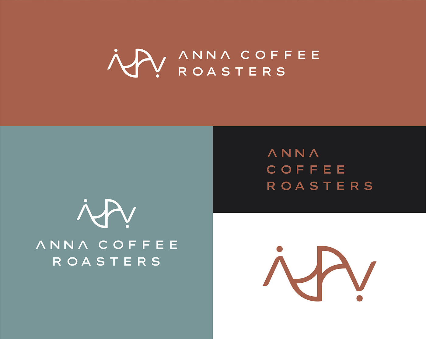
The brand’s colours are brown complemented with a blue shade. A subtle cream colour is used as a secondary accent. The choice of brown and cream reflects the brand's deep connection to coffee beans. The use of blue is intended to convey a connection to nature which is the expanse of the sky. This use of colour captures the brand's every step of the coffee-making journey.


AGENCY :
Andon Design Daily Co.,Ltd.
CREDIT :
Design Director by Pongtorn Wachirapoka
Designed by Nuttavee Jiratthitikan
VIA :
https://www.facebook.com/AnnaCoffeeMicroRoaster
https://www.instagram.com/annacoffeeroasters/
Copyright © Andon Design Daily Co.,Ltd. All Rights Reserved.


