Once again, we had the pleasure of working with POP Investments. This time, our goal was to develop the visual identity and brand strategy of one of ÁTIKO’s siblings, a fresh and cool apartment building development located at Barrio Santa Lucia in Monterrey, Mexico.
This new project shares the same target, neighborhood, and ecosystem as ÁTIKO, so it had to have the same brand essence.
As part of the brand strategy, we looked for a name keeping the same phonetics and looking similar to ÁTIKO.
A portico is a porch that leads to the entrance of a building. It is a space where many of us welcome our family, friends, neighbors, and visitors.
Conceptually it represents a welcoming and reunion space where people stay, celebrate, and enjoy good company.
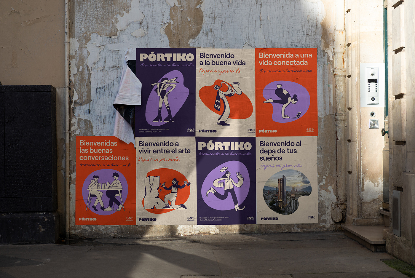
The identity is a reflection of the lifestyle PÓRTIKO offers to its future inhabitants.
We put together some free handmade style illustrations to represent the culture of the neighborhood and the people interested in living there. A symbolic, friendly, and strong color palette, and a fun and bold logo.
PÓRTIKO
It is the entrance to the party of life. A space to enjoy art, culture, and gastronomy in a community that shares the taste for good living.
It is the entrance to the party of life. A space to enjoy art, culture, and gastronomy in a community that shares the taste for good living.
Naming, Concept & Brand Strategy, Brand Identity & Brand Voice.
Year: 2022-23
Illustrations: @isra.pop
Motion: Juan Novelo
Communication & Copywriter: Eliseo Leal
Creative Direction: Alan Coria
Design: Larissa Osorio, Alan Coria