Motago is a new European brand of quality auto parts, specializing in three product groups: auto parts, auto cosmetics and auto fluids. The main feature of the brand is the combination of high quality products with the best price on the market, as well as an unparalleled level of service. We were tasked with developing a distinctive name, logo, visual style for the umbrella brand and universal packaging. In general, the brand had to be associated with the automotive industry, inspire trust and have a modern look and be recognizable among competitors.


Logo and corporate style
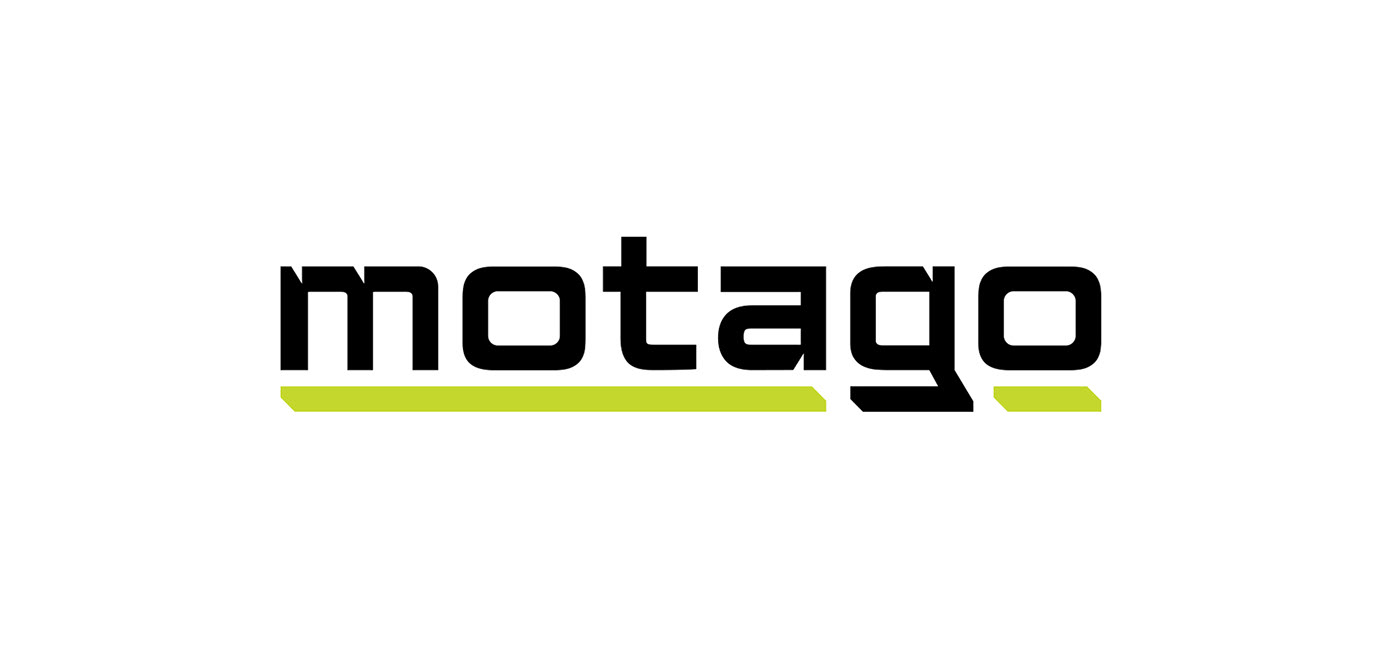
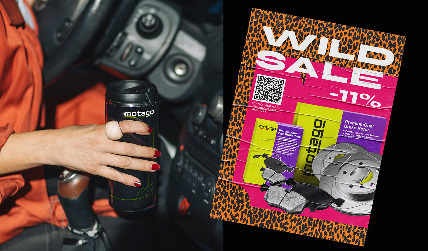
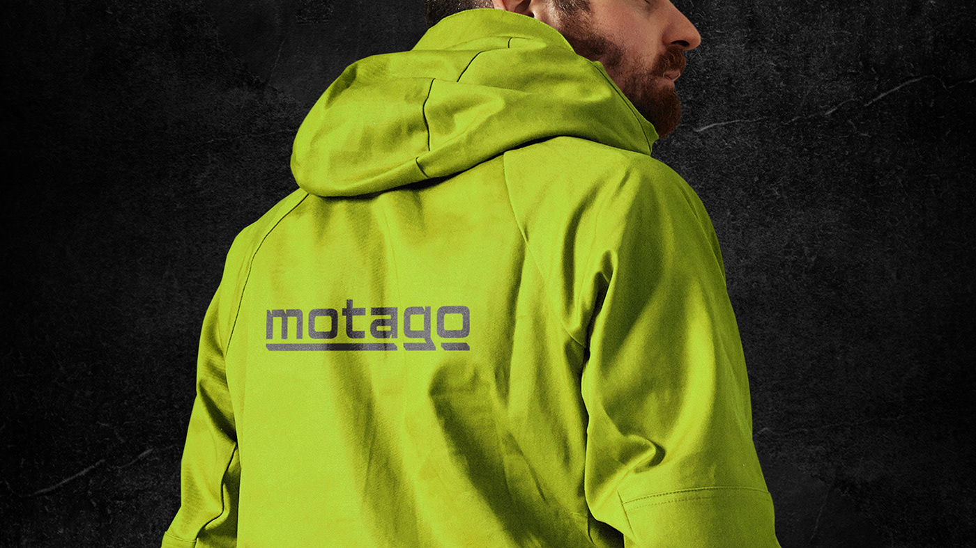
According to the client, the logo and corporate style should have a modern, youthful and bold character. Therefore, the basis for creating the logo was a recognizable stylized font that gives it an automotive character and is associated with technology. Underlining in the form of a colored graphic element symbolizes speed and movement. This element also serves as a color identifier for sub-brands. For the expressiveness of the visual style, we developed graphic elements based on the motifs of stylized letters - these are characteristic dies that can be filled with a fill or linearly to simulate speed. This solution is functional and concise, as this design is easy to adapt to advertising media, as well as to different types of packaging. A bold color scheme successfully distinguishes the brand from its competitors.


Client — Green Tech
CEO — Uliana Hrynchyshyn
CEO — Oleh Hrynchyshyn
Branding & Packaging Design — Vataga Agency
Creative Director — Costya Khmelyuk
Art Director — Nazar Kumanovsky
Graphic Designer — Alina Kravchenko
Project Manager — Ostap Malashnyak


