TWOGETHER SANS
Twogether Sans builds upon the achievements of Twogether Rounded, creating a more comprehensive system and positioning itself as a suitable choice for general text usage. By removing the rounded elements from each character, Twogether Sans gains increased flexibility and a broader range of possibilities for different types of projects.
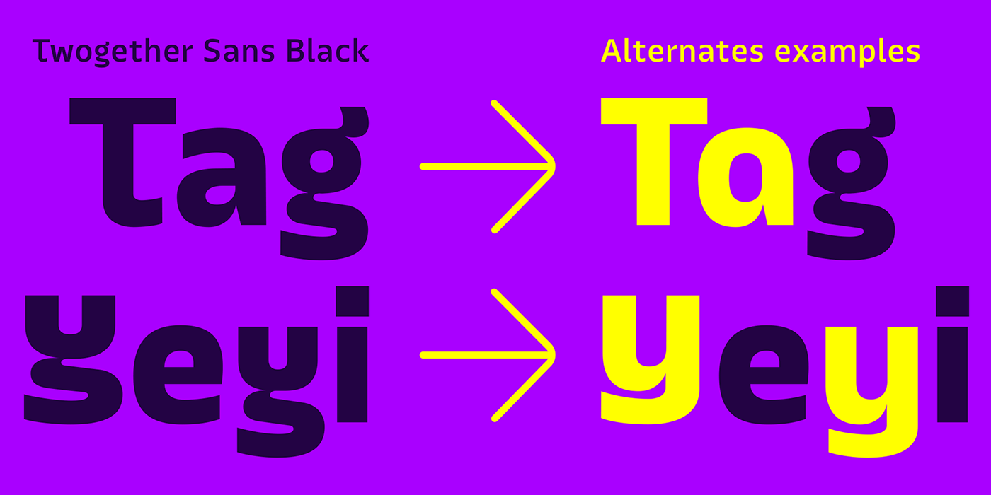
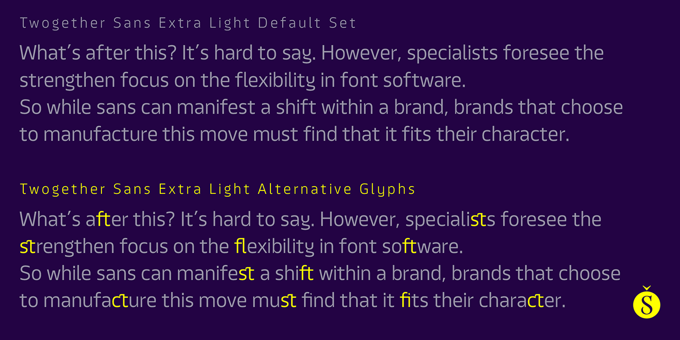
It retains the essential characteristics of its counterpart, such as proportions, x-height, small caps, ligatures, numerals, and the construction of the italic variant. This version also introduces distinctive alternate characters for "T," "Y," "y," and "a." However, in this case, the position of the "a" with an old-style eye has been adjusted to enhance legibility in this context.
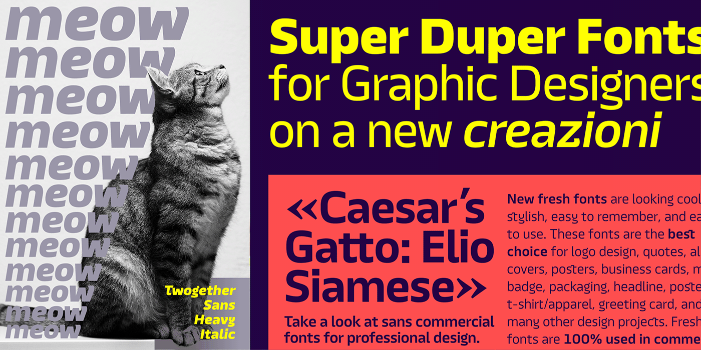
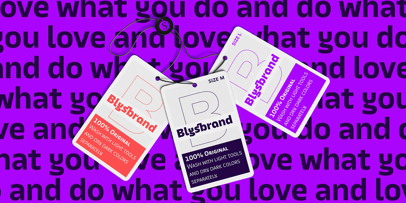
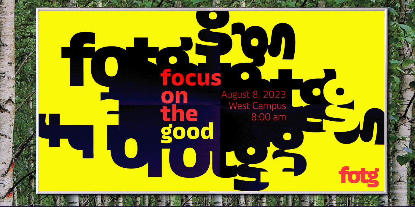
These details maintain consistency with the Rounded version while reinforcing Twogether Sans' unique personality. It remains an excellent choice for branding, editorial design, promotional materials, packaging, and digital applications.
—