Design In Sight Competition 2014
** I'm proud to say that this project won the 2nd Place Runner-Up Award in the 2014 Awards! **
Brief: Choose one of twenty brands and redesign them for the future, using a combination of great research and design.
Concept: I chose to redesign J2O, finding that it was perceived to be a kid's drink, didn't reflect the brand's playful personality, and missed the potential for storytelling within the brand identity.
Solution: Utilising my research into consumer behaviour and trends, I focussed on the story of mixology and chemistry behind the brand, making it more grown-up and slick through simple but bold design, and a playful and exciting consumption process - in short, putting the 'Oh!' back into J2O.
Research was a major part of this project, and my discoveries and brand strategy can be seen here.


Visual Planning

Logos

Brand Identity

Final Bottles
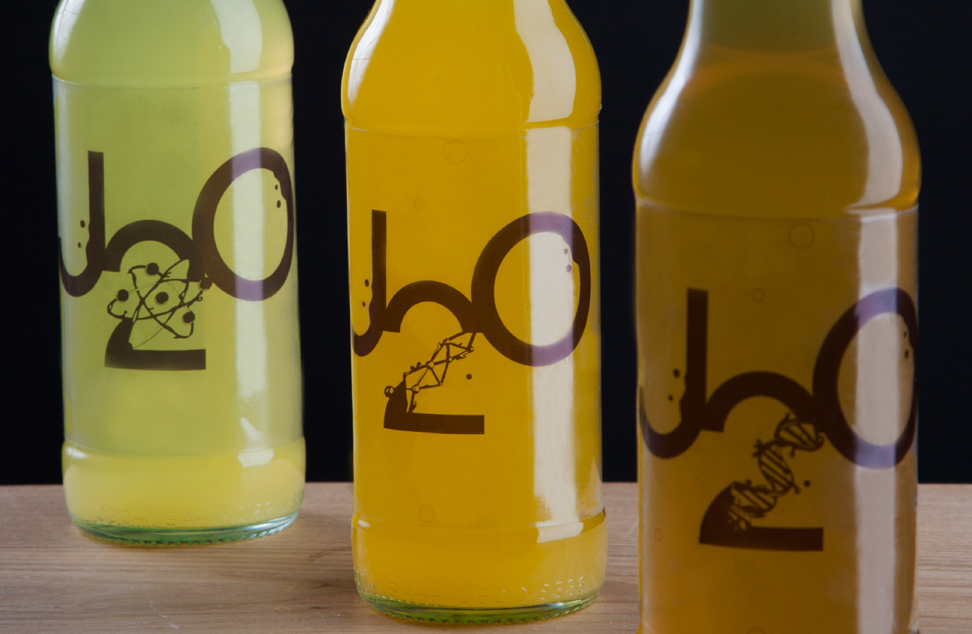
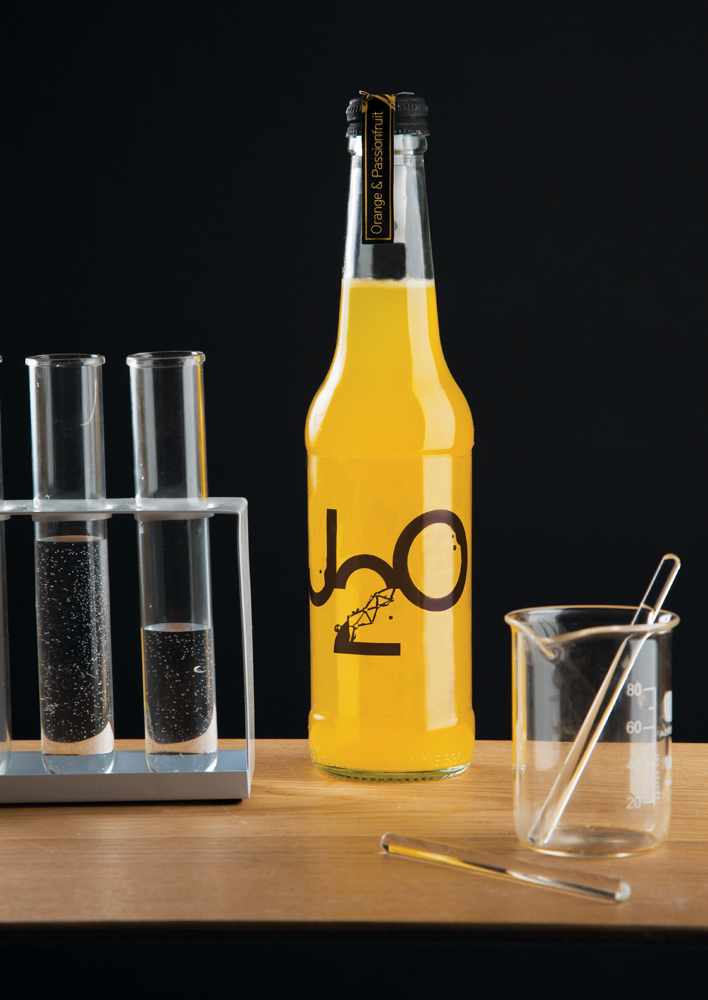
The individual bottles, available to take home from supermarkets and convenience stores, were designed with J2O's USP in mind - the perfect, playful blend between the two flavours in one bottle. As a result, the bottle concept puts you in control of the scientific J2O process. By twisting the lid of the bottle, the second flavour of the drink is released from a hidden sachet - mixing the flavours, transforming the colours, revealing details on the label and most importantly - creating that engaging element of surprise.
The bottles themselves are more elegant and inspired by the slimline, straight structure of chemistry bottles. The packaging design was inspired by the insight that many people differentiate J2O's three flavours through the colour of the drink. This provided the perfect opportunity to eliminate copy and generic images of fruit - instead letting the colours and logos speak confidently for themselves. Smaller labels across the caps provide the flavour names, just in case!

Process

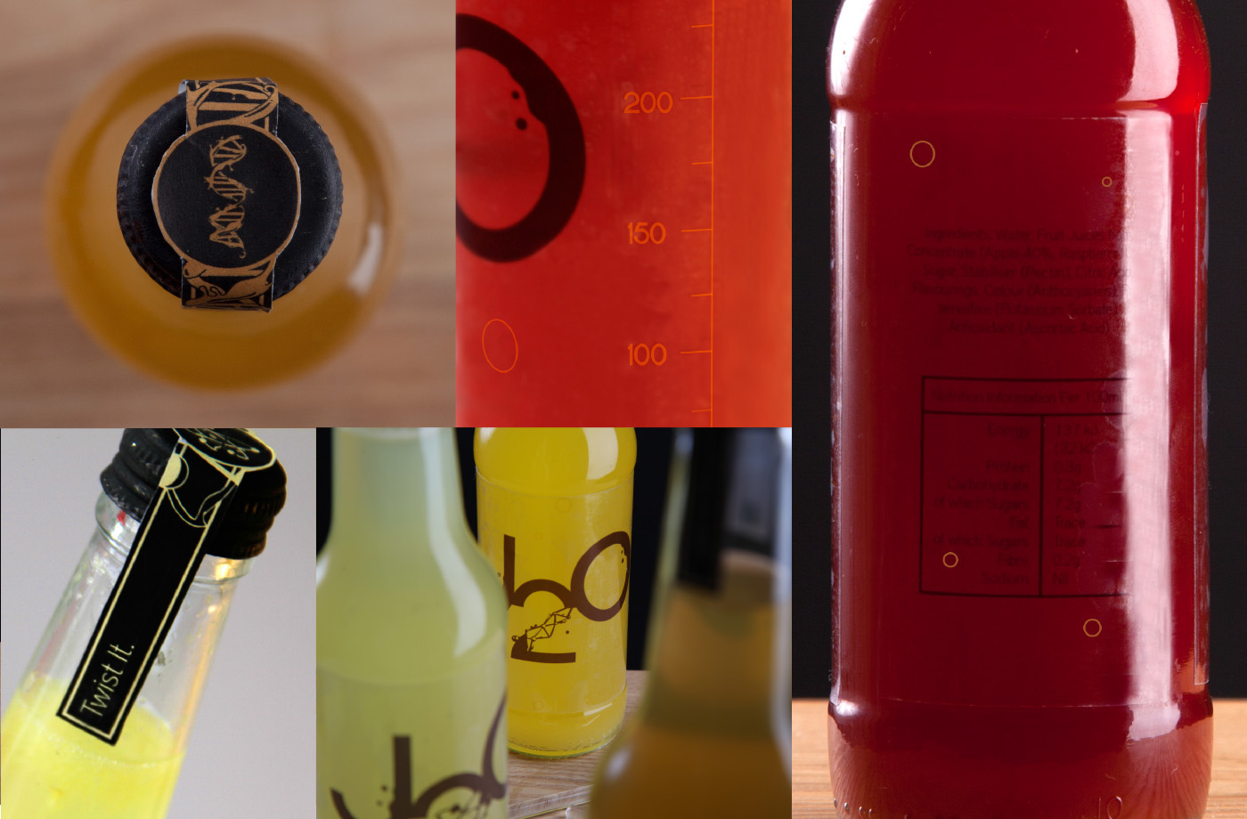
Final bottle colours after the process has been completed

Details - some revealed only after the drink changes colour
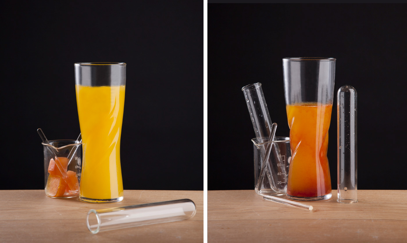
Research found that a key point of sale for J2O was in a pub/bar situation where the bottles tend to be hidden behind the counter. Other bottled drinks are also being fazed out in favour of using the far more sustainable bar taps, providing the perfect opportunity to extend J2O's playful image to point-of-sale.
Extending the engaging bottle concept, each bar tap holds one fruit juice and the other flavours are available as flavoured ice cubes for drinkers to mix in and personalise their J2O every time.

Bar Taps


