Brief
Choose a famous brand, product or service and redesign it in a breakthrough way.
Concept
Gillette is in dire need for a refresh. Their products are difficult to distinguish between, the packaging outdated and ultimately not very good for the environment, which is something that has to be addressed these days. Gillette have been around since 1901, but you wouldn’t believe this looking at the packaging today. I wanted to strip it back, everybody knows who Gillette is and what they do, does it need to be plastered all over their packaging?
Solution
Inspired by the smooth strip left behind when you make that first stroke with the razor, I have carried the diagonal shape through the whole product range. The contrast of smooth and rough textures is the real focus point for this packaging and so the design has been kept to a minimum allowing this to shine through.

Updated logo, typeface and colours
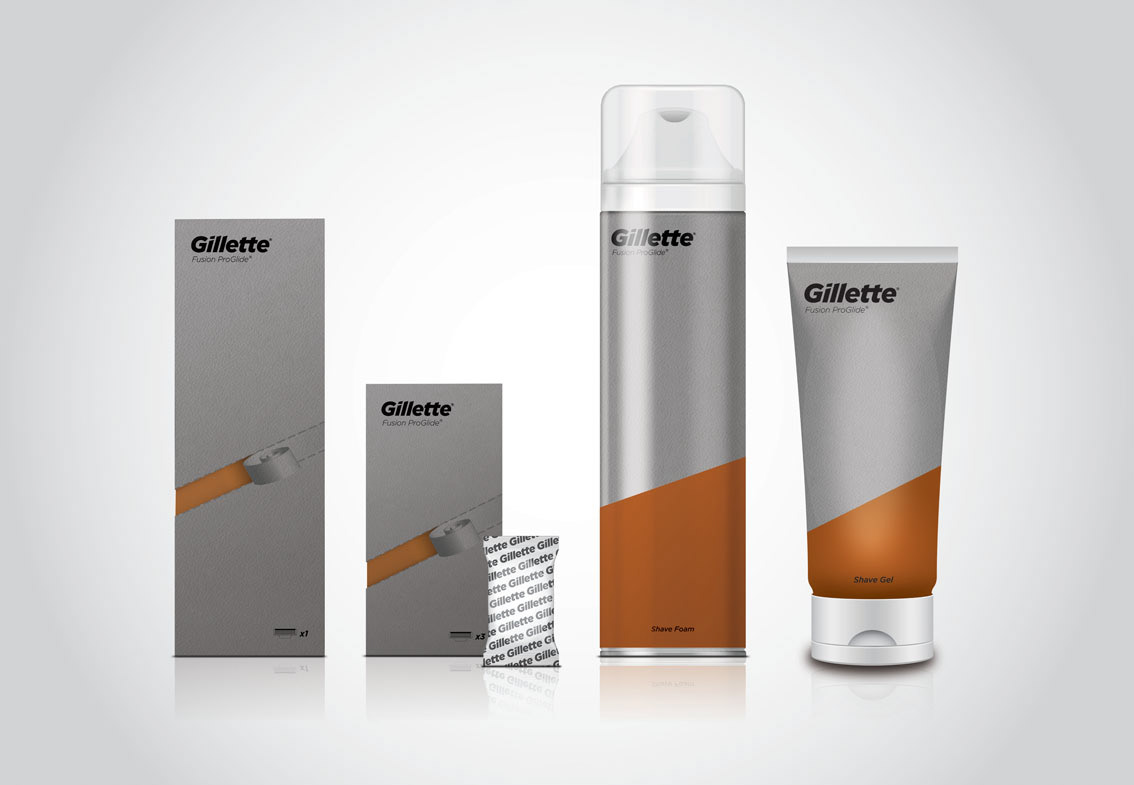

To open you must pull the perforated strip on the rough outer box, as you do this a smooth orange strip will be revealed enabling you to remove the lid. This mimics the smooth strip left behind when you make that first stroke with the razor. The razor blades are individually sealed in their own foil packets complete with Gillette logo pattern.

To open you must pull the perforated strip on the rough outer box, as you do this a smooth orange strip will be revealed enabling you to remove the lid. This mimics the smooth strip left behind when you make that first stroke with the razor.
Razor blades are individually sealed in their own foil packets complete with Gillette logo pattern.

An example of how the adverts could look in a magazine such as Men’s Health. Once again the textures have been carried through, meaning the orange shape is smooth to contrast the rough top half.


