Gravity Sport branding
Gravity Sport is a sports training center for the whole family. It specializes in triathlon and children's sports.
The mission of the Gravity Sport brand is to give everyone an opportunity to win. It combines a sports school of good quality and comfort of a fitness club in order to achieve the goal. The mission implies a high level of customer service and effective communications within the company.

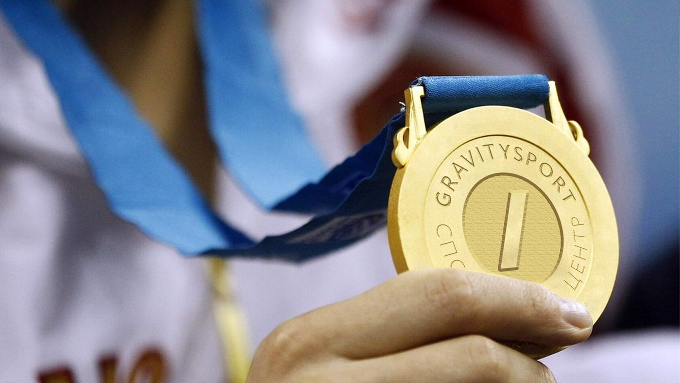
For the win
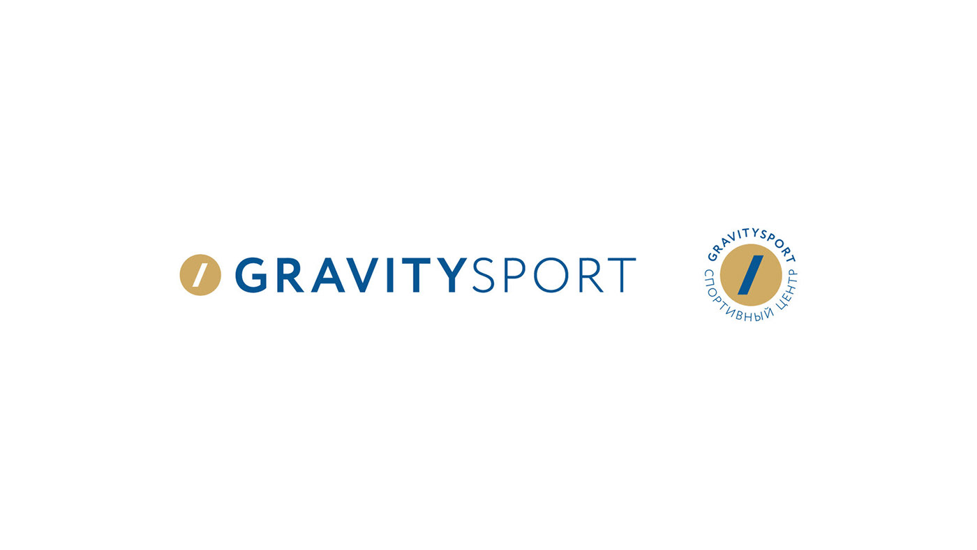
The Gravity Sport logo consists of 2 elements: a text and the brand name. The sign
is designed in the shape of a gold medal with a blue diagonal line. The line is directed forward and symbolizes movement, achievement, victory and first place.
is designed in the shape of a gold medal with a blue diagonal line. The line is directed forward and symbolizes movement, achievement, victory and first place.

Sports victories available for everyone
The corporate identity of the brand is based on the concept of victories, high achievements, and constant willingness to move forward. The diagonal line
is the main brand element and it reflects the idea.
is the main brand element and it reflects the idea.

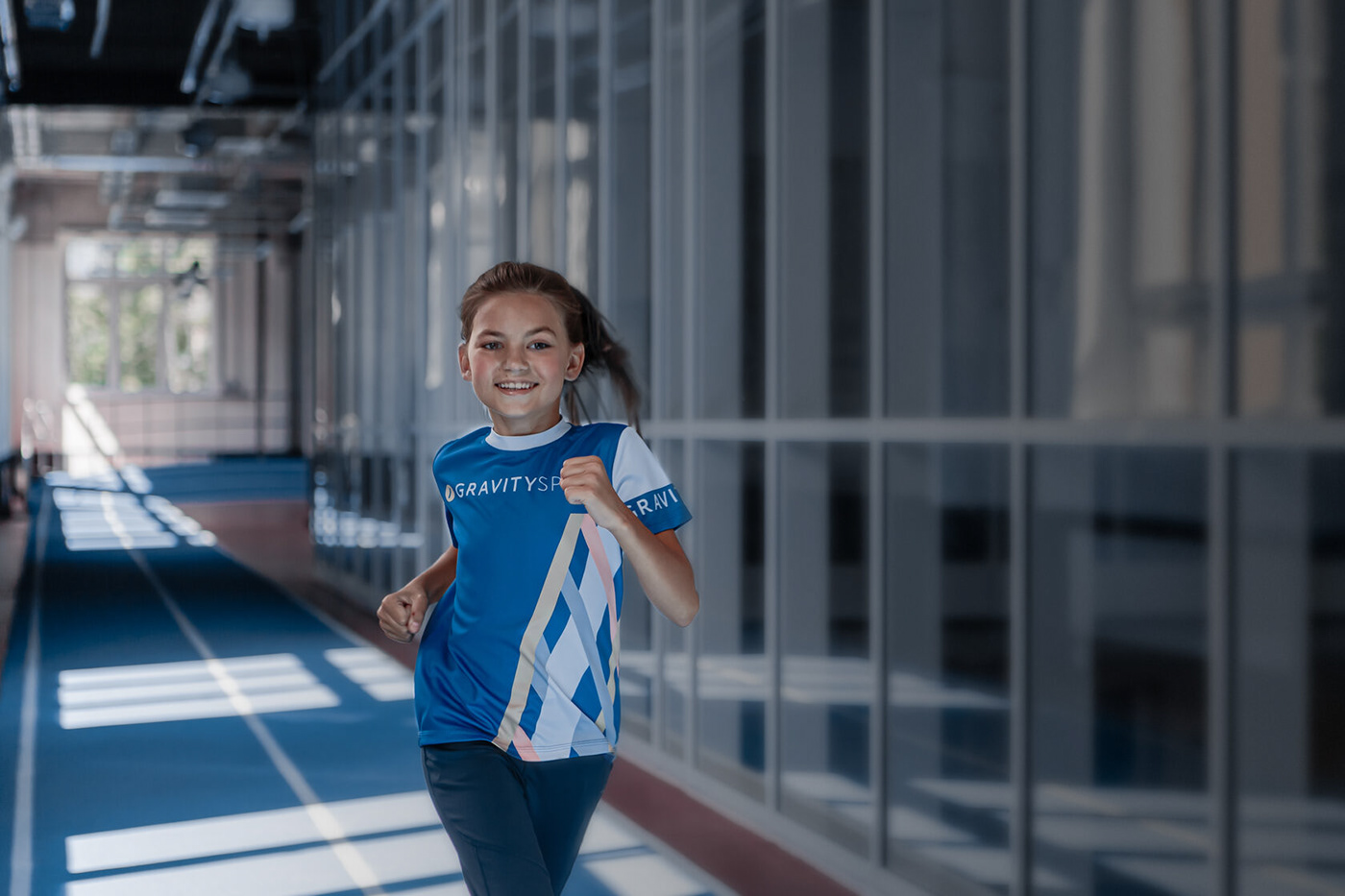
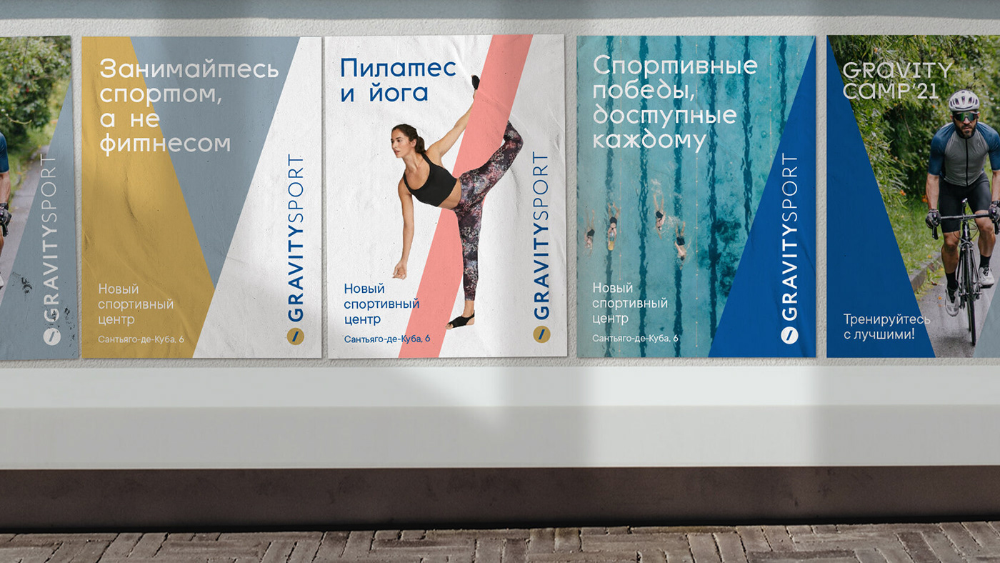
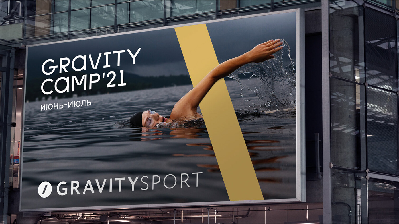
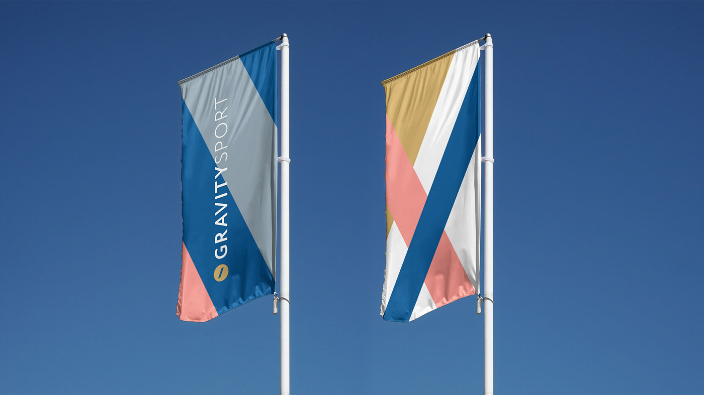
Versatility, utility, dynamics
The corporate identity is represented through graphic images and photo content.
The lines add dynamics and can be adapted to any media. They can be used
as containers for photos or can be placed on top of them, maintaining a unified image
of all communications.
The lines add dynamics and can be adapted to any media. They can be used
as containers for photos or can be placed on top of them, maintaining a unified image
of all communications.
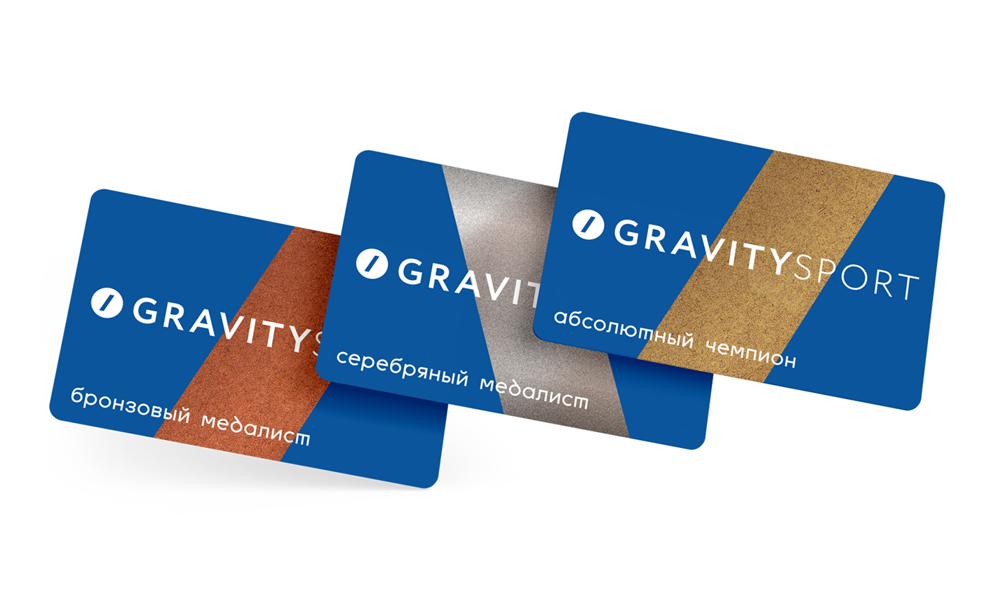
We expanded the color palette and added gold, pink and gray shades to the typical blue which is the base color for sports centers. Such approach allows to design a variety of messages: from children's fitness advertising to announcements of major sports events.
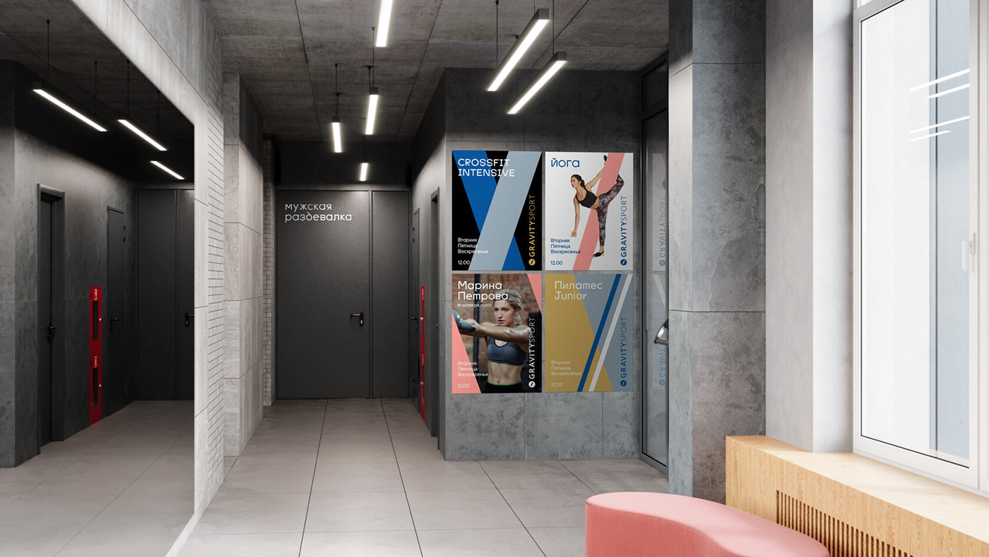
Branded graphics looks perfectly well in the interior. The combination of minimalistic design and bright accents highlights the space and reminds of the pursuit of victory.


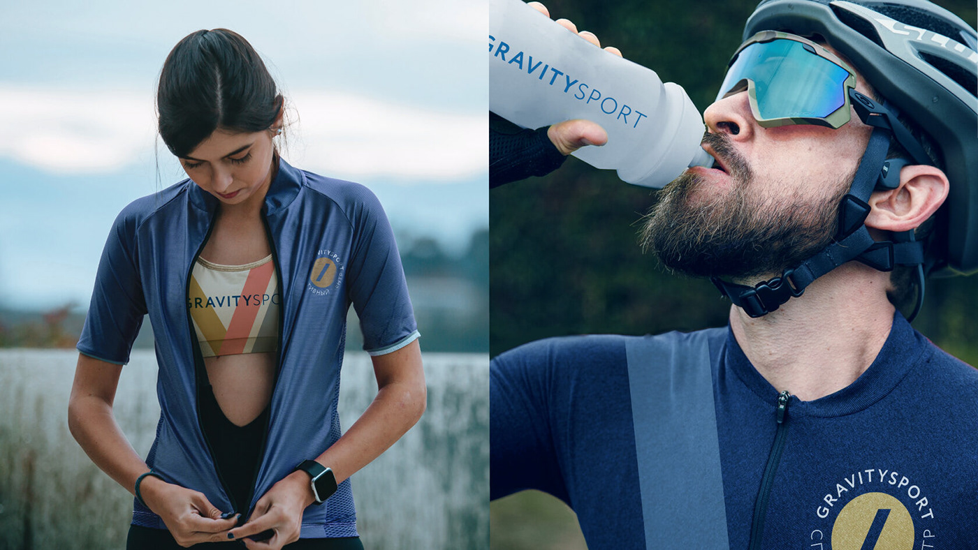
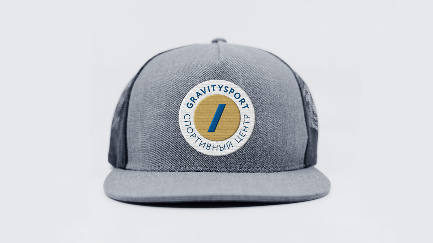
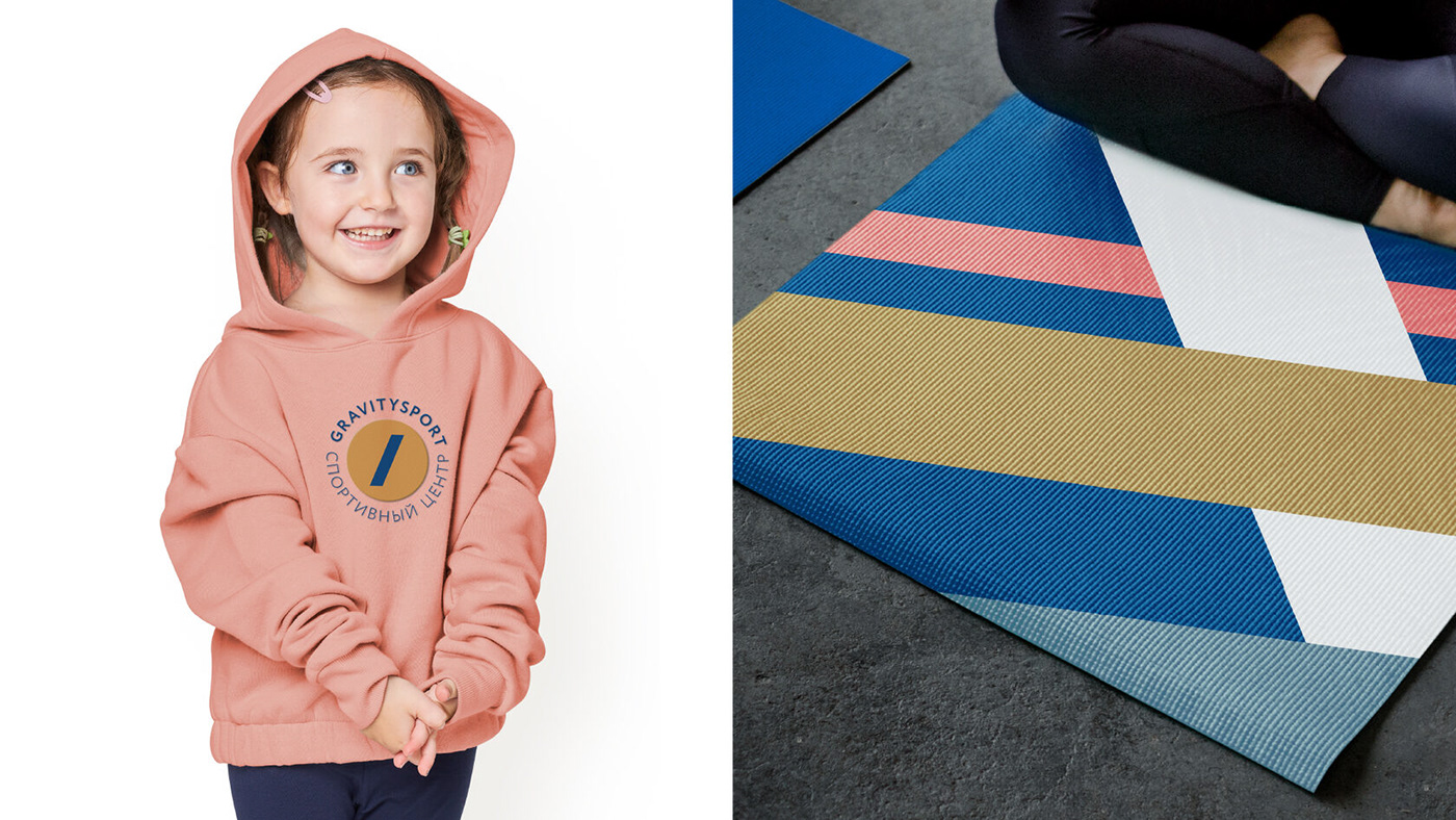
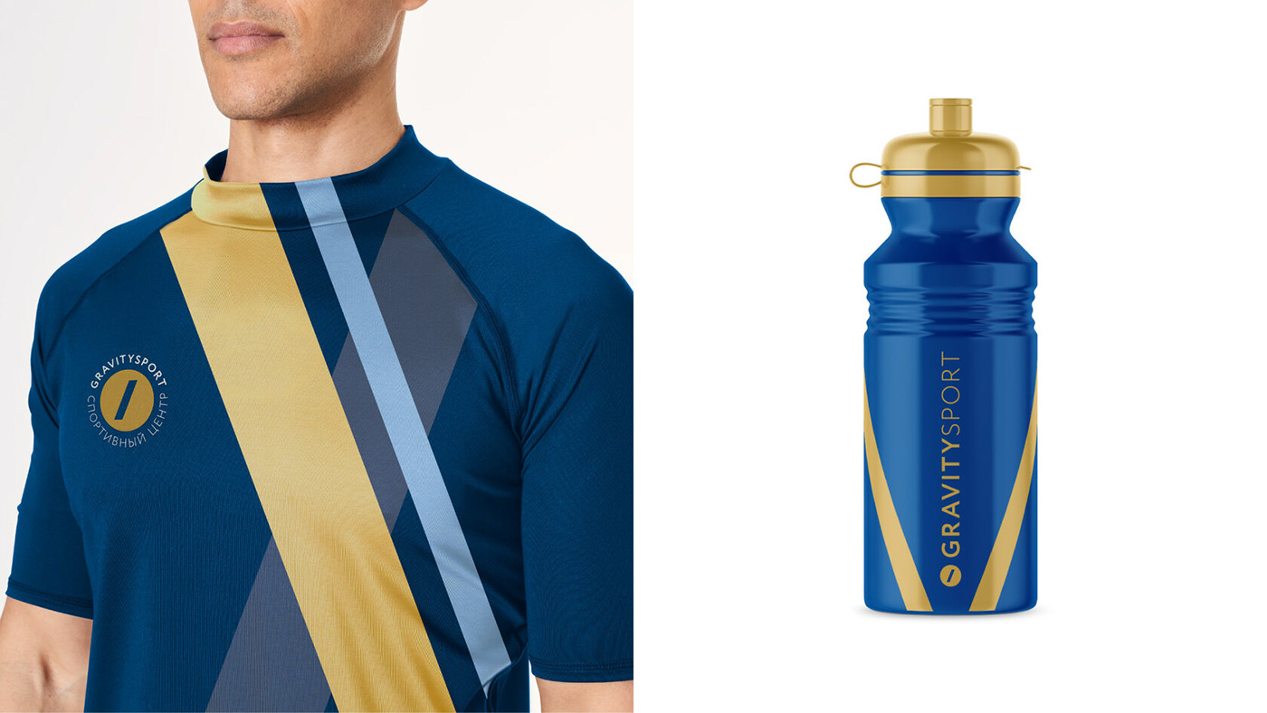
Always fit
The graphics can be adapted for accessories, adult and child sportswear.
The branded lines are organically integrated into the design of clothing and make
The branded lines are organically integrated into the design of clothing and make
it look sporty and at the same time casual.
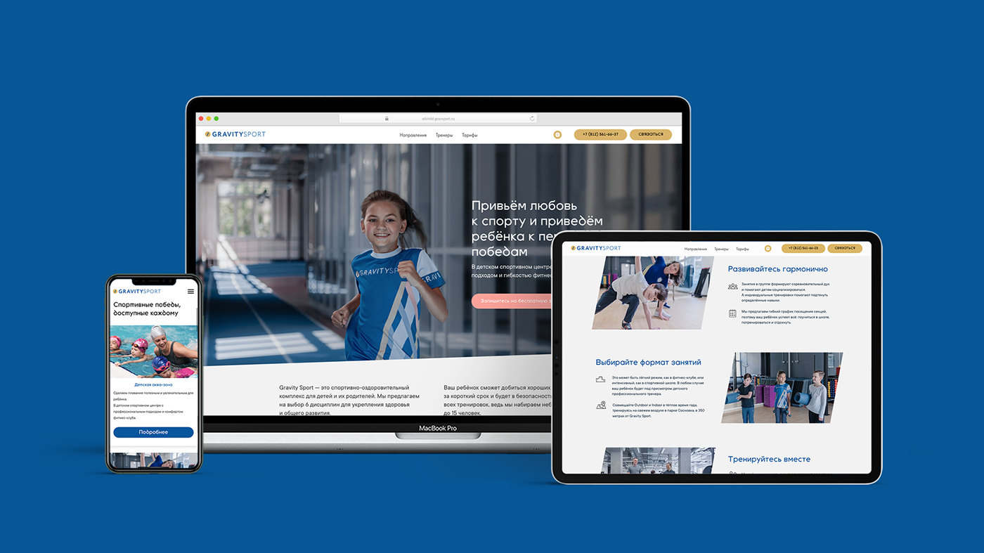
In one line
The corporate identity is represented in the brand's digital communications. We used brand lines, a distinctive font, all the primary (blue and gold) and additional(pink, gray, black and white) colors to design the look of the Gravity Sport landing pages.