JUNCTION BRAND IDENTITY
Junction is an investment fund focused on energy transition. Unlike many others, Junction is concerned not with finding new breakthrough inventions but with scaling great ones that already exist. The fund's founders believe that this grounded approach is the way to shift energy transition into a higher gear and make actual change happen.
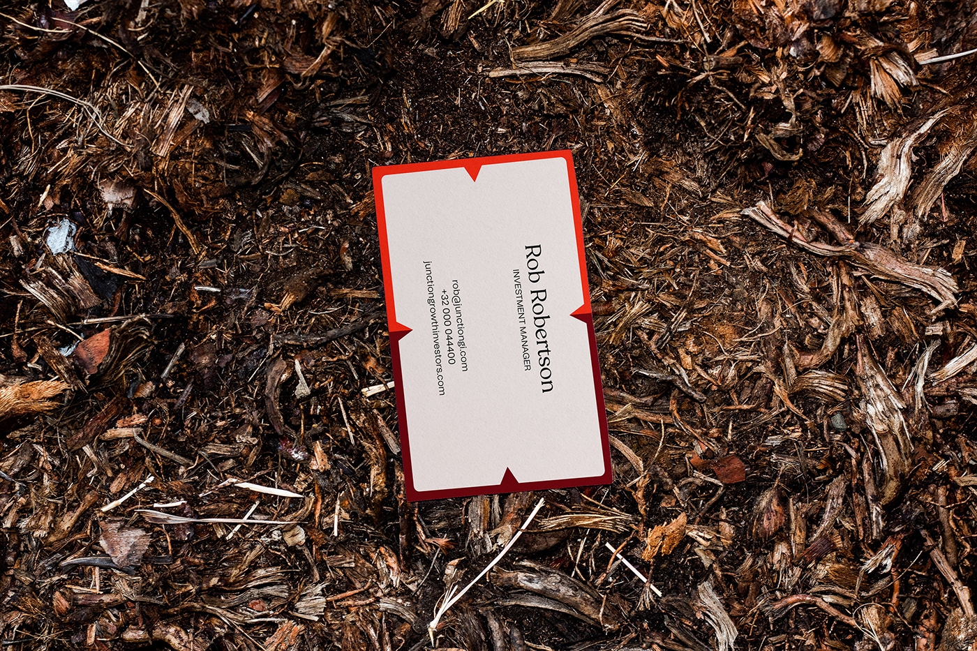
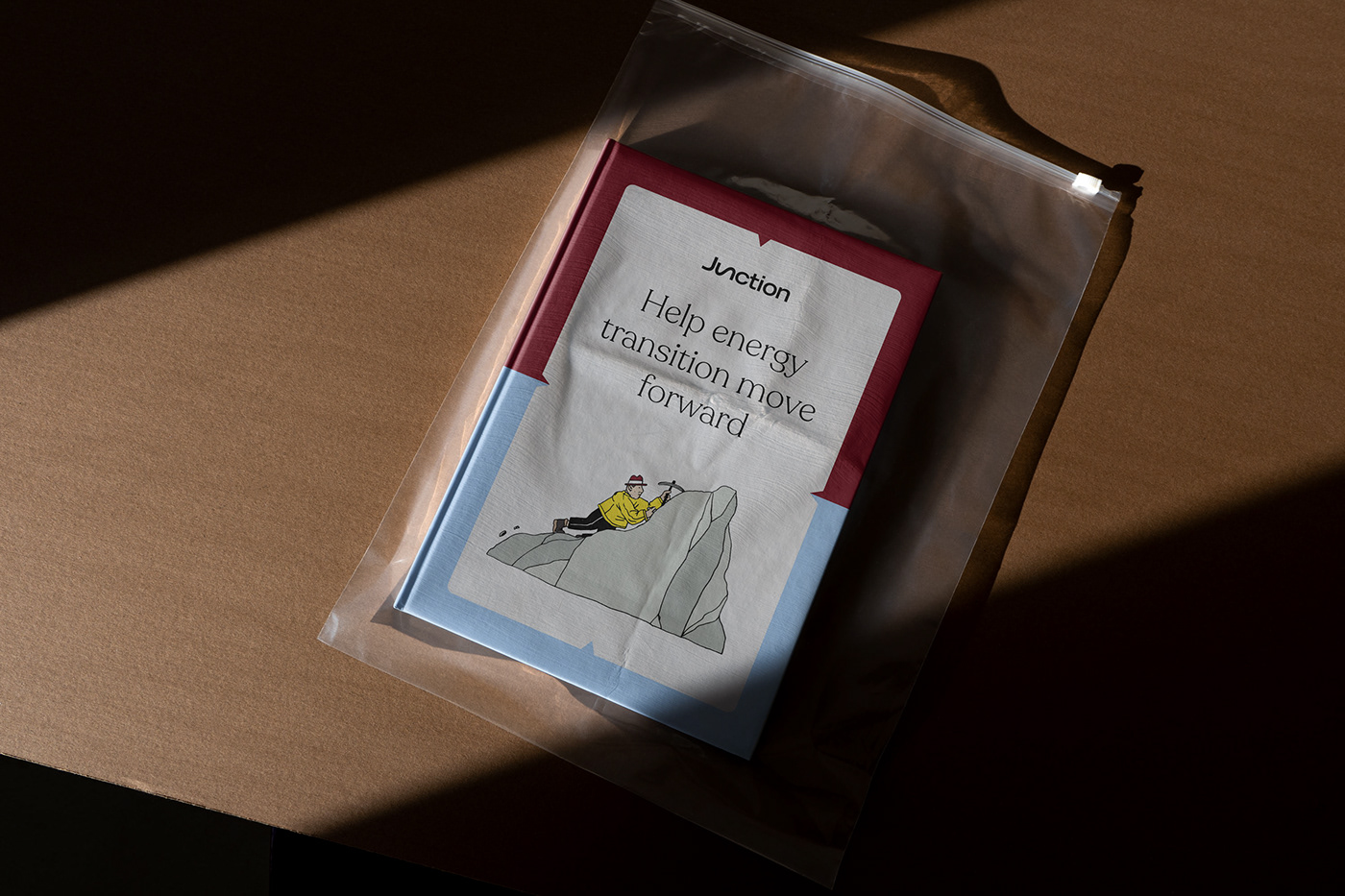
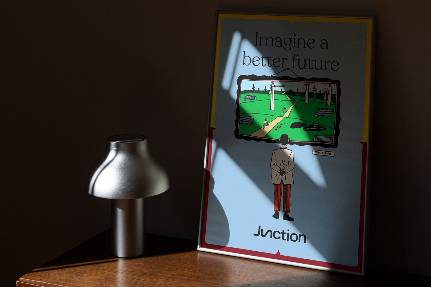
Junction was founded by a four-member team combining former entrepreneurs and investment professionals. Each team member has a distinct area of competence and investment perspective. In brand design, this junction of professional skills and perspectives is expressed with directional notches that divide backgrounds and spaces to create a sense of a structured and multi-dimensional approach. The dual nature of the fund’s founders is represented by two-tone color schemes.
The symmetry in the backgrounds is combined with a cheerful illustration style aimed at representing the fund’s authenticity and sincerity. Because Junction is based in Belgium, the illustration was chosen to mimic the style of the legendary Belgian Tintin comics, in which the protagonist is an investigative reporter whose approach to solving problems and his intelligent and creative character is reminiscent of Junction itself.