ICE ICE BABY
PT
Ice Ice Baby é uma marca de sorvetes (ou gelados, em português europeu) localizada em Lisboa. Mas não é uma sorveteria comum: lá, os sorvetes são salgados — isso mesmo: sorvetes salgados, de azeitonas, grãos de mostarda, couve-flor, feijão branco... enfim. Os sorvetes são todos artesanais e veganos, feitos com ingredientes naturais e sem adição de açúcar.
EN
Ice Ice Baby is an ice cream brand located in Lisbon. But it's not an ordinary ice cream shop: there, the ice cream is salty — that's right: salty ice cream, made from olives, mustard seeds, cauliflower, white beans... etc. The ice creams are all handcrafted and vegan, made with natural ingredients and no added sugar.


PT
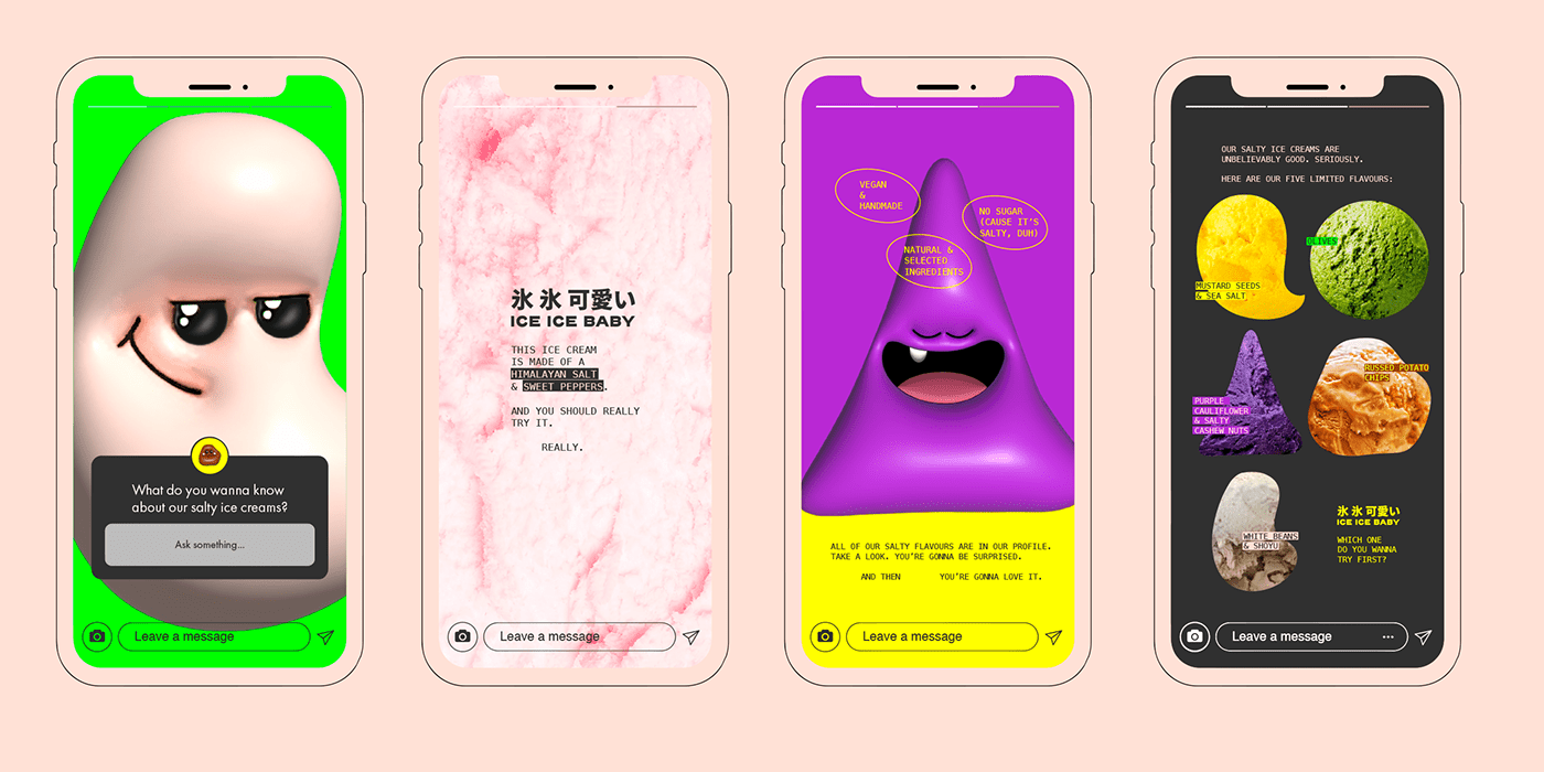
→ Para este projeto, O DESAFIO era despertar a curiosidade e o interesse dos potenciais clientes para estes sabores tão incomuns de sorvete, evitando que eles rejeitassem a ideia antes mesmo de experimentar. Afinal, são sabores de fato não usuais.
→ A SOLUÇÃO foi encontrada no Japão, um país que sempre abraçou e estimulou o consumo de alimentos considerados "diferentes" para outras culturas. Lá, pelas ruas, encontramos tanto os sabores salgados de sorvetes quanto as cores neon e os personagens (muitas vezes monstrinhos) com aspecto "kawaii" (fofos).
Palavras-chave: divertido, ousado, surpreendente.
EN
→ For this project, THE CHALLENGE was to arouse the curiosity and interest of potential customers for these very unusual flavors of ice cream, preventing them from rejecting the idea even before trying it. After all, they are indeed unusual flavors.
→ THE SOLUTION was found in Japan, a country that has always embraced and encouraged the consumption of foods considered "different" by other cultures. There, on the streets, we find both the salty flavors of ice cream and the neon colors and characters (often little monsters) with a "kawaii" (cute) look.
Keywords: playful, bold, surprising.

PT
O logotipo é limpo e moderno, e incorpora em todas as versões os ideogramas japoneses correspondentes ao nome da marca, Ice Ice Baby (sim, sem as vírgulas). Optou-se por uma marca sem ícone, pois a identidade no geral já terá elementos suficientes.
EN
The logo is clean and modern, and in all versions it incorporates the Japanese ideograms corresponding to the brand name, Ice Ice Baby (yes, without the commas). We opted for a brand without an icon, as the identity in general already have enough elements.


PT
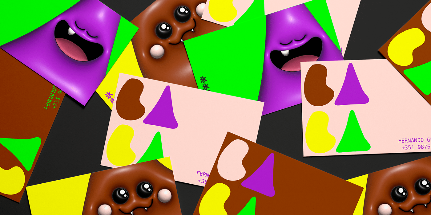
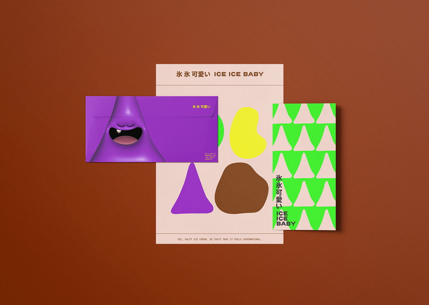
Os principais assets da marca são estes personagens ilustrados e tridimensionais, inspirados pela cultura japonesa “kawaii” (fofo). Com estes monstrinhos, a ideia é brincar com o assustador e o estranho, subvertendo-os a algo divertido e apelativo ao público. Tudo isso, é claro, sem perder o aspecto moderno e ~cool.
Além destes personagens, também faremos uso de suas versões simplificadas — ou seja, apenas suas silhuetas planas. Isso nos permite construir padronagens e elaborar diferentes e modernas aplicações ao longo de todos os pontos de contato de Ice Ice Baby..
EN
The brand's main assets are these illustrated and three-dimensional characters, inspired by the Japanese "kawaii" (cute) culture. With these little monsters, the idea is to play with the frightening and the strange, subverting them into something fun and appealing to the public. All this, of course, without losing the modern and ~cool aspect.
In addition to these characters, we'll also use their simplified versions — that is, only flat silhouettes. This allows us to build patterns and design different and modern applications throughout all of Ice Ice Baby's touchpoints.


PT
Para as embalagens, buscou-se um equilíbrio entre o minimalista — pois queremos trazer as influências japonesas e quase futuristas que nos inspiraram — e o divertido. A embalagem de cada um dos cinco sabores traz um dos personagens em sua versão tridimensional (na tampa) e simplificada (no rótulo em si): o resultado é a possibilidade clara de relacionar diretamente um personagem a um sabor, o que ajuda, no ponto de venda, a gerar atratividade por meio do aspecto lúdico.
EN
For the packaging, we were looking for a balance between the minimalist — as we want to bring the Japanese and almost futuristic influences that inspired us — and the fun. The packaging of each of the five flavors features one of the characters in its three-dimensional version (on the lid) and simplified version (on the label itself): the result is the clear possibility of directly relating a character to a flavor, which helps, at the point of sale, to generate attractiveness through the ludic aspect.