MOON
by Tor Hauk Langseth
Westerdals School project brief:
“Make a brochure and a poster and present a quality typeface. Adobe is the client (fictive) and the audience group is graphic designers. Do research and make the content. Cutting and pasting is allowed. It is only allowed to use the typeface (no photos, Illustrations etc.) for the design. You can use frames, boxes and lines, as well as any ornaments if they belong to the typeface. All colours are also allowed.”
About the brochure:
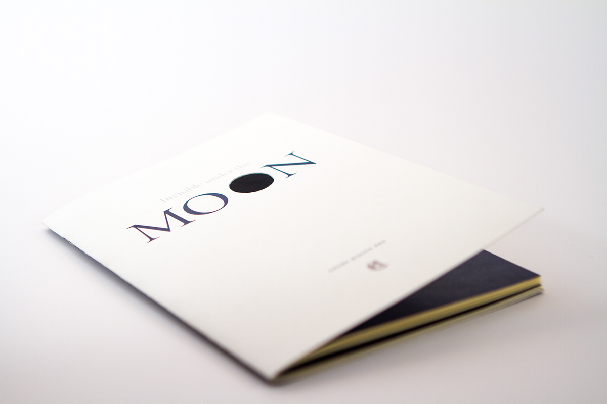
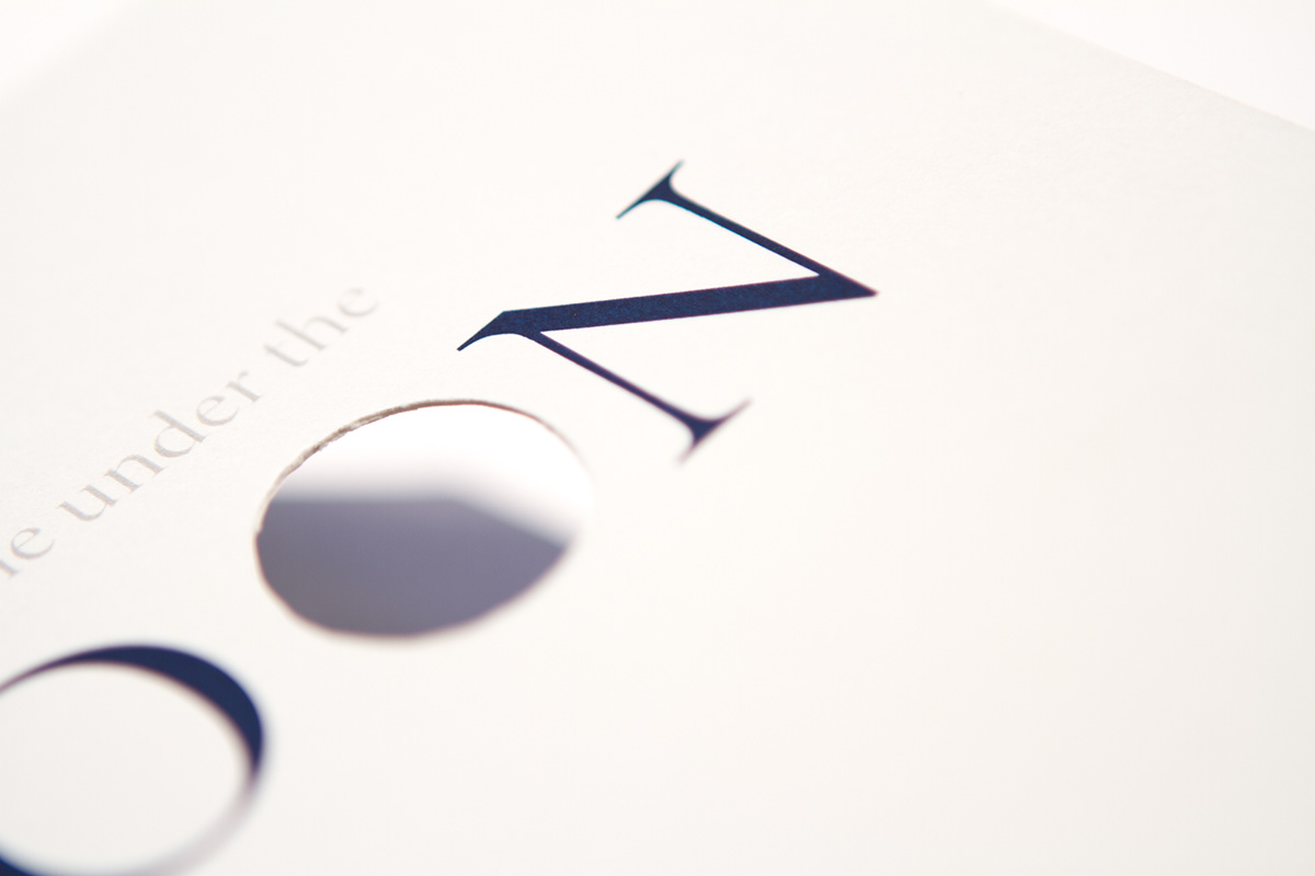
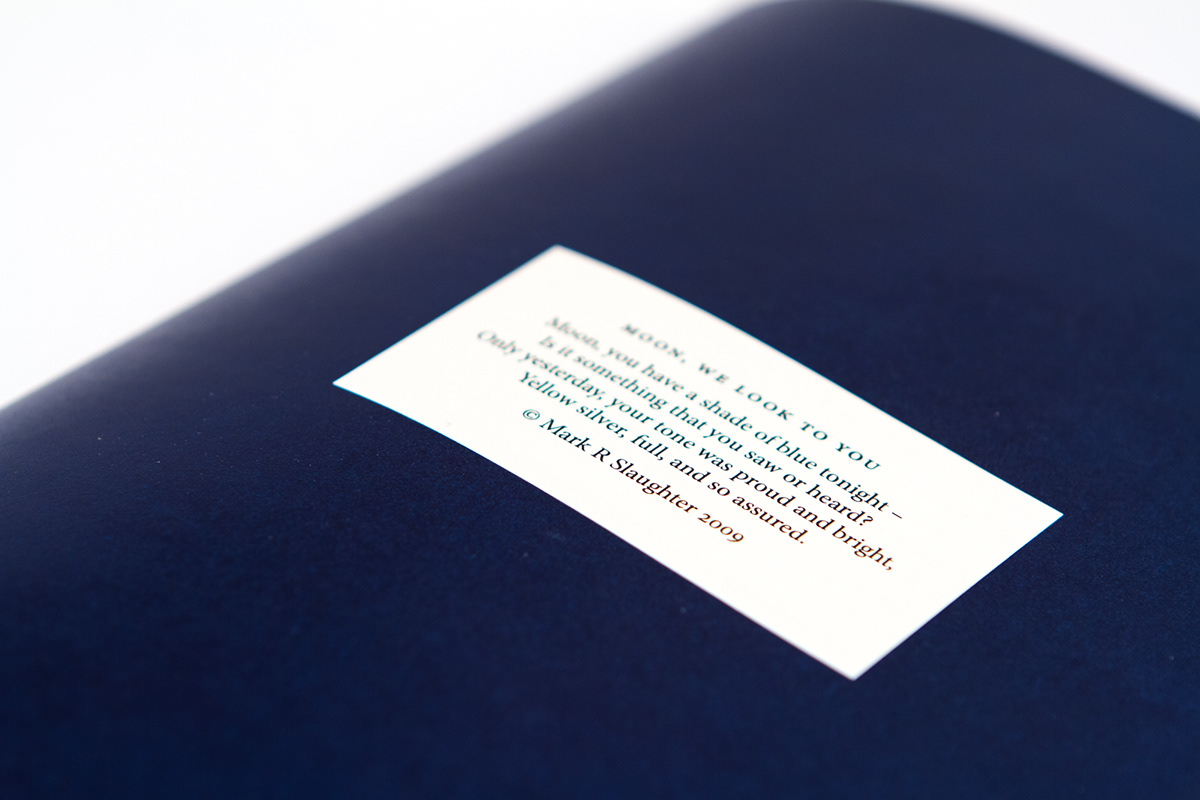
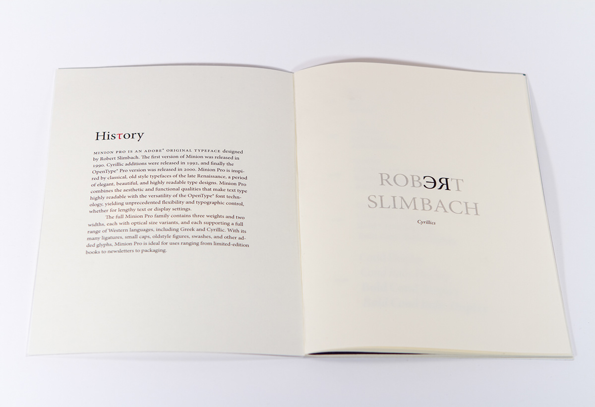
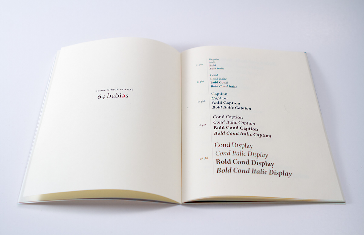
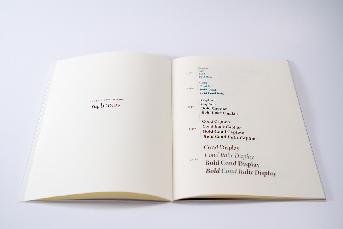
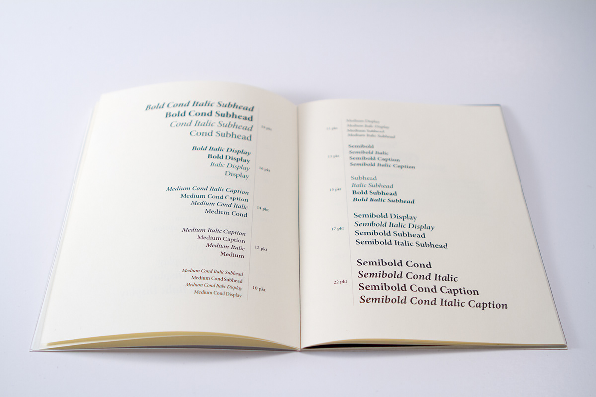
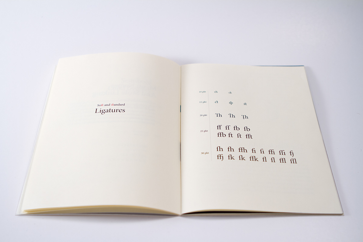
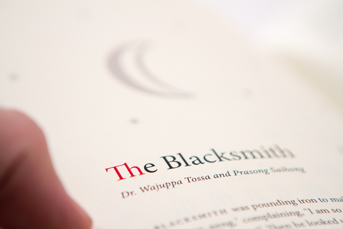
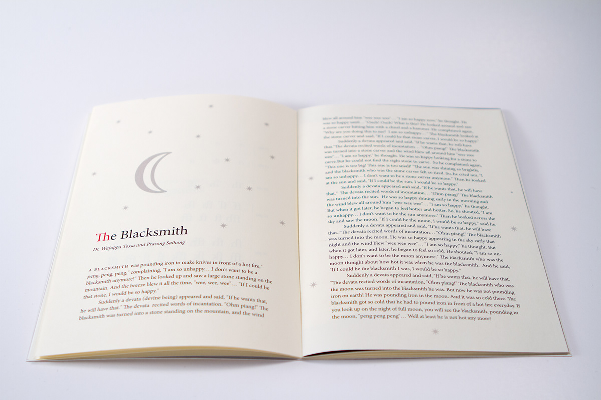
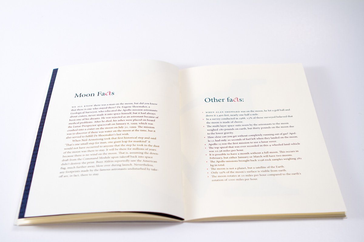
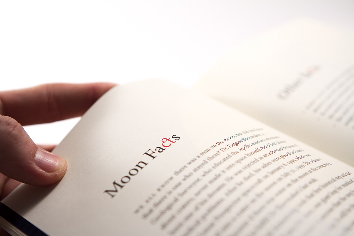
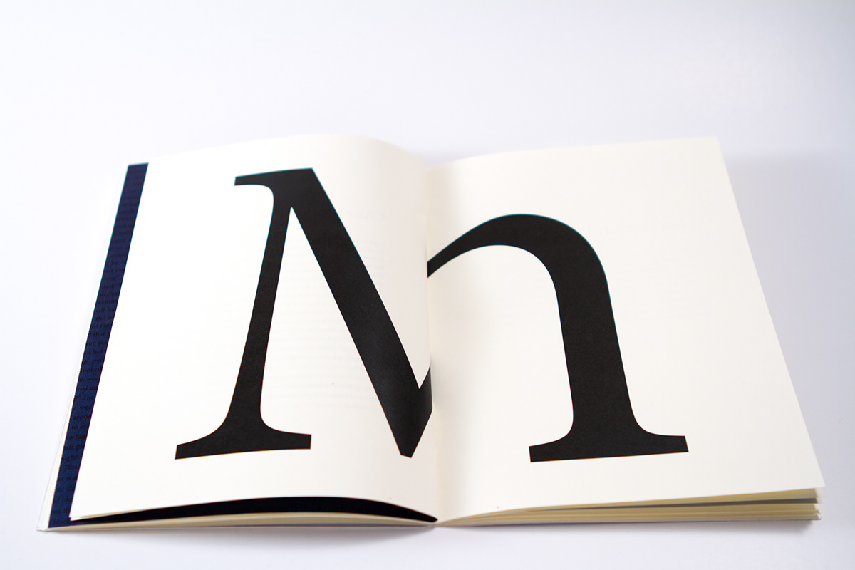
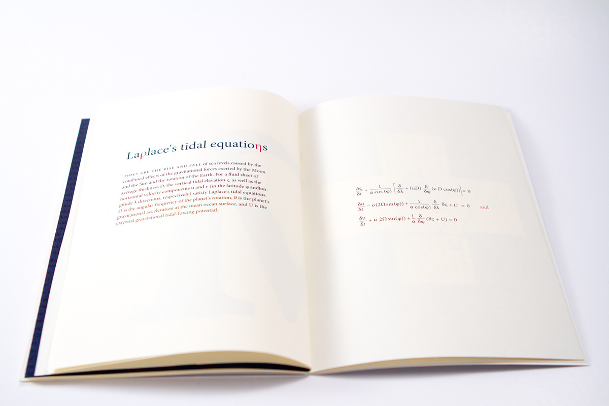
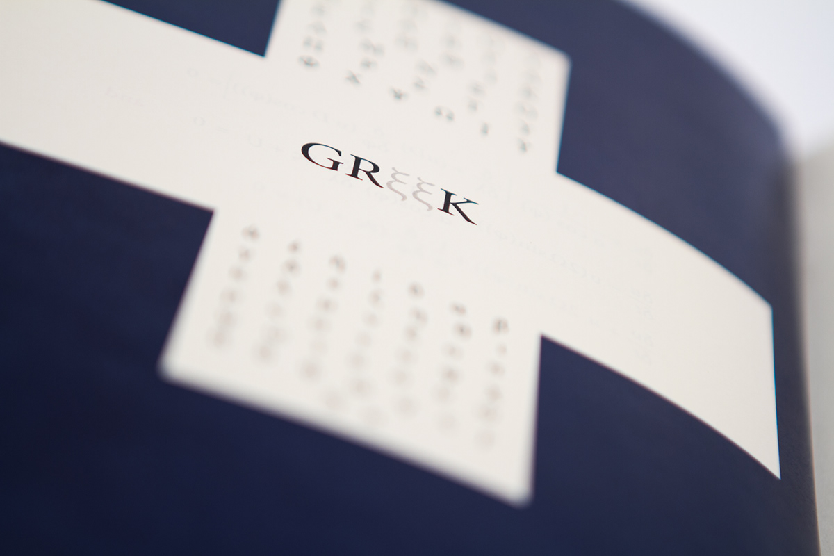
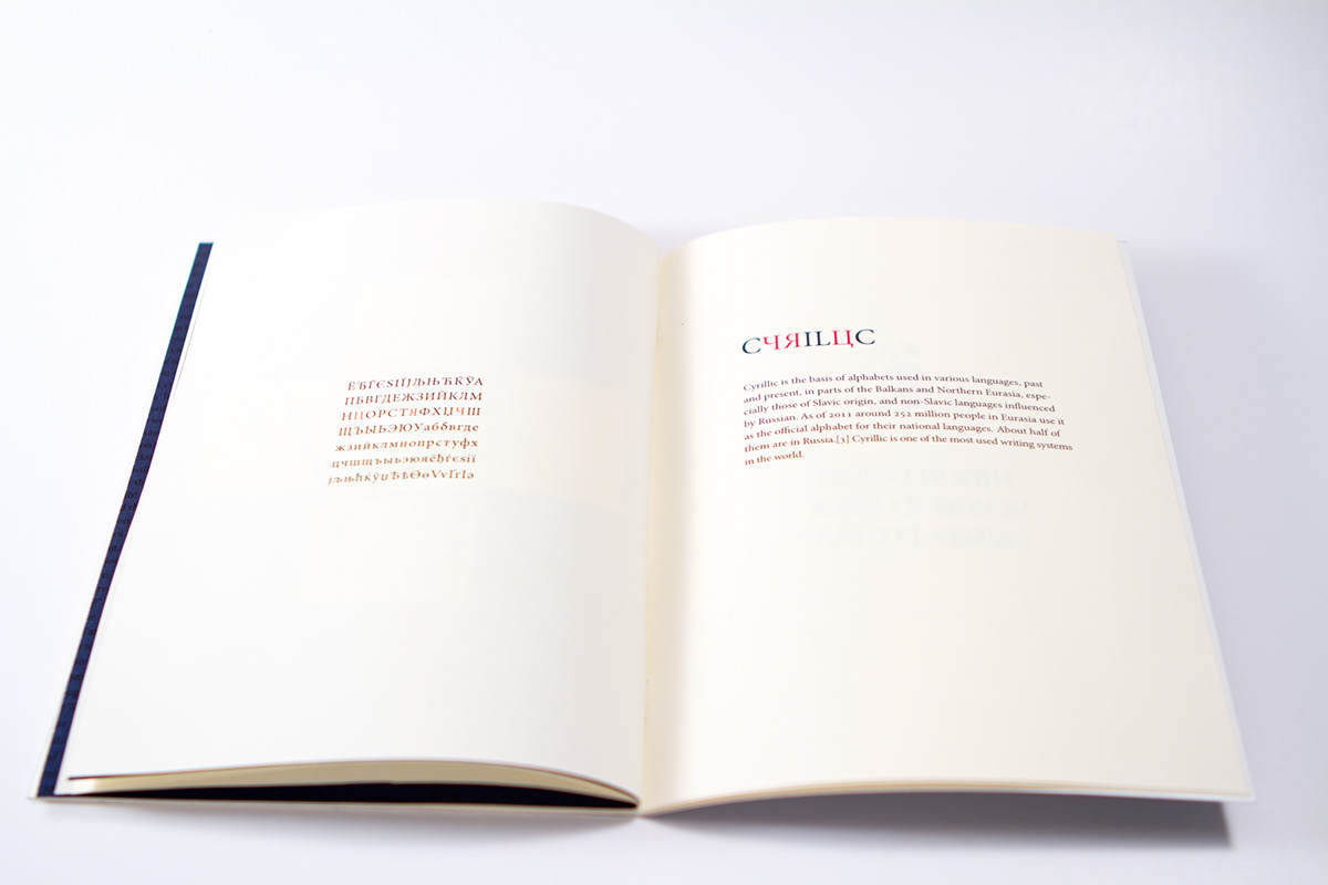
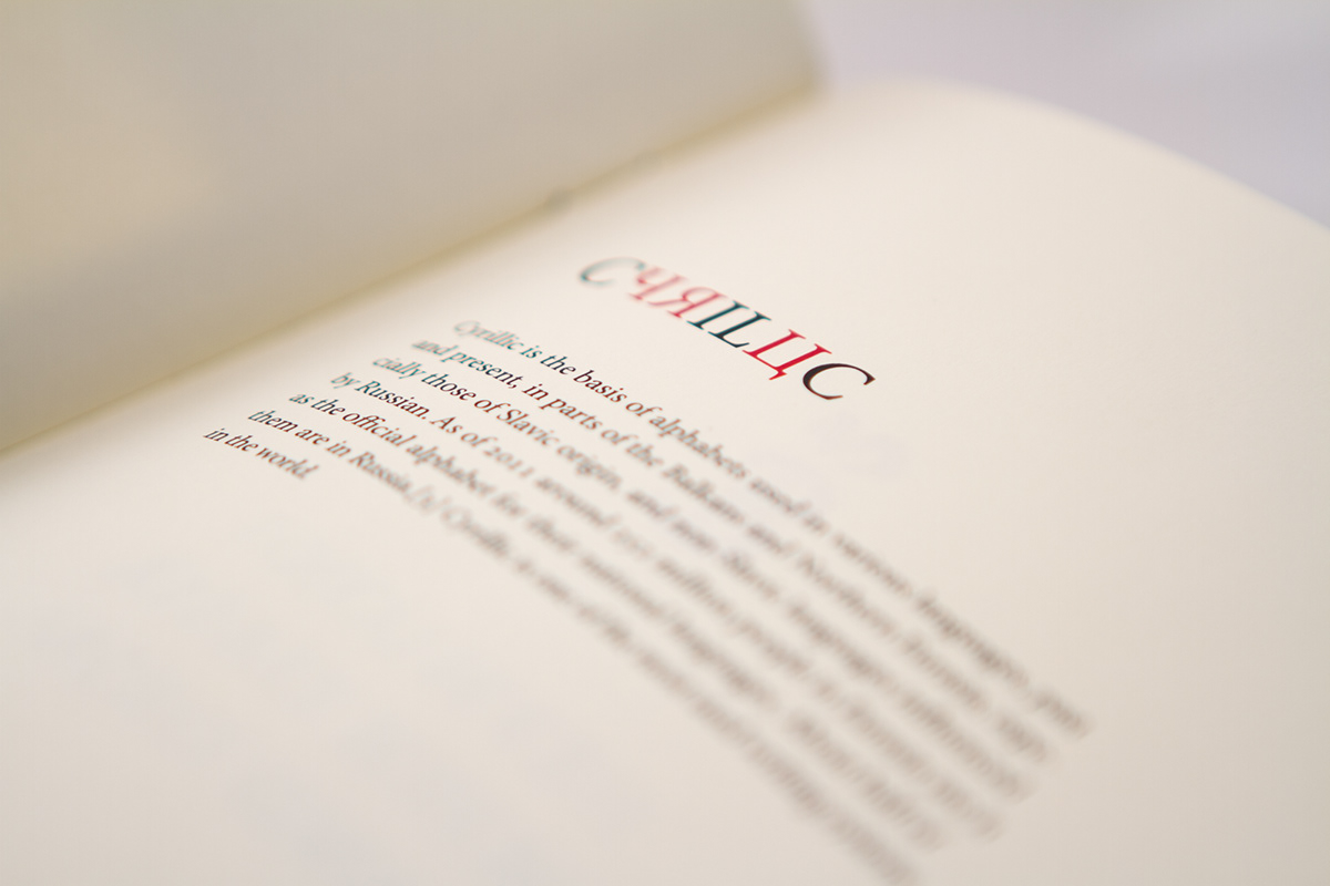
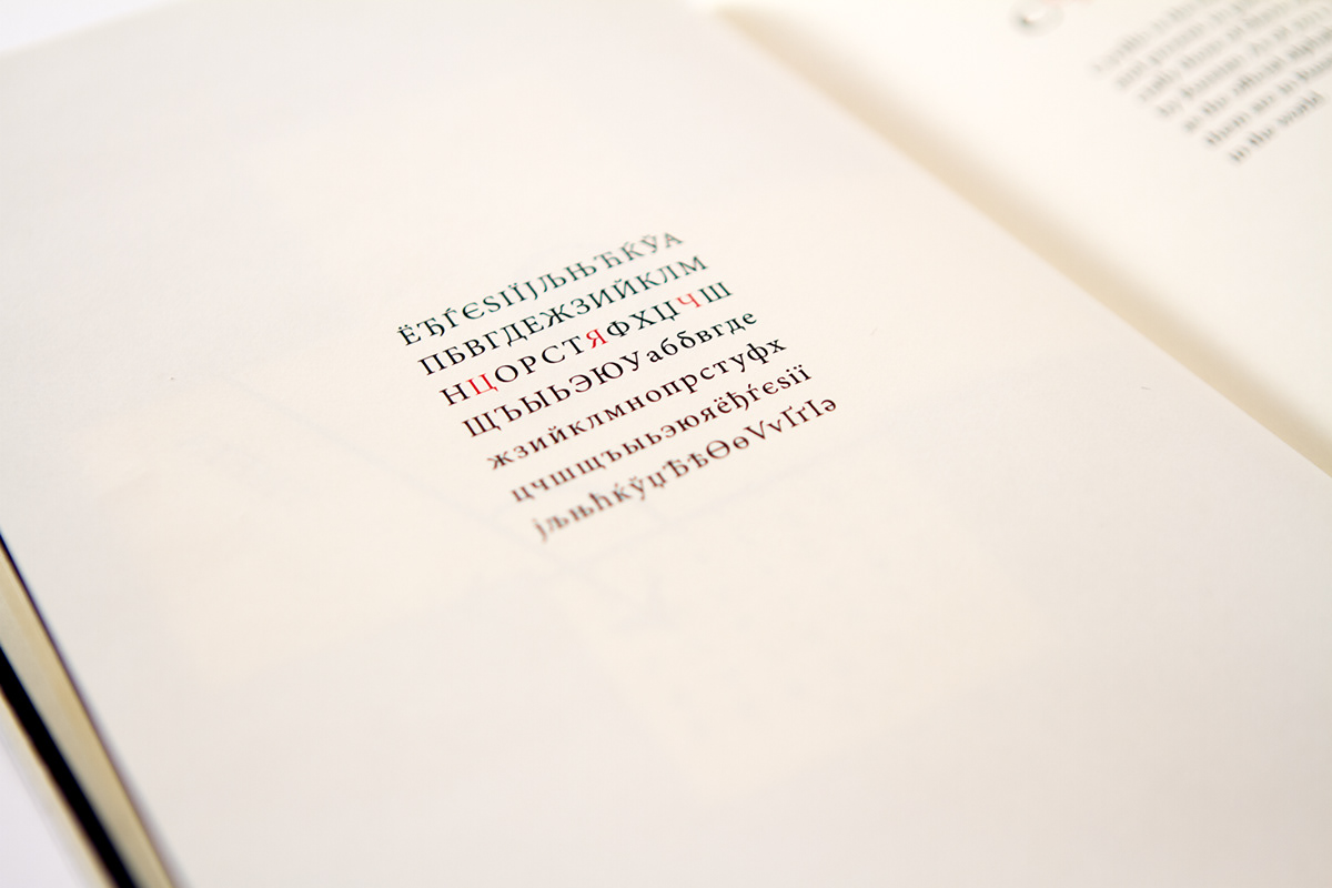
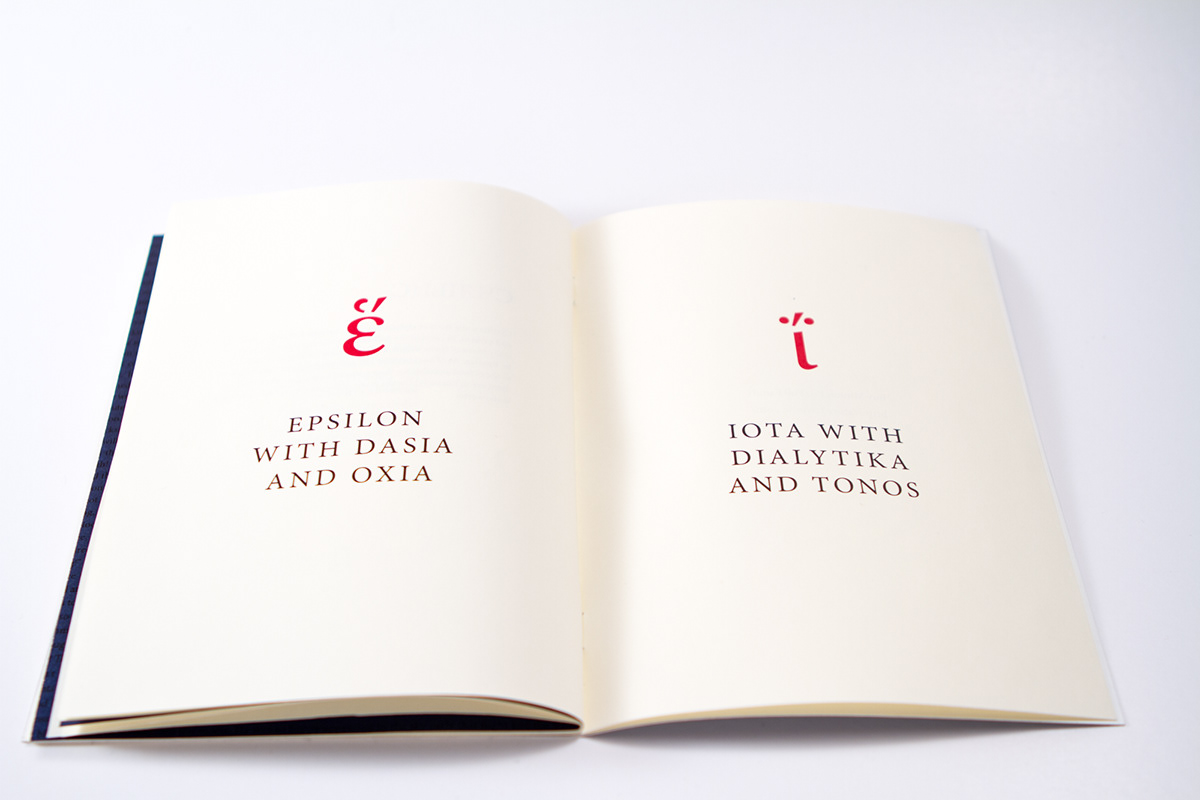
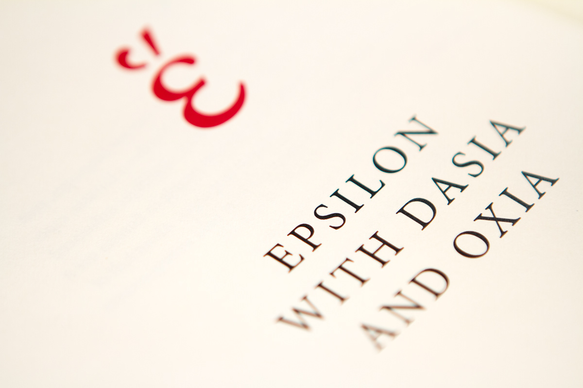
I picked the classic Adobe Minion Pro because it is easy to read and it reminds me about fairy tale books from when I was a kid. When I made the brochure, I wanted to keep the focus on the typeface, but at the same time present a story about the moon. The idea was to put fictive stories about the moon up against hard facts, to make the brochure more interesting to study. I presented the greek and cyrillic letters by replacing some of them with the uppercase and lowercase letters in the headings. This made the brochure more alive. I printed the cover on 300 g white Scandia paper and the main content on 150 g off-white Scandia paper to give the finish a “moonshine look”.
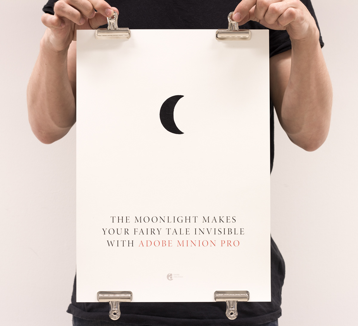
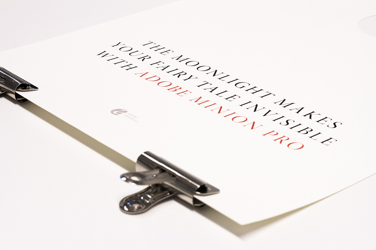
For the poster I used a half moon-icon/symbol and cut it out to make an invisible moon to gain the message: “The moonlight makes your fairy tale invisible with Adobe Minion Pro” This one is also printed on the same kind of paper as the cover of the brochure. A funny thing about this poster is that the moon-shape actually is a symbol that belongs to the typeface!