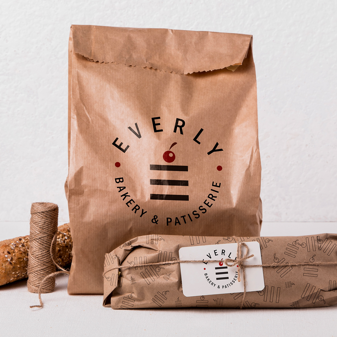
Hello! Designing a visual identity for a coffee and sweets shop named Everly is an essential element for the success of the project and attracting customers. The visual identity includes several important elements that reflect the personality of the shop and make it unique and distinctive.
The Everly logo was designed using a sweet icon that represents the sweets that are served in the shop.
Dark brown and white were chosen as the main colors for the shop's identity, where the brown color conveys warmth and comfort, and indicates that the shop serves high-quality coffee. Meanwhile, the white color represents purity, cleanliness, and simplicity.
The branding and signage inside the shop were designed using suitable colors and lines to achieve a clean, cohesive, and attractive design. Some creative elements, such as curved lines and geometric shapes, were added to infuse some liveliness into the design.
Overall, the Everly shop's identity reflects its personality in an attractive and distinctive way, making it stand out among its competitors. The colors and lines used indicate the quality of the products and services offered by the shop, making the customer experience inside the shop enjoyable and comfortable.