


FM (Facility Management) is an area that comprehensively plans, manages and utilizes facilities and environments for organizational activities of companies and organizations. This area is currently expanding its scope.
S&I Corp. is the first domestic FM company to provide remote management solutions using IT systems, overcoming the limitations of an industry that relied on individual capabilities by utilizing technology and systems and presenting a new paradigm in building management.
Brand Architecture
S&I Corp., a portfolio mainly focused on large buildings, discovered that the building management market is changing based on needs rather than size. Accordingly, S&I Corp. classified and modularized all solutions that can be provided in large buildings into six categories: Asset, Interior, Clean, Safe, Life, and Parking, based on customer needs.

Brand Name
This modularization work customized S&I Corp.'s highly completed services according to customer needs, regardless of building size. The name of this new brand is SANDI, which was developed to be friendly to consumers while linking S&I Corp.'s existing assets.
Brand Core Value

Brand Story
Our endeavors will soon become the industry standard and a part of its history. We strive for innovation in finding and solving problems in new ways, even before our customers ask.
This enables us to provide you with the most necessary solutions. This is what we believe true care means.
In spaces, As individuals who utilize spaces,
S&I Corp.'s new brand 'SANDI' benefits all of them.

Brand Manifesto
SANDI goes beyond building management and createsnew value in all aspects of human experience in spaces.
We actively support on-site expertise to provide optimal solutions when needed, without compromising on standards. We anticipate and prepare for all potential issues in advance.
We stay one step ahead and proactively think about how to bring our customers closer to the future.
We question everything that may seem obvious and innovate.
We contribute to the ecosystem without limiting ourselves to the boundaries of respect.
We care not only about the completeness of our services but also about the lives of customers who inhabit the spaces.
Our success is ultimately our customers' success.
SANDI, Digitalization for Human

Design Concept
The shape of SANDI's symbol is derived from a top-down view of a building, specifically from the emblem of the building. The S symbol, with a square frame, represents each unique building, which signifies SANDI's customers.
Brand Logo
Furthermore, SANDI's logotype also originates from a square shape. It has been designed to be as concise and geometrically shaped as possible.


Brand Color
For the brand color, magenta has been chosen to bring innovation and a sense of vitality to the gray buildings. And gray and white colors have been designated as sub-colors alongside the main color.

Typeface
SANDI's typeface is Poppins, a sans-serif font with a style consistent with the brand logo.

Key visual
SANDI's logo shape represents the building itselfIt can depict buildings of various heights, showcasing diversity in architectural structures, creating a sense of rhythm.


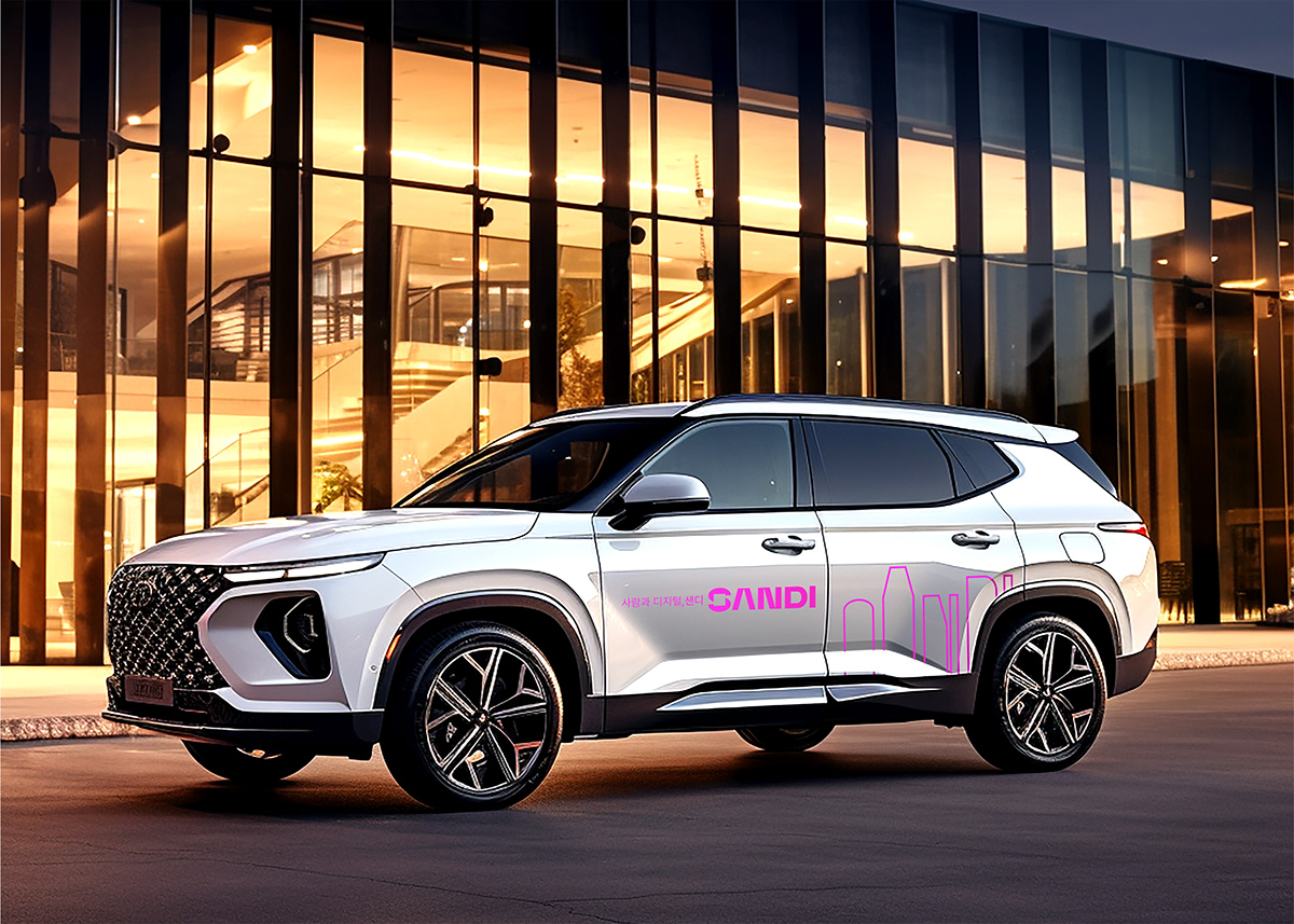
AD
SANDI's advertisements can utilize the symbol to the maximum extent as follows.


SANDI, New Brand Dev. Project
2023
2023
Client
S&I Corp.
PM
Choimyunghwa & partners
Brand Identity
WW (Worth it & Worthy)
Creative Director : Bohyun June Kook
Creative Director : Bohyun June Kook
Brand Strategy / Brand Name Dev. / Brand Communication Strategy : Bohyun June Kook
BX Design / Comm. Design : Kahyun Kim (Be Based on Brand)


