Introducing PlanDelta, the next-generation planning tool that seamlessly connects strategic and financial planning while fostering collaboration and innovation. Say goodbye to rigid budgets and embrace continuous planning throughout the year.
HYPE's Design team was tasked to enhance PlanDelta's existing user experience and interface, crafting a unique product that stands out from competitors.
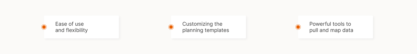
Drawing inspiration from PlanDelta's existing MVP, we embarked on a creative journey to craft a truly distinctive platform. By focusing on three core features, we set out to deliver a product that sets PlanDelta apart from other seemingly identical platforms.

As with all of our work, we took care of the project with very high attention to every detail.
Our team of UX and UI designers carefully went through each step of the process and achieved outstanding results.
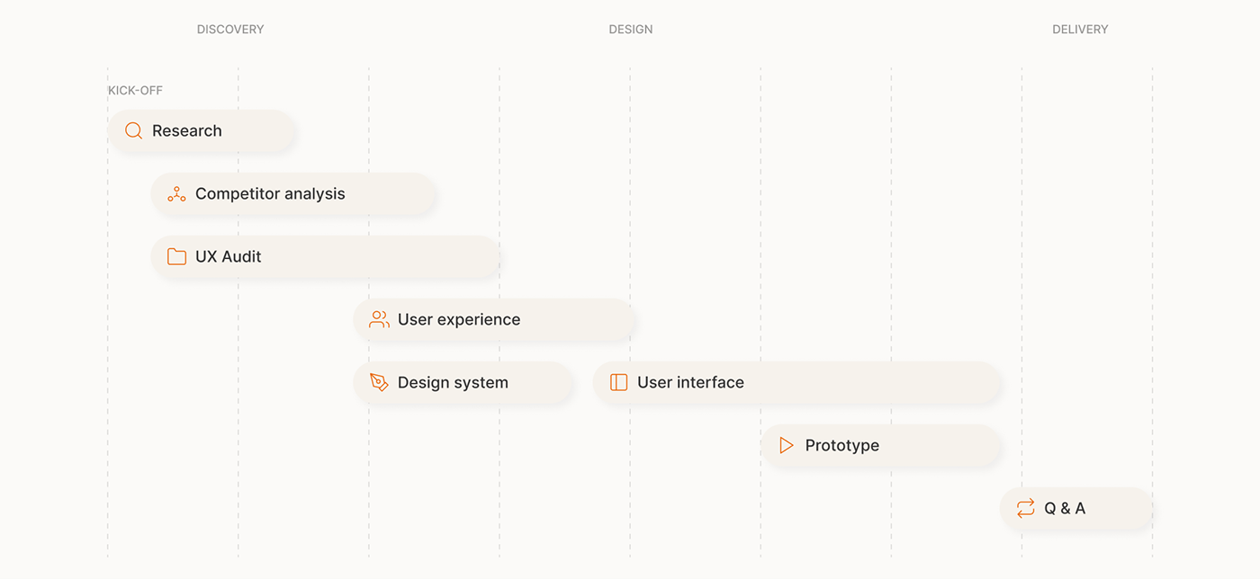

Throughout the process we worked on several user stories and explored every user flow with a great attention to every detail. In our pursuit of the best concept, the biggest problem was finding the best way to visualize all the data and data tables that the product offers to its users. Through the use of the elaborate design system we created templates that could be reused throughout the flow.
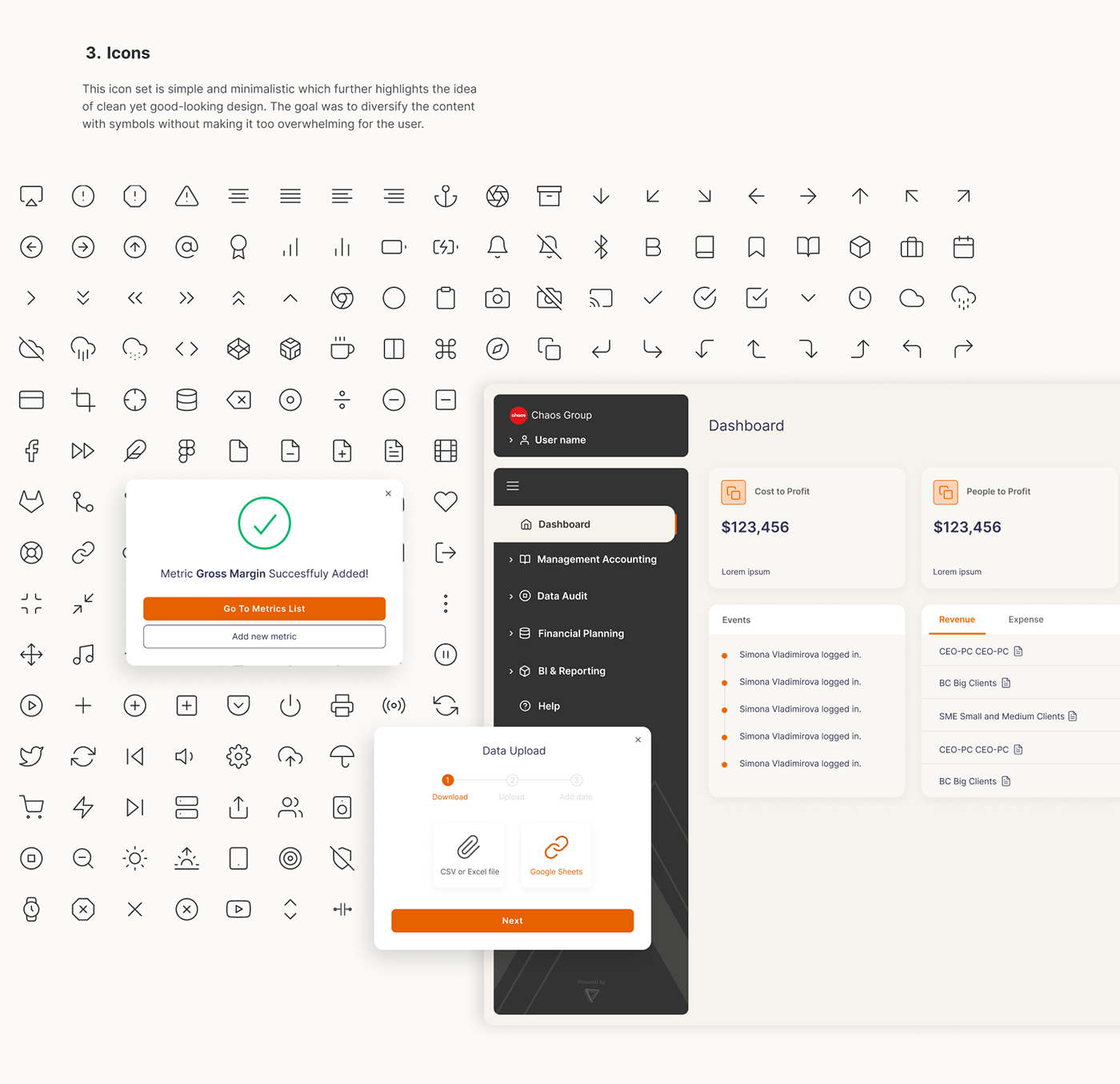
Our goal was to create a standout software solution that showcases PlanDelta's unique technology at a glance. We offered multiple style options, always prioritizing simplicity for this complex data-based solution.
To enhance the user experience further, we carefully curated three customizable color themes that blend seamlessly with the design while adhering to accessibility guidelines.

It was challenging to order by importance the different kind of information on the screen. We created a hierarchy that would help the user see which information to focus on - which is most important and which is simply supporting the main points. We used size, weight color, contrast, case, position and alignment to build PlanDelta’s typographic hierarchy.


Designing a new product can present numerous challenges, particularly when creating more than 30 screens with a lot of content and data to be presented. Our objective was to make the design visually appealing, easy to comprehend, interactive, and engaging, while maintaining a professional and formal tone. To address these challenges, we adopted the following strategies:

Our goal was to achieve a delicate balance between aesthetics and functionality, prioritizing user experience and interface design. The final result is a product that both we and PlanDelta are extremely proud of.