Concept
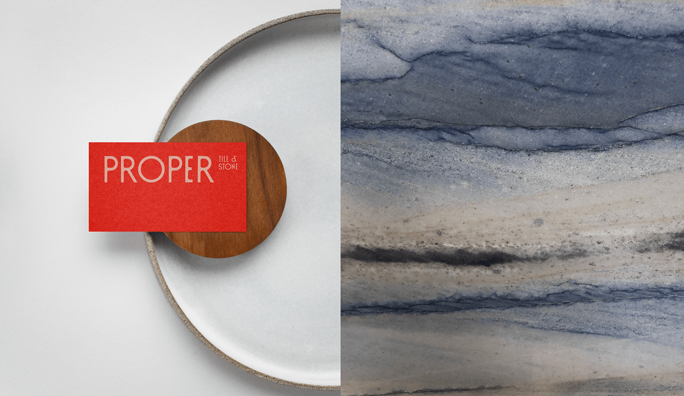
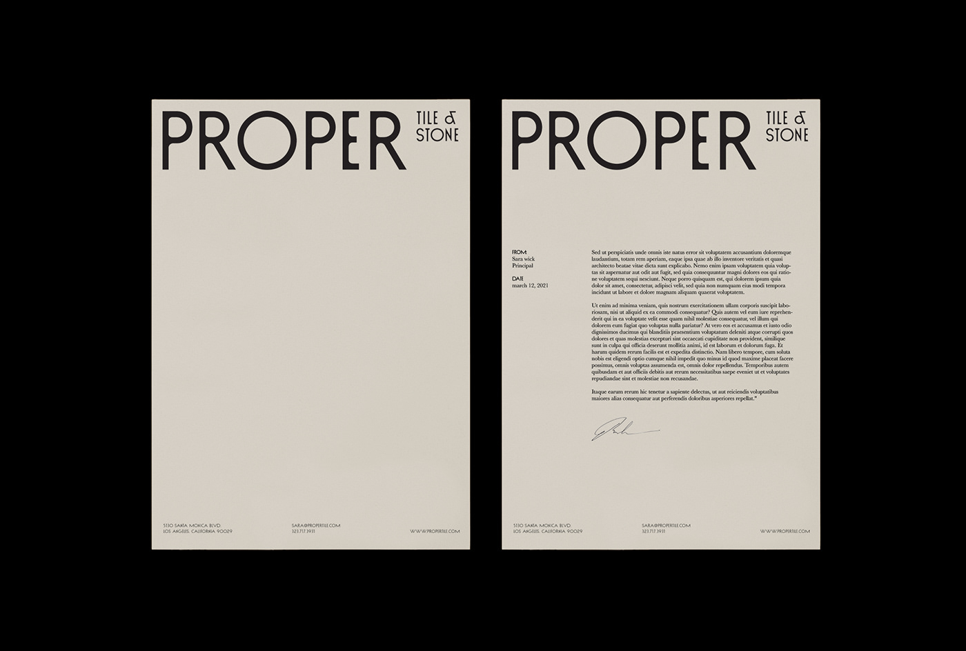
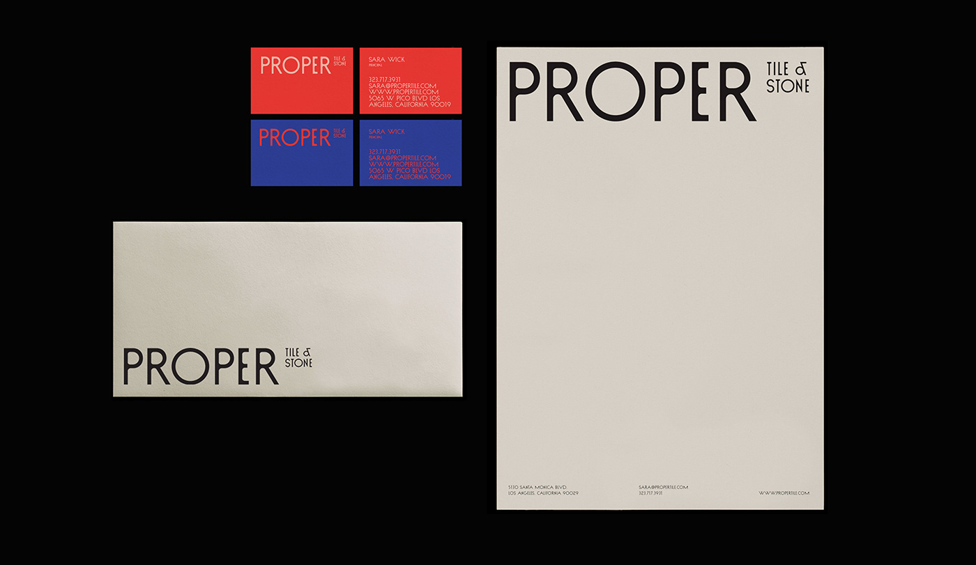
Proper Tile & Stone has years of experience of working with an extensive collection of ceramic, porcelain, stone, and wood — both local and international. It was requested a visual identity that enhances the style and versatility of materials that Proper Tile & Stone works and, at the same time, reflect nature as the main source of materials.
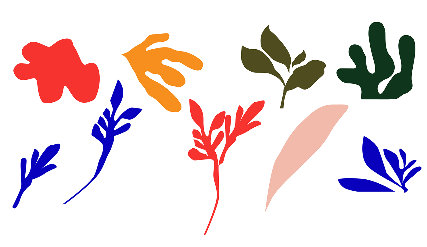
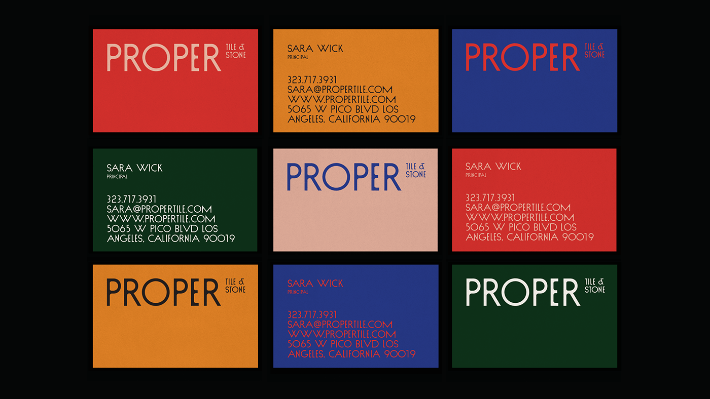
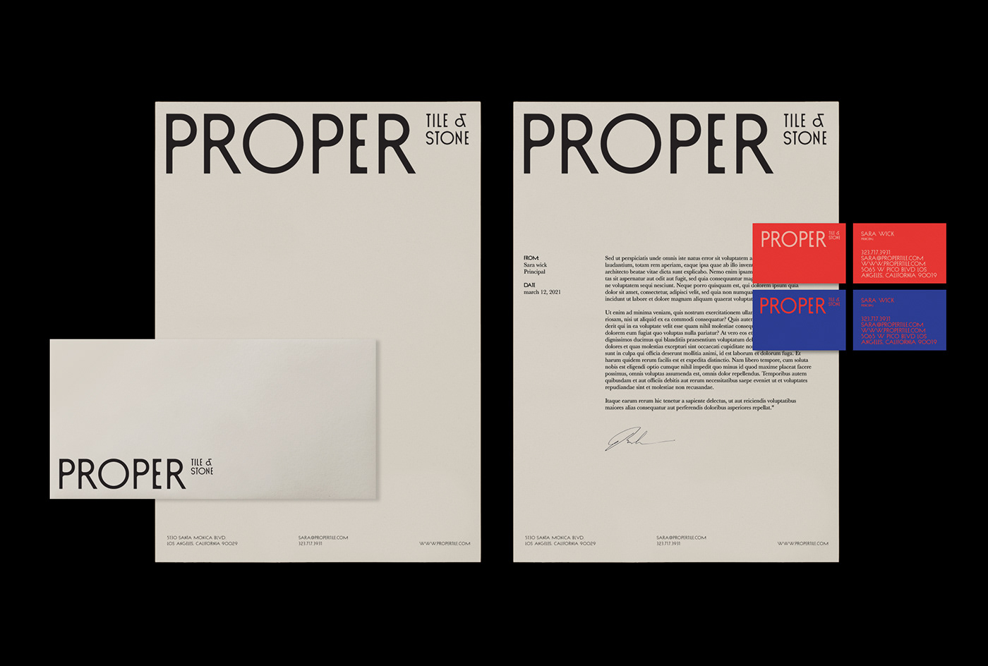
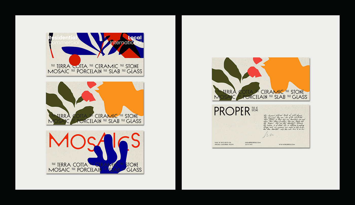
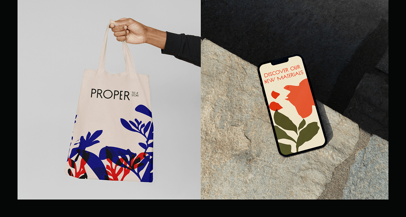
In this concept, natural abstract elements were created to generate strong compositions. The balanced intersection of graphics and illustration served as a concise communicative strategy throughout the whole identity. The illustrative work is the most immediate expression and is composed of varied color combinations with the visuals moving around the space to keep dynamism. They allow a new vibrance and playfulness, full of color and shape to the identity.
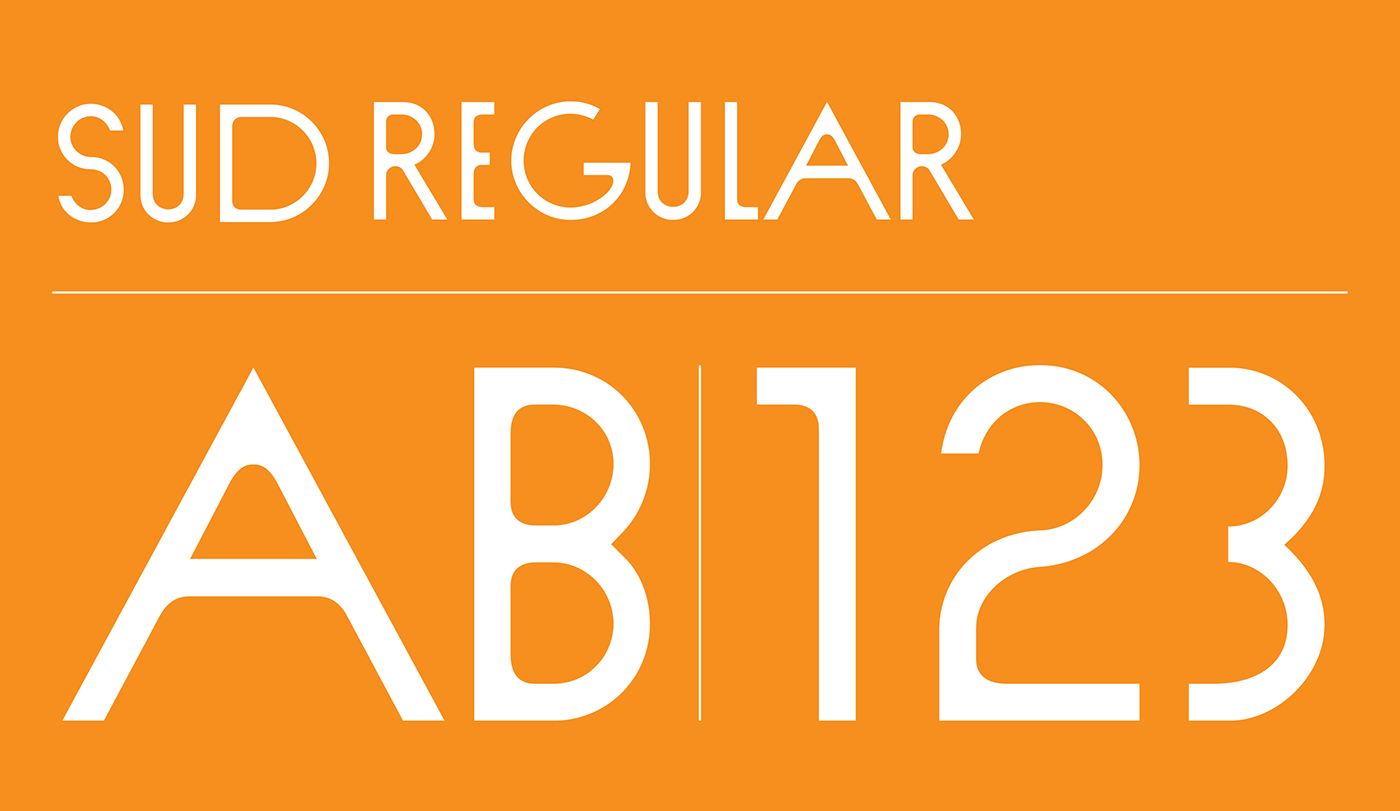
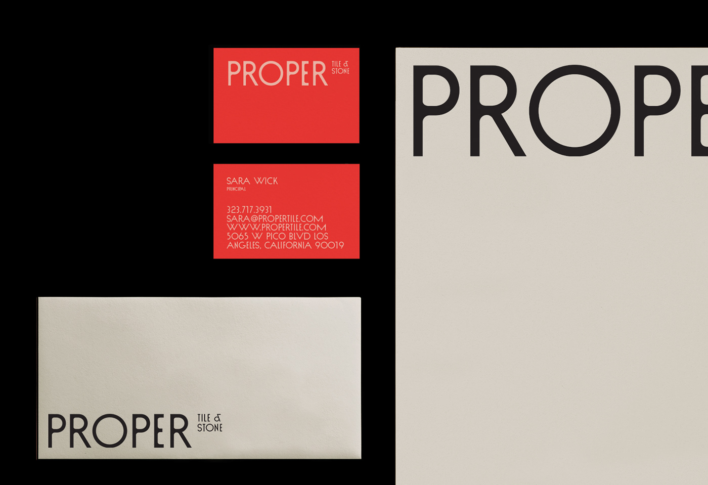
SUD is the main font to create the look and feel of the brand. The font is characteristic of it's unlikely widths, with a big geometric O. SUD font is from VJ Type foundry.
Art direction & Graphic design: Filipa Ferreira
Illustration: Filipa Ferreira
SUD font: VJ Type
Year: 2021
Illustration: Filipa Ferreira
SUD font: VJ Type
Year: 2021
