
Visual design work for Sporting News' iPad application. At the time, the goal was to design an application that would feel at home in then unreleased iOS7. The emphasis, therefore, was on creating an interface that fit in with iOS7's flatter interface, but still allowed users to differentiate points of interaction from content.
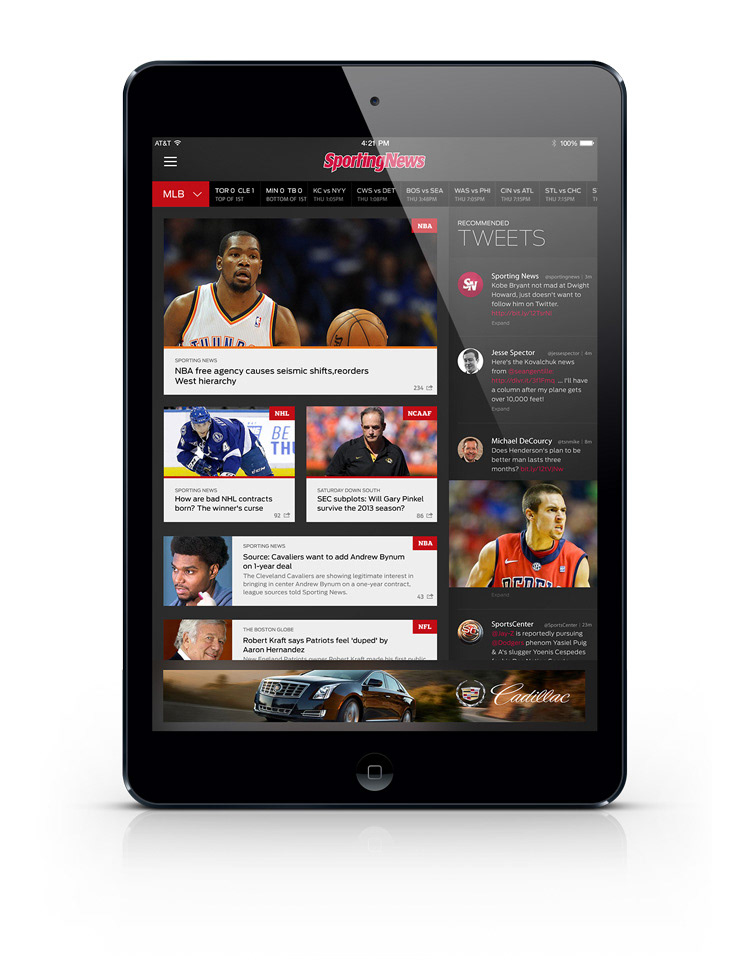
Interaction point elements such as links from the tweet feed, and the dropdown menu were given the brand's distinctive red color in order to highlight them to users. This particular feed layout (left hand stories, right hand tweets) would be carried out throughout all online news sections, including league specific and team specific feeds.

The slideout menu was given a slight shadow to emphasize it's place beneith the content in the main view, and its list items were indented in a manner similar to iOS 7

Online articles, when clicked, would overlay atop the viewport the user was previously on. Like all interaction points, the iOS iconography present for favoriting, sharing, and closing the window are colored to match the sporting news red.
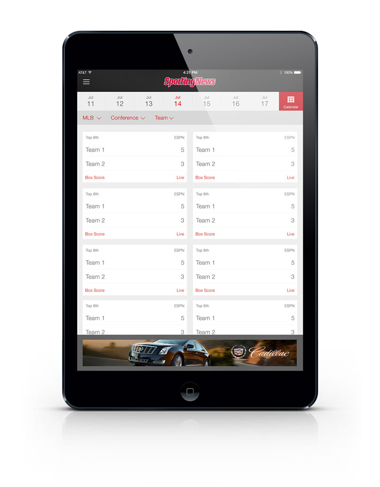
Score list. Navigatable by date, also displays upcoming games and their lineups.
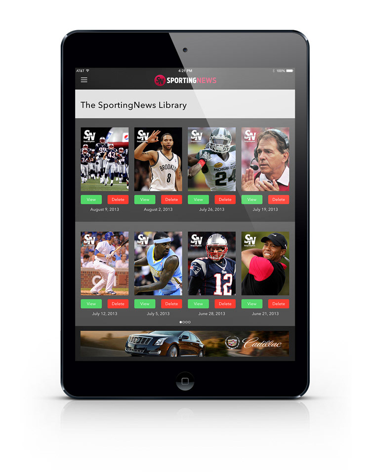
Downloadable issues, utilizing iOS7's native add/delete green and red.
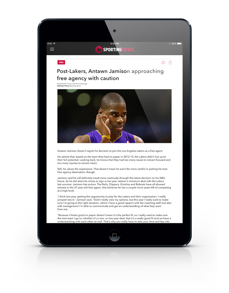
Magazine Mode article.

